Outline:
Twenty years ago most new patients picked up the phone after a neighbor’s recommendation. Today they open a browser tab, type a few words, and decide—often in under seven seconds—whether a practice feels right. That tiny window is ruled by web design. Colors set an emotional tone, typography whispers professionalism, and one well-placed button can shrink the distance between intention and appointment. In short, dental web design is now the digital front door of every clinic. Miss the mark and people bounce; get it right and they walk in already half-won.
Aesthetics with Purpose: The Psychology Behind the Pixels
Great visuals do more than look pretty; they work hard behind the scenes:
- Signal trust – Clean layouts and balanced white space suggest meticulous clinical standards.
- Lower anxiety – Soft hues and friendly photography calm the “drill dread” many adults carry from childhood.
- Differentiate fast – In crowded cities a unique visual identity helps a practice stand out instead of looking like “just another dentist”.
Because dentistry mixes healthcare with lifestyle, and innovative healthcare design choices influence both credibility and comfort—the two feelings most people weigh before booking.
Dental Web Design Principles: Turning Psychology into Pixel-Perfect Practice
So far we’ve talked about why visuals matter; now let’s roll up our sleeves and see how smart choices on the page translate into booked appointments.
Brand Continuity: One Voice, Everywhere
A patient coming to your dental landing page should feel the same warmth they’ll sense when they walk up to reception. To lock in that familiarity, keep your logo, color palette, and tone marching in step across every screen. Swap out generic stock art for real team photos shot under the same lighting; even small touches—like using the identical greeting your front-desk staff gives on the phone—help people recognise you instantly and file your name under trustworthiness. Need a quick win? Draft a one-page style guide before you mock up the site and let it steer every design decision that follows.
Visual Hierarchy: Guide the Eye, Don’t Make It Guess
Visitors skim, not study. On desktop the gaze drifts in a loose F-shape; on mobile the thumb drags eyes down a zig-zag path. Lean into those habits. Put your single-sentence value proposition in the largest type on the hero header, back it up with a crisp supporting line, then drop a bold CTA right beneath.
Mobile-First Thinking
Most dental searches fire up on phones, and Google now scores your site’s mobile slice before anything else. If your hero image drags its feet, would-be patients bounce long before they can admire your chairside manner.
Test tap targets with your own thumb—buttons should be at least 48 pixels tall so no one fat-fingers the wrong link. A fast, finger-friendly site whispers professional louder than any tagline.
Accessibility: Inclusion that Pays Off
Accessible design is both ethical and strategic. High-contrast colour pairs help everyone, from users with low vision to anyone reading your site in bright sunlight. Write alt text that tells the story rather than dumping file names. Add labels to your dentist website design so screen-reader users glide through forms with ease.
Conversion-Ready UX
Finally, frictionless pathways turn curiosity into commitment. Keep a sticky “Book Now” button pinned to the header so it follows visitors down the page without hogging the spotlight. Sync a real-time calendar to your practice-management software and flash an instant confirmation—nothing fuels second thoughts like a vague “We’ll call you.” Sprinkle reassuring micro-copy underneath to nudge wavering users over the line. Each of these tweaks chips away at hesitation until the only logical next step is to hit “Confirm.”
Master these five principles and you’ll watch your website shift from a polite brochure to round-the-clock growth engine—one that greets, guides, and closes for you while you focus on perfecting smiles in the chair.
UX Touchpoints That Keep Patients Hooked: From Curiosity to Commitment
As for the UX, think of it as the handshake that follows the smile: design sparks interest, but UX carries visitors across the threshold, coaxing them to click, confirm, and come back. Below are the patient-facing touchpoints that close that gap—each one removing just a little more doubt, until booking feels like the only sensible next step.
Real-Time Online Scheduling
Motivation is a soap bubble—it pops fast. Letting visitors grab a slot the moment they feel ready locks in intent.
Implementation tips:
- Pair your booking widget with a progress bar (“Step 1 of 2”) so people know completion is close.
- Offer a “Text me my appointment” toggle; reminders via SMS cut no-show rates.
- Always show next-day availability; blank calendars shout “We’re too busy for you.”
Insurance & Pricing Checkers
Sticker shock is the #1 abandonment trigger in dentist website design. Transparent costs shift the conversation from “Can I afford it?” to “When can I start?”
Implementation tips:
- Use a lightweight accordion that lists starting prices plus “may vary” footnotes—enough guidance without locking you into quotes.
- Add an instant eligibility form where patients pick their insurer from a drop-down; integrate with a verification API so results feel magical, not manual.
- Highlight financing options right beside premium treatments to normalize larger spends.
Stories & Social Proof
People trust people. Genuine testimonials and before-after galleries do more persuading than any clever tagline.
Implementation tips:
- Capture short video reviews for authenticity.
- Use before-after images
- Rotate quotes dynamically—new voices each visit keep the page feeling alive.
Educational Hubs
Patients binge information the night before they commit. If you’re the teacher, you become the dentist of record.
Implementation tips:
- Build pillar pages for each high-value service (Implants, Invisalign, Whitening) and cluster blog posts around them to educate your patients and bring more credibility.
- Keep explainer videos under 90 seconds; use captions so commuters can watch silently.
- End every article with a contextual CTA (“Ready to smile brighter? Book a free consult”). Learning should flow naturally into action.
Together, robust design principles and patient-focused UX touchpoints create a seamless, confidence-building journey—nudging strangers from first glance to scheduled appointment without ever feeling pushed.

Best Examples: Steal-Worthy Moves to Adopt for Your Dental Web Design
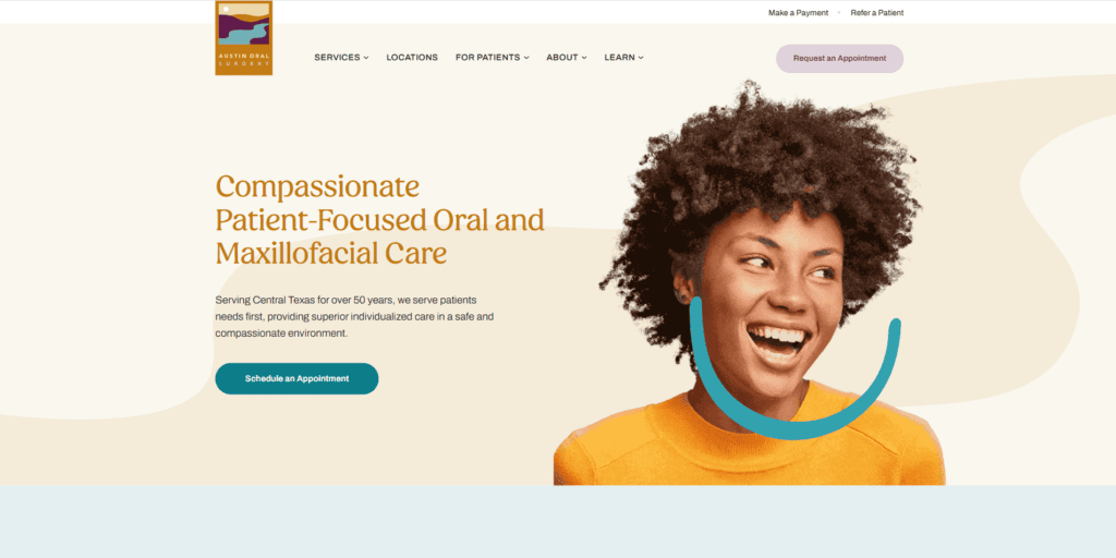
“Oral and Maxillofacial Care” sits on a calming green overlay, immediately soothing nerves. A sticky “Schedule an Appointment” button follows visitors down the page, while a grid of twelve location cards says, “We’re close to you”.
Features You Can Adopt
Pair an empathetic promise with an ever-present CTA. Let geography work for you by showcasing multiple offices up front.
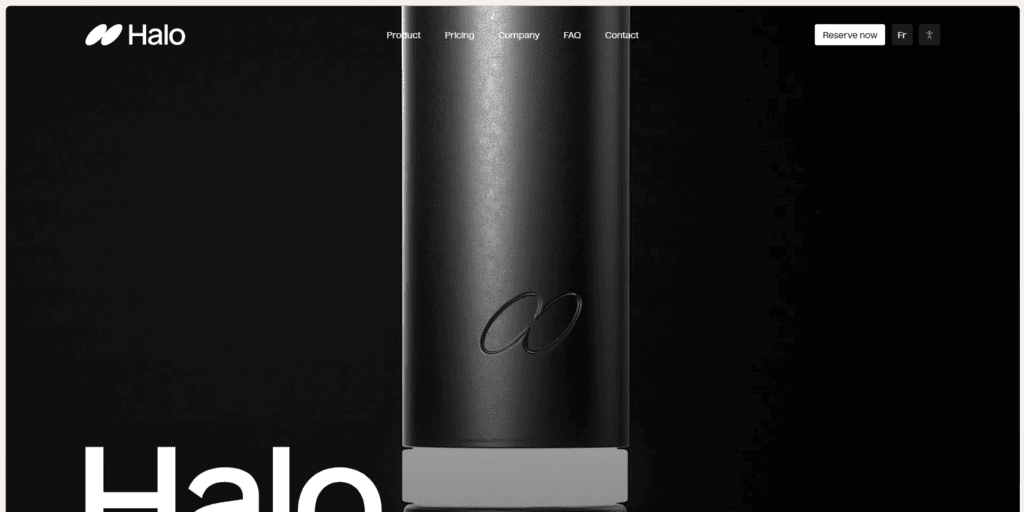
02 Halo Dental
Bold gradient, looping hero video, and the rallying cry “We All Shine” feel more like a tech startup than a dental brand. A single “Reserve Now” button repeats in the header—no clutter, no confusion.
Features You Can Adopt
A fresh visual metaphor can reposition you instantly. Keep navigation minimal when the conversion path is simple.
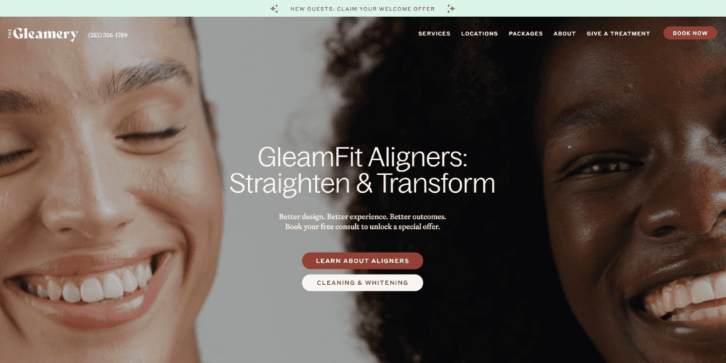
03 The Gleamery
Retail-style layout with an e-commerce cart, transparent pricing, and a “Book Now” button that glows from every fold. Lifestyle photos treat hygiene like spa-day self-care. A before/after slider quantifies shade jumps (“4+ shades whiter”).
Features You Can Adopt
Blend ecommerce UX into dentist website design to normalize purchase behavior and highlight tangible results.
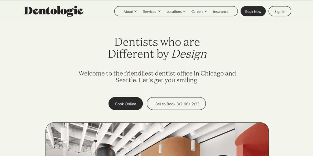
04 Dentologie
Punchy headline “Dentists who are Different by Design” over friendly illustrations. Immediate city selector (Chicago / Seattle) personalizes content, and insurance logos line up like badges of honor. A paid membership plan (“Dentologie Plus”) is introduced with Netflix-style simplicity.
Features You Can Adopt
Use inclusive graphics and micro-copy to feel approachable. Surface insurance info early to kill a common objection, and upsell with clear value framing.
Monochrome hero, magazine quotes, and Instagram feed project boutique credibility. The CTA says “Book Online” but editorial praise does the heavy lifting—social proof as the primary design element.
Features You Can Adopt
Curated testimonials can outshine generic stock photos. Keep the palette restrained to let accolades pop.
Across these sites one pattern repeats: clarity first, personality second, conversion always. Each homepage answers three patient questions in a heartbeat—Who are you? Can I trust you? How do I start? Nail that trio and your bounce rate will thank you.
Common Pitfalls That Scare Patients Away
- Stock-Photo Overload – Patients spot clichés a mile off.
- Hidden Contact Info – Forcing users to dig increases exits.
- Slow Mobile Performance – Page bloat equals lost appointments.
- Accessibility Blind Spots – Poor contrast or missing alt text limits reach and risks lawsuits.
On a Final Note
Patients may discover you through insurance directories or TikTok, but your dental website design decides whether they stick around. By blending warm visuals, streamlined UX, and a sprinkle of personality, dentist website design becomes a silent salesperson—working 24/7, calming fears, and nudging thumbs toward “Book Now”. Audit your current site through this lens, spot the gaps, then let strategic aesthetics pull in smiles long before the first hello at reception.
Ready to rethink your digital front door? Drop us a line and let’s design a site that makes patients click, call, and come back.

Copied!