Local websites
Local websites
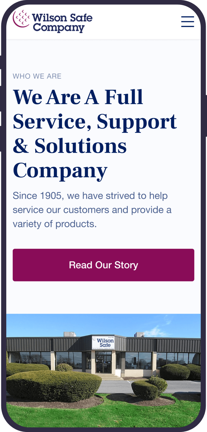
Wilson Safe is an all-inclusive inventory of safes operating since 1905. The company has stood the test of time for over 110 years and proved itself an industry leader offering a complete line of high-quality safes to run business securely.
However, launched and developed in the early 2000s, the Wilson Safe website wasn’t communicating that impressive heritage and strong expertise since it was outdated. And to fix that, our eCommerce web design agency needed to redesign it so as to improve the user experience, attract more customers, and boost sales. And before the redesign, it was essential to analyze the site and its assets to find out the pain points to eliminate. Additionally, it was decided to get insights from customer and stakeholders’ interviews to clarify the process and ground it with the real needs.
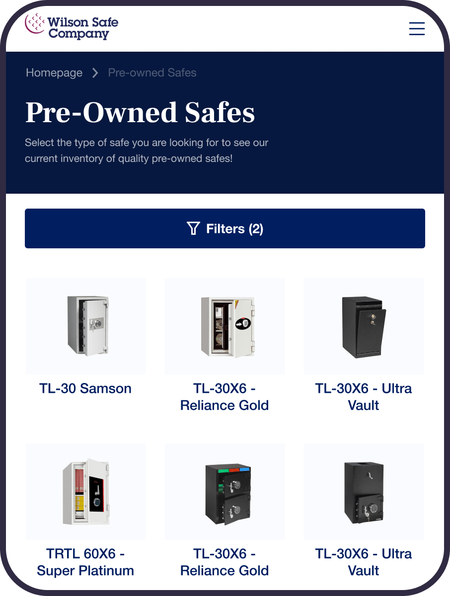
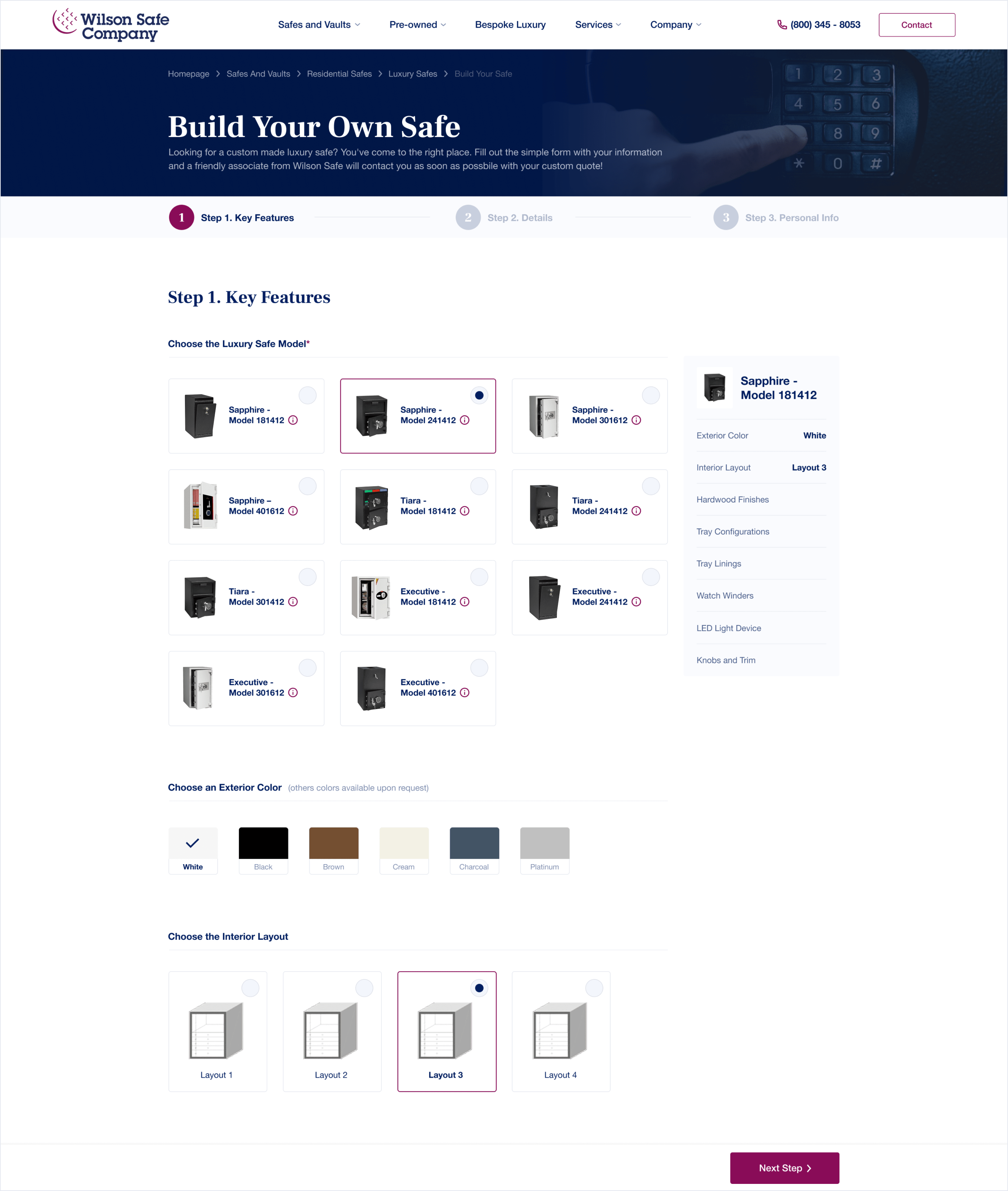
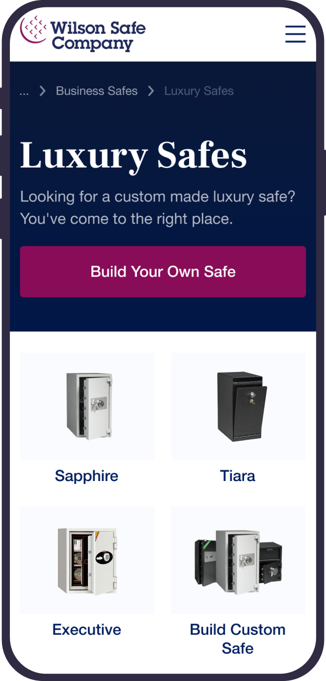
Another integral part of the project was to polish the information architecture and refine the product catalogs. That would enable customers to easily find what they need, eventually bringing their experiences to a new level. For that reason, we needed to categorize all the products so users could navigate through the items without wasting time and scrolling numerous pages for the desired option. Furthermore, the client wanted to implement the bespoke luxury safe feature, enabling customers to order tailor-made safes based on their preferences and needs. That would make their service more customer-centric, allowing for higher personalization, thus better consumers’ involvement.
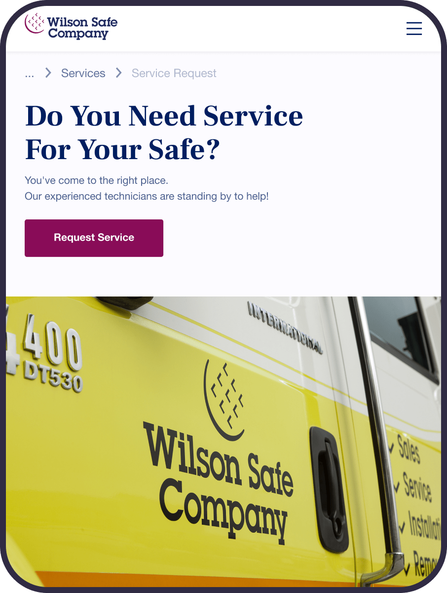
Ultimately, the Wilson Safe website needed rebranding so that the enhanced version of it could reflect the changes and help the company stand out among the competitors.
Throughout the project, we had weekly meetings where we offered various options for the design and got feedback from the client. During the meetings, the client with a marketing specialist suggested their own ideas, which we discussed, and then specified the most appropriate ways of implementing them.
We started with a series of calls where we gathered insights about the current state of the website, relevant data about the customer journeys, and the list of obstacles users faced when interacting with the site. Also, we collected some specifics about the safe retail market to understand the mechanisms used by the competitors. That helped us identify best practices used in the industry and pick up the most relevant ones to differentiate the Wilson Safe brand.
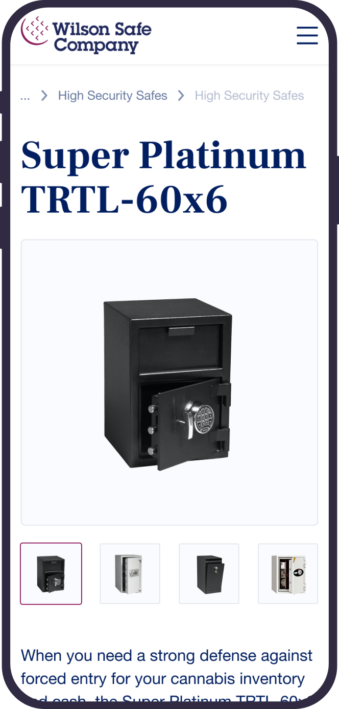
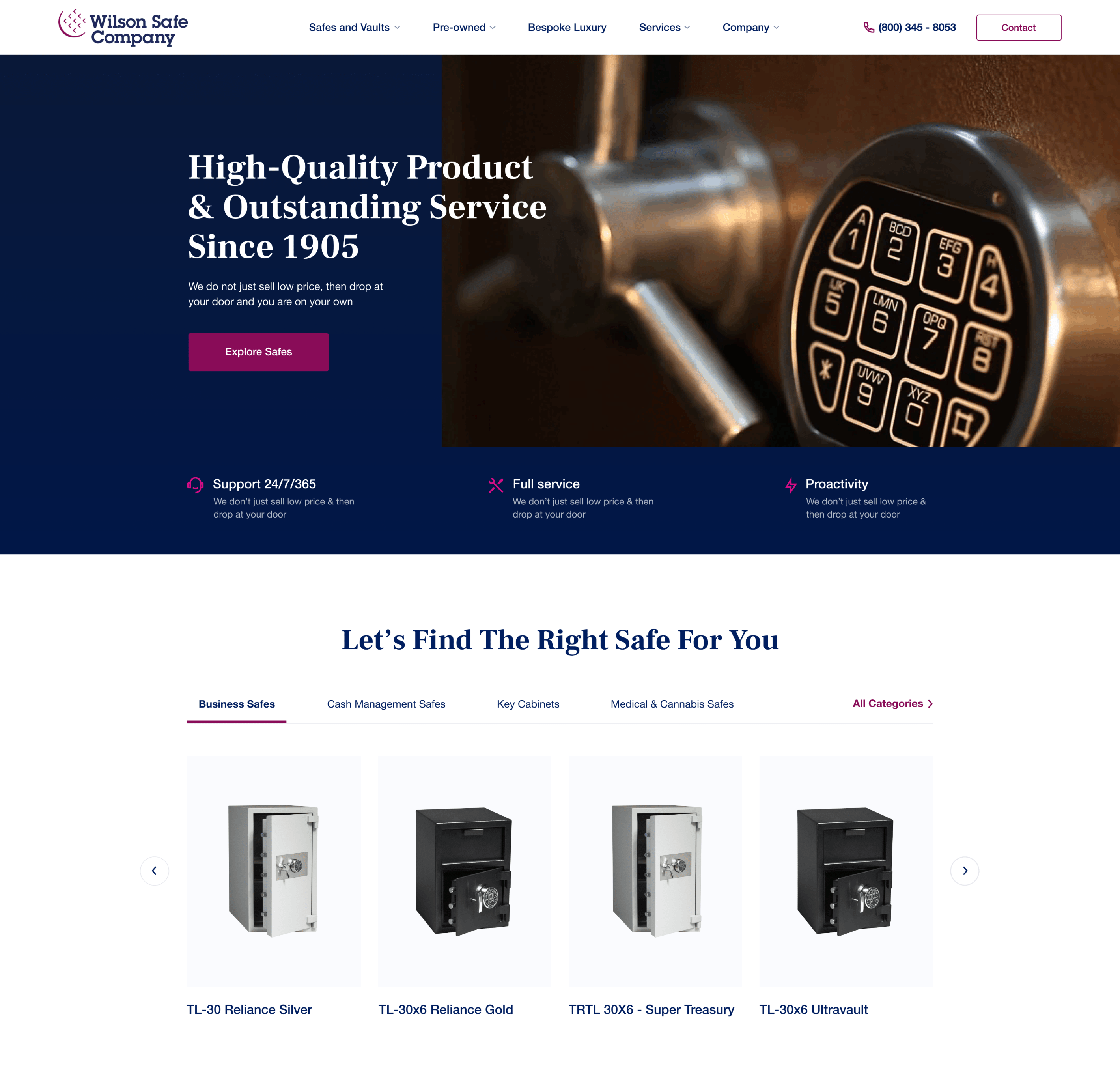
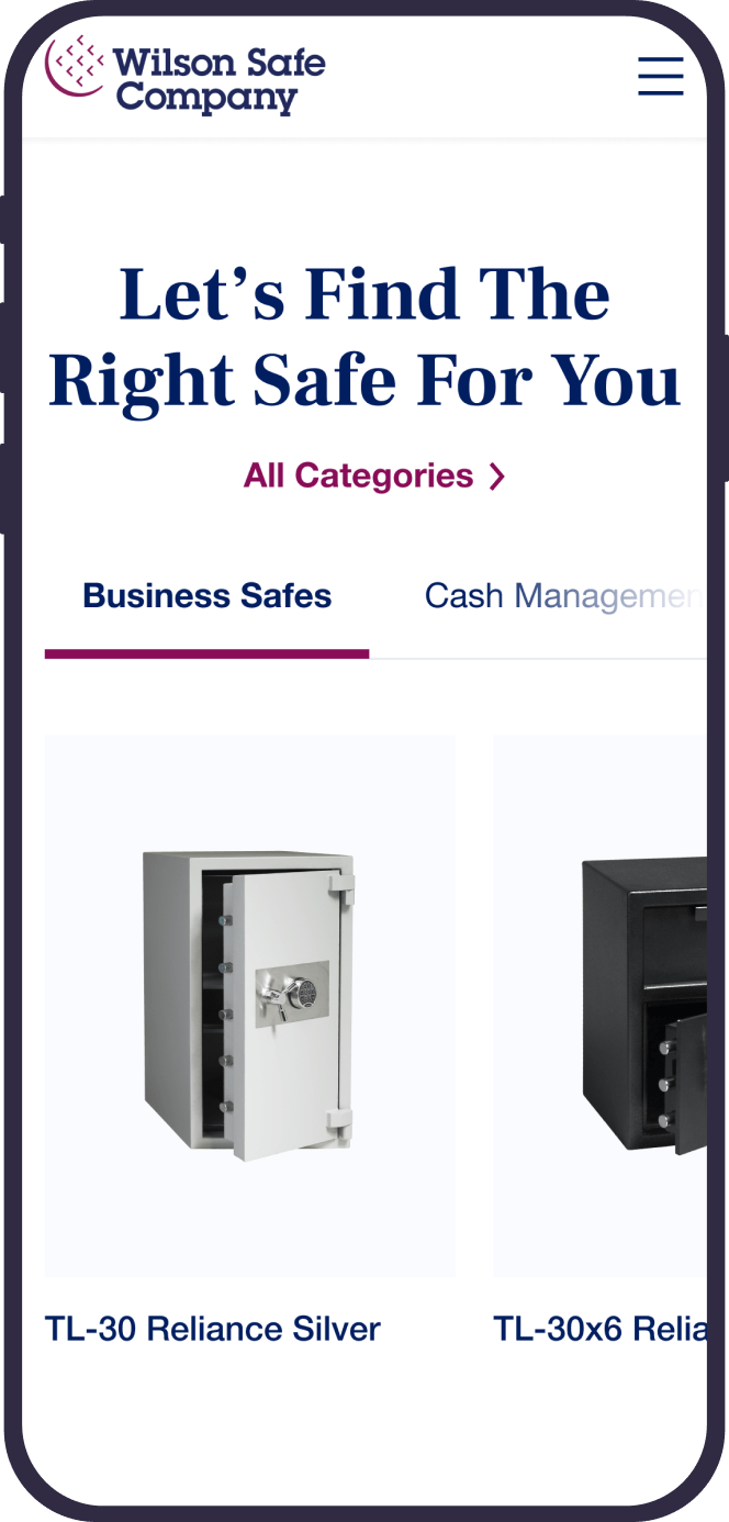
Since the discovery phase provided us with an understanding of how customers are searching for safes, we already knew what to fix to improve the website’s visibility. Namely, we structured the catalog by the area of safe usage (business, bank equipment, residential, etc.) as users would type these keywords to a search engine allowing for a specific case type. We didn’t stop there, and to ensure seamless and effortless on-site navigation, we employed images for different safes types so first-time buyers could immediately distinguish between them.
Once the new information architecture was applied, we moved to wireframing to design a variety of user flows and test upgraded customer experience. Also, we created wireframes for the bespoke luxury safe feature, developing a simple 3-step user flow where customers could select key features like safe model, exterior color, and layout. Thus, we clarified consistent ways of displaying information on the user interface, and after the feedback from the user testing, we made final adjustments.
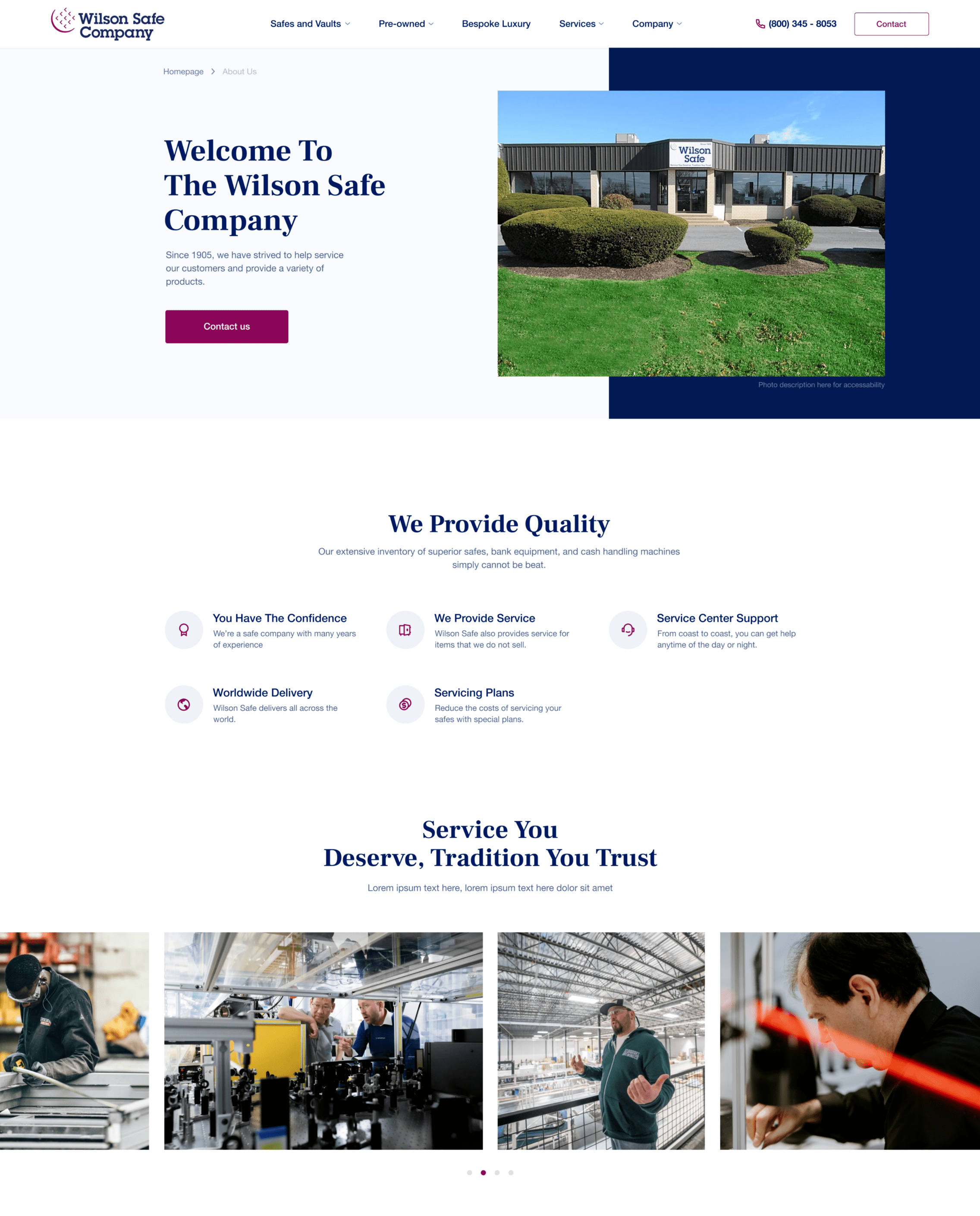
Only then do we move to visual design and branding updates. Although Wilson Safe didn’t have any brand guidelines, they used distinctive colors across their marketing assets, so we decided to keep to them to avoid confusion and deteriorated brand recognition. Thus, we left rich magenta and deep blue as primary colors while adding a few complementary ones for a more vibrant yet minimalistic and precise color palette. To demonstrate the company’s 100 years old history and grandeur, we selected classic Frank Ruhl Libre serif typeface for the headlines. Typography, working in tandem with the color, and other graphic elements, lifted the company’s brand image, making its web platform look reliable and solid.
Finally, mobile-friendly high-fidelity prototypes ensured seamless launch, introducing a new functional and beautiful Wilson Safe corporate website, which then could be easily scaled to e-commerce thanks to flexibility, bringing even more value and profit.