Outline:
We can’t avoid experiencing some problems and mistakes with technologies. We are all familiar with situations when clicking on the link results in the impossibility of getting the information or service required. In such a case we are running into a 404 Error, which tells us that the Page is Not Found.
After facing this notice, the majority of customers and users leave the page looking for other sources available, especially if they see just a plain page containing only this three-digit number. No one wants that to happen, right?
Ester Digital, the UI UX design company, has prepared a comprehensive guide on a 404 error page to help you design the most memorable and fantastic page ever. Let’s have a closer look at this issue.
What is a 404 page
404 error is a standard code used to show that the server connection is established, however, the server failed to find the page needed. As a result, the 404 page appears to inform us that the information, products or service desired could not be found at the indicated address.
This may happen due to various reasons:
- The page was deleted. That means that the sought-after product or service is no longer provided.
- The website structure was modified. In this way, the page still exists but under another address.
- The page address was simply entered incorrectly.
- The information contained could not be disclosed to third parties.
There are two types of 404 pages – generic and custom. The generic page represents a traditional one-line message, typically, against the white background. Meanwhile, the custom page is the one designed and structured individually according to the website’s brand style.
Why is a 404 page so important
A 404 page is of great importance and should be perceived as such, as it’s an extra opportunity to show your company’s brand, uniqueness, and creative approach to the things that seemed not so pleasant before.
Although matters with arising errors are inevitable, it’s crucial to make the process of dealing with them as smooth as possible. And here we come to 404 web design.
Since 404 error is understood as something bothersome, 404 page design takes a big part in eliminating this feeling of disappointment that makes customers leave and, probably, never come back to using the whole website in general. Without it, the company will possibly lose its potential customers or users.
To avoid this situation, you’d better encourage your visitors to think that the 404 page is not a deadlock but a part of your website ecosystem.

HTTP Status codes: a brief history
There are 4 most common patterns of 404 error messages:
- 404 Not Found
- 404 Error
- HTTP 404 Not Found
- This page is not found
In three out of four names we have this mysterious “404” figure. What does it stand for? There’s one legend according to which, 404 is the number of the first server room, where the inventor of the World Wide Web, Tim Berners-Lee worked with his team. However, according to some sources, the above-mentioned room never existed. Therefore it’s up to you to believe it or not. Fascinating, right?
What do official sources say about the origin of the name? HTTP 0.9 version, created in 1992, included status codes consisting of 3 digits. They were used to display requests status and were divided into 5 groups. Since we’re interested in 404, let’s have a look at it in detail. 4XX denotes a client-side error, e.g. mistyped URL. X04 indicates a specific error faced (server-side).
Notwithstanding the fact that by its origin 404 error is a client-side one, it should not always be regarded like that. There may be situations when the wrong link was copied from another website. And as a result, it wasn’t truly the client’s mistake, and, consequently, it wasn’t their fault.
Competing theories of the 404 error page
Let’s have a closer look at the types of 404 error pages. We’ve already mentioned them but let’s remind ourselves. There are 2 types of 404 pages – custom and generic ones. In this regard, there are 2 different “competing theories.” And now it’s high time to get better acquainted with them.
The generic page is mostly technical and contains nothing but information about an error that occurred, and it may lead to customers’ dissatisfaction.
The custom page, in its turn, which we (along with Google) strongly advocate for, can and should become an additional tool for a company in terms of marketing and branding. It may also grow into a kind of a landing page, demonstrating to users that nothing bad has happened and it’s just a part of the process.
However, it doesn’t always work like that. Custom pages don’t fit all the websites. Let’s consider an example of a web giant, Google. Although Google itself supports the idea of a personalized approach to designing 404 pages, it has an austere 404 error page. That may seem odd, but there are some reasons for that.
First and foremost, if you own such a massive website with loads of pages of various content, a custom approach that includes a search bar and links to popular pages is of no use.
Secondly, it may seem too bold but Google, being one of the most renowned search engines, runs no risks in having such a plain 404 error page because users will never stop using it even after a failure.
Having reviewed these 2 theories and understanding all their pros and cons, you have a chance to decide which one you prefer and implement it in designing your error page.
What should a 404 page include
To avoid any potentially negative effect, these pages should contain more than just the notification of a failure. Let’s examine the most crucial elements and points of 404 pages closer.
- Say NO to an appalling error message.
Such a sign as “404 Error” doesn’t mean anything for those who are not into tech language. However, it intuitively tells us that this is a dead-end and we should close this website. So, to inform the customers of an error, we can just use a neutral phrase like “This page is not (cannot be) found.”
- Include graphics to make it attractive.
Luckily, nowadays, many sites realize the importance of 404 web design, and for the sake of mitigating this situation and decreasing the frustration level, they add some beautiful, peculiar or funny graphics and pictures. Laughter is the best medicine, however, it’s not enough to bring the customers back to using your website. That’s why it is wiser to go beyond making the page look only catchy.
- Keep up with the website’s general look.
We should not forget that the 404 error design page should be consistent with the whole branding regarding colors, layout, and functionality.
- Make it not only beautiful but informative.
The information on possible next steps should also be included. It may contain a homepage link or links to your latest articles, or publications, some ways of reporting a broken/dead link; it may even contain search fields.
Remember, just showing that the page cannot be found is not enough as well as pointless, thus leading to loss of connection between the user and your site. And it’s not your goal, right? So, make them see how cool and creative you are. We know you can do it (So does Nike).
Essential aspects of 404 page
The best thing you can do to stimulate the users to stay and continue using your website is to avoid no-frills 404 error pages, as they offer just a single option – to leave and, more likely, to bury them in our memory lanes forever (among your customers, of course). This is definitely an unfavorable outcome for everyone involved.
Here are some essential aspects you should follow.
- Explain to your visitors in plain language what has happened and possible reasons why. And pretty please, avoid using technical jargon, as this world is full of everyday people.
- Allow them to report on a broken or dead link. You’ll also benefit from acknowledging that you have a problem.
- Offer them a list of further steps they can take.
- Make your page usable. Besides providing a link to your homepage, don’t forget to add a search bar, some links to your best products, or popular articles.
- Don’t overload your page. Too much information or dozens of links may just confuse the users.
- Use this situation as a chance of displaying your company’s brand identity. That’s why you have to make sure a 404 page fits your website concept and design.
Be creative and think outside the box while creating a 404 page not found design. Break the mold by showing that this page doesn’t have to be boring and frustrating because you’re not boring and frustrating!
Top 20 error 404 page examples
To show that it’s not only possible but beneficial to customize a 404 error page, let’s get acquainted with the best 404 page design examples to see how and why their custom pages work.
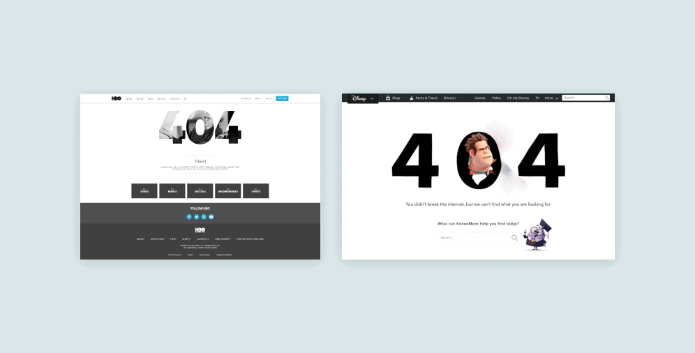
#1 HBO
Here we can see that the error that happened is not the end of the story. HBO still provides the users with an opportunity to easily navigate through their website, while expressing their apology.
#2 Disney
As well as being offered a search bar and a menu, users will duly appreciate the presence of one of the most famous Disney characters, Wreck-It Ralph, who is used to disrupt and break everything (but NOT the Internet). As a matter of fact, it is not just an image, but an animated video, which also adds some touch of entertainment.
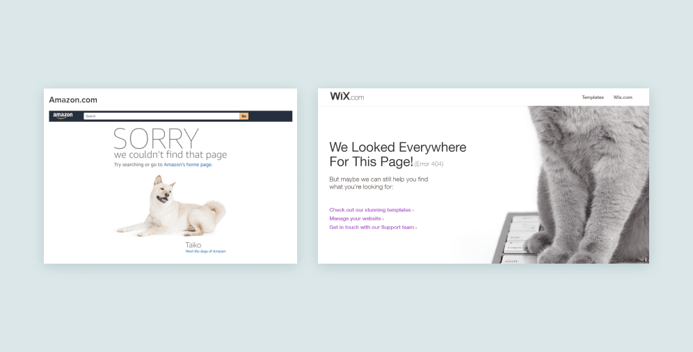
#3 Amazon
Having a reputation of being a big dog lover, Amazon demonstrates it here too. It will not only remind you about a man’s best friend but will also help to wear off a bad feeling after failing to open the page needed. How can anyone stay mad looking at these good boys and girls? Among other things, every time you reload the page you can see different dogs (more cuteness).
#4 Wix
Observing this fluffy creature, we mentally come back to something warm and safe, experiencing positive emotions only. The cat sitting on the keyboard is a suggestion that perhaps the user mistyped or misclicked something – just like we do when our cats decide to walk all over the keyboard. Other than that, WIX offers us to follow the links that may be of help.
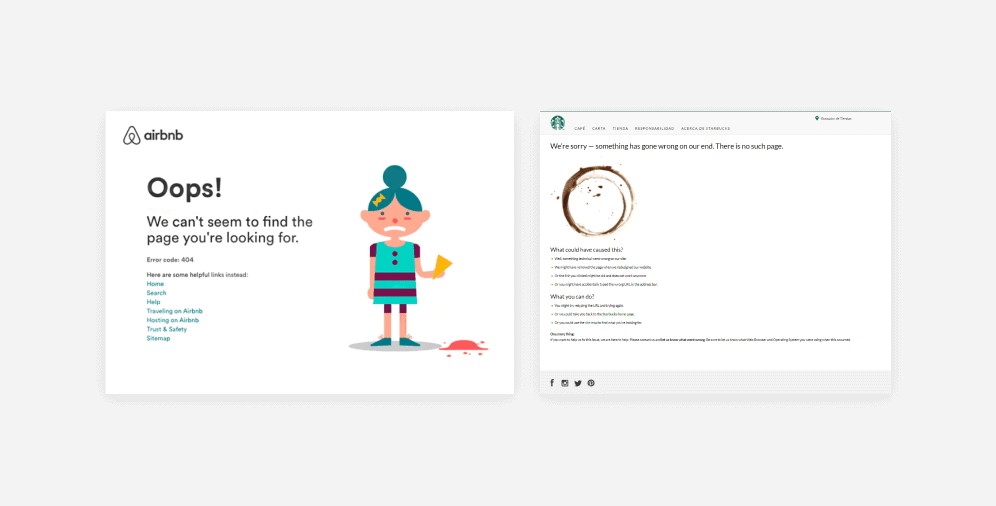
#5 Airbnb
Viewing a girl with her ice cream on the floor is a metaphor for what users feel when they find themselves in this situation. Apart from being entertained, Airbnb provides its customers with a set of useful links available.
#6 Starbucks
This coffee giant did a great job in designing its 404 error page. It includes a picture of a coffee ring, which, figuratively, shows us that the page is not here. What is more, Starbucks provides a list of possible causes and reasons why something went wrong, as well as several further steps that could be taken.
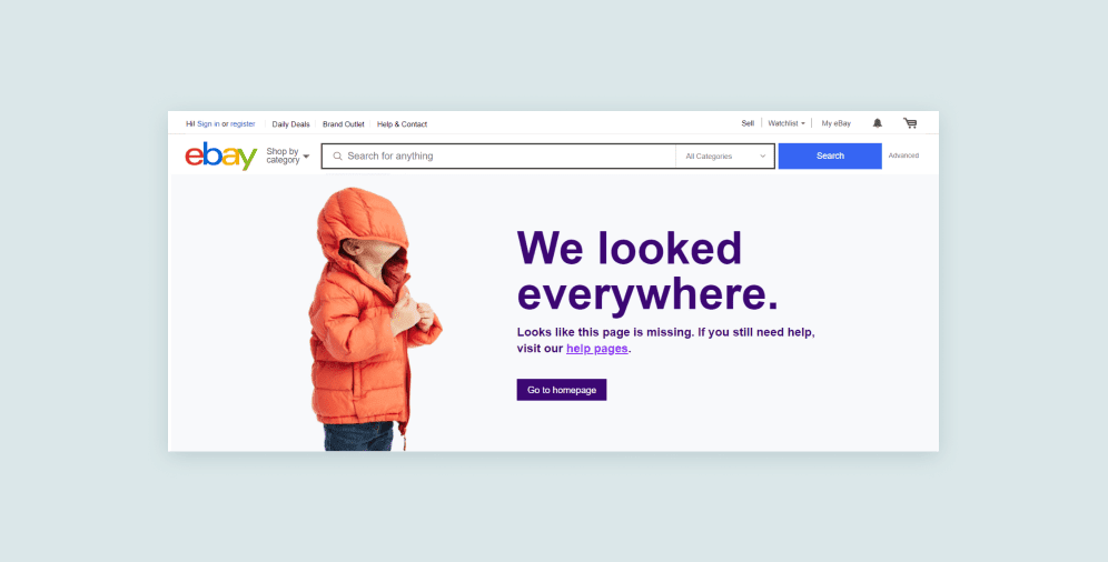
#7 eBay
An image of a child with his hood pulled over his eyes demonstrates not only an obvious fact of not finding the page, but adds some positive view on this situation. eBay also offers to return to the homepage, as well as to follow the link to get some help. Additionally, the search bar along with their trending deals are still available.
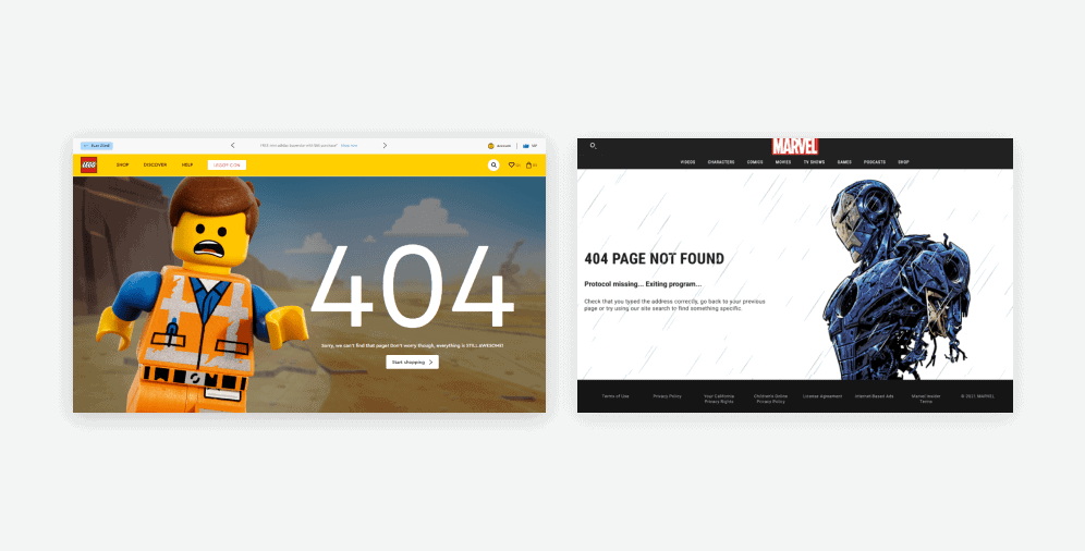
#8 Lego
When you land on this page, the first thing you see is one of Lego’s characters, Emmet, who keeps saying “Everything is still awesome” in every situation. And that is one of the tools to comfort users and to make them smile. Furthermore, it 100% corresponds to the idea of staying in line with your site design and showing your brand.
#9 Marvel Comics
Fully maintaining website design and concept in general, Marvel Comics also provides users with the reasons for 404 error occurrence. As well as Amazon, they have a variety of versions of error 404 design.
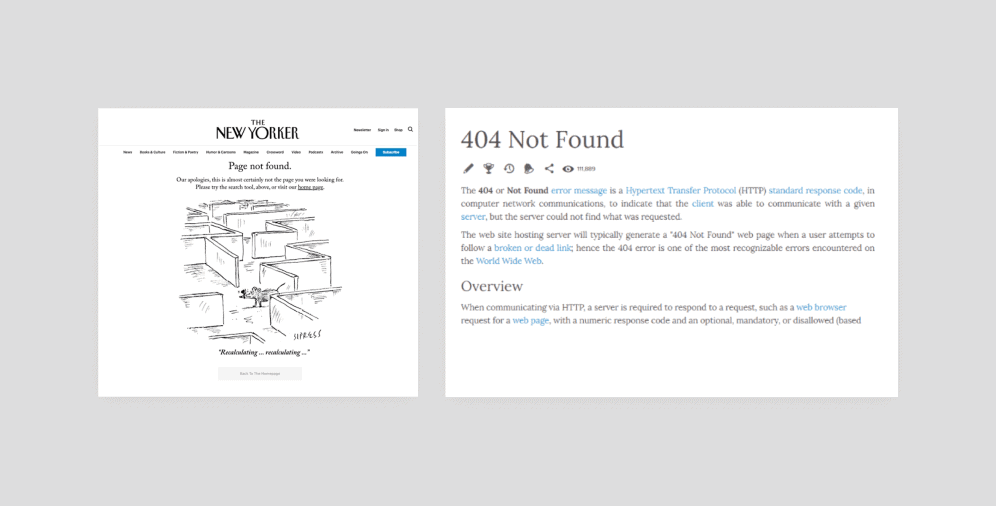
#10 The New Yorker
The design of this page is a great reflection of both the situation (a mouse trying to find the exit) and the style that is so inherent to the New Yorker. Despite the error, users can still navigate through the website.
#11 Everipedia
Such a 404 error design page is the most obvious solution that may be expected from an online encyclopedia. Have a problem? Read about it and figure it out!
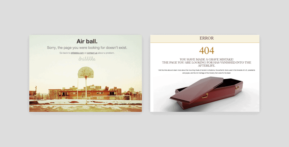
#12 Dribbble
Simplicity and beauty as we know it. The page is not overloaded with any special terms or extra images. Dribbble just directly shows that they are ready to work on this problem, thus putting the link to their support team. Anyway, if users don’t want to take part in this activity, they can just go back to the homepage.
#13 National Museum of Funeral History
Not only the correspondence of the image to the main concept of the NMFH but also the level of the dark humor used makes this page so unforgettable. The whole purpose of 404 error is reflected in this great graphic metaphor.
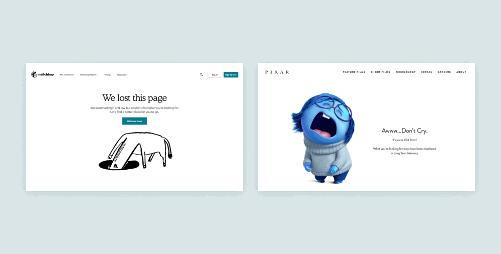
#14 Mailchimp
This well-known integrated marketing platform knows how to melt the hearts of its users. An animated donkey with its head in the hole trying to find the page you’re looking for, as well as the manner they use to explain the current situation, can’t leave anyone indifferent.
#15 Pixar
An image of crying Sadness, the character from the Pixar cartoon Inside Out, accurately displays most users’ reaction when they face a 404 error. And cheering words right next to her add some relief, as it seems that everything is under control and it’s going to be fine (promise).
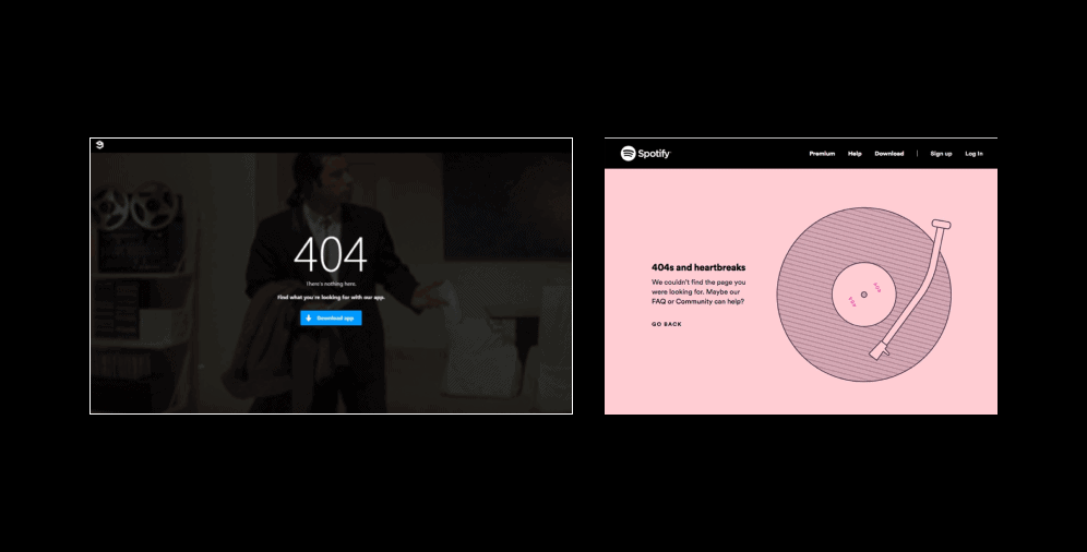
#16 9GAG
Being a platform and social media account with entertaining content, 9GAG’s 404 error page also has an element of humor – a gif with John Travolta getting lost. Moreover, the site benefits from this occasion by persuading customers to download their app.
#17 Spotify
Everything used here is a demonstration of their brand – pink color, vinyl record. Spotify even hid this “404” sign in the name of the disc. With all these features, you just can’t help but have this wistful and tight lump in your throat.
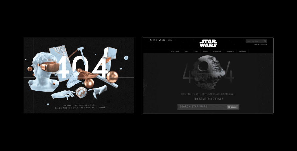
#18 The Artery
After reaching such a stunningly designed page of the Artery, hardly anyone will immediately close it. Their 404 error page is not only in harmony with their website but it also displays and proves their position as “creative doers”.
#19 Star Wars
This 404 error page doesn’t restrain users from navigating through the website at all. What is more, the incomplete Death Star image along with the words “this page is not fully armed and operational” to the full extent upholds its brand and Star Wars movies themselves.
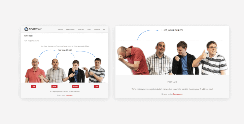
#20 Email Center UK
An interactive 404 error page is another example of creativity level. Email Center UK made their 404 page in 2 parts. In the first one, users can see that the error happened is not their mistake and there’s nothing to blame them for. Consequently, they have 2 options: to forgive the guilty party – developers – and to return to the homepage or to choose one of them and “to fire” them for their failure. In case you decide ”to fire” the employee, you can see the second page with a funny joke and advice to return to the homepage.
On a final note
Undoubtedly, all business owners want their customers and users to be satisfied with the products, information, and services they offer. So far, hopefully, you are aware of the importance of a proper error 404 page design and the fact that neglecting it might result in both loss of clients and your position in the eyes of the public.
It’s in your best interest and power to make your website fit your company’s creative vision as well as being successful at converting clients and making them stay on the website. And we’re always here for you.
In case of any Qs arising, don’t hesitate to contact us. Our team will willingly provide you with any help desired.

Copied!


