Local websites
Local websites
B6 Real Estate Advisors is a forward-thinking investment sales and capital advisory firm that operates in both New York City and New Jersey. The firm utilizes a unique Territory Network model that guarantees its agents have in-depth knowledge of their local markets. The company’s philosophy is aligned with the interests of its clients and it uses cutting-edge technology to enhance its service offerings.
Project Goals
As a real estate company established in 2018, the client was in need of a branding and marketing update. They wanted to modernize their image and present themselves as a young and progressive New York business, as the company had undergone major structural changes.
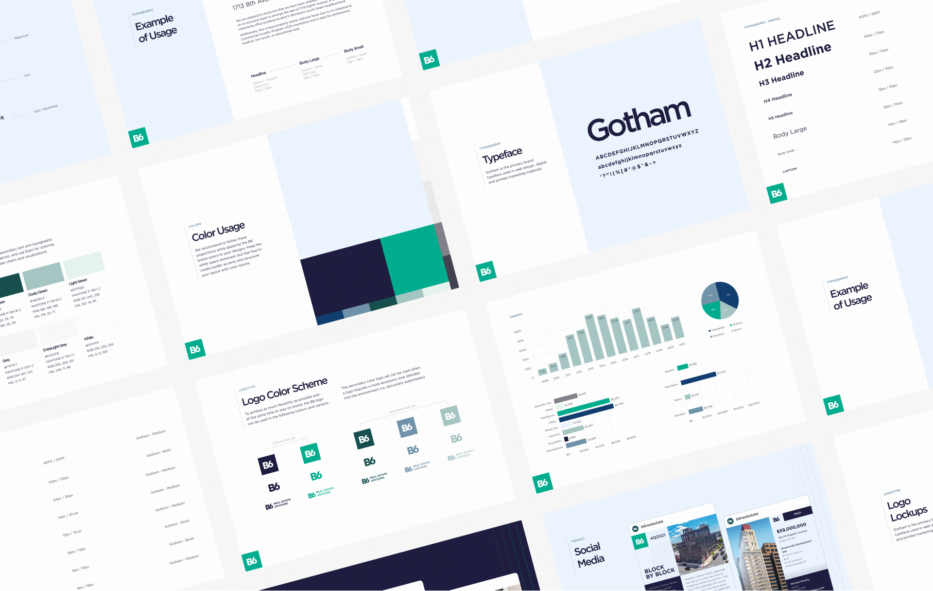
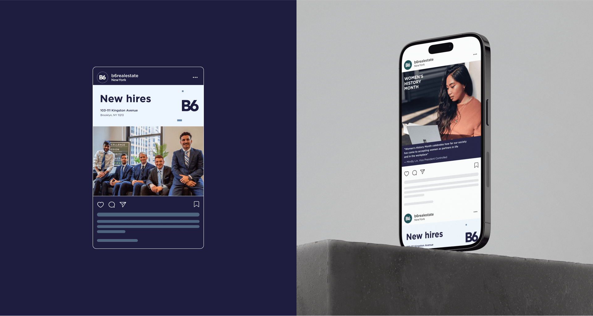
To achieve this, Ester Digital’s design team was brought on to create a design system for all marketing collateral, including easy-to-use templates based on the new brand materials. As the client’s marketing channels expanded, we implemented a unified strategy that included guidelines for social media, emails and other online and offline marketing materials.
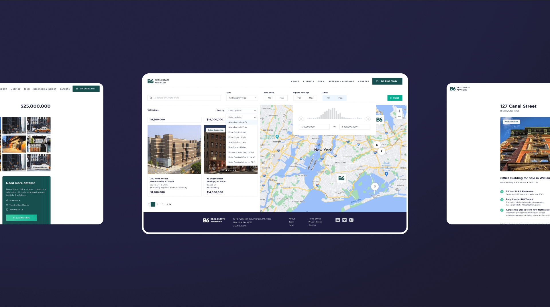
Our team also made design and development adjustments to the client’s WordPress website to align it with the new brand design. The updated brand guidelines made it easy to update the UI layout structure and improve overall UX for desktop and mobile users.


Our Process
Through a series of Zoom meetings with the B6 team, we gained valuable insights into the client’s team structure, their use of marketing materials during the prospecting stage, and their overall marketing positioning. This information helped our Creative Director and the design team to develop a cohesive strategy for updating brand materials and revamping the website layout.
As the client desired to maintain their existing WordPress setup, it was important for us to identify any technical limitations that could impact publishing, updating, and maintaining the content and listings directory.

Deliverables and Results
For the launch of updated brand materials, we focused on a clean and contrasting color scheme, accentuated by green and blue. By reducing the use of secondary colors from previous iterations by 25%, we were able to update the existing color palette without compromising the core elements of the brand identity, making it look more innovative.
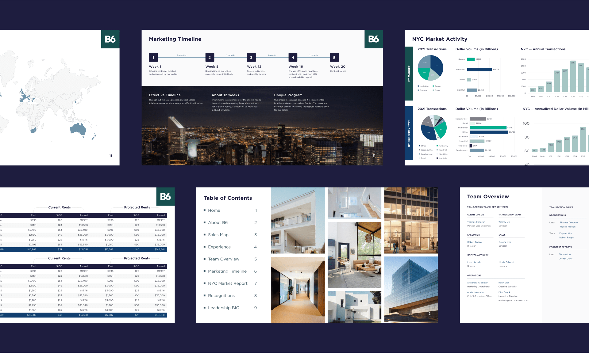
With the updated brand guidelines, our design team was able to create a variety of templates for the client’s marketing team to use.
The end result was a holistic brand identity that featured a simpler and more inclusive color scheme, improved marketing materials through the use of our template system, and a consistent UI/UX that aligned with the brand’s new look and feel.
