Local websites
Local websites
Umbrella is a blockchain company that delivers data to connect with applications and products in the most secure and cost-effective way. Serving precise, scalable solutions and offering over 4,000 data pairs, the company remains an absolute leader in the Oracle ecosystem.
Challenge
Blockchain is a highly professional and innovative niche that demands an expert approach. Its visual representation should be accurate, distinctive, and systematic, staying comprehensive and appealing to end users. Although the Umbrella website was sharp and exhaustive, it didn’t translate to the full extent the uniqueness and expertise of the service. While the site’s pattern-like design concealed the brand, overwhelming infographics did not make it easier to understand how the product worked. Ester had to solve those issues by introducing a new website design and rebranding.
When analyzing the market, we understood we wanted to escape visual cliches that have invaded blockchain for years of its growth. Our designers needed to craft a unique solution that would convey complexity and technology, still focusing on compatibility with the brand values and target audience specifics. To make that all happen, it was integral to balance design and complicated infographic materials. We chose creative direction as an instrument to realize that.
Process
The client provided valuable marketing research and an in-house workshop, which then served as a foundation for concept development. Thus, our creative experts designed three mood boards, each representing different ideas and associations with the industry.
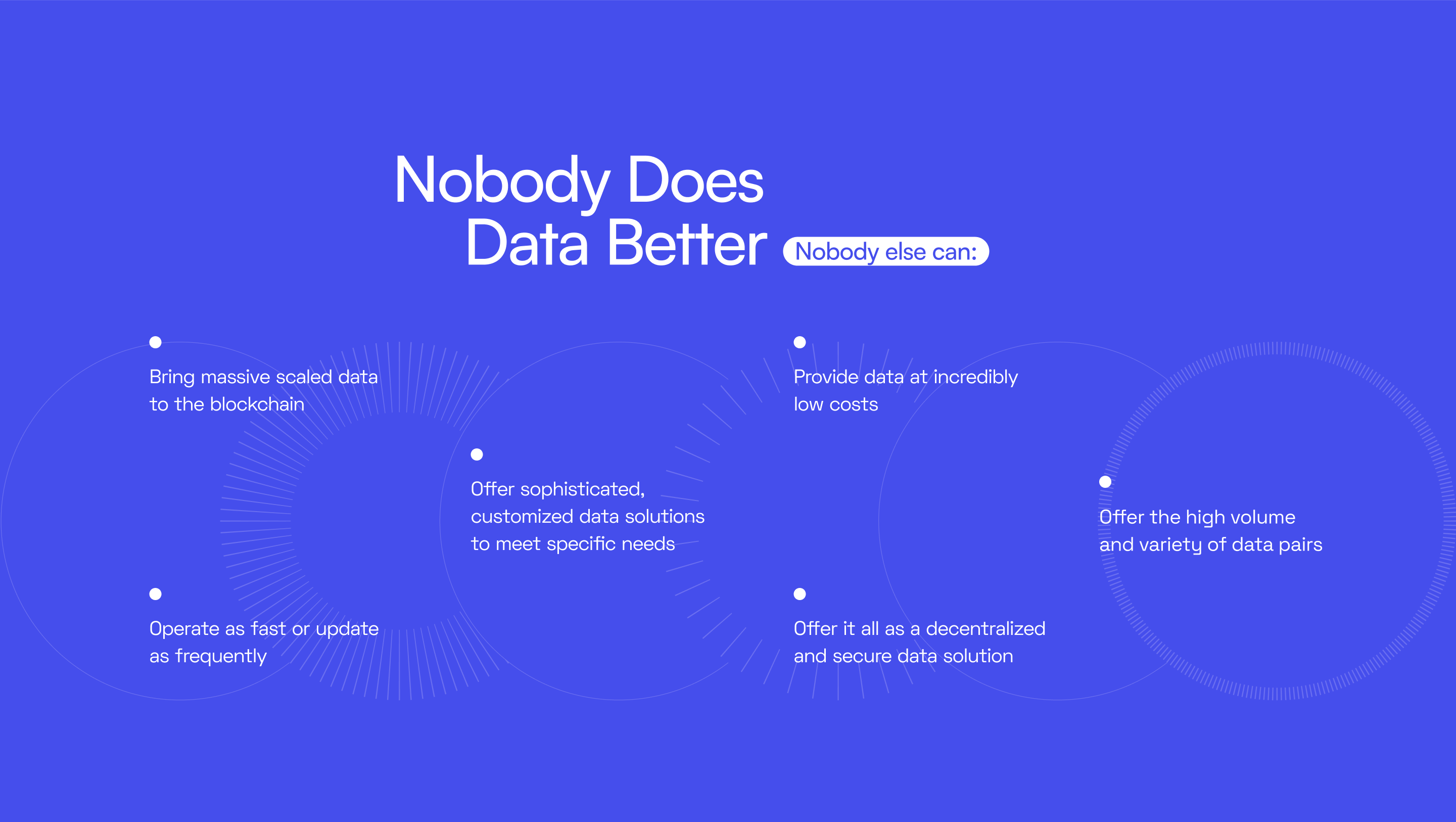
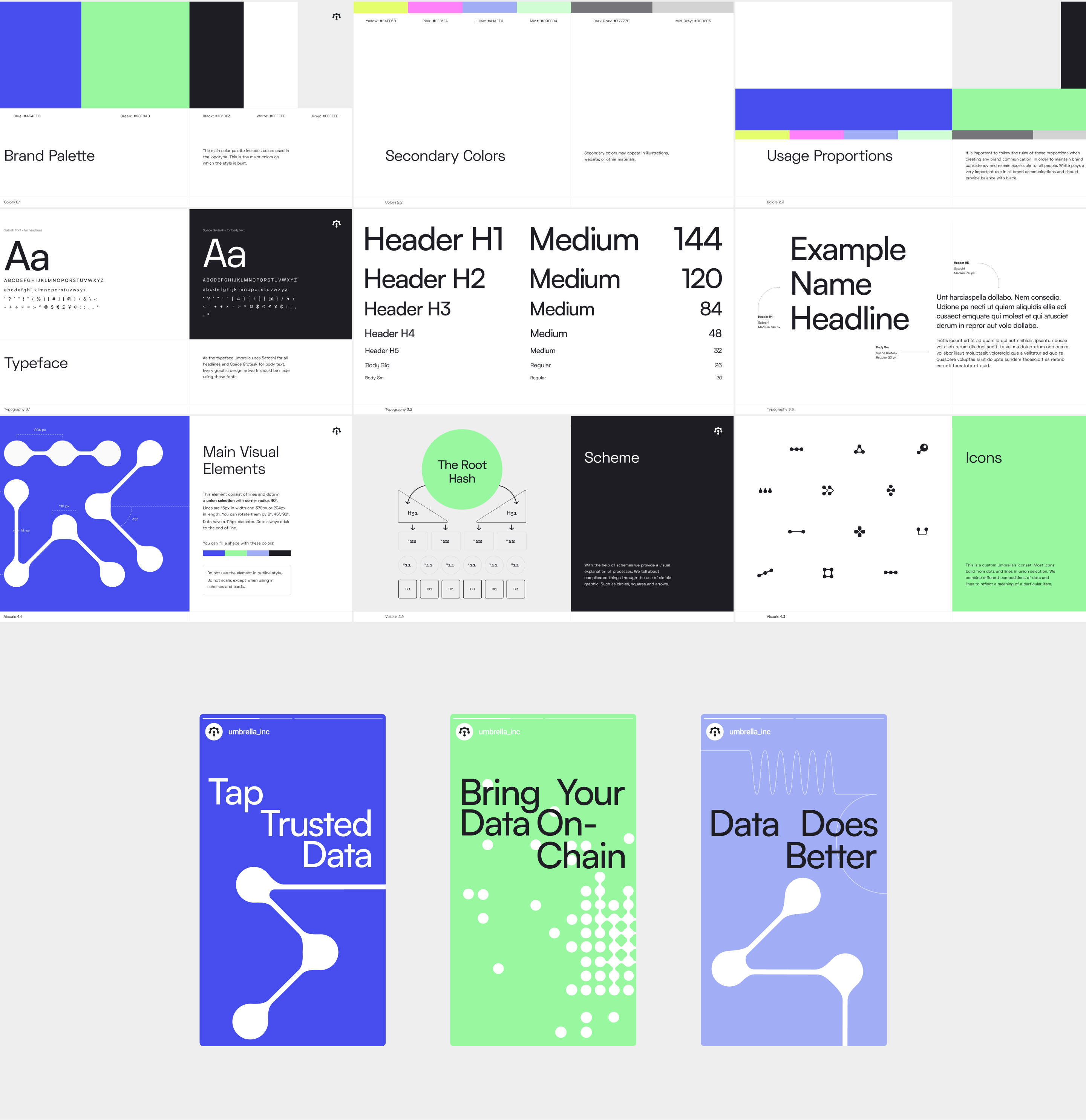
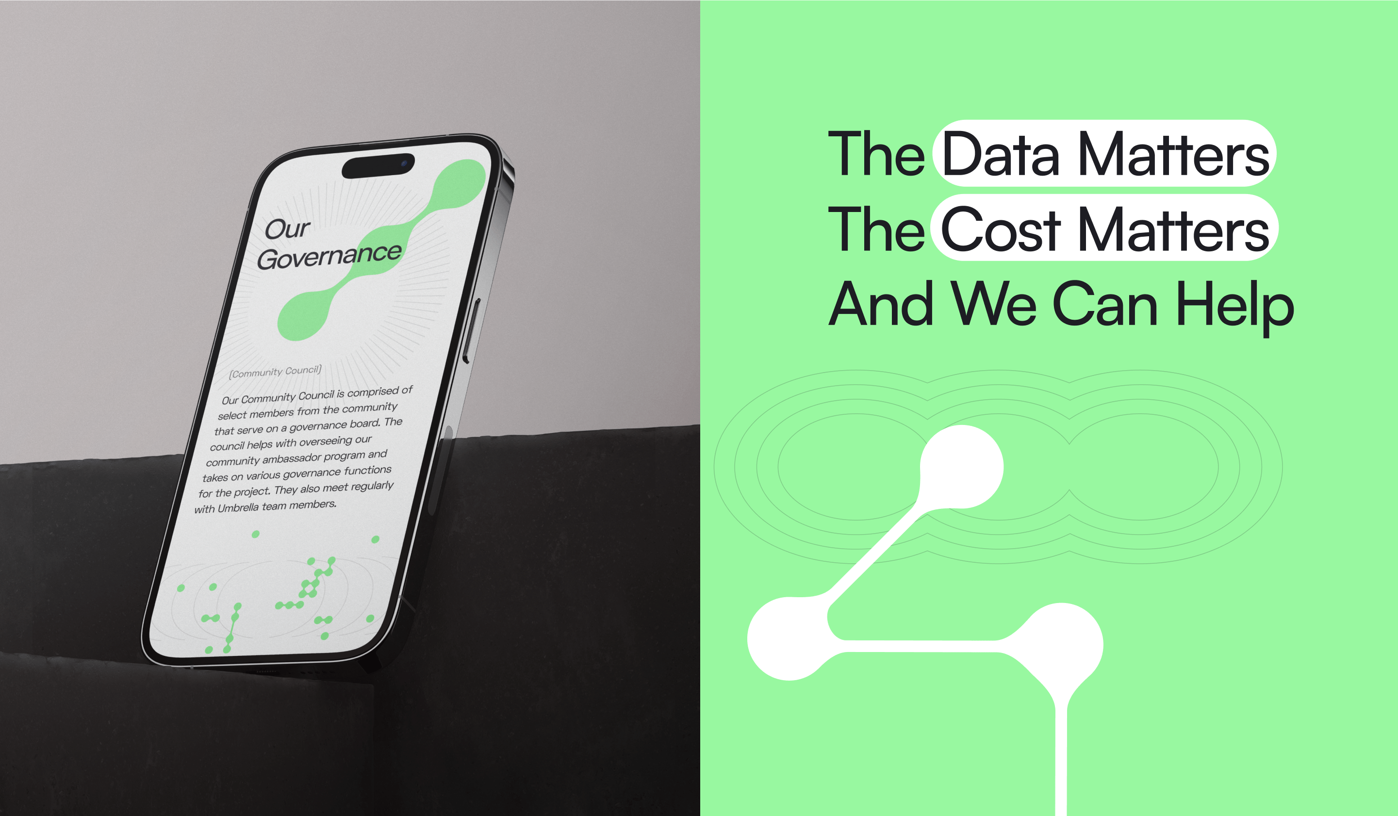
Partnering with the client, we picked a brand direction combining glitch art, noise, and repeatable digital artifacts. As a color palette, we stop our choice of neon green and electric blue, symbolizing the power of blockchain technology and its revolutionary character. To carry out that story further, we sketched linear illustrations with geometric shapes and lines, pre-visualizing motion and energy. While the illustration’s typography pointed out some retro aesthetics, the chosen texture and polished look brought innovation and future to the storefront.
In the project’s course, the Umbrella team closely worked with our specialists, disclosing blockchain processes so we could translate them into visual language as precisely as possible. It made our final graphic concept supported by how things work in reality, thus being holistic and strong. Based on it, we embarked on the website redesign.
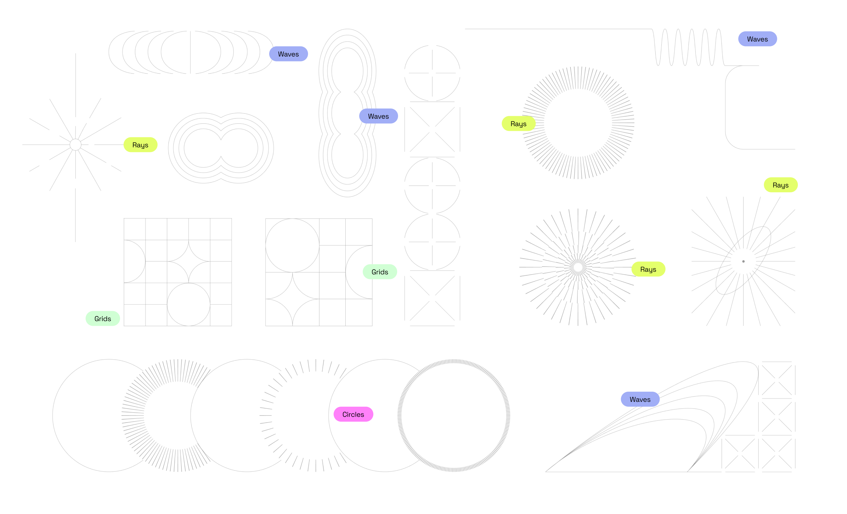
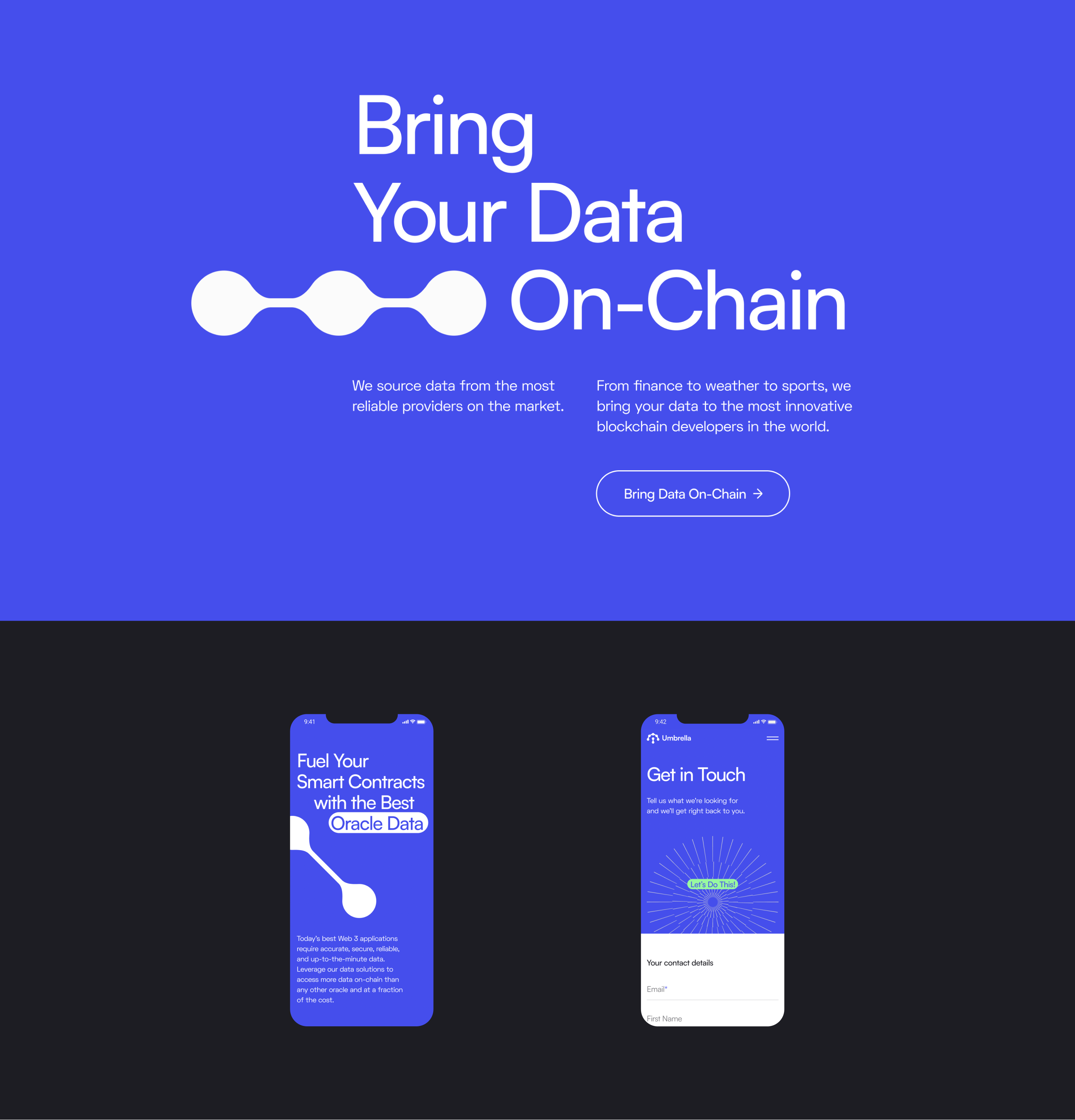
As a qualified agency, we always seek ways of streamlining our work. With the Umbrella project, our designers used a system of visual elements and modules to recreate them within the website landscape. Not only did it make the process dynamic and fast, but it also increased the overall consistency. To escape corporate uniformity, we developed an exclusive solution that was agile and relevant in the market. After the client approved the idea, we scaled it into website pages. Another vital step was to fix the sitemap, improve navigation, and break down pages into easy-to-comprehend structural blocks to reduce cognitive weight.
Settled design line determined how the Umbrella’s new logo would look. Initially, the client wanted to leave it unchanging, so we just made it more soft and scalable to harmonize with the overall picture. Based on our visual production, we created brand guidelines and handed the results of our work to the client.
Outcome
Now, a new image of the Umbrella brand can speak for itself. It is unique, distinguishable in the market, and fits the spirit of the industry. The website clearly depicts the company’s product, reveals its essence, and communicates expertise understandable for both non-involved customers and blockchain developers.
