Outline:
When designing a website, developing a web application, or creating a logo, entrepreneurs always try to convey the main idea of their brand through effective color combinations, as everyone wants their business to be associated with a particular mood. For example, with a business that sells homemade sweets and cakes, you might associate something bright and soft. However, a serious logistics company will probably not want bright pink or light green business cards. But of course, it’s worth mentioning that there are always exceptions to the rules.
Before you start writing your own corporate design manual, we recommend you first to familiarize yourself with one of the most important elements of corporate identity — the color palette — and its role in the success of your brand. Color combinations are a powerful communication tool that can be used to indicate actions, influence mood, and elicit physiological responses. There is even a special test that measures a person’s psychophysical state, stress level, action and communication ability.
Customers and inexperienced designers often wonder how to choose brand colors that go well with the business idea and with each other. How do we know which color green looks good and whether blue and orange harmonize with each other? We will find out!
The Powerful Role of Color in Brand Design
Is it true that there are positive and negative color combinations? Are there delicious and not delicious colors? Sad and funny ones? Rich and cheap ones? You can answer yes, but with a slight note in the fine print.
Colors can positively or negatively influence design, whether it’s a logo, an app, or a website. After all, a person experiences certain emotions when viewing a color. Everyone associates certain color combinations with certain things. Some with wealth, some with delicious berries and fruits. Sometimes, however, the same colors elicit completely different reactions in different people. This is often related to cultural characteristics.
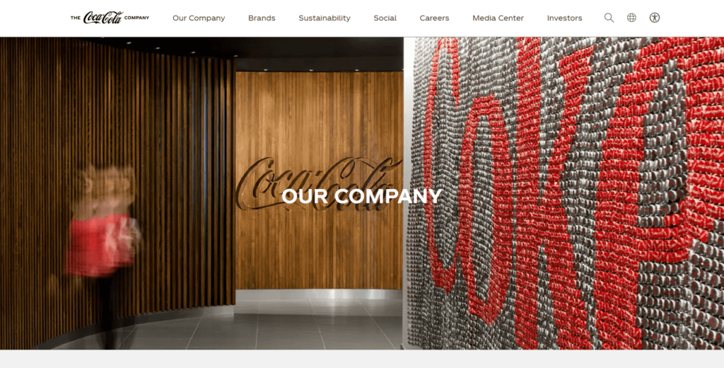
- Red is generally associated with passion, anger, danger, love, and happiness. In marketing, it strongly aligns with actions and discounts. For instance, the red color in Coca-Cola’s branding is instantly recognizable and associated with the brand’s lively and refreshing identity.
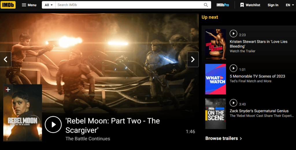
- Black is connected with mystery, elegance, trust, but also with sophistication, power, heaviness. In design, it conveys technological advancement and the high quality of a service or product. IMDb, the Internet Movie Database, uses dark elements in its background and interface, aligning with the cinematic content it hosts.
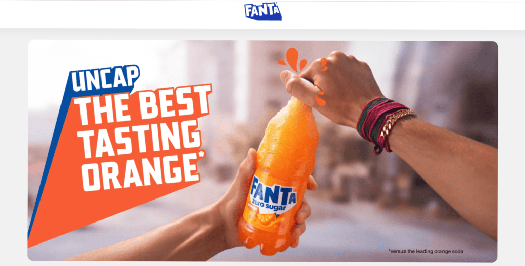
- Orange is associated with a call to action. But if you pay attention, you’ll notice that it’s rarely used in large quantities, as its brightness can be nerve-wracking. One of the vivid examples is Fanta’s use of bright orange in its web design that aligns with its fun, youthful, and vibrant image.
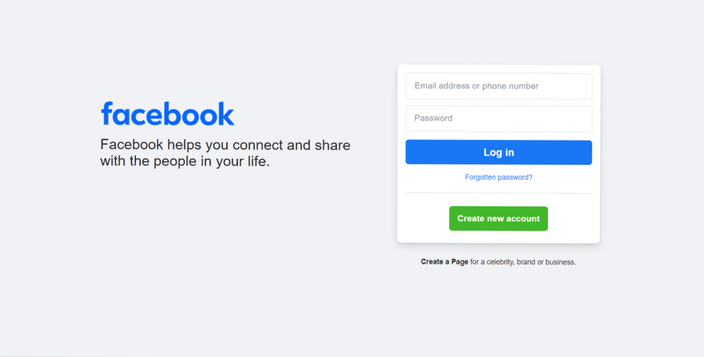
- Blue reveals sensitivity, intelligence, elegance, and loyalty. It is used in a variety of situations. It is also closely connected with loyalty, honesty, and power. Facebook’s blue color scheme is intended to foster a sense of reliability and trustworthiness in its social networking platform.
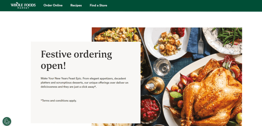
- Green is associated with abundance, nature, freshness, and happiness. Green is easily perceived by our eyes and has a calming effect. It is also associated with money. Whole Foods uses green to emphasize its commitment to natural and organic products.
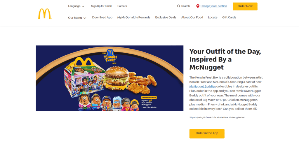
- Yellow conveys happiness, concentration, refreshment. It is often used to attract attention. The bright yellow used in McDonald’s branding is designed to be eye-catching and evoke feelings of cheerfulness.
- White correlates with purity, cleanliness, and in Asian countries, also with unity. It is a symbol of minimalism and style. It is used to create space and direct attention to the important elements of the website. The online version of New York Times uses a white background to mirror the traditional look of a printed newspaper and to enhance readability.

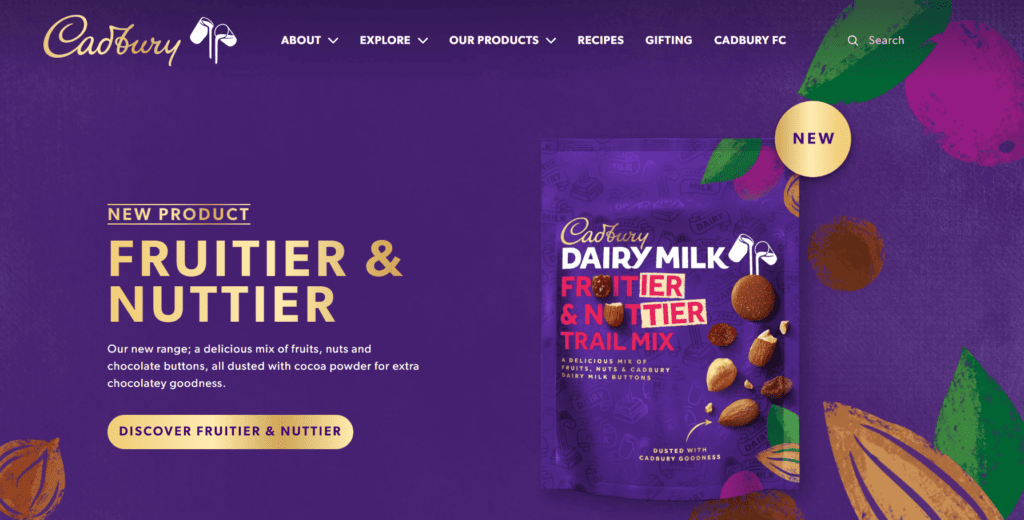
- Purple exudes royalty, luxury, wealth, sophistication, and is often used in the beauty industry. Cadbury’s use of a rich purple shade in its branding reinforces the luxurious and indulgent quality of its chocolate products.
- Gray appears restrained and formal. It is also used to calm consumers. Apple’s website often uses gray tones in its product pages and backgrounds, especially for products like MacBooks and iPads, to convey a sense of sophistication and technological elegance.
There are many different shades of colors. By changing them, we can achieve a completely different effect.
Exploring the Core Principles of Color Theory
In the world of color theory, there are three primary colors at the foundation: red, yellow, and blue. These colors, when mixed in various combinations, give rise to secondary colors. For instance, green emerges from mixing blue and yellow, orange from red and yellow, and violet from a combination of red and blue. Further blending of these primary and secondary hues leads to the creation of tertiary colors. A notable example of such color combinations is red-orange, a mix of a primary color (red) and a secondary color (orange).
Colors can also be categorized based on their emotional resonance and visual temperature. Warm colors, comprising red and yellow, evoke feelings of warmth and comfort, reminiscent of the sun and fire. In contrast, cool colors like blue and green, often including purple, are known for their soothing and calming qualities, making them popular choices for background elements in design. Additionally, there are neutral colors — white, black, and gray — that provide balance and flexibility in color schemes. Beige is sometimes included in this category, offering a soft, warm alternative to these classic neutrals.
Besides, it is vital to keep in mind the following factors:
- Saturation
It can also be referred to as color intensity. By changing the saturation, we get different shades of the same color. High saturation is usually used to uplift the mood while reducing saturation leads to a sadder effect.
- Brightness
It indicates how light or dark an object is. Brightness changes when black or white is added. By mixing colors of different brightness and saturation, you can get a large number of different shades.
In the field of design, several color combinations are prominently used, each with its unique application and characteristics:
01 RGB (Red, Green, Blue)
This palette deviates from the traditional primary colors by including green instead of yellow. It’s predominantly used in digital devices like computer and TV monitors, leveraging light to mix colors. RGB is not suitable for print due to its light-based composition.
02 CMYK (Cyan, Magenta, Yellow, and Black)
‘K’ in CMYK stands for Black. This palette is a cornerstone in the printing industry, allowing the creation of a wide range of colors by combining these four. Although CMYK can produce many colors, its spectrum is more limited compared to RGB.
03 Pantone Matching System (PMS)
Developed by the Pantone Corporation, this system provides a vast array of specific color combinations. While offering precision and consistency, especially useful for branding, Pantone colors can be quite expensive.
04 Hexachrome
An advanced system created by Pantone, Hexachrome builds upon the traditional CMYK by adding two more colors — Pantone Hexachrome Orange and Pantone Hexachrome Green. This expansion significantly broadens the color gamut, surpassing the capabilities of both PMS and CMYK in print applications.
Understanding color combinations is crucial for crafting visually appealing and effective works. Whether it’s for digital mediums or print, the choice of color palette can greatly influence the overall impact and effectiveness of a design.
Basic Types of Color Combinations
There are several types of color combinations based on the color wheel. The most basic and commonly used ones are listed here.
01 Monochromatic
The monochromatic palette is the easiest to use. It involves using only one color and all its shades. It looks fresh and interesting. Although a monochromatic palette is nice to look at, in web design, it’s still better to use such a palette with some additional color to highlight more important elements and draw attention to them.
02 Analogous
Colors from the analogous palette are placed next to each other on the color wheel. Like monochromatic palettes, they are a pleasure to look at, largely because such color combinations are found in nature. However, when using such a palette, the contrast often gets lost, which can make it difficult to highlight more important elements in the design.
03 Complementary
The colors of this palette are opposite each other on the color wheel. These color combinations are very popular among designers and artists. When using such a color palette, it’s worth choosing one color as the main color and the other as an accent. Because with equal amounts, too much visual tension can arise. However, when applied correctly and with the goal of creating a visual contrast, such a palette can be very effective.
04 Triadic
This palette includes three colors that are evenly distributed on the color wheel and form a triangle. This palette is often used in designing for youthful and jovial brands, as this type of palette can look loud.
05 Split–complementary
Such color combinations are similar to complementary palettes but with the addition of a third color that lies next to one of the complementary colors on the color wheel. This type of color palette is also very effective in website design and can create more visual interest.
06 Double Split Complementary
This palette consists of 2 pairs of complementary colors that form an “X” on the color wheel. Such a palette offers a lot of contrast, interest, and variety, but also has some pitfalls. It can become overloaded and inappropriate if not properly balanced. If you are not familiar with color combinations, try not to overdo it with contrasts.
For those just starting out in design, it’s advisable to limit your palette to three or four colors to maintain clarity and avoid visual clutter. Begin with a primary color as the focal point of your design. Complement it with a secondary color and an accent color; these will enhance and contrast with the primary hue. Remember, black and white, while often considered basic, are also important color combinations in design and can be used effectively to create balance and contrast.
Which Colors Match with Red
Red is not without reason the first color of the rainbow — it is strong and bright. That’s why this color is often lightened or darkened to make it softer and quieter. If you want to use red in its striking form, use it subtly. In other words, good color combinations are red with shades of black, gray, and white. This way, you can make the most of the bright red.
Which Colors Match with Purple
The color purple in color combinations could be described as universal. Often mistakenly referred to as a warm color, it actually belongs to the cooler colors. However, this gives purple a significant advantage. It harmonizes perfectly with both cooler and warmer colors.
Purple makes good color combinations with colors close to red, blue, and pink. Additionally, by changing the saturation and brightness of purple, you can create a beautiful monochromatic palette, as various shades of purple harmonize well together and do not strain your eyes. Also, by combining purple with green-blue and yellow-orange, a cheerful and fresh effect can be achieved. Combining purple with green and light green creates a wonderful composition reminiscent of flower fields.
Which Colors Match with Blue
Blue is one of the three primary colors. This color is associated with the sky, the ocean, water in general, freshness, and tranquility. It’s mostly connected with coolness and composure. It has a pleasant and trustworthy effect. Natural elements like water and wind are symbolically represented in blue. Which colors go well with blue? It is primarily azure and purple. If you need more contrast, then green, orange, and yellow tones are suitable.
Which Colors Match with Orange
Orange is a secondary color created by mixing red and yellow. This color has been used in art since ancient cultures. Orange creates a sense of freshness, excitement, and warmth. It is associated with nature and the change of seasons.
Orange and pink are complementary colors. They form a very gentle color combination. Rusty orange tones go wonderfully with delicate pink. Bright orange can combine with a range of different colors. It could form an autumnal palette alongside cream, olive green, red, and brown. Due to its brightness and saturation, orange goes well with black, white, and gray.
Which Colors Match with Yellow
Since prehistoric times, ochre has been used in rock paintings, as this color was very accessible. Moreover, yellow is associated with a warm sunny day, joy, happiness, fun, and self-confidence. This is a very vibrant color. Usually, it is used in moderation with other, more neutral color combinations. A quite trendy combination is yellow with black. Complementary colors of yellow are blue and purple, but it also harmonizes well with colors like orange, red, white, pink, and green.
Which Colors Match with Green
Green is the second most popular color after blue. It stands for nature, life, youth, security, and hope. This color and its shades, particularly emerald and olive, are very popular in interface design. It is often combined with pink, delicate pink, blue, and light blue. It also looks good with neutral creams, grays, and black. Different shades of green form beautiful color combinations with brown, achieving a very natural effect.

Essential Tips for Choosing a Color Palette
60-30-10
This rule, originating from interior design, has been adapted to UI/UX design. According to it, it’s recommended to allocate 60% to the dominant color, usually the background. 30% goes to the secondary color, and 10% to the accent. This helps to avoid overloading the design. Nowadays, most devices have the option to switch between dark and light modes. When choosing, keep in mind how accent color combinations will look in dark mode.
Prioritize accessibility
Font size and color combinations should create the necessary contrast with the background so that the text can be read without straining the eyes. You can use the Color Contrast Checker. When you select the background and font colors, you’ll see a contrast display. The minimum is 4.5.
Tools for Palette Selection
- Coolors
This innovative website provides randomly generated color palettes that users can personalize. The interface displays colors side by side, and with a simple press of the spacebar, all colors rotate, excluding any that you choose to lock in. This feature allows for the seamless creation of a custom palette that aligns with your preferred hues.
- Color Hunt
Offering a collection of pre-designed, harmonious color combinations, Color Hunt is a valuable resource for designers. These palettes are categorized by base color and mood, facilitating easier selection. A unique feature of this site is the ability to view the popularity of a palette based on likes from other users, providing insight into trending color combinations.
- Adobe Color
This tool empowers designers with the ability to fine-tune colors on a color wheel, enabling the creation of personalized palettes. It supports various palette types, ensuring versatility in design projects. Additionally, Adobe Color offers the functionality to upload an image and extract a color scheme directly from it, perfect for achieving cohesive design aesthetics inspired by real-world visuals.
On a Final Note
Understanding the harmonious color combinations represents just a fraction of the daily challenges faced by digital artists and designers in various fields. The art of design transcends the mere selection of colors and fonts. It encompasses aspects like user convenience, functionality, and accessibility.
We trust that our article has provided valuable insights for your endeavors in corporate design or logo creation. Should you require assistance with your design projects, our team is here to help.
At Ester, our daily mission involves crafting websites, applications, and digital products that align with the latest trends in the design industry. We are committed to delivering high-quality solutions tailored to meet the specific needs of our clients. For those interested in our services or if you have any inquiries, please feel free to reach out. Our team is eager to assist and will respond promptly to your requests.

Copied!


