Outline:
Every year, one color quietly steps into the spotlight and changes how we see the world — or at least our screens. It shows up in product packaging, branding campaigns, and yes, websites. It’s not just a pretty hue picked by trend forecasters; it’s a pulse check on how we feel, think, and connect — digitally and emotionally.
The Color of the Year 2025 isn’t just a visual trend — it’s a signal. A cultural cue. A nudge for brands and designers to tune in and adapt. And while it might feel like a marketing gimmick on the surface, there’s much more going on under the hood.
Beyond Looks: Why Color Trends 2025 Actually Matter in Web Design
It’s easy to think of color as just decoration — something you slap on at the end to make things pop. But when you dig a little deeper, you’ll see it’s doing way more than that. Color combinations guide attention, trigger emotions, build trust, and even nudges people toward clicking that button or staying just a bit longer on a page. In short? It shapes behavior.
Color Taps into Human Psychology
Different shades tap into different emotional reactions. Blues build calm and credibility. Oranges bring out warmth and energy. Deep greens can make a brand feel grounded and earthy. These reactions aren’t random — they’re baked into how we process visual information. That’s why big companies test popular colors schemes the same way they test copy or layout. One color shift can push conversions up or down without changing anything else.
2025 color trends tap into this psychology but go one step further. They reflect what’s going on in the world — socially, emotionally, and even economically. So when website designers work that trending hue into a palette, they’re not just following a style. They’re tapping into a shared cultural mood.
Color Builds Consistency Across the Brand Experience
In digital spaces, where users bounce from screen to screen and brand to brand, consistency builds trust. Using a carefully chosen color scheme — one that feels modern but stays true to your brand — helps people recognize you instantly, whether they’re on your homepage, your app, or your social media.
And when a new trend comes along and you wonder what brand colors to choose, it’s not about throwing your whole palette out the window. It’s about figuring out how (and where) to work it in — subtly, intentionally, and in a way that enhances what you’ve already built.
Trend Colors Influence What “Feels” Modern
Design isn’t static. It grows alongside tech, culture, and style. What felt fresh in 2020 can feel dated now — and color plays a massive role in that shift. When new color trends emerge, they slowly push older palettes aside, changing what feels “current” without anyone saying it out loud.
That means designers need to stay ahead of the curve — not just to impress, but to stay relevant. Working with 2025 color trends isn’t about chasing fads; it’s about recognizing where user expectations are heading and gently steering design choices in that direction.
Spotlight On: Mocha Mousse — The Color of the Year 2025 and What It Really Means
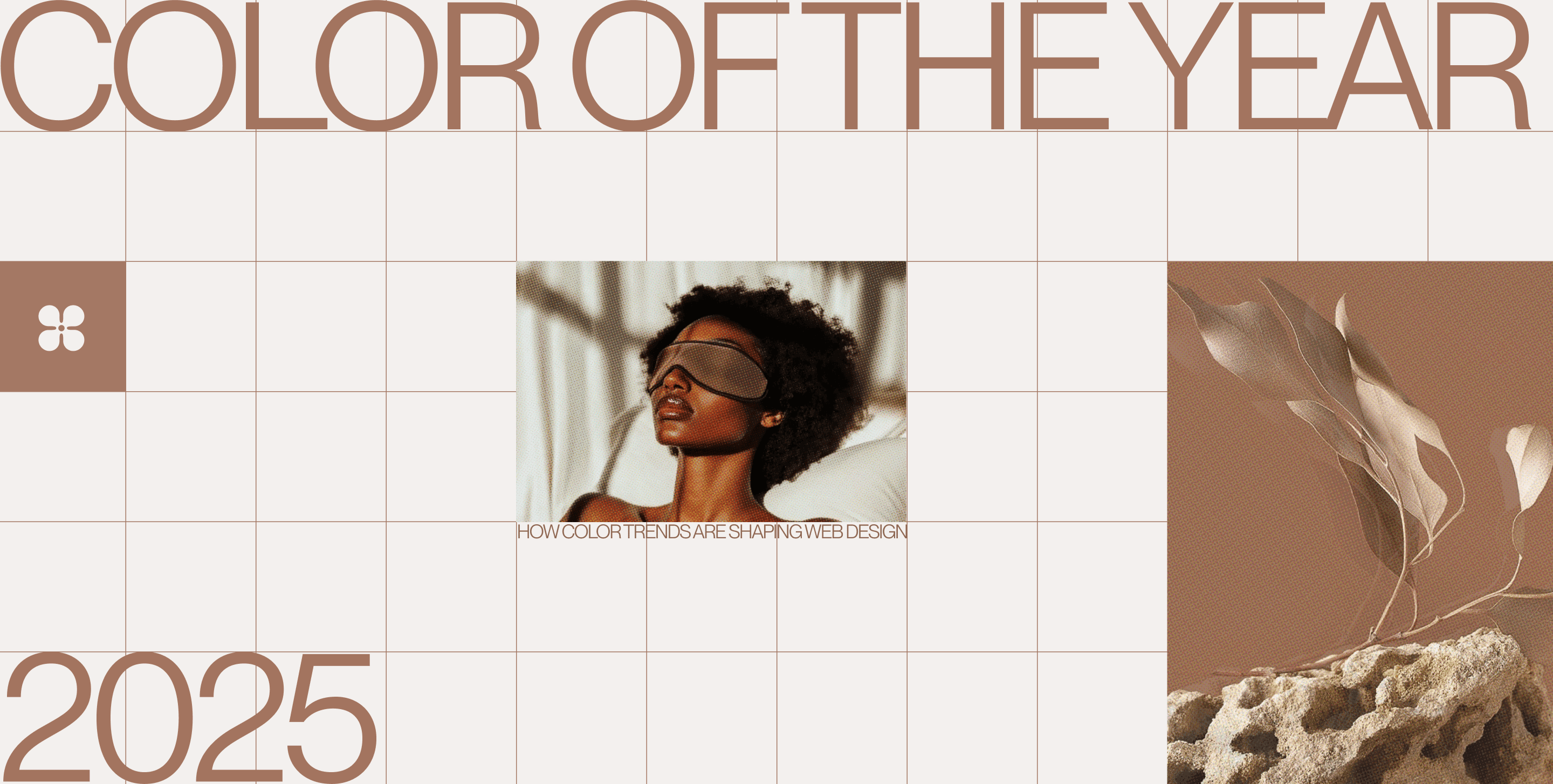
Say hello to Pantone Mocha Mousse — a rich, warming brown that’s officially taking the design world by storm in 2025. It’s cozy, grounded, and full of depth. But don’t let its earthy tone fool you — there’s a lot going on beneath the surface.
Why Mocha Mousse
Pantone doesn’t just throw darts at a color wheel. Every Color of the Year reflects the current emotional climate. And right now, the world is craving comfort, calm, and connection. Mocha Mousse checks all those boxes. It’s soft without being dull, familiar but far from boring. In a sea of digital overload, this hue brings warmth and a sense of touch — something the web has always struggled to deliver.
We’re seeing a move away from hyper-saturated neons and glossy gradients. Designers are leaning into tones that feel real, tactile, and timeless. Mocha Mousse does just that. It brings an organic softness that digital design often lacks — and it creates space for users to breathe, scroll, and stay.
A Color That Grounds the Digital Experience
In a world where screens often feel cold and sterile, Mocha Mousse invites users in. It’s a shade that balances tech-forward minimalism with emotional depth. Think of it like digital woodgrain — something that stabilizes, supports, and warms up even the most modern interface.
It also pairs beautifully with both classic and contemporary palettes. Want a clean, monochrome look? Mocha Mousse works. Need a cozy background for bolder accents? It’s got you covered. It’s this kind of flexibility that makes it more than a trend — it’s a tool.
What This Signals for Web Design in 2025
The choice of Mocha Mousse signals a bigger shift in digital design:
- From bright to soft: Muted tones are becoming the new neutral.
- From flat to layered: Depth is back — and warm browns build natural layering in UI design.
- From detached to grounded: Users want design that feels human again.
Mocha Mousse in the Wild: How Brands Are Using It on the Web
Let’s walk through how a few well-known names are doing just that with Pantone partnerships — including Mocha Mousse — and what lessons we can take from them for smart, strategic web design.
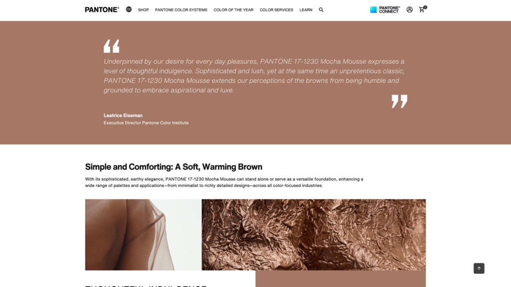
Pantone’s Mocha Mousse Page: Emotional Framing Done Right
Pantone’s own presentation of Mocha Mousse is a textbook example of emotional design. The page is simple, but not plain. It’s soft, layered, and warm — the color isn’t shouting; it’s holding space. Every visual choice reinforces the core message: reassurance, stability, and calm.
Subtle gradients, soft type, and tactile textures create a website that feels less like a screen and more like a space. The brown isn’t boxed in — it flows across sections, weaving through imagery and whitespace. This is how you let a color carry emotion without overwhelming function.
Takeaway: Mocha Mousse isn’t just a visual — it’s a tone of voice. Use it across layout decisions to create a digital space that feels safe and thoughtful.
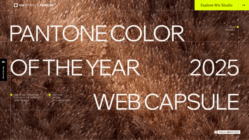
Wix Studio: Turning Color Into a Design Language
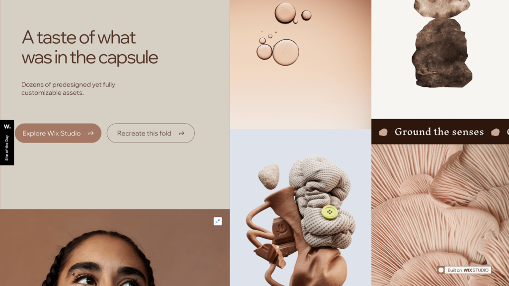
Wix Studio and their Pantone Color of the Year microsite is a living example of how to embed trend colors into the web in a way that feels natural and usable.
Instead of just using Mocha Mousse as a visual theme, the site demonstrates how to build a full design system around it — showing typography styles, button hover effects, and responsive layouts that carry the same warm tone across devices. It’s not about splashing trending colors on the background — it’s about using it to tell a story of trust and clarity.
Takeaway: A successful web color strategy builds consistency from headers to footers, not just in visuals but in behavior and interaction.
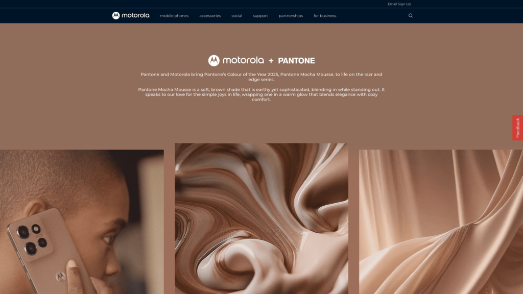
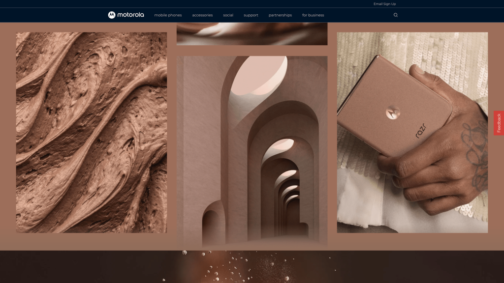
Motorola: Bold Accents Meet Clean Design
Motorola’s collaboration with Pantone shows how a warm, earthy color can be integrated into sleek, tech-focused product pages without losing sophistication. Their product microsites mix a high-end minimal aesthetic with bold splashes of Mocha Mousse on interactive buttons, hero backgrounds, and scroll-triggered transitions.
They’re not afraid to let brown do the talking — but they keep it sharp with contrast: white text overlays, metallic typography, and crisp photography. It creates a tactile, modern look that blends softness with structure.
Takeaway: Use Mocha Mousse as an accent layer on clean white or charcoal backgrounds for a high-end, product-driven layout.
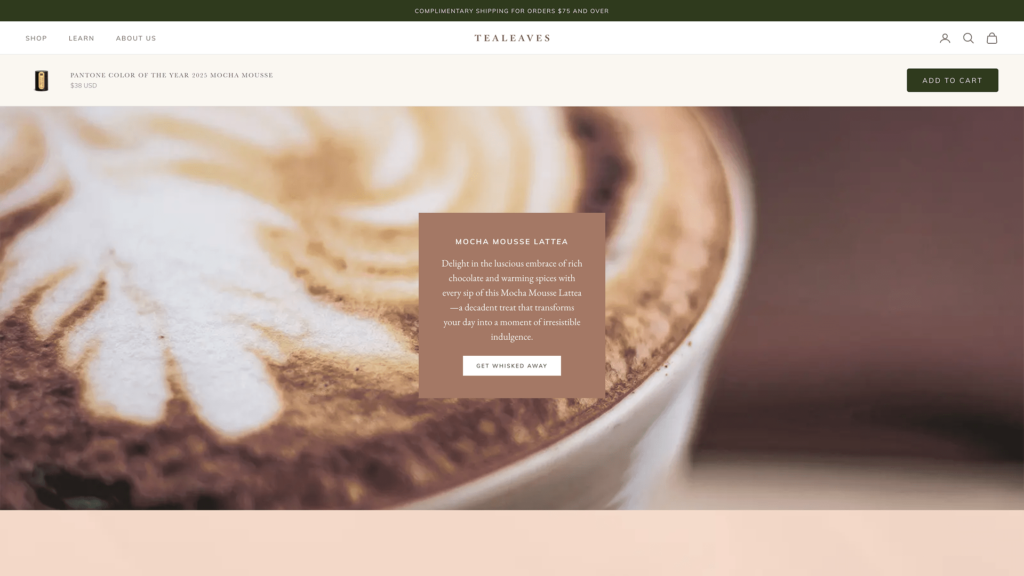
Tealeaves: Storytelling Through Sensory Design
In its collaboration with Pantone, Tealeaves designed a web experience around color and flavor, blending sensory storytelling with web design. Their campaign site uses Mocha Mousse to symbolize warmth, richness, and earthiness — a perfect match for their product ethos.
What’s interesting is how the color flows across UI and content: you’ll see it in microinteractions (hover effects), behind testimonials, and woven into subtle infographics. It’s never overpowering, but it makes the page feel immersive.
Takeaway: Use Mocha Mousse to build visual continuity across content-heavy pages, letting it serve as a soft thread that ties experience together.
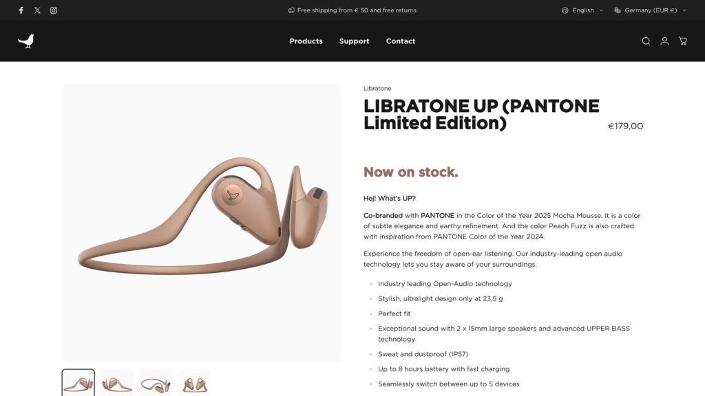
Libratone: Soft, Scandinavian, Smart
Libratone, known for its minimalist Scandinavian aesthetic, integrated Pantone’s trending colors to push emotional resonance in product storytelling. Their pages often use neutral tones — but the strategic injection of a warm brown like Mocha Mousse breaks the coldness and adds human touch.
On their product storytelling pages, the color is used as background for lifestyle imagery, section dividers, and subtle icon fills. The result? A design that feels smart, clean, and deeply considered — not cold.
Takeaway: When your brand leans minimal, a single warm tone like Mocha Mousse can add depth and humanity without breaking the grid.
As you see, incorporating Mocha Mousse into your web design isn’t about jumping on a trend — it’s about using a culturally resonant tool to shape how people feel when they land on your page.
And that all should start with knowing where to place it — which brings us to the next step: building a smart color scheme.
Website Color Schemes That Work: Main, Secondary & Accent Explained
Choosing a trendy color is one thing. Knowing how to use it? That’s what separates an eye-catching site from a confusing one. Every great website color scheme is built around three essential roles: main, secondary, and accent colors. Each one does a specific job, and when they work together, they guide the user experience without saying a word.
Main Colors: The Foundation of Visual Trust
Your main color shows up the most — it’s the tone that defines your brand’s visual identity. It might fill backgrounds, banners, or hero sections. This is where Mocha Mousse truly shines. Used as a main color, it wraps the entire layout in warmth. It feels familiar, like coffee shops or crafted wood, which can calm users down and keep them scrolling.
Main colors set the emotional tone. In 2025, we’re seeing more brands shifting from icy whites and cold blues to natural, grounding tones. Using a color like Mocha Mousse as the main shade helps build trust through softness — it says, “You can stay here.”
Secondary Colors: Support Without Stealing the Spotlight
Secondary colors are there to complement the main shade. They often show up in content blocks, overlays, or illustrations. They help with layout balance, visual contrast, and information hierarchy.
With Mocha Mousse as the main, your secondary color could be a soft cream, dusty peach, muted olive, or even a desaturated navy. These tones provide contrast without clashing. The trick is to stay within the same mood — you want harmony, not competition.
It’s also where you can build in accessibility. Too much brown on brown? A lighter secondary color can help lift text readability without breaking your aesthetic.
Accent Colors: Small, Sharp, and Built to Pop
Accent colors are the ones users actually notice first. They’re the sparks — used on call-to-action buttons, links, icons, hover states, and interactive elements. The accent draws the eye and encourages action. And here’s where you can have some fun.
Mocha Mousse works surprisingly well with copper metallics, soft oranges, blush pinks, or teal-greens. These combinations create a visual pause — they stop the scroll just long enough for users to take action.
A great accent color doesn’t overpower. It pops because it’s used sparingly, and that’s the key. Sprinkle it in, test how it behaves against your base and secondary shades, and make sure it still passes accessibility checks.

RCAD by Ester Digital — An Example of Strategic Color Choice
In our collaboration with RCAD, Ester Digital enhanced this trendy color palette — and no, we didn’t just pick it because it was trendy. We chose it because it delivered something the old layout didn’t: warmth, trust, and subtle sophistication.
Main Color: Bringing Balance to a Tech-Heavy Story
We used Mocha Mousse hues as the foundation — not just in backgrounds, but in key hero sections, banners, and overlays. It grounded the design, made the content approachable, and visually softened the high-tech imagery and technical copy.
Secondary Colors: Neutral Enough to Support, Rich Enough to Stand On Their Own
It’s easy for 3D rendering companies to lean into stark palettes — black, gray, and electric blue. But RCAD’s clients aren’t just engineers. They’re also architects, developers, and creatives — people who care about aesthetic feel just as much as technical function.
And we wanted to create a bridge between those worlds. Make the site feel high-end, but not sterile. Technical, but still human.
To support that idea, we built a palette of muted earth tones and clean off-whites:
- A soft ash gray gave breathing room between sections.
- Clay beige and warm slate added visual variety across service pages and icon backgrounds.
- A pale cream tone was used to bring lightness to form fields and text areas.
These weren’t fillers — they were chosen to keep contrast high, readability intact, and cognitive load low.
Accent Colors: Visual Cues That Guide Without Distracting
In a conversion-focused site like RCAD’s, accent colors do more than decorate. They direct action. We introduced a deep navy accent for CTAs, hyperlinks, and menu transitions. It stood out against Mocha Mousse hues without feeling too jarring — bold enough to catch the eye, soft enough to keep the mood consistent.
Hover effects were subtle but meaningful. Buttons shifted into copper tones. Active links carried a whisper of blush. It all tied back to the primary color — every interaction felt like part of the same language.
After launch, the impact was clear. Bounce rates dropped by 21%. The average session duration went up. And most importantly — heatmaps showed users weren’t just landing and leaving. They were scrolling, clicking, and reading.

Now that we’ve explored how to use this color in a living, breathing project like that of Ester Digital and RCAD, let’s zoom out. What broader possibilities of this trending color 2025 we can reveal?
What Color Trends 2025 Reveal About the Future of Web Design
When we talk about popular colors, we’re not just talking aesthetics. We’re talking signals — quiet hints about what people are feeling, craving, and reacting to. So if Mocha Mousse is the face of 2025, what does that say about where digital design is going?
Turns out, quite a lot.
Soft Power Is Replacing Flashy Design
Not long ago, web design was full of high-saturation neons, intense gradients, and high-contrast animations — all aimed at grabbing attention fast. But today’s users are tired. Tired of being sold to, distracted, overstimulated.
Mocha Mousse fits into a larger shift toward subtlety. We’re seeing more brands lean into softness — muted colors, gentle transitions, and visual rhythm instead of static walls of content. It’s not about grabbing the eye and holding it. It’s about inviting the user in and giving them room to breathe.
This is more than a style shift — it’s a tone shift. Design is moving from aggressive to empathetic.
Emotional Design Is Taking the Lead
Color is a shortcut to feeling. Warm browns like Mocha Mousse bring in calm, reliability, and safety — things that resonate in uncertain times. As a result, brands are starting to ask bigger questions during design sprints:
- How does this layout feel?
- Does this color make users trust us more
- Does it support slower, more thoughtful interaction?
That emotional lens is shaping everything from homepage flows to product page detail. It’s not just UX — it’s emotional UX.
Tactile Color Is Closing the Digital Gap
Mocha Mousse doesn’t just look warm — it almost feels like you could reach out and touch it. And that’s the point. One of the hardest parts of digital design is making things feel human.
By using tactile, natural colors, designers can soften the screen, reduce fatigue, and build comfort. The goal isn’t to mimic paper or wood — it’s to simulate familiarity.
That’s why we’re also seeing texture-inspired color trends rise — from earthy terracottas to velvety olives and linen whites. They bring something physical into the digital. That’s where the future of branding is heading — especially for industries like wellness, education, sustainability, and culture.
Color-Driven Personalization Is Around the Corner
With AI and data-rich platforms becoming more intuitive, we’ll likely see customizable color experiences in the near future. That means:
- Brands using mood-based color themes for logged-in users
- Interfaces that adjust tone based on time of day or user preference
- Dynamic color palettes that shift subtly with behavior
Mocha Mousse? It might become the “default warm mode.” A starting point in a much bigger shift toward personal color design — one that meets people where they are, not just where the brand wants them to be.
On a Final Note
So, what does the rise of Pantone Mocha Mousse really mean for web design in 2025?
It means we’re moving into an era where digital experiences are expected to feel better — not just look better. Where users are drawn in not by visual fireworks, but by thoughtful choices. Color is becoming less of a finishing touch and more of a strategic foundation — shaping trust, emotion, and flow from the very first pixel.
So if you’re planning your next web design move, don’t just ask, “Does this look good?”
Ask, “Does this feel right?” Because in 2025, that’s what good design actually means. Feel free to reach out to us, and we will help you with answers.
