Outline:
Maximalism web design is an exhilarating world where creativity reigns supreme. With bold typography, intricate visuals, and vibrant palettes, it challenges the clean, restrained ethos of minimalism. Yet, while maximalism captures attention with its audacious flair, the question remains: Can it be practical? Designers must explore whether maximalist branding and maximalism in graphic design can offer more than aesthetics—whether they can coexist with seamless functionality to serve both the user and the brand effectively.
The allure of maximalism web design lies in its storytelling capacity, immersing users in rich visual experiences. But behind the layers of vibrant colors and intricate textures lies a challenge: maintaining user engagement without overwhelming them. Designers have to juggle the desire to express with the need to guide users toward specific actions—a balancing act that is both art and science.
Maximalism’s Evolution: Why the Bold is Back
The resurgence of maximalist branding is no coincidence. In a landscape where digital spaces are saturated with uniform designs, brands use maximalism to stand out. Vibrant color schemes, expressive fonts, and eclectic layouts reflect a rejection of simplicity. Maximalism isn’t just about visual extravagance—it’s a tool for storytelling, personality, and emotional connection. Many companies turn to experts, such as a web design agency in New York, to harness this aesthetic effectively and ensure their bold branding aligns with business goals.
This return to visual opulence is also fueled by changing cultural preferences. Younger consumers gravitate toward maximalism web design for its sense of individuality and nostalgia, reminiscent of 80s pop culture or Art Deco flair. Maximalism in graphic design allows brands to visually communicate their uniqueness, but the challenge lies in making this artistic chaos serve a functional purpose, particularly in digital spaces where users expect seamless navigation and clear content delivery.
The trend also aligns with social media aesthetics, where bold visuals catch attention faster in crowded feeds. Companies leverage maximalist branding to create immersive campaigns that stand out on platforms like Instagram and TikTok. But as the design world embraces maximalism, the challenge grows: how do you prevent bold design from overpowering the core user journey?
When Beauty Backfires: Functional Pitfalls of Maximalism Web Design
Maximalism web design can become a double-edged sword. While visually captivating, it risks overwhelming users with too much information, cluttered layouts, or slow-loading pages. These pitfalls can frustrate users, especially when they struggle to find key content amidst the visual splendor. In contrast, minimalist graphic design offers a streamlined approach, focusing on simplicity and clarity, which helps users navigate with ease.
Cognitive Overload: Chaos or Clarity
Users confronted with too many design elements may feel mentally fatigued, leading them to abandon the experience prematurely. A visually busy interface can make it difficult to identify primary actions, reducing usability and impacting engagement. For example, an overly elaborate eCommerce site might initially attract users but lose conversions if customers struggle to complete their purchase journey.
Performance Issues: Heavy Aesthetics at a Cost
Heavy graphics, animations, and videos—often hallmarks of maximalism—can slow down websites, causing longer load times. Page speed plays a critical role in user experience, as research shows that users abandon pages that take more than three seconds to load. Maximalism in graphic design must be carefully balanced to avoid sacrificing speed and functionality.
The Secret to Functional Opulence: Crafting Usability Amid Abundance
Maximalism web design doesn’t have to compromise usability—it can be functional when approached strategically. Designers need to focus on balancing the richness of visual elements with usability, ensuring that the UX is never compromised by aesthetic choices. Below are expanded website design steps to help achieve maximalist branding that is visually compelling and practical.
Design with Hierarchy in Mind: Structured Chaos
Maximalism thrives on complexity, but it must be controlled with a clear visual hierarchy to avoid overwhelming users. In structured maximalism, every design element serves a purpose, and users are guided through the interface in a deliberate, intuitive way.
- Using Size and Contrast
Key elements like headings or CTAs should stand out through bold colors, larger fonts, or elevated positioning on the screen. This guides users toward the most critical areas of the page without losing them in the design clutter.
- Strategic Layering
Layering images, texts, and graphics can add depth and richness to the design, but every layer should serve a function. Overloading without structure results in chaos, while intentional layering drives engagement.
- Prioritizing Key Actions
Identify the most critical user tasks—whether it’s filling out a form, clicking a product link, or making a purchase—and make those paths visually prominent. In maximalism, some things should demand more attention than others.
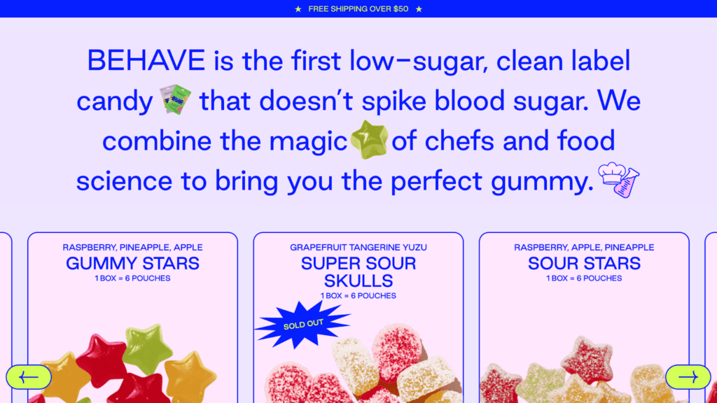
BEHAVE’s website, designed for a candy brand, uses a color palette as bright as its products. The design is unapologetically colorful and playful, offering a visual feast while maintaining focus on the products. Despite its bold aesthetics, the site employs a clear hierarchy, guiding users intuitively to product pages and checkout with well-positioned CTAs and seamless navigation. This shows how maximalism can be engaging without compromising usability.
Whitespace as the Silent Hero
Whitespace—often overlooked in maximalist design—is essential to creating balance. Contrary to popular belief, maximalism doesn’t mean every inch of space must be filled. Strategic use of negative space can amplify surrounding visuals and provide the user’s eye with areas to rest.
- Framing Key Elements
Whitespace can serve as a natural frame, emphasizing products, images, or calls-to-action amidst a visually busy layout.
- Improving Readability
Incorporating breathing room around text blocks improves readability, especially in maximalist layouts where fonts and typography may be experimental.
- Avoiding Visual Fatigue
Giving users space to pause between interactions can reduce cognitive fatigue and ensure longer engagement times.
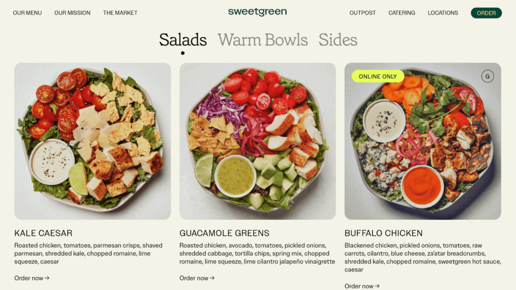
Sweetgreen’s site demonstrates the power of whitespace by combining minimalist design with an emphasis on fresh ingredients. The clean layout and simple typography ensure that the brand’s health-centered message remains front and center. Even with a restrained color palette, the thoughtful use of negative space emphasizes key elements, such as product photos and CTAs, guiding users effortlessly through the site. Sweetgreen’s design shows how whitespace can enhance focus, even in vibrant, product-centric interfaces.
Microinteractions to Anchor User Experience
In maximalism web design, microinteractions play a vital role in guiding users without adding to visual clutter. These small, often subconscious interactions—like button animations or hover effects—help users understand how to navigate complex interfaces.
- Instant Feedback
Microinteractions, such as buttons changing color when clicked or sliders smoothly transitioning, offer feedback that reassures users their actions are successful.
- Encouraging Exploration
In maximalist layouts, users might be encouraged to explore through animated hover effects on interactive elements. For example, product images that zoom in when hovered over invite further engagement.
- Reducing Cognitive Load
Microinteractions also reduce cognitive load by visually indicating where users should click or how to interact with certain areas of the page.
Maximalism in Graphic Design: When Branding Becomes an Experience
Maximalist branding often blurs the line between design and experience. It enables brands to craft visual identities that resonate emotionally with their audience. By infusing designs with intricate textures, playful typography, and layers of meaning, maximalism in graphic design offers an immersive storytelling vehicle.
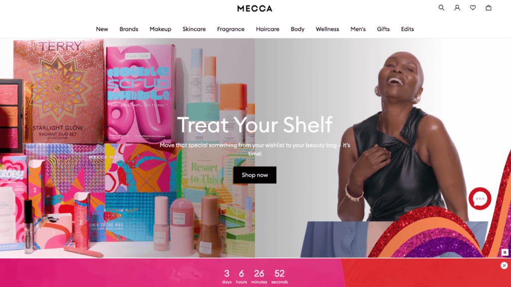
MECCA’s website embodies maximalism with a colorful and dynamic interface, reflecting the brand’s playful and inclusive approach to beauty. The design incorporates vibrant color schemes, layered visual elements, and a variety of textures to create an energetic shopping experience. This maximalist approach feels like a celebration of beauty diversity, making the site engaging, memorable, and emotionally resonant. MECCA’s site demonstrates how maximalist branding can enhance storytelling while supporting seamless product exploration, keeping users entertained and connected to the brand.
However, maximalism isn’t a one-size-fits-all solution. While lifestyle or luxury brands thrive in this aesthetic space, industries like finance or healthcare might find it counterproductive. For these sectors, clarity and simplicity are essential to build trust, which means maximalism web design must be carefully tailored to fit both brand identity and user expectations.
Balancing Creativity and Usability: The Designer’s Tightrope
Maximalism empowers designers to experiment freely, but too much creative freedom can lead to usability pitfalls. Successful maximalist web design demands collaboration across multiple disciplines, from UI UX consultants to developers. This collaborative process ensures that the design isn’t just aesthetically pleasing but also serves the user’s needs effectively.
Prototyping is a vital step in bridging the gap between creativity and functionality. Designers should test prototypes for usability before finalizing visual elements. Early user feedback helps identify navigation issues, allowing teams to refine layouts before launch. This iterative approach ensures that maximalist branding aligns with functionality from the start.
Adaptive Maximalism: Making the Design Work Across Devices
One of the most critical challenges for maximalism web design is ensuring that the experience translates effectively across different devices. A layout that looks stunning on a desktop may feel overwhelming on a smartphone. Adaptive design principles are essential to maintain both visual appeal and usability.
- Responsive Layouts for Seamless Transitions
Responsive design ensures that elements automatically adjust based on screen size, preserving the brand’s identity across devices. On mobile, designers can strip away excessive animations while maintaining bold, essential visuals.
- Prioritizing Core Interactions on Mobile
On smaller screens, the focus should shift to core interactions such as navigation and CTAs. For example, instead of showcasing multiple layered graphics, the mobile interface might highlight just one impactful image to keep the user’s attention.
- Touch-Friendly Elements
Mobile-friendly maximalism also means optimizing buttons, links, and sliders for touch interactions. Overcrowding interactive elements reduces accessibility and frustrates users.
Maximalism Meets Accessibility: Designing for All Users
Accessibility is a crucial consideration in maximalism web design. While vibrant colors and layered graphics offer visual interest, they can pose challenges for users with disabilities. To make maximalist designs inclusive, designers should adhere to accessibility guidelines.
Using color contrast effectively ensures that text remains legible. Interactive elements like buttons must be easily distinguishable, even amidst complex layouts. Designers should also provide alternatives for users relying on screen readers, such as descriptive alt texts for images and accessible forms.
The Future of Maximalist Branding: Where Aesthetics and Functionality Converge
Maximalism isn’t just a passing trend—it’s evolving with new technologies and design philosophies. As designers continue to explore the boundaries of visual expression, functional maximalism is becoming a refined art. The future lies in sustainable maximalism, where bold aesthetics align with responsible design practices.
With the rise of tools like Figma and Webflow, designers can experiment more freely while maintaining control over usability. AI-powered design tools are also enabling teams to predict user behavior, helping them create maximalist web designs that feel intuitive rather than overwhelming.
Maximalist Web Design without Compromise: Practical Tips for Designers
To successfully balance aesthetics and functionality, designers can adopt several best practices. Here are actionable tips to help navigate the complexities of maximalism web design:
1. Prioritize Performance:
Heavy visuals can slow down websites, harming the user experience and driving visitors away. Designers should:
- Use compressed images and videos to reduce page load time.
- Optimize code, scripts, and fonts to improve site speed.
- Consider lazy loading for non-essential visuals to prioritize faster loading times.
2. Test Across Devices and Platforms:
Responsive design should not be an afterthought. Regular testing ensures that:
- The interface looks and functions well across smartphones, tablets, and desktops.
- Animations and transitions are seamless and non-disruptive across platforms.
- Performance benchmarks are met, regardless of device type.
3. Embrace Iterative Design:
Collect user feedback throughout the design process to identify areas for improvement:
- Use prototypes and wireframes to test usability before finalizing the design.
- Gather data from A/B tests to see which maximalist elements enhance engagement.
- Refine based on user behavior and feedback post-launch to ensure continuous improvement.
4. Balance Aesthetic with Purpose:
Not every decorative element needs to be included. Ask yourself:
- Does this element contribute to the user journey? If not, it may be unnecessary.
- Make sure key visual elements—like product images or service highlights—take center stage.
- Incorporate decorative touches that support the brand narrative without distracting users from their goals.
5. Maintain Brand Consistency:
Maximalism offers the freedom to experiment, but brand consistency is essential:
- Ensure the color palette, typography, and imagery align with the brand’s identity.
- Maximalist elements should amplify, not detract from, the core message.
- Use maximalism to enhance storytelling, creating a memorable experience that reflects the brand’s unique personality.
On a Final Note
Maximalism in graphic design and maximalist branding offer endless opportunities for creativity, but without structure, they risk alienating users. When executed thoughtfully, maximalism web design becomes more than a visual statement—it transforms into a functional experience that delights and engages.
Designers must embrace both the art and science of design, ensuring that every choice, no matter how bold, serves a purpose. With a strategic mindset, maximalism can offer brands a unique identity without sacrificing usability. By blending aesthetics with function, designers can unlock the full potential of maximalism—crafting experiences that not only look spectacular but also perform flawlessly. If you want to explore how maximalism can elevate your digital presence, contact us and let’s create something bold and functional together.
