Outline:
Software as a Service is becoming increasingly prevalent, revolutionizing how businesses operate and deliver value to customers. Software as a Service is cloud-based apps that are easily accessible online, excluding the necessity for extensive hardware and significantly reducing operational costs. As more industries embrace SaaS, the importance of exceptional UI/UX design in SaaS applications becomes more evident. A well-crafted, intuitive interface captivates users and ensures a seamless and satisfying experience, which is critical to retain customers and drive the application success.
Core Tenets of Effective SaaS Interfaces
Software as a Service examples showcase a variety of UI designs, but what makes a UI truly effective? Balancing aesthetics with functionality is key, as captivating designs can attract users, but they must not compromise usability. Here are their primary components.
Putting Users First
At the foundation of any successful SaaS interface lies a user-centric design philosophy. Grasping the diverse user needs is essential. This understanding can be cultivated through methods such as conducting surveys, user testing, and collecting detailed feedback. This way, developers create interfaces that surpass user expectations and boost SaaS experience.
Minimalist Mastery
Adopting minimalism in SaaS UI design proves to be one of the most efficient approaches. By removing superfluous components and honing in on crucial functionalities, designers generate interfaces that are clear, streamlined, and free of clutter. This strategy boosts usability and significantly enhances the visual charm of the application. Case studies often reveal that minimalist designs lead to higher user satisfaction, as users gravitate towards straightforward and efficient interfaces.
Designing for All Users
Inclusivity is a cornerstone of UI/UX design. A thoughtfully designed SaaS interface is always accessible to everyone. It means following practices and utilizing tools that improve accessibility, such as screen readers and keyboard navigation options. An inclusive design philosophy ensures that all users can enjoy a seamless SaaS experience, thereby broadening the user base and increasing satisfaction.
By focusing on these core principles, developers create outstanding examples of SaaS apps that excel in the market and maintain an incomparable user experience.
Current Waves in SaaS UI Design
The SaaS interface design is ever-changing, with trends continuously reshaping the way apps interact with users. Keeping abreast of these developments is vital for crafting user-centric interfaces. Here are some of the most influential SaaS trends currently driving the industry:
Dark Mode: A Blend of Aesthetics and Practicality
Dark mode has surged in popularity, favored for its elegant aesthetic and functional advantages. By reducing eye strain and conserving battery life on OLED displays, it enhances user comfort during prolonged usage. Numerous examples of SaaS apps now incorporate a dark mode feature and offer users a customizable viewing experience tailored to their individual preferences.
Microinteractions: Strengthening User Engagement
Microinteractions, the tiny yet dynamic elements such as button animations, hover effects, and loading indicators, are significant for elevating user engagement and satisfaction. These minute details offer instant feedback, bringing a sense of interactivity and vibrancy to the interface, thereby enhancing the overall SaaS experience examples. Designers who focus on such nuances can greatly improve the responsiveness of their SaaS interface.
Neumorphism: Blending Skeuomorphism and Flat Design for a Unique Aesthetic
Neumorphism combines the tactile realism of skeuomorphism with the simplicity of flat design, creating soft, realistic elements that seem to emerge from the background. By expertly using shadows and highlights, neumorphism gives UI components a three-dimensional quality, presenting a contemporary and eye-catching aesthetic. Although still evolving, this trend has already been embraced in numerous examples of SaaS for distinctive visual appeal.
Custom Illustrations: Adding a Personal Touch
Custom illustrations are becoming a key differentiator in SaaS interface design. These personalized visuals can convey a brand’s personality, demystify complex concepts, and enhance user engagement. Integrating unique illustrations, applications can stand out in a competitive market, making them both memorable and appealing to users.
Also See: Example of AHA SAAS Moment with Best UX Practices
Brilliant Software as a Service Examples to Inspire
Exploring exceptional software as a service examples will fuel your creativity and highlight best practices in UI/UX design. These standout examples of SaaS showcase innovative interfaces and features that streamline workflows. Here are some captivating SaaS experience examples to inspire your next project:
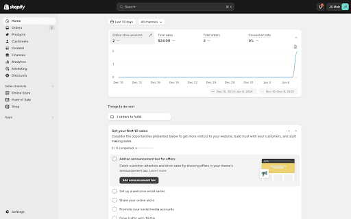
Shopify Dashboard: Mastering Business Metrics
The Shopify Dashboard is a prime example of SaaS apps that excels in user interface design. Its straightforward layout allows shop owners to quickly grasp their business metrics at a glance. With a clear presentation of key performance indicators, users can monitor sales, traffic, and customer insights effortlessly.
The dashboard also includes a straightforward checklist to guide users through their next steps, ensuring they remain on track with their business goals. This intuitive design makes complex data easily digestible, empowering users to make informed decisions swiftly.
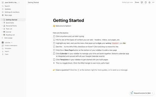
Notion: Versatile Workspace Overview
Notion offers a SaaS interface that is clean and minimalist, enhancing usability with its drag-and-drop functionality. The workspace overview screen is highly adaptable, catering to an extensive range of tasks from project management to event planning.
Notion stands out with its focus on user-friendly customization and visual clarity, allowing users to organize content seamlessly. This screen’s flexibility and intuitive design make it a standout feature, showcasing how simplicity and functionality can coexist harmoniously in a software as a service example.
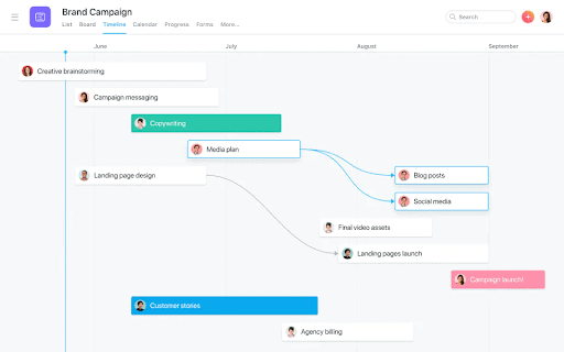
Asana: Dynamic Project Timeline Screen
Asana’s project timeline screen is a compelling example of SaaS that helps teams visualize project schedules and dependencies effectively. The interface allows users to adjust timelines with ease and see the impact of changes in real-time, which is crucial for efficient project planning. This dynamic and responsive design guarantees that teams can manage their workflows smoothly, making Asana an indispensable tool for project management.
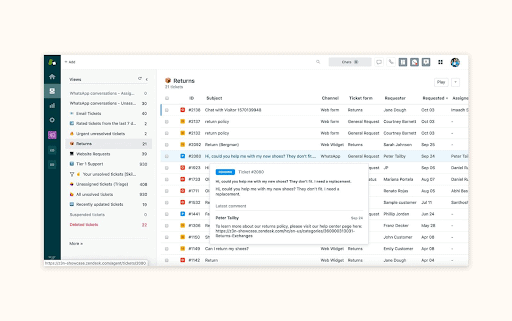
Zendesk: Efficient Ticket Management Screen
The ticket management screen in Zendesk exemplifies how a SaaS interface can enhance customer support operations. Designed for efficiency, this screen allows users to quickly view, sort, and respond to customer inquiries.
Its clean layout and strategic use of color to highlight ticket status help prioritize tasks, ensuring that customer support teams can provide timely and effective assistance. This interface demonstrates the importance of clarity and organization in managing customer interactions.
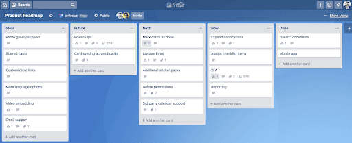
Trello: Visual Task Management on Board Screen
Trello’s board screen is a classic example of SaaS apps utilizing a Kanban-style layout for project management. Tasks are organized into lists and cards, which users can drag and drop to represent progress. Such a visual approach to task management enhances user engagement and productivity by providing an organized way to track project status. Trello’s intuitive design simplifies complex workflows, making it an invaluable tool for teams.
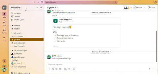
Slack: Seamless Channel Navigation
The channel overview screen in Slack is a testament to effective SaaS interface design. It helps users easily navigate between channels, direct messages, and settings, with a clean and accessible left sidebar organizing all conversations. This layout boosts user experience by making communication seamless and efficient, demonstrating how thoughtful design will facilitate collaboration.
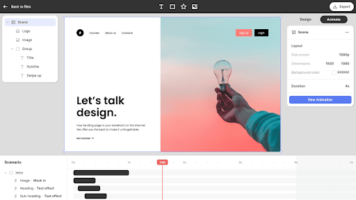
Jitter: Interactive Animation Timeline
Jitter’s animation timeline screen stands out for its functionality and user-friendliness in creating and editing animations. The horizontally laid out timeline at the bottom, reminiscent of video editing software, helps new users acclimate quickly.
Interactive controls for precise adjustments and real-time previews are essential for fine-tuning animations. This clear and visually distinct interface makes managing animation elements straightforward, illustrating Jitter’s capability to simplify complex tasks into an accessible workflow.
These software as a service examples not only highlight the importance of intuitive and visually appealing design but also demonstrate how effective UI/UX can significantly enhance the user experience. By drawing inspiration from these exemplary interfaces, you can develop SaaS applications that are both functional and delightful to use.
On a Final Note
To ensure the success of software as a service, mastering effective UI design is indispensable. By focusing on user-centric principles, embracing minimalism, and prioritizing accessibility, developers can create interfaces that greatly enhance user satisfaction and engagement. As the industry continuously evolves, staying abreast of the latest trends and utilizing the most effective tools will be vital for sustaining a competitive edge.
For those aiming to innovate and thrive in the realm of examples of SaaS, we provide a rich source of expertise and inspiration. By delving into our portfolio and applying the principles discussed in this article, we can create outstanding SaaS experience examples that captivate users and endure over time. So, it’s high time to contact us.

