Outline:
Undoubtedly, localness is praiseworthy. This is generally accepted. In a world plagued by air miles, far-flung travel at the drop of a hat, climate change, food additives, and strawberries in January, the worries of the world at large have a panacea. Instead of globalism, there is localism. With healthy food grown locally, a sense of age-old communities, working together selflessly as they have done for generations, and leaving the greater world to its own devices, globalization is kept at bay as much as possible. Of course, there are downsides to this way of life. For instance, where I live, there is no mobile coverage ☹️
Beyond the allure of a simple life, there is an increasing trend and desire to live in tight-knit communities, where local traditions have been preserved and passed down for hundreds, if not thousands, of years.
On a lighter note, let’s not forget the stereotype that local people, with no influx of new blood, are inbred, resistant to change, and might even struggle with basic skills like counting!
The Power of Local: Exploring the Rise of Devolution
There are two flows of people. In many parts of the world, people are gravitating towards the bustling, melting pot cities, but for those who can afford it, there are also the outflows from the city to the countryside. Additionally, there is a rise in local devolution. Scotland and Wales have established their own semi-autonomous governments, and Catalonia is striving for independence from Spain, among other examples. This is not just a form of nationalism, but also reflects a growing desire to return to the values and aspects of life that truly matter.
Local traditions often foster the preservation of languages, such as the Cornish language in the South West of England. Cornwall, along with Wales, has historically been the last refuge for native Britons following successive waves of invasion from the Romans, Saxons, and other groups. By 1800, there were no remaining speakers of Cornish. However, as of 2023, there are now perhaps 300 fluent speakers and 5,000 individuals with basic proficiency, largely due to a growing interest in localism and cultural heritage.
From the Ground Up: How Localism Shapes Design Choices
Typography can tap into this innate human desire. It goes beyond mere aesthetics, variety, and novelty, offering an escape from blandness and uniformity (think Starbucks). Instead, it evokes a sense of belonging reminiscent of the times when we all lived in close-knit communities before the concept of imposed diversity took center stage.
The core idea here is that people have a natural inclination to belong to a group, to identify with others, and to share common values, rather than existing in a chaotic, unstructured environment. Surprisingly, even the motivations behind Los Angeles gangs and the Scandinavian Hygge movement can be traced back to this fundamental human need for connection and a sense of belonging.
What was the ideal social unit throughout the million years or so of human history? I believe it was something in the region of 20 or 30 families, just enough to ensure protection, procreation, and prevent excessive inbreeding. And if you have ever lived in a village, you will observe the same attitudes and behaviors all over the world. Of course, this may not be suitable for everyone. However, many individuals, when thrown into the whirlwind of modern life (a nice Norwegian term), still feel an ancient need to belong and not be forced, for politically correct reasons, to confront a new and unfamiliar culture on every street corner. I believe in London, there is a street — not a long shopping street with businesses and cafes — that caters to over 50 different nationalities and cultures.
The Art of Balancing Tradition and Innovation in Branding
It is a well-worn path: adapt or perish. Take any classic brand — Marmite, Kit-Kat (UK), or Coca-Cola, for instance. Their logos and designs have always remained consistent, right? Incorrect. Although the fundamental elements are present, a brand’s logo must fulfill two objectives:
– Firstly, it must provide reassurance by fostering the impression that tomorrow will be the same as today, which was identical to yesterday — offering the familiarity and stability of a loyal, unchanging companion. This unwavering presence conveys the notion that both the brand and, by extension, ourselves, have always existed and always will, dispelling any fears of death or the end of times.
– Secondly, a logo must evolve to stay relevant in an ever-changing world, adapting to new trends and consumer preferences while maintaining its core identity. In this way, a successful logo seamlessly combines the comfort of tradition with the excitement of innovation.
Nonetheless, it is crucial that a brand never appears outdated, as attracting new customers and cultivating a strong brand image is essential. For younger consumers, being perceived as old-fashioned can spell the demise of a brand. In some cases, creating the impression of offering something new, even without significant changes, can significantly impact sales.
This tactic is hardly new; it is one of the oldest tricks in the book. Consider the example of a soap powder; how many times can it be labeled as “new” or “improved”? There is a limit, and in such situations, refreshing the logo can serve as an effective alternative to maintain a brand’s appeal.
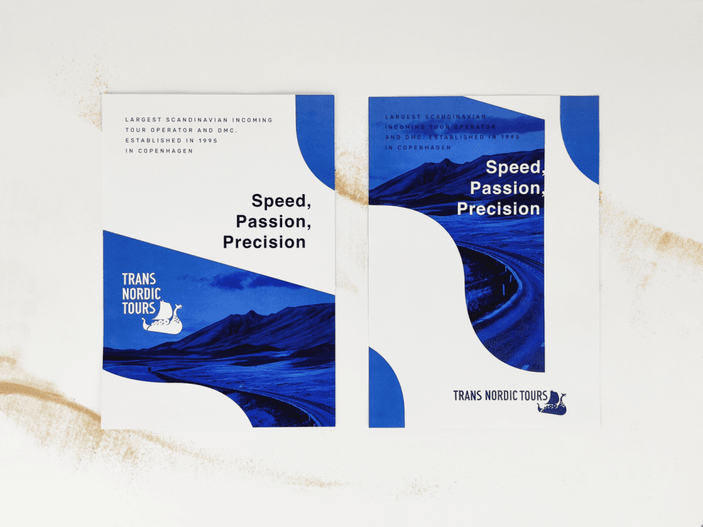
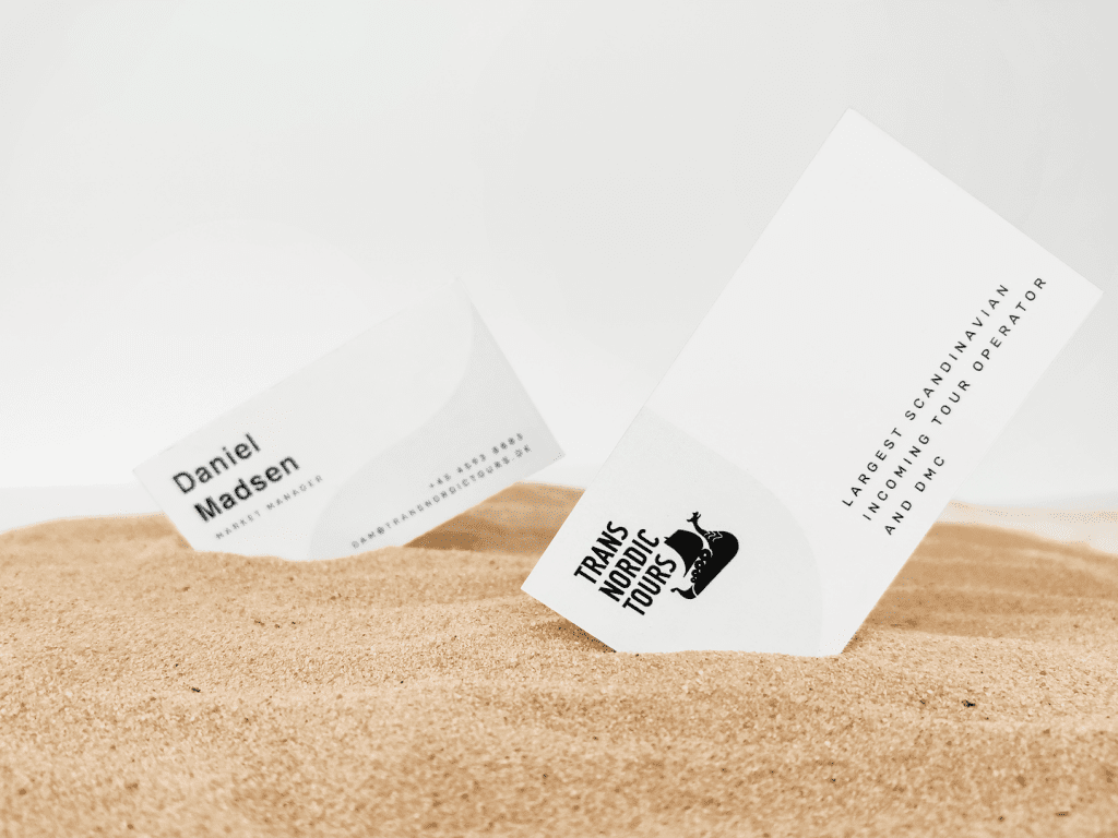
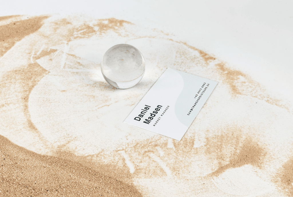
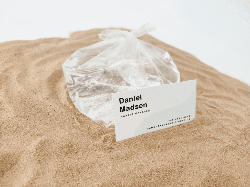
From Ancient Runes to Modern Branding: The Story of the Trans Nordic Tours Logo
Transnordic Tours’ wordmark logo is the epitome of a well-thought-out design, considering the various factors that came into play. Firstly, the logo provides a local connection with the market, which is a significant factor in drawing tourists, particularly those from outside Norway, who associate Viking Longships with the essence of sea travel in Norway. In addition, the logo’s design exudes a sense of freshness, deviating from the conventional, dated logos of other travel companies. The logo’s curves directly mirror those of ancient runes, adding a timeless aspect to its modern design. Thus, the wordmark logo for Trans Nordic Tours strikes a perfect balance between modernity and tradition.
Beyond this, there is a deep-rooted attachment to the mystical quality of runic languages that was popularized by Tolkien and is commonly associated with runes. This attachment creates a belief that magic may still exist or could potentially exist in these ancient symbols.
On a Final Note
As a result, we can leverage cultural connections to create a distinctive branding and design for the local market. By updating and expanding the range of connotations and denotations associated with the symbols, we can increase their brand value and appeal to a wider audience.
This approach allows us to capitalize on the historical and cultural significance of runes while also giving a contemporary twist that resonates with modern consumers.
If you want more insights into this project, contact us, and we will provide you with all the details.
Copied!


