Local websites
Local websites
Brokeree is a company that provides brokers with highly flexible and technological products and assistance to implement the most modern solutions to ensure their business growth. They deliver software decisions and trading plugins for professionals, as well as platform servicing and support in integrating such solutions. Their website was in dire need of a revamp because of its disorganized and overburdened structure. The Ester Digital team helped them with rebranding, UI/UX design, and web development.
Since the company deals with high technologies, rapidly changing markets, and modern tools, its website had to be representative of that. Unfortunately, it wasn’t the case – it was overloaded with complex information, illustrations, and icons that were not aligned with their brand style, and had an outdated and awkward design. Our task was to modernize it, bring new life to the existing design decisions, and fill the website with refreshed and brand-new imagery that could complement the company’s spirit.
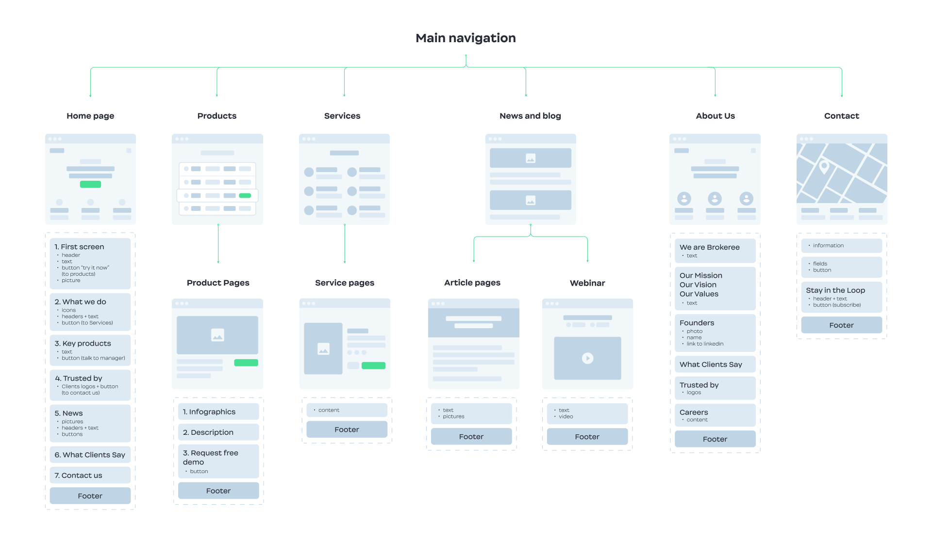
Also, the website lacked a coherent information structure. Its architecture was muddled and convoluted – it needed a systematic approach and effective navigation that helps users find appropriate information immediately.
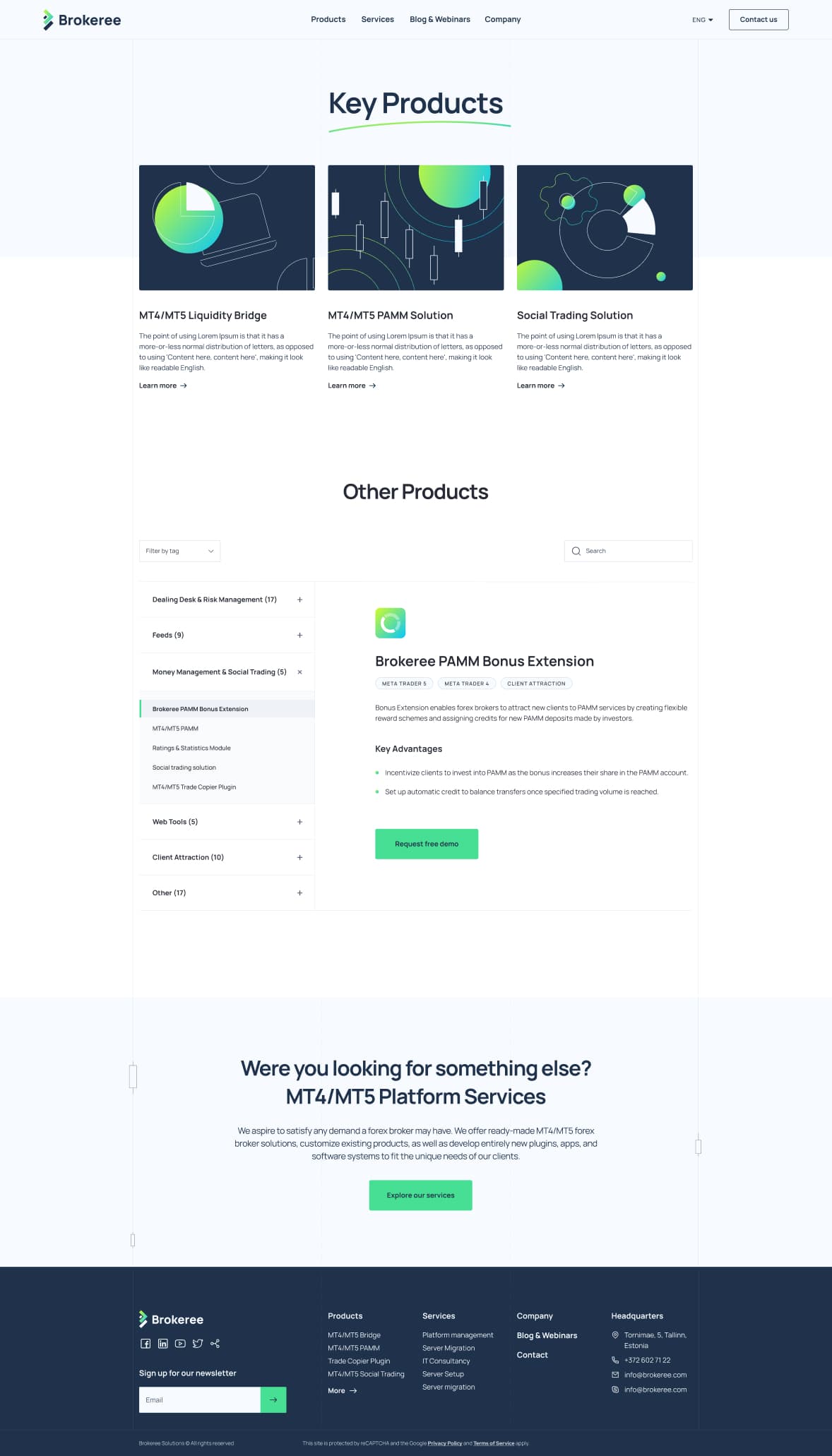
Lastly, the menu and the product lists were not user-friendly – it was hard to go through pages, the filters for the product categories did not work properly, and overall the pages were not assembled well. All of that affected its speed and decreased its SEO performance.
To solve all those issues, our team had to carry out several tasks.
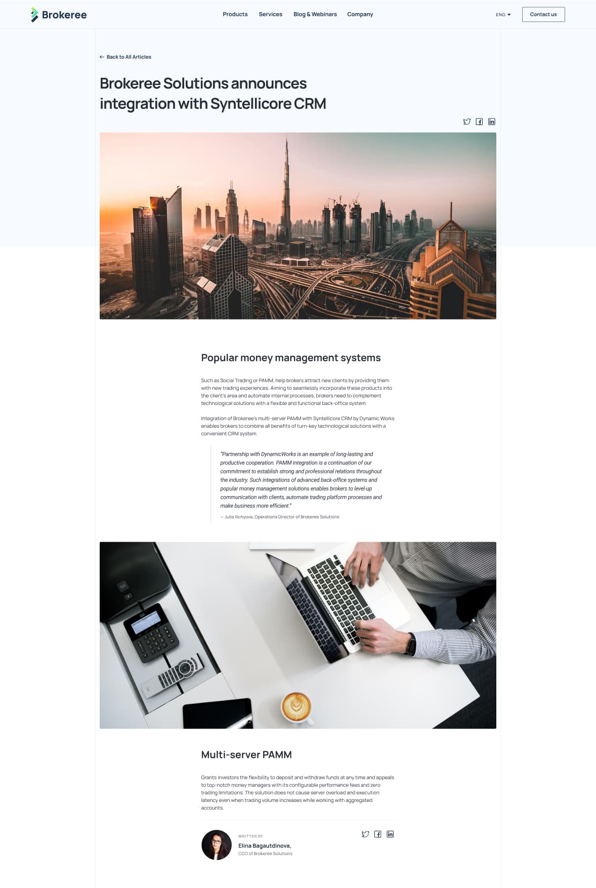
Firstly, we worked on revamping the existing website and its crucial components. We had to put a fresh spin on the Brokeree brand elements and make them more up-to-date and polished while adding new pieces that coordinate well with their corporate identity.
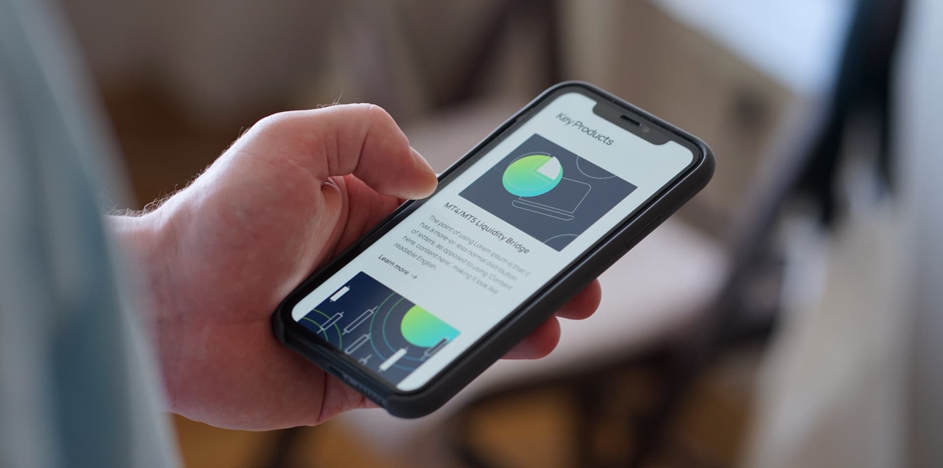
Secondly, we had to get rid of the clutter, confusing navigation, and UX-related issues. Besides that, we had to make the website fast, responsive, and mobile-friendly to improve the SEO parameters.


We solved those problems by implementing coherent information architecture, creating clean and appealing UIs, restructuring their product and service pages, and introducing a set of minimalist icons and illustrations that showcase the technicality of their products in a simple and straightforward manner.
When considering what visual approach to take on with Brokeree, we analyzed the nature of their company and their business style. Hi-tech and financial spheres are known for their austere and formal approach but we decided to bring out their creative side and show their expertise and professional approach in a minimalist yet fascinating way.
We started with updating their logo. The team used the existing logo as a foundation and changed it up slightly to ensure its recognition. We chose colors that were clearer and more forward-looking, added a gradient to liven it up, and included a more simplistic, streamlined font for better readability.
In terms of web design, we opted for a greenish palette with a few dark blue accents for CTAs and highlighting. Green and light colors are typically associated with calmness and tranquility, which is what the Brokeree team wants to exude. The fonts used for the website are roundish and less rough than they used to be, making them much more readable and user-friendly.
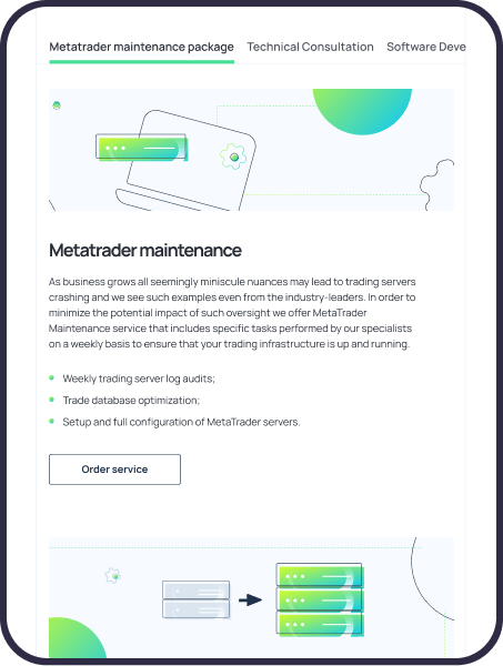
We also worked on the iconography and a set of custom illustrations for the website. The previous iteration had loads of infographics and product illustrations that were not always informative. Our team reviewed the existing visuals and created our version of the imagery, aligning it with the chosen brand style. We cut down the number of the illustrations and interchanged some of them with new icons, thus sticking to a minimalist and clean style to reduce the digital clutter.
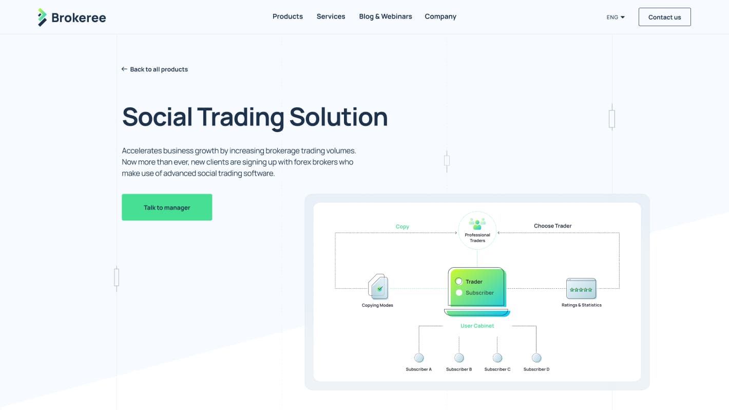
Besides simply implementing the developed brand style, we reconsidered some of the vital elements of the homepage. The previous website used the candlestick charts extensively since they describe the market movements and serve as somewhat a character of their own. Since they play such a crucial role in the Brokeree work, we decided to make them more dynamic: we made them move along the lines instead of being static, creating a parallax effect. This serves as an expression of how volatile markets are, adding a subtle touch of artistry and motion.
Service pages had issues with product display: the navigation wasn’t clear, and the filters that help to move between the pages were not working, so we had to rearrange the whole structure. We placed the name of the categories on the left, with their detailed descriptions being on the right. It is much easier to jump through the pages with such a simplistic navigation table. All the key products and services have their own unique illustrations used across the whole website, improving their recognizability.