Local websites
Local websites
YGrene is a leading Property Assessed Clean Energy (PACE) company that offers an alternative way to finance energy-efficient and renewable energy upgrades for residential and commercial properties in California, Missouri, and Florida. The company has multiple advantages, including low, fixed rates, no upfront costs, and no repayment penalties, which makes it a reliable service provider.
Ester has designed a distinct and authentic brand identity for YGrene and helped create accessible and responsive apps that are easy to use within any media.

The main goal of the project was to develop a highly personalized visual language and a comprehensive visual representation of the client’s mission so as to improve the company’s brand identity. Also, it was critical to add some useful elements that can help increase the conversion rate. Consequently, one of the main objectives was to gain a balance between the website’s usability and profitability. To achieve that, Ester worked closely on the project with the client’s tech, marketing, and business teams, constantly receiving valuable feedback.
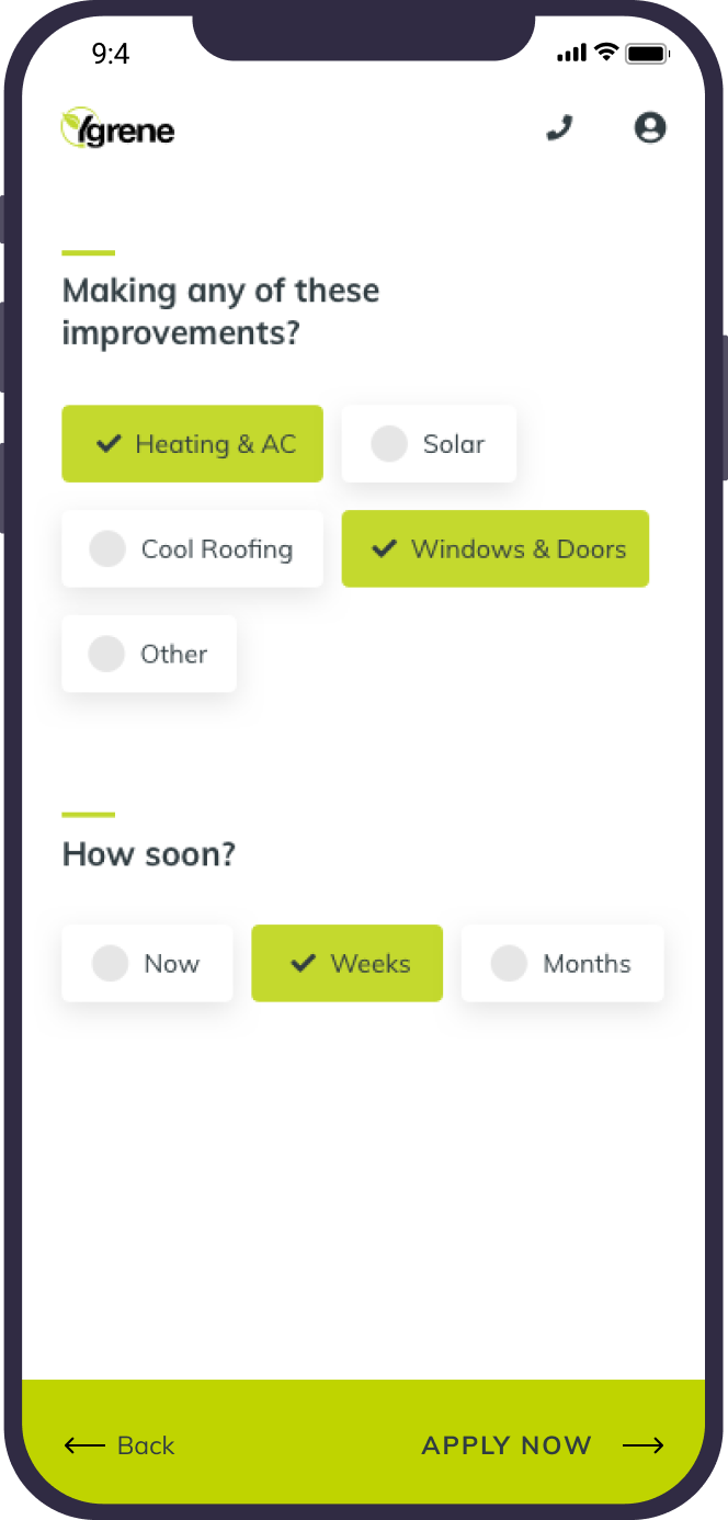
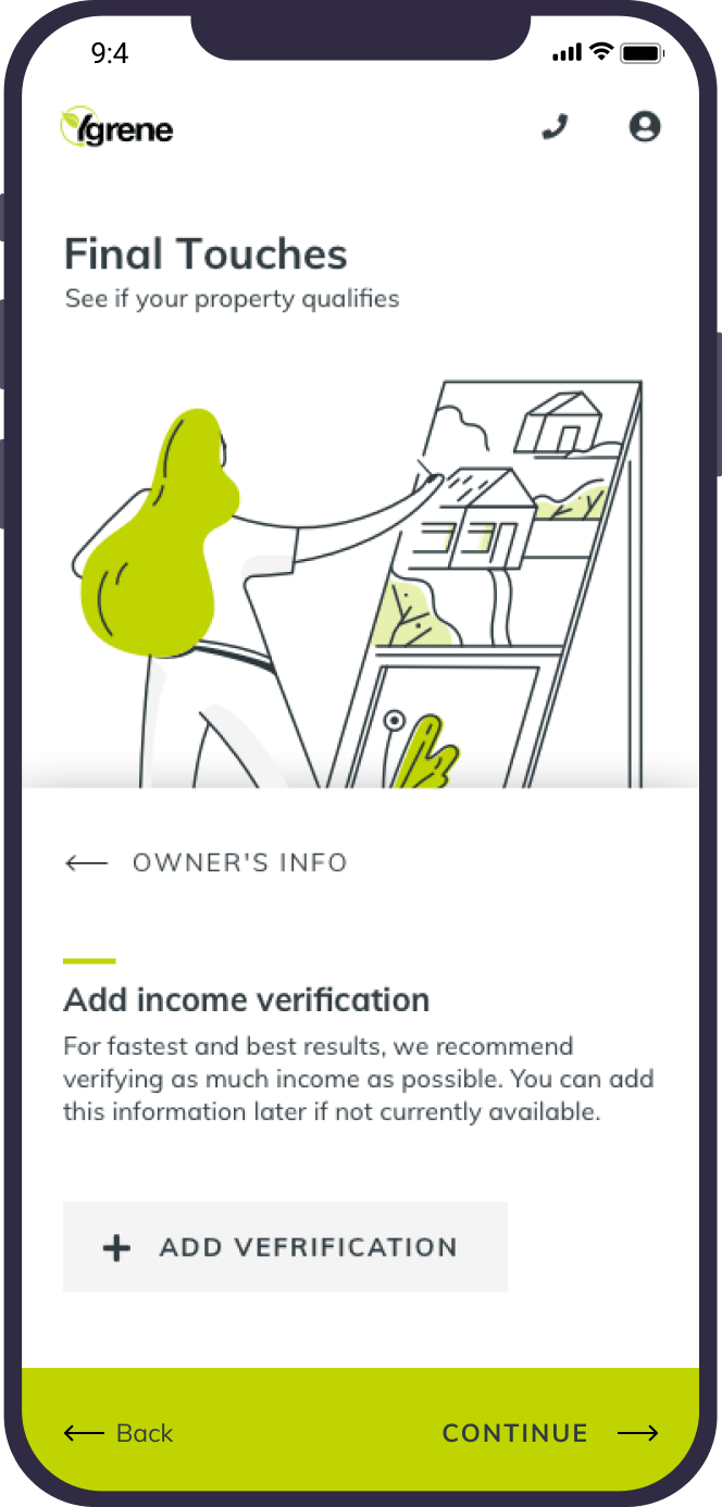
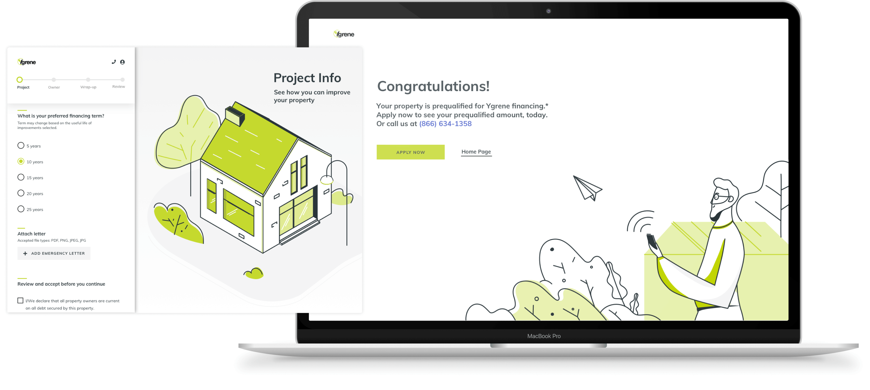
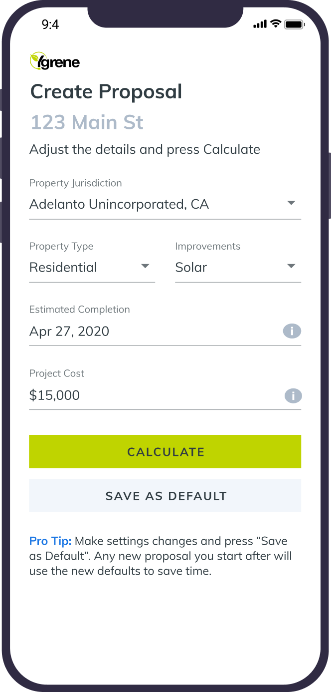
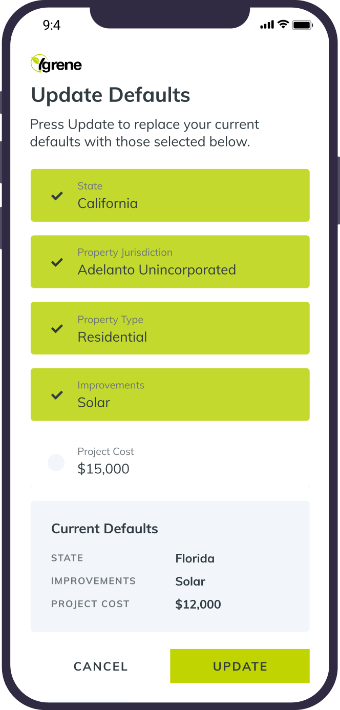
At the beginning of the project, the client only had a basic visual representation: the color scheme they wanted to work with and a general idea of what they wanted to see as a result. Coherent brand identity and practical tools (for example, a Prequalification App that checks the property’s eligibility for financing) were at their nascent stages of development. So, the advancement of those two aspects became the first significant step on our way to creating a cohesive identity system and enhancing uninterrupted operability.
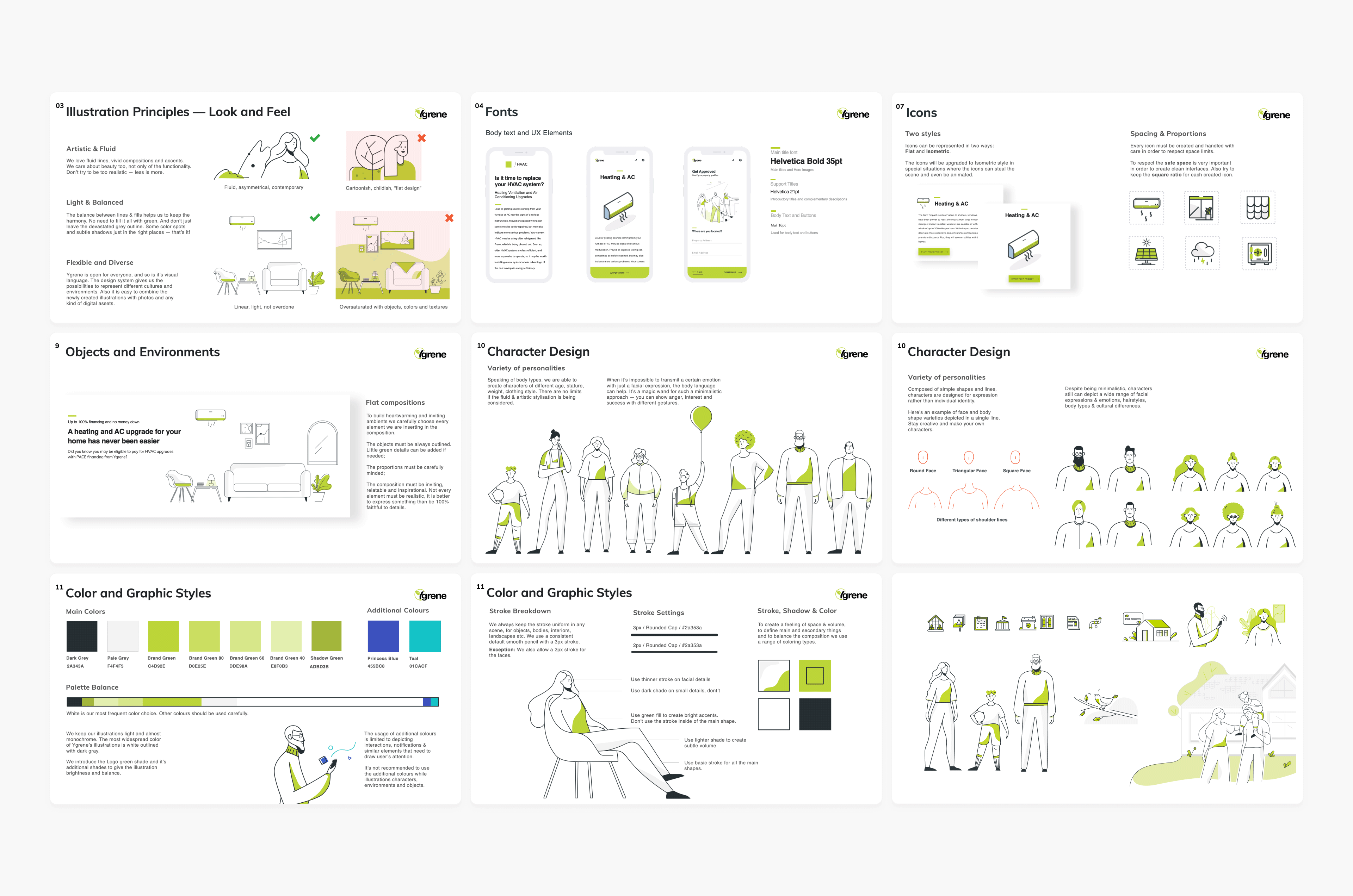
Inspired by the simplicity of nature and using a variety of visual storytelling tools, Ester created custom illustrations serving a wide range of purposes. From small icons used in mailouts and blog posts to illustrations used through different communication channels providing a more enjoyable user experience while making the client seem a mature and established organization.
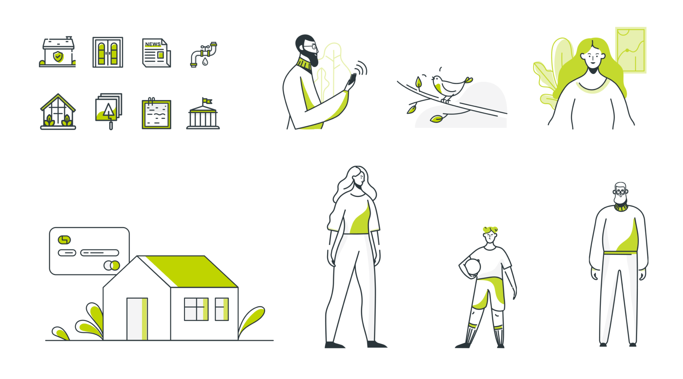
Following an excellent application of a basic visual structure, together with the client, we developed a set of principles regarding the usage of photos versus illustrations, broken down according to their communicative purposes. Designing a coherent and transparent visual identity is impossible without setting up a platform’s basic tone, which was accomplished, namely, by selecting primary and secondary colors, as well as by creating the easy-to-follow typography guides that prioritize readability. The results of all those efforts gradually grew into a fully-developed brand book. What is more, we took into account every little detail regarding possible cultural differences between people from various areas and custom-made illustrations in a way that fits a particular target audience.
After establishing and implementing a clear and effective brand identity, Ester proceeded to improve the client’s existing tools, starting working on the optimization of the client’s Prequalification App. This app checked the property’s eligibility to get financed for home improvement and determined a prequalified amount of financing. Since the product had already been created and was operating, Ester developed it further by adding a stepper that shows the number of accomplished tasks, making the UI more user-friendly and utilizing customized illustrations and a newly developed visual style. Later, the statistics showed that the simplified version of the app increased the success rate and the number of clients who followed through with application tasks, which, all in all, indicated successful completion of our initial goals.
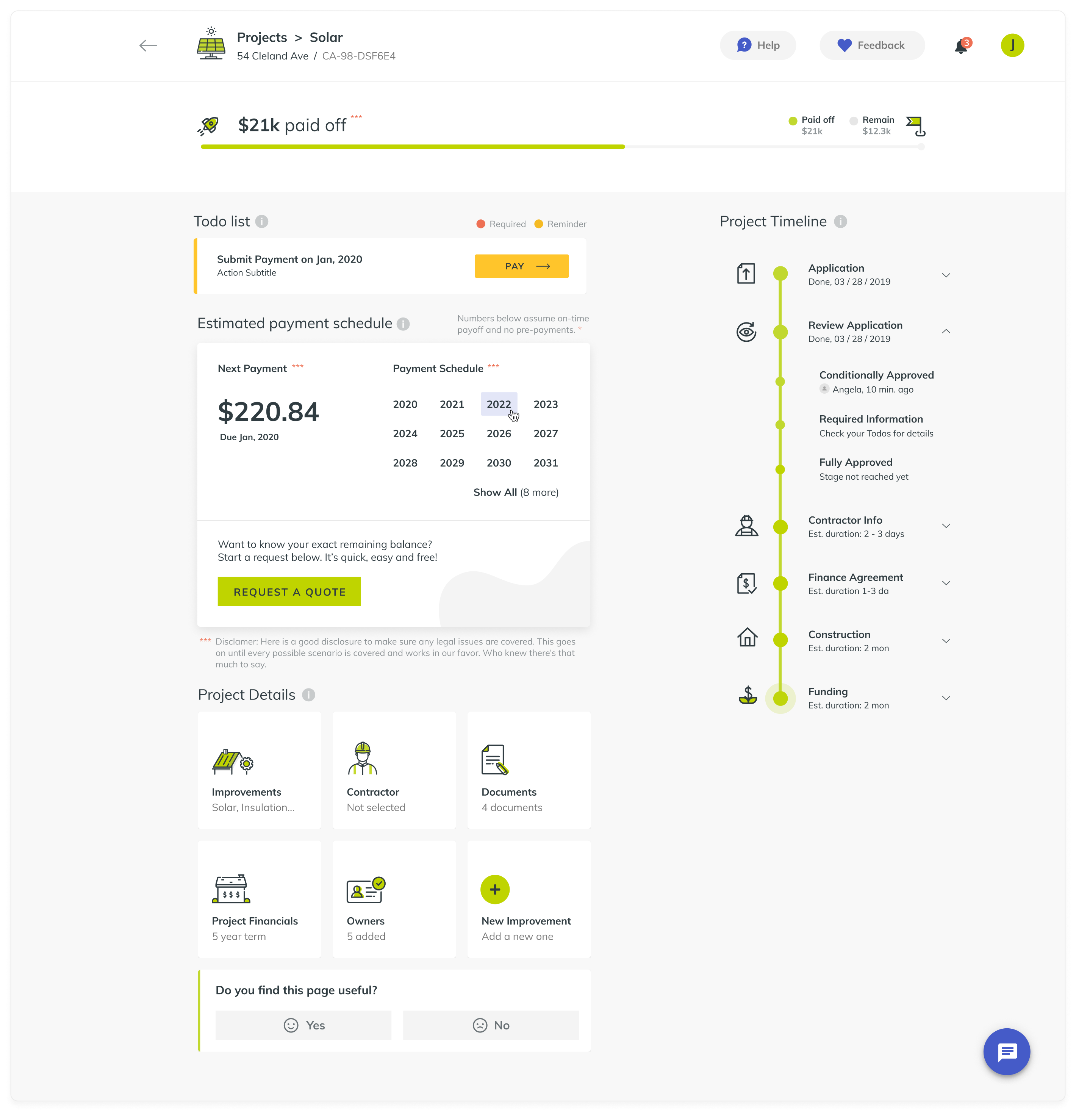
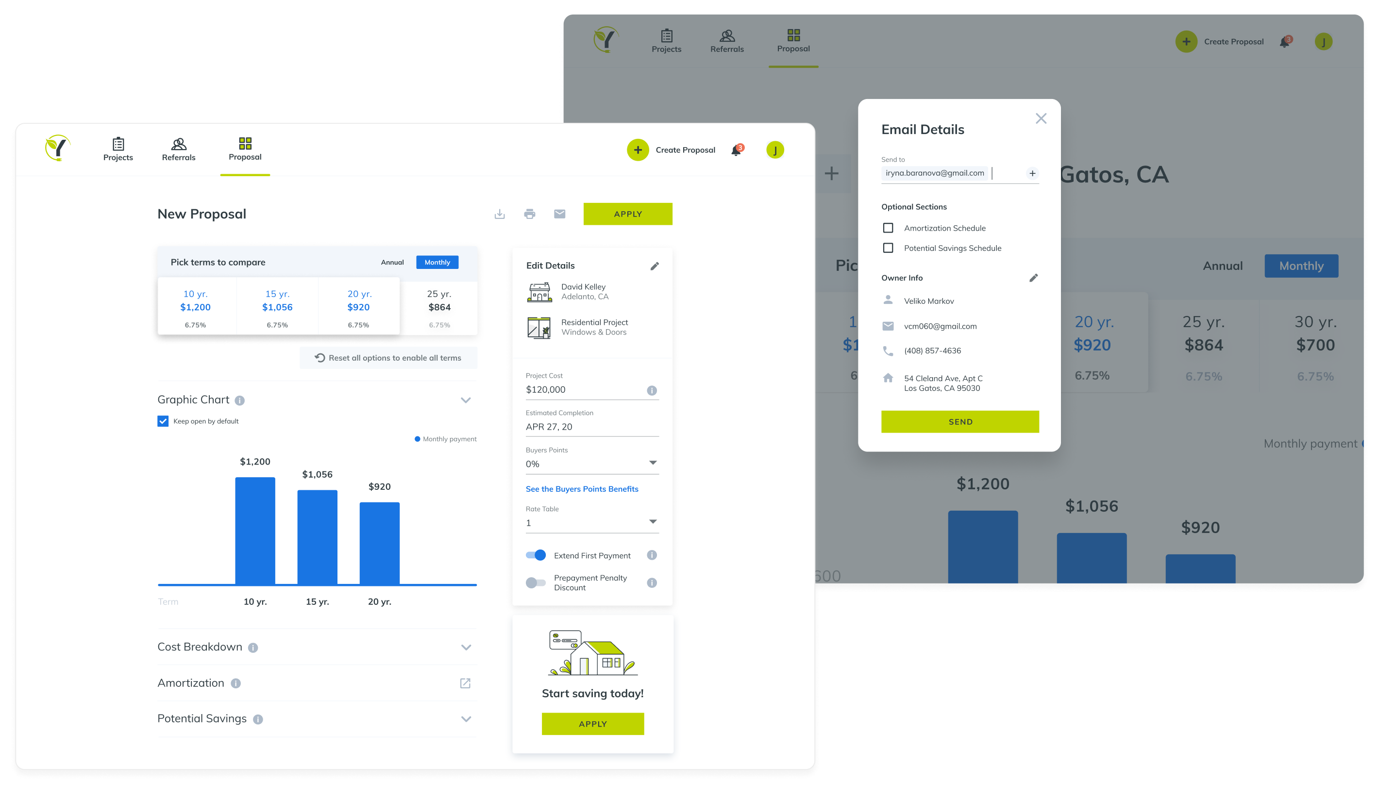
However, both teams – the client’s and ours – decided to pause there and took a further step to ensure a wider reach of users and customers. That led to the creation of a Homeowner Portal – a web app that now helps homeowners manage their home improvement financing managed by the client. Users can create their profiles, check the status of their financing, calculate the pre-qualified amount and navigate their way through applications, projects, and payments. Another web app – Contractor Portal – became a logical extension of the Homeowners Portal. The Contractors Portal facilitates the process of creating and managing financing projects for the registered contractors. More specifically, this solution includes a Proposal Tool, which is used to introduce various financing options to the homeowners, assessing their potential savings and checking the amortization schedule. Naturally, giving complex and often confusing information about loans and cost breakdowns in an engaging and captivating manner is challenging, but Ester managed to achieve that by using different tools, diagrams, and flow charts that provide visualization and make the user experience more entertaining.
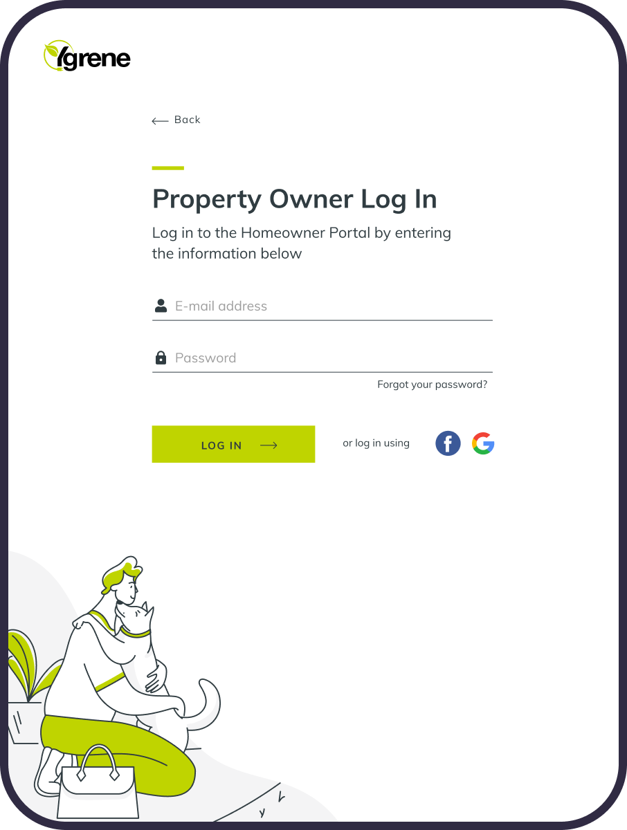
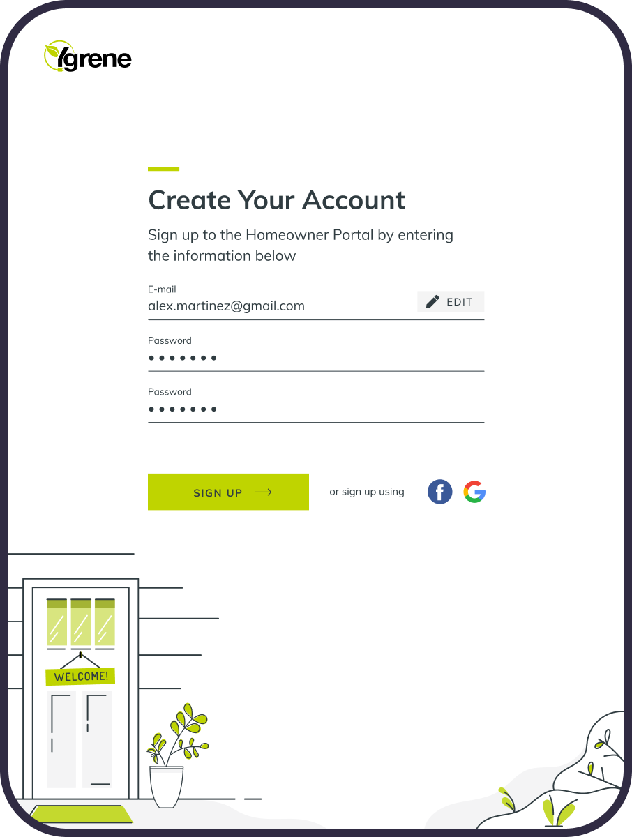
Lastly, along with the two web apps, Ester created and properly tested their custom-built mobile versions. Users can choose the media they would like to engage with the client, depending on their preferences, which makes the whole process more inclusive.
The updated brand identity echoes the client’s main purpose – supporting home improvement financing using clean and renewable energy resources. It mainly features two colors – green and white – that are applied across the website and mobile apps to support consistency and relatability. The challenge of making everyone feel included was overcome by over-stylization and simplification applied to faces featured both in marketing and product illustrations (thus “humanizing” the user experience). That ensured the visual language created by us is distinctive and recognizable yet remains simple and monochromatic. Here at Ester, we believe that the brand’s new visual representation and incorporated tools will reflect the client’s desire to promote clean energy resources and environmental awareness.