Outline:
Everyone involved in online sales is familiar with the term “Call-to-Action,” which is an element that encourages visitors to take a particular action based on what the company offers. But how do you create an effective CTA Design? Where should it be placed? And how can it be made to work properly?
In this article, we will provide answers to these and other crucial questions, which will assist companies in selecting the best user experience services, thereby making their website even more effective. So, let’s begin by defining what a Call-to-Action is.
Emotional Appeal: How Call-to-Action Design Influences User Behavior
A Call-to-Action (CTA) is a graphic element that motivates and inspires website visitors to take specific actions such as buying a product, downloading a file, or subscribing to a newsletter. The CTA tells users what they should do and what the page owner expects from them. The button may prompt them to place an order for a product or service, sign up, or get a free consultation. Targeted action through CTA Design increases conversion and sales while facilitating product promotion.
A call-to-action is a critical element because without it, even high-quality content might not work, and the clients will not understand what step they need to take next and how to take it. To avoid such situations, it’s essential to make a clear appeal or formulate what needs to be done after reading the article or viewing the catalog with goods.
Furthermore, it is important to recognize that the CTA evokes emotions. That is why it is vital to convey to potential clients how their lives will change for the better after purchasing the proposed product or how the service may solve their problems.
Moreover, the call-to-action communicates the benefits of the offer to the customers and motivates them to buy or subscribe. It is also nice if the client gets an additional benefit in the form of a discount or a gift.
All of these and many other arguments, among many others, prove that neglecting this element may affect business operations’ effectiveness, which is more than unfavorable.
Boost Your Website’s Conversion with These Effective CTA Design Types
There are various types of CTA Designs that aim to prompt users to take different actions. Let’s take a closer look at some of them.
“Sign up”
This type offers website users a simple and easy registration process, depending on the website’s focus and goals. It is critical to motivate clients and let them know what they will receive or learn from the registration process, as customers always need to know the benefits they will receive.
“Subscribe”
With this CTA Design type, companies provide users with useful and interesting content or profitable offers. This call-to-action often implies leaving only an email, which is easier for users to share than a phone number, which may be canceled at any time.
“Try for free”
This CTA Design allows users to try the company’s product or service for free. If it is worthwhile and crucial for clients, they will likely purchase it. During this trial period, there is also a chance that users will become accustomed to it and realize how essential it is.
“Join us”
If the companies use various social media networks, they should inform users and invite them to join their world and ecosystem there. This way, customers will be aware of diverse events, latest news, and be the first to know about new product releases.
“Read/Learn more”
This CTA Design is employed to pique the interest and curiosity of users by providing more information about a product or service. Users are not always required to subscribe or sign up; they only need to click and go to the page. Therefore, this type of CTA has a high click-through rate.
“Event promotion”
If a company occasionally arranges events, meetings, or celebrations for their customers, placing such a CTA will be of much help. It serves as additional advertisement and a tool for attracting new visitors to come and get acquainted with them while retaining the attention of existing users.
“Buy now”
It encourages users to make a purchase immediately. It is commonly used in e-commerce websites and is effective when paired with an appealing discount or limited-time offer.
“Contact us”
It is used to encourage users to get in touch with the company via phone, email, or contact form. It can be used for various purposes such as customer service, sales inquiries, or technical support.
“Download now”
This CTA is used to prompt users to download a piece of software, a mobile app, an ebook, or any other type of downloadable content. It is usually accompanied by a brief description of what the user will receive after the download.
“Get a quote”
It is used to encourage users to request a quote for a product or service. It is often used in B2B websites where potential clients need to know the cost of the service or product before committing to a purchase.
“Request a demo”
This CTA Design is used to prompt users to request a demonstration of a product or service. It is commonly used in software companies or businesses with complex products or services that require a thorough explanation.
“Refer a friend”
This CTA is used to encourage users to refer their friends or family members to the company. It is often accompanied by a reward or incentive for both the referrer and the referred.
Depending on the company’s mission and target audience, the CTA may convey diverse messages. And the main thing here is to make it valuable for the customers so that they feel the benefits.

Recent CTA Facts You Should Be Aware of
In order to create a truly effective CTA, let’s consider some facts that may help companies in avoiding some mistakes.
HubSpot conducted research to see what call-to-action is the best for increasing the conversion rate. They considered three types of CTA:
- Basic is a quite impersonalized CTA, meaning it doesn’t adjust to users in terms of their gender, location, language, and so on.
- Multivariate is pretty much the same as the basic one, but the difference is that it implies several CTA that are tested in order to see which of them converts better.
- Smart, in its turn, is a personalized CTA that takes into account all the users’ data so that the element becomes genuinely adaptive.
The results were the following:
The conversion rate of Smart CTA is 202% higher than the Basic or Multivariate ones. And that shows how essential the personalized approach is.
Depending on the forms of the CTA (buttons and interactive images) the conversions were different, and it appeared that the buttons were more effective than the images.
Therefore, we can see that while dealing with the CTA, it’s more advantageous to make it in the form of buttons and apply a customized technique rather than the standard one.
Once the essence of a CTA and its types are explored, it’s time to see where this element should be placed.
Maximizing Conversion Rates: Where to Place Your Call-to-Action Buttons
Placing the CTA is a complex issue, as it needs to be easy to find without being too intrusive. To strike the right balance, the CTA should be located in the most prominent places. Let’s take a closer look at some of these locations.
Homepage/Landing page
Since website visitors’ first impression starts on these pages, placing a call-to-action button is necessary. Furthermore, on homepages or landing pages with a hero image, the user’s gaze naturally stops at the center, making it logical to place the CTA button there for a quick response.
Blog
The essence of a blog is to engage users in the brand, product, or service, making CTA buttons like “subscribe” or “learn more” necessary. Depending on the post’s size, these buttons may be placed in the middle or at the end of them.
Sidebar
The sidebar provides information to help website visitors understand what they can find on the site and what they are offered. Therefore, it’s a good place to include a CTA button, in addition to the menu, lists of sections, and a search bar. However, it’s essential to keep in mind that the sidebar is relatively small, so the button should not take up much space, causing confusion.
Welcome pop-up message
When website visitors first enter the site, a large pop-up message may welcome them. Such messages may contain special offers, discounts, or promotions. Placing the CTA button here ensures the message is prominent and catchy.
E-mail marketing content
Just like with web pages, users may not scroll through the whole email to find important information placed at the bottom. Therefore, when advertising new products or services, it’s better to place the CTA button closer to the beginning of the letter or, if it is small, right after it, so clients immediately notice it.
Product pages
Product pages are essential for e-commerce websites as they showcase their products or services. Here, CTA Design buttons like “add to cart,” “buy now,” or “check availability” are necessary to lead the customer to the purchase decision.
Thank-you page
Once a customer has completed a purchase or filled out a form, they will be directed to a thank-you page. This is an excellent place to include a CTA Design that suggests further action, such as “leave a review,” “subscribe to our newsletter,” or “share on social media.”
404 Error Page
When website visitors reach a page that does not exist, they will be redirected to a 404 error page. Although it may seem unnecessary to include a CTA button on this page, it’s an opportunity to guide visitors back to your website by providing options like “go back to homepage” or “browse our popular categories.”
Footer
The footer of a website is where all the necessary information is placed, such as contact details, legal information, and social media links. Therefore, it’s also a good place to include a CTA button that encourages users to take further action, such as “start a free trial” or “request a quote.”
Depending on the website structure and goals, CTA buttons may be added to various locations. However, it’s important not to overload pages with too many CTAs, as this can be overwhelming for users.
CTA Text: Crafting Clear and Compelling Call-to-Action Copy
The success and functionality of the CTA depend on its design. Now that we’ve considered the options for placing the CTA, let’s explore how it should look.
Size
Since the purpose of the call-to-action button is to grab users’ attention, it’s vital that it stands out from other buttons on the screen, especially in terms of size. Large buttons have a good chance of being noticed and clicked, but they should not be too large as to ruin the visual composition and layout structure or too small to be overlooked.
Color
Although a call-to-action button should be prominent and catchy, it shouldn’t differ from the overall website or page design. It should stand out against the general background but not look like a foreign object. When multiple buttons are present, different shades or colors can be used to indicate that they offer different actions.
Shape
CTAs can be presented as links, images, or buttons, but buttons are the most effective. Buttons of any shape can be used on the website, whether rectangular, square, or round. The key is that they fit perfectly into the website design and do not get lost among the other content.
Clickable look
The CTA button should look like a button so that users understand that it is clickable and not just part of a banner or image. To avoid confusion, designers can employ shadows, 3D effects, and other visual cues.
Contrast
According to the Von Restorff effect, the object that is different from the rest is more likely to be remembered. To attract users’ attention, the CTA button should be more visible and noticeable by using contrasting colors. However, the color should not contradict the overall color scheme of the page.
Text
Text is critical to the effectiveness of a call-to-action. It should be understandable and indicate what will happen after pressing the button. Usually, it’s a short and straightforward phrase that catches the client’s attention. Long and complex sentences should be avoided as they require more time to comprehend.
Additional design elements such as drop shadows, hover effects, and beveled edges can be used to make the CTA button effective. However, designers should not overuse them as minimalism is still in demand.
Crafting Effective Microcopy for Your Call-to-Action Buttons
There’s one more detail to pay attention to that can make the CTA even more effective – microcopy. Microcopy is the small text that users see around or in call-to-action buttons. It usually provides a simple explanation of an action that motivates people to perform it.
Microcopy is helpful for website owners as it allows visitors to work out their uncertainty about what’s on the other side of the CTA by providing additional detail that convinces them to click on it. Unfortunately, the space for microcopy is limited, so it’s essential to keep it short yet meaningful.
Maximizing the Impact of Your CTA: CTA Design Tips for Effective Representation
Once the design and some important aspects of the CTA are covered, it’s time to discover how the information there should be represented.
Go with the first-person speech
The first-person call-to-action is more personal and may substantially improve the conversion rate. In this case, the visitors are not told what to do, but they are asked to make their own decision. You can’t but agree that the CTA “Download my free trial” sounds much better than a plain “Download free trial.” That’s why such an approach will be fully appreciated by clients.
Create a sense of urgency
The practice of adding some elements of urgency to the CTA button, such as limited editions, temporary bonuses, and others, is quite efficient and practical. However, this urgency shouldn’t look artificial as long as visitors will soon recognize it. That is when a company’s promotion lasts two weeks and then is automatically extended for another two weeks (or more), the trust of customers will be lost.
Keep it short and simple
The shorter – the better: people value their time that’s why they love brevity as well as simplicity. When it comes to the CTA, you should forget about writing long essays and using complex phrases, and not beat around the bush as long as otherwise there’s a risk of losing the client’s attention. The most important thing is to make clear to the user what you offer and what they should do.
Use directional and visual cues
Text buttons and CTA may create several potential issues connected to page scanning or comprehension. The lack of visual cues such as color or borders may be confusing since the users won’t get where the button is, while the directional cues deal with pointing towards the button itself (using an arrow, for example). Therefore, these elements are also of much help, especially when making the CTA prominent and easy to find.
Utilize negative CTA
Sometimes it’s appropriate to use negative CTA buttons, thus not trying to offend the users but somehow challenging them. If there’s a CTA for purchasing the service, or a gym pass, for instance, then both options of getting either refusing it should be included. And if the text of the “yes” option is pretty clear, the “no” one may contain some kind of sarcasm, something like “No, I’m fine with my non-perfect body.” In this way, visitors will take more time to think over the offer before clicking on the button since by refusing they will confirm their shame.
The tips provided are intended to help the companies in making their CTA buttons unique and efficient. Some of the techniques are quite common for every website, while the usage of others may not be appropriate for all of them. That’s why you should choose them wisely and consider the company’s mission, values, and target audience.
Top 10 CTA Examples
Having reviewed the theoretical side of the call-to-action button, we’d like to proceed with showing you the brightest examples of the CTA application that work.
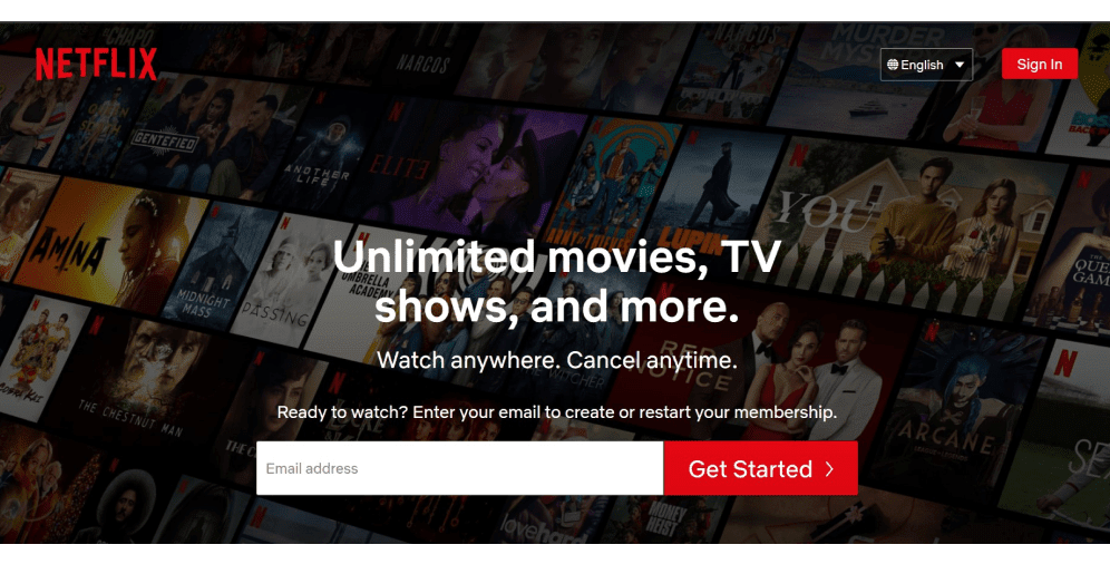
01 Netflix
The text of the CTA of the Netflix website is definitely convincing since users are offered not only a short registration form but also an opportunity to employ the service on any device, at any time, and to unsubscribe whenever they want (in case of their dissatisfaction with the services provided). Moreover, the button at the top of the page calls to take the same action, but in other words, thus the message doesn’t sound obtrusive (smart move!).
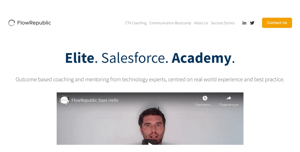
02 FlowRepublic
When users first enter the FlowRepublic website, they immediately face the pop-up message with the button that calls them to subscribe to the newsletter. This CTA is accompanied by an assurance that they will not send them spam and an indication that they may unsubscribe at any moment. And such microcopy elements add a sense of safety, thus making users relax (very thoughtful!). In addition, on the homepage, there’s a CTA button for contacting them, which is truly prominent thanks to the application of a contrasting yellow color.
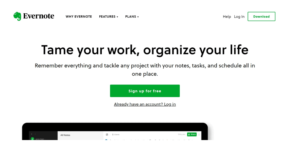
03 Evernote
The laconic and minimalist design of the Evernote website displays the advantages of the service and offers a free sign-up option. In case the users already have an account, a quick link to logging in is also presented here. At the top of the page, visitors can find a prominent call-to-action for downloading the application. Both of the buttons are made with the help of the green brand color, which makes the design balanced and consistent.
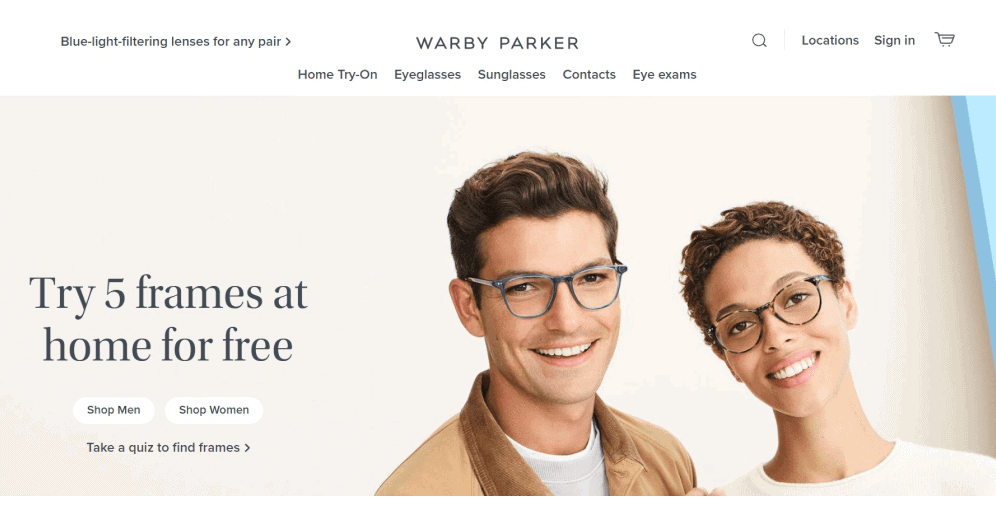
04 Warby Parker
The glasses brand Warby Parker has applied an interactive CTA button. Here the visitors are offered two options: to choose the glasses in the relevant category (according to their gender) or to take a quiz to pick the best frame (based on the quiz results). Such a call-to-action is rather effective for attracting new customers since they have just started discovering the brand and still may have some doubts about it.
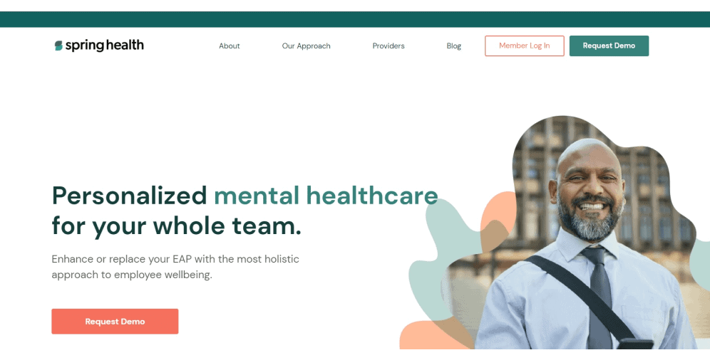
05 Spring Health
Upon entering the psychological support platform Spring Health, a pop-up message appears on the website urging users to subscribe to their newsletter. At the top of the homepage, there are two CTA buttons: “log in” and “request demo” that are designed in the corporate colors of the company. Below, visitors can also find another “request demo” CTA, but in a different contrasting color. Even though there are two identical buttons here, they don’t seem intrusive or out of place.
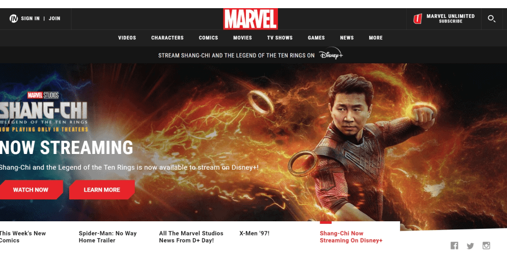
06 Marvel
The Marvel website is full of various call-to-action buttons, but the way they are presented makes them look so natural that no one will perceive them as disturbing or troublesome elements. Let’s see, the left upper corner includes the logging in and joining buttons, while the right one contains the subscription CTA. Right on the big banner, visitors can find two more buttons calling for watching and learning more, executed in the red and white brand colors.
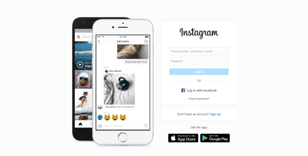
07 Instagram
The Instagram website is designed in a really simple and elegant way. Here, except for the image with the running application on the mobile phone, users can see a logging-in form accompanied by the CTA button for taking the same action but with Facebook. Another text call-to-action encourages users to sign up (if there are still people who don’t employ it, which is scarcely possible). And just below, there are buttons for downloading the application for devices of different software.
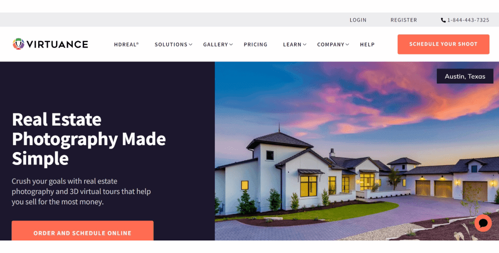
08 Virtuance
The real estate marketing company Virtuance welcomes its visitors with a pop-up message encouraging them to sign up for the newsletter, in return offering a possibility to win a free photoshoot (sounds attractive, right?). On the homepage, users can see two prominent CTA buttons containing the same message “order and schedule the shoot.” These elements are made in a contrasting orange color, making them bright and truly visible, and leaving the visitors no chances to miss them out.
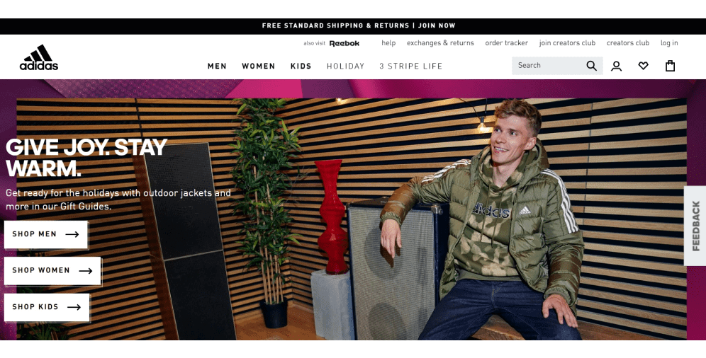
09 Adidas
The Adidas website homepage contains several call-to-action buttons. The first one encourages visitors to join them and can be found in the header. It’s accompanied by the offer of free shipping and returns. In this way, users promptly see the benefit of interacting with the brand. In order to help clients in their navigation, the three big CTA buttons are placed right on the banner, which is rather convenient and frees users from endless searching and setting up filters in the catalog.
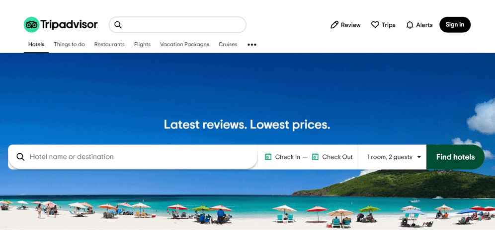
10 Tripadvisor
Tripadvisor is another good example of a website with a proper CTA – looking at this button (Find hotels), it immediately becomes clear what this search bar is designed for. Just a “find” call-to-action can mean anything in this form while adding the detail works out all the questions and possible complications. Furthermore, the black sign-in button located in the header is really noticeable against the white background.
The examples displayed above are intended to show how various call-to-action buttons can work to the greatest extent possible, thus making the process of interaction with the website mutually beneficial for both companies and users. Moreover, we believe that they will serve as a source of inspiration for you when it comes to creating CTA buttons.
On a Final Note
The call-to-action is a key element in users’ interaction with the product or services offered. It should be clear, logical, and reflect the essence of the product, so that users understand what will happen after they press the button.
In this article, we have discussed the types of CTA, their effective placement, and provided examples that work. We hope that the information provided is sufficient and that you won’t face any difficulties while implementing it. However, if you encounter any issues or challenges, our team of professionals at Ester Digital is always ready to lend you a helping hand. Please do not hesitate to contact us, and we will work through them together.

Copied!


