
Outline:
When you hear the word “dashboard,” what is the first thing that comes to mind? Perhaps the cockpit area of an aircraft or a car dashboard, which includes an array of features necessary for controlling and communicating with the vehicle. This same concept can be applied to the dashboards that are widely used on websites and web applications.
In this article, we will explore the reasons why web dashboards are in such high demand and discuss their design process in detail. There is much to discover, so our UI design agency suggests beginning by defining what we mean by this term in web design.
Web Dashboards: The Key to Managing Information Efficiently
Web dashboards are user interfaces that display important data and metrics in a centralized location. They are frequently used in business and analytics applications, where users need to monitor various key performance indicators (KPIs) and make informed decisions based on that data. Web dashboards may also be used in other contexts, such as social media platforms, where users can see their profile statistics and activity.
The design process for web dashboards is critical, as an excellent dashboard design can provide a user-friendly experience that helps users quickly and easily interpret data. It typically involves identifying the relevant KPIs and data sources, determining the appropriate data visualization techniques, and organizing the dashboard layout for optimal usability. It’s important to ensure that the design is consistent, cohesive, and visually appealing while maintaining the primary focus on functionality and usability.
The Art and Science of Dashboard Design
These days, most businesses crave a skillfully designed dashboard. In essence, a dashboard is a simple, clear overview that demonstrates the most valuable information, new trends, or recent updates. It can also serve as a guide for users by immediately displaying critical data and directing them to specific areas of the website.
The popularity of dashboards stems from their ability to display information in a quick format. Users can easily glance over the dashboard to find what they need, as everything is typically arranged on a single screen.
However, designing a terrific dashboard is not a simple task. Before starting your project, you need to determine what features it should include and learn a few tips to make the process smooth. But before delving into these details, there is one more important topic to discuss.
It’s crucial to understand that the dashboard design principles should be based on the specific needs of the business and its target audience. The dashboard’s purpose, such as monitoring website traffic or tracking sales figures, will determine the type of data that should be added. The target audience’s characteristics, including their goals, expectations, and level of expertise, will help to guide the dashboard’s design and functionality.
With these considerations in mind, it’s essential to choose appropriate data visualization techniques, such as charts, graphs, and tables, to effectively display the data. The layout of the dashboard should also be carefully designed, with a focus on simplicity, clarity, and ease of navigation.
Unlocking the Potential of Data Visualization: A Deep Dive into Dashboards
It is not surprising that our sense of sight provides information faster than our other senses. People can quickly process visual information before even thinking about it, which is why data visualization is so powerful. Properly designed data visualization can efficiently communicate with users and help them absorb a large amount of information more smoothly than descriptive statistics.
A data visualization dashboard is an interactive tool that increases accessibility, facilitates understanding of content, and provides users with a simple view of all components in one location. It is a magnificent tool for any business that wants to control numerous key performance indicators (KPIs) and different metrics.
Dashboards can feature visualized data through tables, charts, and gauges. The design you choose should fit your project perfectly. The dashboard’s purpose is to display complex data sets in a clear and concise manner, making it easier for users to comprehend and analyze the information. Its design should be consistent with your brand image and reflect your company’s values.
Data visualization dashboards are widely used in industries such as finance, marketing, and healthcare, where accurate and timely data analysis is critical. When designing a data visualization dashboard, it is crucial to understand the user’s needs and the type of data to be displayed. It is also vital to choose the appropriate visual representation to effectively communicate the data and facilitate its interpretation.
In summary, data visualization dashboards are powerful tools that enable businesses to control and analyze large amounts of data efficiently. However, the dashboard design principles are critical in ensuring the information is presented in a clear and concise manner. When designing a dashboard, it is essential to consider the user’s needs, the type of data to be displayed, and the appropriate visual representation to productively communicate the information. So, what are the key features of a great dashboard design?
The Anatomy of a Great Dashboard: Key Features and Best Practices
A remarkable dashboard design is one that instantly displays pertinent and critical information. Along with this, there are several other characteristics that need to be considered:
- Dashboards should be highly customizable to fit users’ specific needs.
- They should offer a simple and clear user interface that is easy to navigate and understand.
- They should be intuitive, with crucial items and widgets presented in an easy-to-digest manner.
- They should follow trends and quickly update data on demand.
Additional Requirements for Successful Dashboards
While impressive dashboards can enhance usability, several other requirements need to be considered to ensure their success, such as:
- Critical information should be easily accessible with a single click.
- Data should be prioritized and presented in a visual hierarchy that can be viewed at a glance.
- The design should offer users an overview with distinct initial details and the option to learn more when needed.
- All elements should be shown in a minimized view, but users should have the option to inspect everything.
- Providing users with the ability to choose how everything is presented can improve their experience.
Business Dashboards
Although these characteristics are suitable for every dashboard, business dashboards are more specialized. They typically display the primary metrics and key performance indicators (KPIs) that businesses require. Smart dashboard designs can help businesses operate more efficiently and make better decisions. Business dashboard interfaces generally include:
- Metrics and KPIs
- Data sources
- Navigation
- Visualizations
- Filters
Users can choose from plentiful sources of information, and visuals depend on their needs. Dashboards can contain maps, graphs, charts, or other visual representations that provide quick access to desired data. Filters enhance the user experience by offering more control over what they see and letting them choose different locations or departments. Clear navigation and labels are also essential as they help users find what they need more efficiently.
Dashboard Design Principles and Expert Tips
If you want to create an effective dashboard design, you need to consider several key principles and tips. In this article, we will explore some vital design principles for dashboards and provide you with tips to help you create a dashboard that meets your users’ needs.
01 Put Users’ Needs First
The first step to creating a productive dashboard is to identify your users’ needs and determine what information they require. You should ask your clients for their input to help you select the right KPIs and determine the appropriate type of dashboard and visualization tools to use. Keep in mind that APIs may be necessary to connect with different data sources, which can impact the project’s timeline.
02 Pick the Type of Dashboard Carefully
There are various types of dashboards designed for different purposes and audiences. For example, a KPI dashboard is ideal for senior executives and officials, as it provides a high-level overview of the company’s performance. An operational dashboard, on the other hand, is more suited for supervisors and monitoring staff, as it provides real-time data on business processes.
03 Select Suitable Visualization Methods
Choosing suitable visualization methods is crucial to ensuring the effectiveness of a dashboard. Use a minimal number of visualization tools and choose ones that fit your project well. Tables can be useful for displaying large amounts of data, while line charts are ideal for displaying data patterns, and bar charts are great for comparing statistics. Avoid using pie charts, as users may find it challenging to examine each slice.
04 Make Relevant Information Instantly Accessible
The five-second rule is an essential principle to keep in mind when designing a dashboard. The most important data should be available within five seconds after the dashboard appears. Place vital pieces of information at the top of the screen and arrange the rest of the info in a logical order. This way, users can quickly scan the major insights and scroll down to get more detailed information.
05 Keep it Simple
The fundamental design principle for creating an effective dashboard is to keep it simple. Use clear labels, divide data into sections and categories, and ensure that all headers and subtitles have the same font. Avoid mixing too many colors or fonts as this can overcomplicate the interface and make it harder for users to analyze the information.
By following these key principles and tips, you can create a dashboard that is easy to use and provides valuable insights to your users.

Designing Effective Dashboards: Learning from the Best Examples
Now that we understand how dashboards can significantly impact the overall user experience of a website or web application, it’s worthwhile to explore some impressive dashboard design examples to have you covered.
In addition to the operational and strategic dashboards we mentioned earlier, we’ll also review examples of analytical and tactical dashboards. These are the four most common types of dashboards, each with its exclusive interface, layout, and key performance indicators (KPIs). By examining these examples, we can gain insight into what makes them effective and how we can apply those principles to our own dashboard designs.
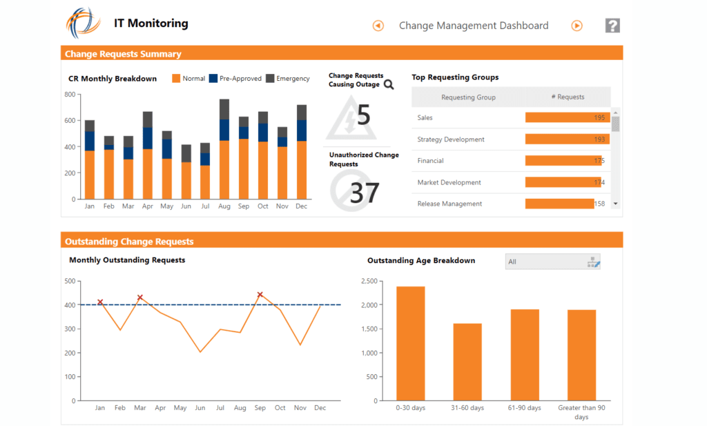
First, we have Dundas’ operational dashboard for IT operations. Such dashboards are known for tracking data in real time and displaying general key metrics for users. As you can see, the layout of Dundas’ dashboard is quite simple but still efficient. It has all the necessary information for IT monitoring and allows users to watch the outstanding requests as well as the overall number of requests and top requesting groups.
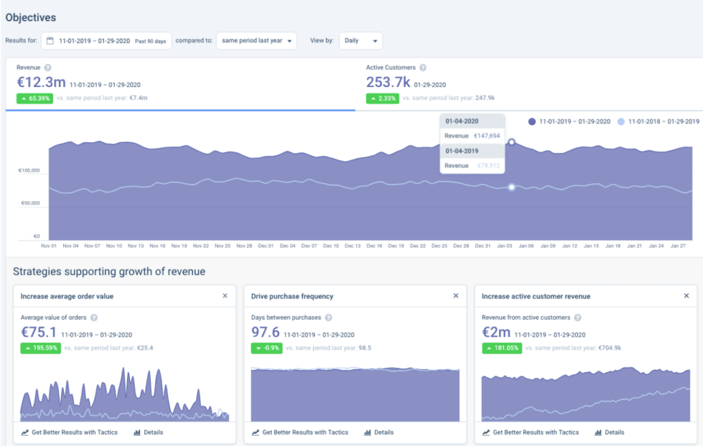
Strategic dashboards keep track of the company’s progress towards its long-term goals. Here you can find general objectives and monitor the results. Dashboards like this make it simple to observe business growth and assess the effectiveness of your current strategies.
You can see daily insights here. However, it can be switched between weekly and monthly results as well.
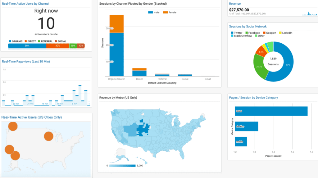
When it comes to analytical dashboards, the situation is slightly different. They usually focus more on specific areas within a department, unlike the strategic ones that provide a whole overview of business processes.
Without any doubt, Google Analytics is the most famous analytics dashboard. It looks clear and creative at the same time, offering you a quick look at your website’s performance. You can use numerous widgets here to make the data more structured and uncomplicated. In case you’d like to get more insights, there is a possibility to drill down a little deeper.
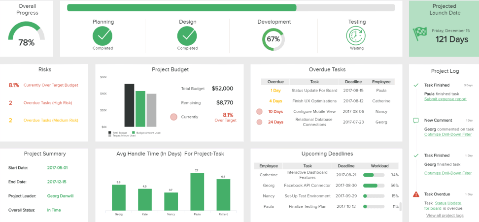
Last but not least is a tactical dashboard, which may include elements of both strategic and operational dashboards. Its main distinction is a focus on a sole project or area of organization. They are amazing for IT projects and often contain different metrics that help supervisors keep up with the dynamic work process.
As shown in the example below, a tactical dashboard can be presented as a project overview with particular timelines. You can monitor the efficiency of numerous parties, see your progress, and determine the risks. Once the project’s done, you’ll be able to assess the results and make up an IT report.
On a Final Note
In modern web design, dashboards play a crucial role in providing users with easy access to complex data, which helps companies avoid confusion and build trust with their customers. As a result, dashboards have become an integral component of many websites and web applications.
There are various types of dashboards, each with its unique features and design requirements. To create an exceptional dashboard, it is essential to consider all the principles, peculiarities, and tips discussed in this article. It is worth noting that the popularity of dashboards is constantly increasing, making it crucial to understand the intricacies of their design process.
By carefully considering the dashboard’s purpose, audience, and the data it presents, designers can create an intuitive and visually appealing dashboard that provides users with the information they need. Moreover, dashboards can be designed to promote user engagement and encourage interaction with the data. By doing so, companies can build stronger relationships with their customers and enhance their overall user experience.
If you have any further questions, do not hesitate to contact us, and we will respond promptly.

Copied!


