Outline:
To make your website work effectively and beneficially, it must be not just user-friendly but also fresh and swanky in its design. Therefore, we can say that a good design should meet the criteria of convenient user experience along with its visual relevance. That is why the created resource shouldn’t look divorced from the current web design trends.
Moreover, thanks to the wide technical capabilities developed over the past few years, websites have become more functional and eye-catching. Our UI/UX design agency also believes that 2022 is the year when sites that follow the right direction toward clarity, openness, and simplicity will be the ones that will conquer the market.
And since we do care about our clients, we decided to share with you the latest websites trends that will help you improve your site, grab the attention of customers, thus enabling your business to stand out from the rest.
How has another pandemic year changed the design world
Frankly speaking, 2021 was a truly impressive year in terms of design development and usability. Last year’s situation with the pandemic and self-isolation showed that it’s extremely difficult to retain clients for those companies that do not have a convenient modern website or application. And if in 2020 everyone was just trying to adapt to new realities, the following year was accompanied by a real boom in all spheres related to IT, including design. And as a result, almost all businesses felt a strong need for a high-quality online resource.
It seems that the pandemic is not going to leave us for quite a time, which means that the importance of UX and UI will only grow, and the tools for their development will receive new functionality and peculiarities. For example, Figma, a vector graphics editor, has launched a voice chats feature so that its users could experience such a desired and inaccessible thing as live communication.
Moreover, this prolonged presence of Covid-19 implies not only the fact that we will continue enjoying round-the-clock family time but also that the trend for interaction and collaboration between designers around the world will only intensify. This phenomenon, in its turn, will significantly enrich and improve graphic design, accelerate the information and experience exchange, expand traditional boundaries, thus paving the way for common creative space.
What was trendy last year
Before starting our journey across 2022 design trends, let’s together, along with our mobile website design company, recall those that were popular in 2021 and have a quick overview.
Parallax animation and other scroll effects
The parallax effect is a kind of animation that always looks expensive and premium and allows you to create the feeling of movement, volume, and spatial depth. This effect may be employed in websites for various purposes:
- To spice up the resource
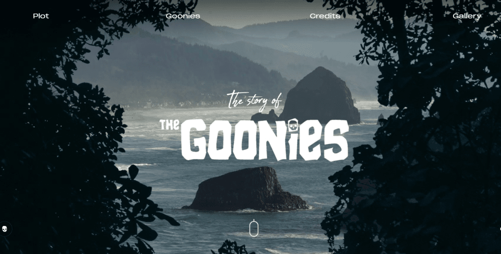
The only way to stand out from the competitors is to apply some interesting design solutions. And the parallax effect is a good choice since it can be used to enliven illustrations or text and add some depth to the website without complex design frills. Take a look at the website of The Goonies. Here they invite you to join their alluring world. Who can reject such an invitation, right?
- To highlight the product
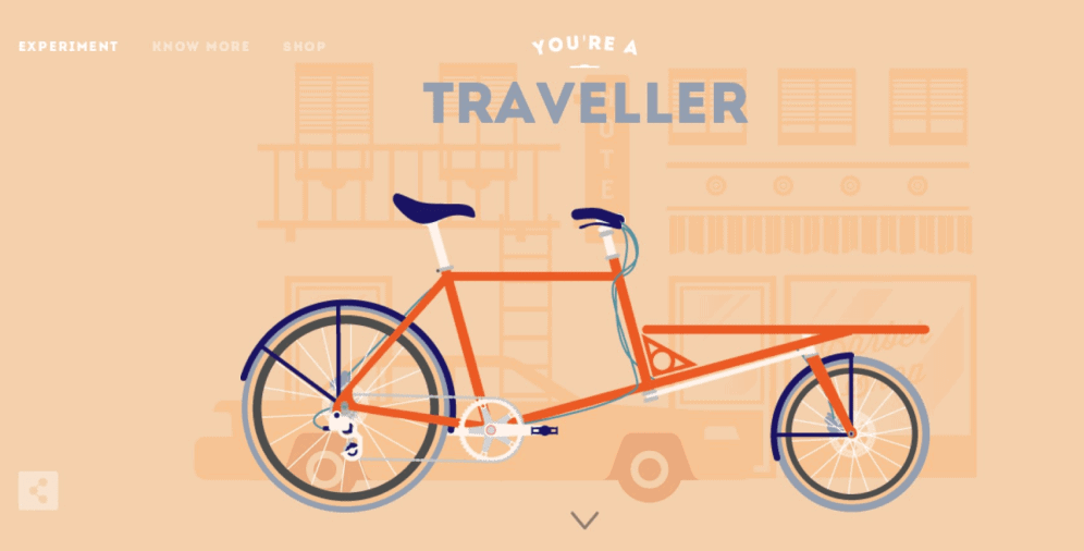
Parallax is an amazing tool that helps to draw the users’ attention to one single object. How does it work? The key object (an advertised product, for example) is placed on the top “layer” while the background with some information may change within the scrolling. The Cyclemon website is a wonderful example.
- To show dynamics and process
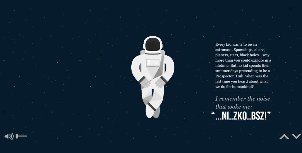
It’s more suitable to utilize the parallax effect if the company offers some services rather than products as it will make the illusion of movement, thus engaging the website users so that they are more likely to apply for the service or place an order. One of the brightest examples is the Nasaprospect website.
Animations
The animation was another vivid and eye-catching 2021 website design trend. If these elements are made professionally, then, certainly, they will get a positive response from users and make them stay longer on the site.
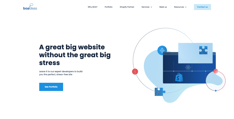
In many cases, animation effects are used to draw the website visitors’ attention to essential details. They may also be utilized to emphasize the clickability of an element against other elements on the page. Just take a look at the BOA website with its cool animation. And as long as they offer their services in developing websites, such a reflection of their activity is more than advantageous.
Animation is also able to report certain states of the page (loading, downloading, etc.), somehow distracting users. The thing is that in these situations, animation affects the way website visitors perceive time. It creates the sense that the action is being carried out faster than it really is. There are many examples you can find on Dribble or Icons8, and below, there are some of them.
Gigantic titles
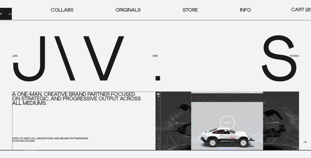
As of today, users have less time to spend on websites searching for the necessary information. For this reason and to capture the attention of visitors, modern web design has begun to adapt to the typography of unusual size. Moreover, huge texts not only help to focus users on the main things, but they also add some funny oddness and charm to the site. Check out the website of Jon Way Studio.
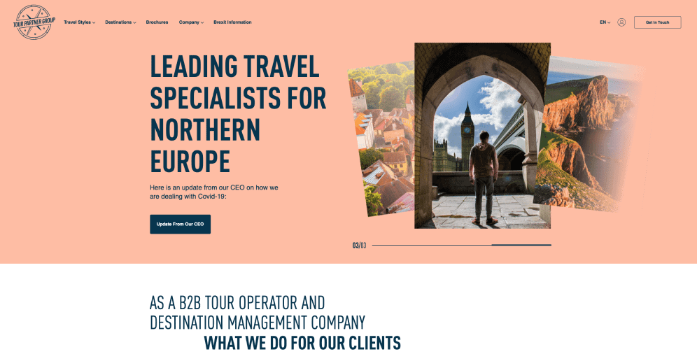
Furthermore, titles of extreme sizes are quite dramatic, extravagant, and appealing, and they definitely may cause a wow-effect on website visitors. It doesn’t matter whether you use them only or in combination with fascinating graphics – such titles will clearly and loudly convey the company message. And the Tour Partner Group website just incredibly demonstrates that.
Data visualization
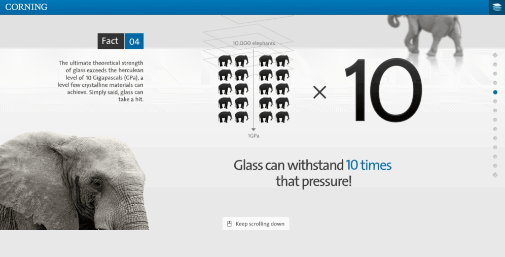
It has long been proven that most people are visual learners, and it’s easier for them to perceive information through images. Therefore, data illustrations help display statistics, explain dependencies, and draw appropriate conclusions. Look at how Corning Glass Class presents glass properties.
Data visualization assists not only in structuring the data for more effortless perception but also evokes an emotional response from users: graphs, diagrams, and charts make content much more interesting, engage customers, and help them visualize the information provided. That is why, in 2021, the user-friendly way of delivering data was highlighted. And this is how The Software House did it.
Custom illustrations
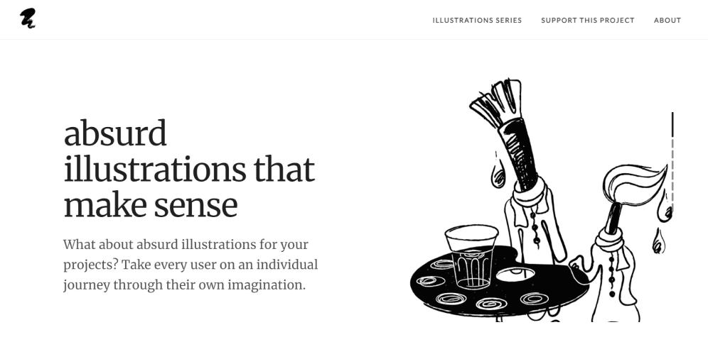
The main reason for the vogue for custom illustrations was a huge number of stock images that led to the fact that the majority of projects looked the same way and lacked any individuality — such an approach will not make anyone happy or satisfied. Custom illustrations are a different matter. They are created specifically for the product, its target audience, and communicate the company’s uniqueness. Just have a look at the main page of Absurd Design.
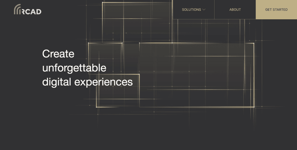
Moreover, one-of-a-kind custom graphics on the website are an excellent way to make the resource original, create a special atmosphere, and grab the users’ attention. Abstract drawings, watercolor effect, characters — illustrations in web design are limited only by the author’s imagination and creativity. In addition, compared to a photo or a picture, custom illustrations can convey the brand concept much deeper. Here is an example of the RCAD website.
3D illustrations
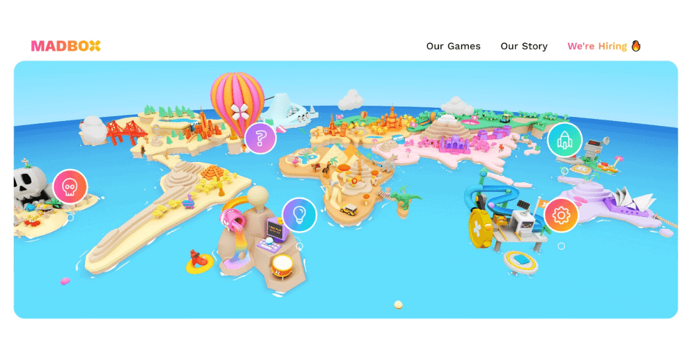
Most of the time, 3D illustrations appeal to the feelings and emotions of users. Shapes, colors, dynamics, texture — all of these elements have a direct impact on the perception of your brand. Just between us, users love stories. And the employment of such illustrations is a fantastic way to tell these stories. The aftertaste left by them will be much stronger than that left by static pictures or texts. That is how Madbox coped with this task.
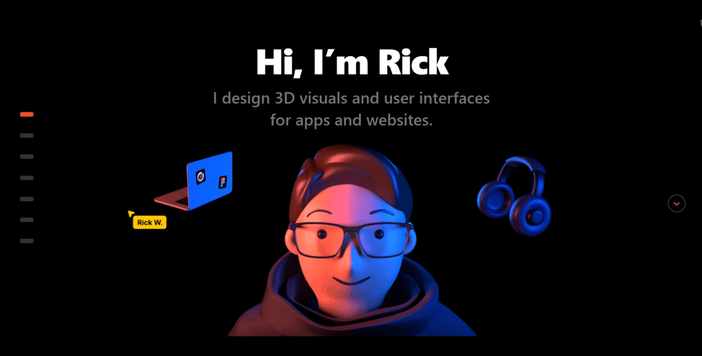
Besides, 3D illustrations do not only make the website unforgettable but also improve the user experience and allow companies to control the visitors’ attention. The main thing is not to overplay them: these elements should look suitable, not complicate the interaction with the site, and not slow down its loading speed. Below you can find an example of the website of Rick Waalders.
Dark design mode
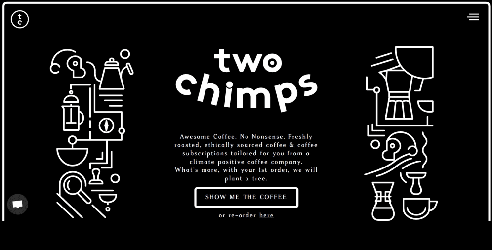
The dark design mode has been around for a long time, but due to several factors, it has become a trend only in the last few years. Firstly, if this mode is built appropriately, it will substantially reduce the eyestrain (especially at night), and the information will be perceived much easier. Take a look at the website of Two Chimps Coffee.
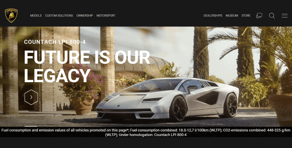
Secondly, the dark mode often allows companies to create a more stylish design since almost everything looks brighter, richer, and more elegant against a dark background than against the light one. And this is the feature of our perception, the way our vision works. Consequently, thanks to these and other reasons, this mode joined the website trends of 2021. And the Lamborghini website is a marvelous example.
What are the new trends in web design
These and other tendencies have come into web design, making the websites look outstanding and unforgettable. Most of them continue to grow and improve, but we shouldn’t forget that design has a lot in common with fashion, and its trends are constantly changing. That’s why to keep up with the latest tendencies in web design, let’s discover those that will certainly help you win the hearts and minds of customers.
Memphis design
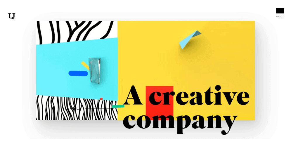
The style opposite to minimalism is Memphis. It appeared in the 80s, and since everything in fashion is cyclical, today, this design is experiencing its reincarnation. Memphis is a style that combines bright, saturated colors and a range of different forms. Geometric shapes are considered the central elements here, and sans-serif fonts with a high level of visualization are widely-used. With the help of this style, the resource looks truly cheerful and vivid. Therefore, if there’s a need to add some fun, creativity, youth, and dynamism, Memphis design is the right choice. Upperquad is a digital studio that looks so fresh that no one can get past it.
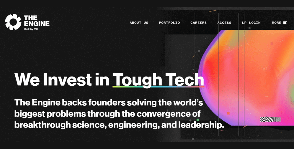
Memphis style may also be used to design websites of more demanding business areas. It can be introduced by applying a few elements and picking not so bright colors but rather soberer, pastel tones. And there should not be too many of them as they may eventually distract users from the main point. The design of The Engine website is a great proof of the Memphis style relevance in a fairly serious field of operation.
Typographic hero image
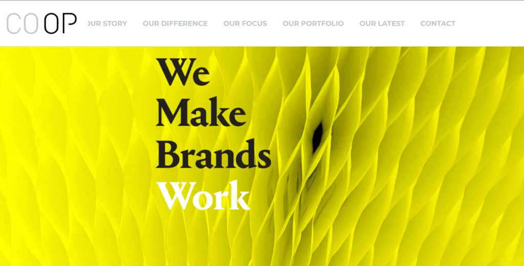
There was a time when it was generally recognized that the image is the main website visual while the text is just a semantic part. However, recently it has drastically changed. The designers recalled that the letter is also a graphic element, and it was the right time to use it accordingly. As a result, the practice of employment typography instead of images is gathering pace. Just take a look at the Coop website, where there’s nothing else except the company slogan.
When it comes to hero image, then, in 2022, masterfully selected fonts and their proper combination in typography can replace it and give a lot of information about the project essence, the type of audience it is designed for, and the goals it pursues. And PontemGroup shows it to the greatest extent possible.
Retro revolution
It’s silly to deny that the classic look of the websites from the early 90s has become one of the most popular web design trends. It seems like the 90s are back in the 2020s with their vibrant colors, geometric shapes, patterns, and the ubiquitous application of iconography.
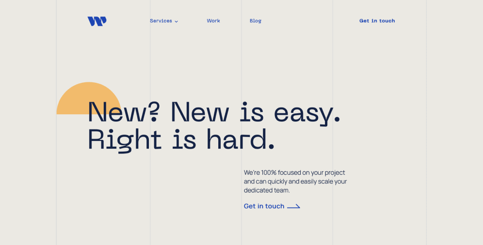
Fortunately, this style has never completely disappeared, and, in 2022, web designers will also actively utilize it to create a nostalgic atmosphere of those years, distinguish themselves from the competitors, and emphasize diverse product features. For example, the look of the Wilder website immediately evokes warm, sentimental feelings.
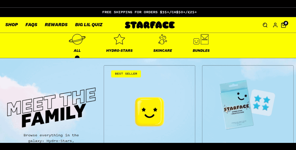
Unlike the time when the sites were full of an excessive amount of unnecessary features that affected the UX, today’s resources will cause a wistful smile in the customers. Furthermore, they will also meet all the requirements for smooth and flawless user interaction with the website. And the case with the website design of Starface serves as its solid evidence.
Inclusive copy
Any good web design strives to create products that will physically, cognitively, and emotionally suit each and every customer. And this is why the WCAG guide was developed — it contains rules for creating an inclusive design.
Inclusivity is a website design method according to which products and services are made and represented in a way that they are accessible to as many people as possible, regardless of their age, gender, or physical abilities. This design puts users at the forefront and helps designers understand the best way of meeting human needs. And our agency is not an exception since such an issue is of vital importance to us.
Therefore, web design should meet the following requirements:
Manageability — users should be able to adapt the website interface themselves, through the settings available on the resource, for instance.
Stability — for users with special needs, the set features should be preserved even after updates, redesigns, or other introduced alterations.
Clarity — companies should not communicate with the audience in the language of professional terms only. The simpler the content is, the better it is understood.
Perceptibility — users should have a chance to perceive information by any available means (voice assistants, artificial intelligence, etc.).
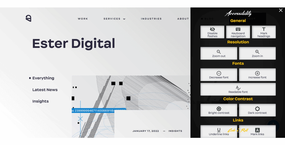
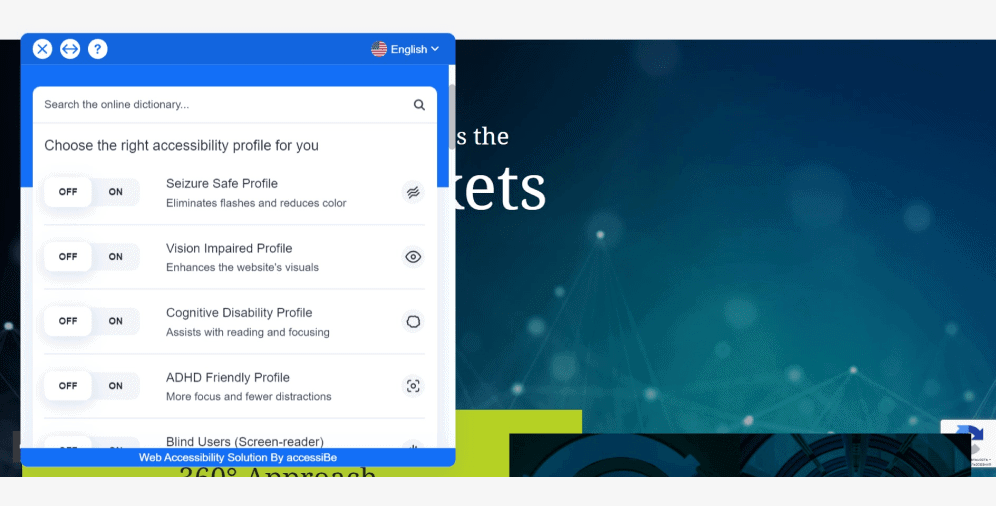
Below, you can see how thoughtfully StepStone designed its accessibility settings.
Neo-brutalism
Application of unaligned blocks, asymmetry, multiple fonts, or overlapping elements are a visual hell for a perfectionist. In web design, the combination of such elements is called brutalism.
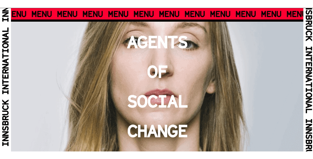
Brutalism is a bold, grungy style that doesn’t strive for perfection. This style has its specific principles that should be realized. For example, here, functionality takes precedence over appearance, and there are no soft shapes or shadows in brutalism. In this style, you may also find diverse visual errors (made on purpose), while symmetry, animation, and color compatibility are totally missing. Just look at the website of Innsbruck International. They know for sure what brutalism stands for.
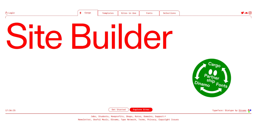
To mitigate this effect, neo-brutalism will become one of the trends in 2022. It will combine the roughness and extremes of brutalism with the softness and restraint of minimalism so that no perfectionist will be injured while staying on the website. That is how the website builder Cargo implemented neo-brutalism.
Moving type
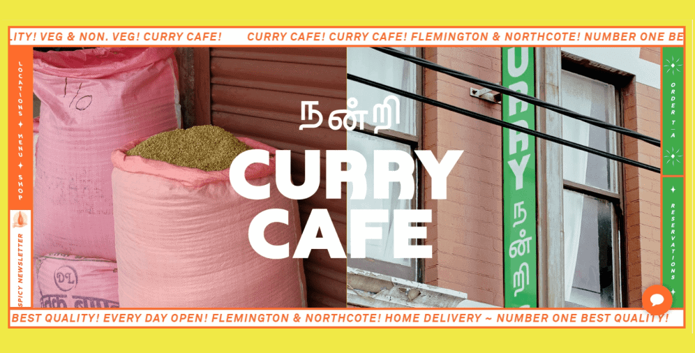
Animation is not a new phenomenon in web design. However, in 2022, besides graphics, it will also deal with texts and be presented in various forms. For instance, as “news tickers” into which you can insert the latest news, announcements, greetings, discounts, current time and date, and other interesting and useful information. Thus, the website will get another tool for both: catching the attention of site visitors and carrying out advertising campaigns. Take a look at the Curry Cafe website, where you can see how essential information runs around the hero image.
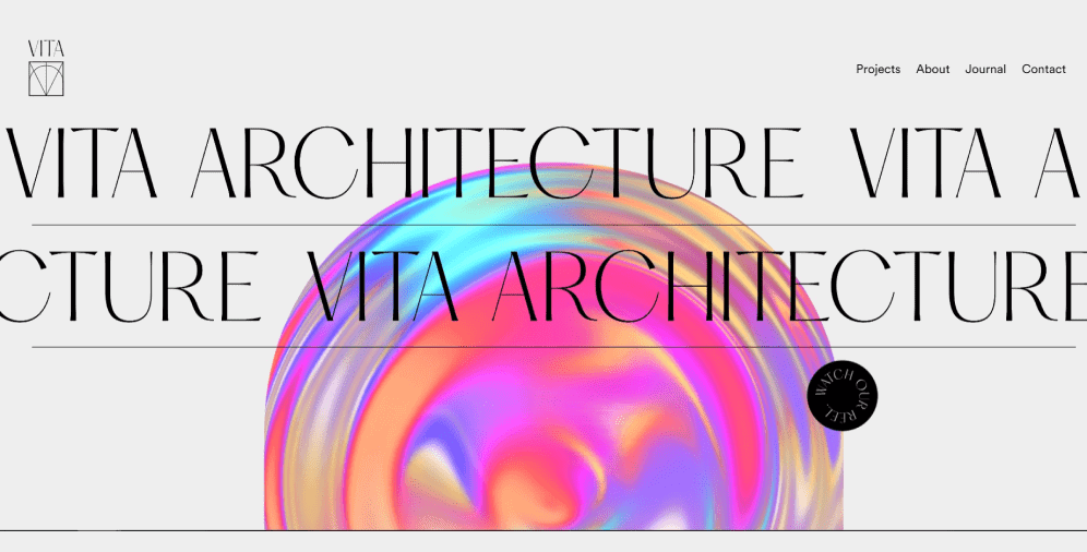
Moreover, these animation effects make it easy to build animated designs, where the text can move from one edge to another, float, and even slide across the design. Such a technique can’t leave anyone indifferent. And the moving text placed on the Vita Architecture successfully shows it.
Creative scrolling experiences
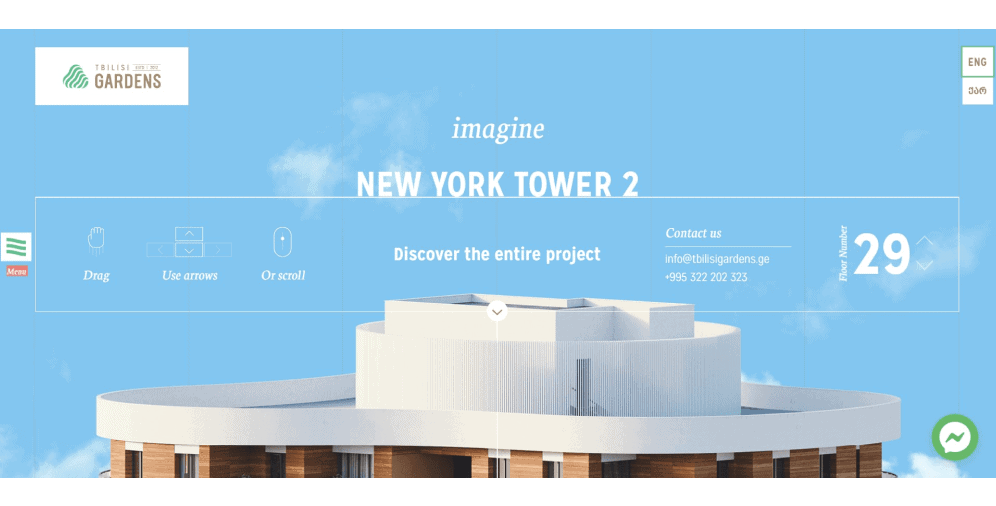
Scrolling is one of the main tools for user interaction with the interface. In modern website design, it should be not only simple but also memorable and creative. Simplicity here doesn’t mean how physically easy or hard it will be for users to scroll through the page, but how smoothly their eyes will follow the flow of information. The web page design should have some kind of anchors that will lead visitors. And this mission is possible, for instance, by creating a single background space where each further element will be perfectly combined with the previous one within the style or the curve of lines. Tbilisi Gardens’ website offers its users an amazing scrolling experience.
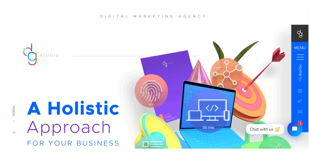
You can also develop easy scrolling with the help of such an animation, in which each subsequent element will appear after the previous one. Furthermore, one of the scrolling trends in 2022 is its transformation. Here, the design elements change their position or shape along with the mouse movement. Below, you can find such a creative solution showcased on the DG Studio website.
Handmade graphics
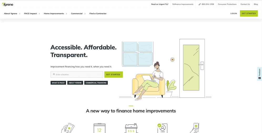
As we all know, handmade implies the creation of unusual, somewhat unique things with our own hands, rather than employing boring standard templates. In web design, this trend denotes the utilization of hand-written fonts, hand-drawn images, jagged underlinings, and other elements that show the human presence in their production. The following YGrene website explicitly reflects this idea.
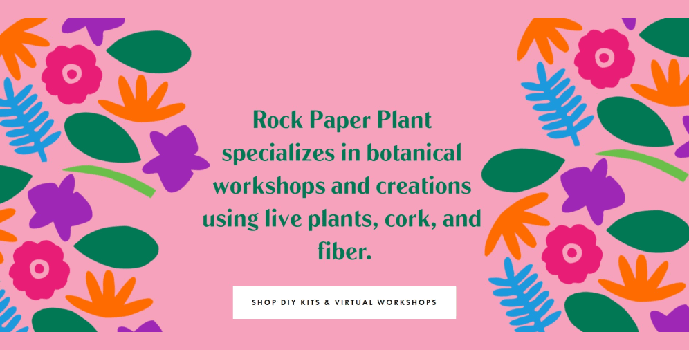
The advantages of such a design are originality, catchiness, and excellent communication of a creative course, which directly influences the project prominence. When, for instance, strict and accurate computer graphics cannot echo an imaginative approach, then childish, naive, or quite careless handmade comes to the rescue. This style may be employed separately or along with traditional web trends. Anyway, it will look great. Across the whole website of Rock Paper Plant, you can observe how cute and lovely it may look (as if it was designed by children).
Contact us right away

Gradients
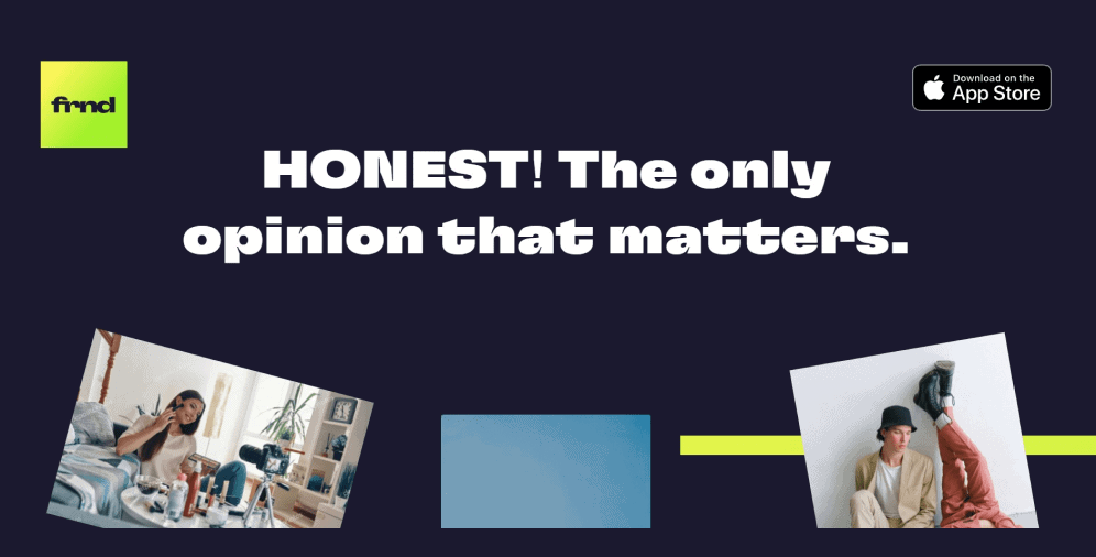
Today, it’s almost impossible to surprise anyone with gradients, but this effect continues to evolve and stays in trend even in 2022. The main secret of the gradient effect is the right combination of shades — you can use the company brand colors or experiment with various sober color palettes. This is how an iOS application FRND employs gradients. Looks fascinating, right?
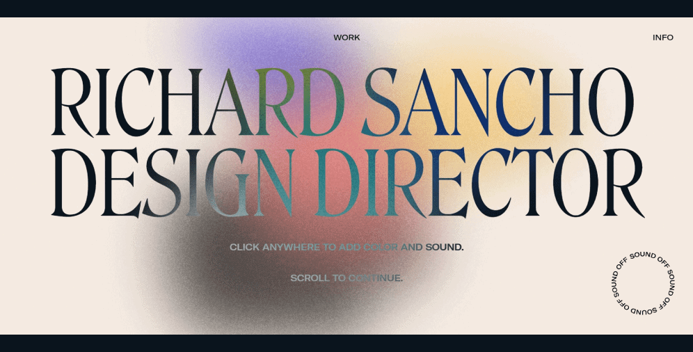
Grainy gradients, in their turn, create a completely different feeling. They make the design more natural, enrich it with texture, add depth to the graphics, create a sense of volume and realism. And since the gradient is pretty self-sufficient and can catch the users’ attention without the need to apply any other elements, it’s crucial not to overload the design. That’s why this technique perfectly goes along with minimalism and large typography. Probably no one can argue that the website of Richard Sancho is a fantastic example of employing the grainy gradient.
White space
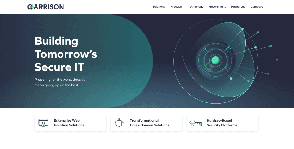
White space, or negative space, is a phenomenon in which there’s room between design elements. The idea derives from minimalism and states that a sufficient amount of space allows focusing the users’ attention on significant elements only: text, photo, title, etc. Negative space does not just define the boundaries of objects located on the page but also builds connections between them, thus creating an outstanding visual composition. Check out how aesthetic and laconic the Garrison website looks.
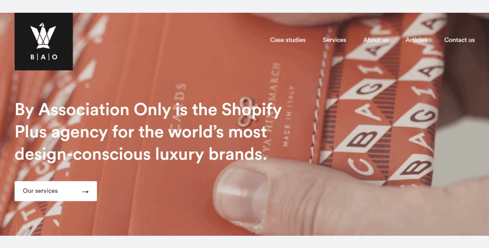
Furthermore, it’s worth mentioning that the term white space has nothing to do with the white color and does not imply its strict usage. The thing is that the term comes from the print design, from the time when the texts were typed against the white background, consequently, the free space was of the same color. But that time has passed, and now you can employ any color, texture, pattern, or background image you like. Looking at By Associations Only, it seems like this company is already aware of this concept and actively utilizes it.
As long as the development of web design doesn’t stand still, there’s a need to constantly monitor the changes it brings. This year they vary from bright retro and Memphis style to neo-brutalism and gradients. And while working on the website design, it’s vital to look for a golden mean between beauty, fashion, and functionality. Otherwise, there’s a risk that the site will look tacky or repulsive. And we don’t want that to happen, do we?
On a final note
Many UI and UX design trends of 2022 will carry over from the last year, and as you can see, they aim at improving the users’ interaction with resources and are moving towards something frank and natural. But just like with any feature or function, it’s crucial to keep moderation in mind, thus not trying to cram all the styles and elements into one website.
In this article, we have shared with you some trends we hope will enable you not only to stand out from the rest but also attract more visitors to your website. In any case, if you still have some questions or you need help with the design, our team of professionals is always at your disposal. Contact us, and let’s enjoy our fruitful cooperation together.

Copied!


