Outline:
The first steps of web design are crucial, and among them is choosing the appropriate layout. Your website’s layout is the foundation that determines how users will interact with your platform, and whether that experience will be seamless or interrupted. Naturally, you don’t want it to be too complicated and drive visitors away.
While eye-catching colors, high-quality images, and compelling content are great, it’s of little value if they are not built upon a solid foundation. In this article, our responsive website design company aims to emphasize the importance of selecting the right layout and delve into its key elements. We will discuss various types of layouts, tips on how to design a website layout, and provide inspiring ideas and examples to help you make the most out of your UI UX design.
Website Layout 101: Understanding the Basics and Importance
In essence, a website layout refers to the deliberate arrangement and adjustment of all visual elements on a web page. These elements are never placed randomly, as a proper arrangement helps to enhance the user experience.
Also, a website layout plays a crucial role in determining the hierarchy of a page’s content and makes navigation clear and easy for users. It influences what visitors notice first when they open a website and what elements hold their attention the longest. Properly organized and selected layouts can significantly improve a website’s usability, enhance engagement rates, and provide visitors with a positive experience.
It is worth noting that a website’s layout goes beyond just aesthetics. The layout should align with the website’s purpose and target audience, as these factors play a significant role in determining the layout’s effectiveness. By considering these elements, designers can create an intuitive and user-friendly interface that helps visitors achieve their goals efficiently.
What to Consider When Choosing the Right Website Layout
When selecting a website layout, there are several essential considerations to keep in mind. Firstly, users are more likely to focus on the whole page when they first visit your website, so it’s important to provide a clear and original path for them to follow.
While creativity is valuable, it’s vital to ensure that everything on the page is easily accessible. A good layout should help users find the information they need quickly, while a poor one will only confuse and frustrate them, leading them to leave promptly.
Another vital factors are the correlation between your content and layout and the importance of classic designs.
Every website should have a message for its users, which is effectively delivered through its content. While the content of websites may vary significantly depending on their specific business, the website’s layout should always be fitting for its purpose. For example, an online store should select a layout that presents products or services effectively, while an information resource should consider using a news or blog layout.
While creativity can make a website stand out, classic layout options can be more effective in certain situations. Common layouts are more familiar to users, making them feel more comfortable, and leading them to stay longer on your website, which can be beneficial for your business. It’s worth noting that a classic layout can still be customized to fit your brand’s style and requirements.
In summary, choosing the right website layout is akin to building a solid foundation for your home. It requires careful consideration, a review of multiple options, and an understanding of its importance in the overall success of your website performance.
Exploring the Best Website Layout Types: Tips & Use Cases
Choosing a layout that is both visually appealing and user-friendly might be difficult. There are numerous layout ideas to choose from, and each has its unique benefits and drawbacks. To help you make an informed decision, we compiled a list of the most popular layout types and their use cases:
Z-Pattern Layout: A Simple and Effective Design
The Z-Pattern layout is an effective way to design websites with big images and landing pages that aim for high conversions. The pattern follows the way users typically scan a web page in a zig-zag pattern, starting from the top left corner and moving to the right, then diagonally down to the bottom left corner and up to the right one. This way allows users to quickly scan information and decide whether it’s worth their attention. To make the most of this layout, ensure that the most important information is placed in the diagonal part of the pattern, while the bottom line often features engaging CTAs.
F-Pattern Layout: Ideal for Content-Rich Websites
The F-Pattern layout is a similar design to the Z-Pattern, but works best for websites with lots of content, such as news portals and blogs. The layout is based on the F letter shape, with the first horizontal line being heavy with text and catching the most attention. The vertical line of the pattern can help you make the page look less cluttered and more appealing. Visitors typically stay longer on the top part of the page, so it’s important to place the most engaging content at the top.
Fullscreen Image Layout: Showcasing Stunning Visuals
The Fullscreen Image layout features a huge image that takes center stage, allowing users to see who you are and what you represent. The image can be accompanied by a video or illustration, and the most important thing is to ensure that your visuals are of high quality and engaging. This layout suits best for businesses that obtain amazing visuals, such as photography websites or those selling specific products.
Split-Screen Layout: Combining Different Content Types
The Split-Screen layout is an excellent choice for websites that offer various types of products or services or combine written and visual content. The layout is divided into two equal sections by a vertical line in the middle of the screen, allowing web designers to bring distinct ideas to life and showcase the same one from completely different angles. The two sections should complement and emphasize each other’s peculiarities and not fight for attention.
Asymmetrical Layout: A Creative and Dynamic Design
The Asymmetrical layout is an option for those who want to split their screen into different parts, but this time, not equally. Due to the asymmetrical design, the entire layout often seems more engaging and dynamic. You can use different colors, styles, and image sizes to make your sections more diverse. One part of the layout is usually highlighted, where the most vital information is placed, and is great for innovative, unique businesses that want to show their creativity and involve visitors immediately.
Single Column Layout: A Simple and Direct Design
The Single Column layout contains all its content within one vertical column, making it a simple, calm, and direct way to design a web page. Visitors can smoothly navigate through it by scrolling down, and it’s essential to include a “Back to top” button for users’ convenience. If your website incorporates a lot of content, divide it into paragraphs and include some images to avoid overwhelming readers.
Box-Based Layout: Perfect for Portfolios
The Box-Based layout merges content into multiple boxes, with each box containing a link to a different web page. The most important eye-catching content can be placed in one big box, with a couple of smaller ones. This layout is perfect for portfolios or any other website with lots of images.
Card Layout: Versatile Design
The card layout is a versatile layout that uses boxes to present different types of content. This layout has no strict hierarchy, and all elements are mostly equal. This means that everything is approximately the same when it comes to their sizes, fonts, etc. The design looks great on all kinds of digital devices and is known for its simple and intuitive navigation. It can be used for big websites with lots of content, such as online stores.
Magazine Layout: Content-Heavy Websites Made Easy
The magazine layout is a popular layout that mimics the design of printed newspapers and magazines. This layout is usually shaped in the F letter pattern and has big headlines that easily grab users’ attention. Although the magazine layout follows a specific pattern, you can still split your content into smaller pieces or play around with the colors, fonts, and sizes of your elements. The magazine layout is perfect for blogs, news portals, or any content-heavy website.
Horizontal Stripe Layouts: Engage and Inform
The horizontal stripe layout is a unique layout that comprises full-width stripes that are all different and contain their own content. These stripes are designed in similar styles and color schemes, and some of them may contain visuals while others contain text blocks, and sometimes everything is mixed. Horizontal stripe layouts are usually long and require some scrolling down. They are perfect for landing pages of any kind, where you want to showcase a lot of information in a visually appealing way.

The Power of Intentional Design: Goals for Your Website Layout
We hope now you know what type of website layout you need for your website. However, as for designing one, it’s paramount you understand the core goals of website layout design.
A well-designed website layout can make or break the success of a website. It is the foundation that sets the tone for the user experience and ultimately determines the website’s success. To create an effective website layout, it’s essential to set clear goals and design with intention. So, here is the list of the core goals of website layout design:
- User Experience: User experience is the primary goal of website layout design. The layout should be intuitive and easy to navigate, ensuring that users can find what they’re looking for quickly. It should also be visually appealing, with a design that’s consistent with the brand’s image.
- Branding: The website layout should reflect the brand’s identity and values. The layout should use colors, fonts, and imagery that are consistent with the brand’s image. This will help users identify and connect with the brand.
- Content: The layout should be designed to showcase the content effectively. The content should be organized in a way that’s easy to read and visually appealing. The layout should also allow for the easy addition of new content.
- Responsiveness: The layout should be responsive, meaning it should be optimized for all devices, including desktops, tablets, and mobile phones. This will ensure that users have a consistent experience regardless of the device they’re using.
- Conversion: The layout should drive conversions, whether it’s through sales, sign-ups, or downloads. The design should encourage users to take action and make it easy for them to do so.
A Comprehensive Guide to Website Layout Specifics and Considerations
In addition to the basic considerations and website layout design goals discussed in the previous section, there are also specific aspects of the layout one should consider for a consistent design result.
Dimensions and Padding
Web pages typically look good in the 1024×768 browser resolution. Responsive pages can be wider, while mobile pages are designed to fit 320px width. A columnar grid system with a certain column width is highly utilized these days.
Background Styling
To make the background effective, it’s better to choose a full-sized image, a pure color, or a tiled wallpaper. Avoid aggressive or irritating graphics and try to evoke positive emotions in users.
Page Color
Choose consistent colors that match your logo and brand style. Consider your target audience and business specifics before making a final choice.
Typography
Select a sans-serif font for main content since it’s easily readable. Use different fonts for titles to emphasize the difference between them and the main content area. Avoid mixing font families and overusing bolding, italics, and capitalization.
Header Sections
The header section typically includes a top-bar with links to social media, phone numbers, and emails. The logo area can be found below, with the company logo and slogan. The masthead area is below the logo area and can feature a singular image or a slideshow.
Navigation
The navigation menu can be placed vertically or horizontally, on a left-sidebar, above or below the masthead, or at the top as a hamburger menu on mobile devices. Short links on the navigation menu should fit into one line, with additional links available in a drop-down menu.
Body Content
The main content area of the page is one of the most important areas, as it can be indexed by search engines. Ensure your text contains a fair amount of keywords.
Sidebars
Sidebars are useful for contact or resource information, contact forms, secondary navigation, and more.
Content Elements
Consider using patterns popular among many businesses, such as 3 or 4 columns with images for services, with titles, brief descriptions, and links to their own pages. Ensure your page looks complete, but not overloaded with unnecessary information.
Footer and Sub-Footer Sections
The footer section, typically placed at the bottom of the page, should contain short links to basic information about the company, geography, and social media. The sub-footer is placed below the footer and is used to provide information such as a business license, copyright notice, and privacy policy.
An Overview of the Layout Design Process
Now, when you know all the considerations and specifics of layout design, we can move to its implementation. The website layout design process usually involves careful planning, wireframing, prototyping, and testing. Let’s delve deeper.
Stage #1 Planning: Identifying All Content Areas
Before designing a website layout, it’s essential to determine the content areas you want to include. Divide the content into comprehensive pieces and decide on their volumes to ensure that they fit together visually. Use squares or rectangles to represent the content, whether it’s text or images.
Stage #2 Wireframing: Creating a Series of Wireframes and Prototypes
Design a series of wireframes from simple to complex and compare them. Focus on the user experience, rather than chic graphics. Determine the best element arrangement for users and make it as engaging and intuitive as possible. Ensure that your layout is compatible with all screen sizes.
Stage #3 Iteration: Testing and Gathering Feedback
After creating a series of wireframes, present your options to colleagues for feedback and create interactive prototypes. Use tools like Figma to test all the buttons and navigation without actually building a web page. Find trial users and record their experience on your website to identify possible failures or UX stumbling blocks. Iterate until you’re completely satisfied with the outcome.
How to Design a Website Layout that Works
Layout design process may seem simple, but without a set of steps in mind it may turn into a daunting task. So, let’s look in detail and explore how to design a website layout step-by-step.
Step 1: Define Your Goals
Before you start designing your layout, it’s vital to define your main goal. Consider what type of business you’re promoting, the values you want to convey, and the website’s purpose.
Step 2: Put it on Paper
Write down your goals and any essential details that you want to include. Having a clear vision will make the design process much more manageable.
Step 3: Sketch the Top-Level Framework
Sketch out your website’s top-level framework, but don’t overcomplicate it. Have a few drafts to choose from to make sure you’re selecting the best option.
Step 4: Employ a Grid
Use grids to create connections between elements on your page. They not only show how all the elements interact but also give order to your layout.
Step 5: Choose Your Fonts
When choosing your website’s font, stick to simple, classic options like sans-serif for the main body of text. Reserve fancier fonts for headlines and titles.
Step 6: Think Simple
Make your layout intuitive and easy to navigate. Avoid giving users too many options, shorten your menu, and ensure all basic topics like “Contact” and “About Us” are visible.
Step 7: Utilize Negative Space
Negative space is essential to any website’s layout. It helps avoid overwhelming users and focuses their attention on the right items. It can also create a hierarchy of information to guide users in the right direction.
Step 8: Realize that Colors Matter
Colors have a significant impact on users and can encourage them to make quicker decisions. Consider your audience and their preferences to create a color scheme that engages them.
Step 9: Format Persuasive Copy Properly
Format your website’s text in a way that positively affects conversion rates. Place headlines center-stage, and divide content into sections to make it easier to read.
Step 10: Think About Users First
When designing a website layout, it’s essential to keep your audience’s journey in mind. You want to make sure your elements are arranged sequentially, making the navigation around them logical and convenient.
Step 11: Be Clear About the Outcome
Make sure your website layout guides your users through the entire process, leading them from the beginning to the final point. Clear and visible calls-to-action (CTAs) are the elements that can help you achieve this.
Step 12: Don’t Be Afraid to Borrow
Take inspiration from other websites and use whatever you find appropriate for your own business. There is no harm in borrowing and improving something that works.
Step 13: Go Responsive
Having a mobile-friendly website is vital for most businesses. It’s important to have a website that is easily accessible on any digital device, or else you’ll lose a lot of traffic, which will noticeably decrease your conversion rate.
Step 14: Feature Your Offerings and Smiling Faces
Large and beautiful images, such as happy people with your products, can improve your website’s conversion rates. These images will positively affect users’ trust level in your brand and encourage them to make a purchase more quickly.
Step 15: Strategically Place Trust Emblems and Social Proof Elements
Collect testimonials and images from your clients, put your partners’ logos on your website, or create links to case studies. The more positive feedback you have, the more reliable you will look into the eyes of your potential clients.
Step 16: Create a Solid Prototype
Prototyping is a good way to ensure your website will look the way you want while being highly efficient. There are enough tools that will make all the hard work for you.
Step 17: Pay Attention to Details
Every element on your website matters, from menus and images to colors and fonts. Be attentive to details, and you won’t have to fix anything afterward.
Step 18: Keep Testing
Try and change various elements on your website to see what your audience prefers. Even small things like CTAs can drastically influence users’ reactions. Keep testing, and you’ll achieve the desired results.
Step 19: Refine, Sharpen, and Improve
Take care of every single detail and try to sharpen it as if the whole website depends on it. Refine your elements and treat them with equal respect to get the finest layout in the end.
Step 20: Keep Improving
Even when everything seems to be perfect, there is always room for improvement. Remember that it’s vital to update your layout design to stay on the top of the user experience goals and that of your website and provide additional refinements to meet the demand of your customers.
Tips and Ideas to Create a More Attractive Website Layout
If you’re looking to create a website layout that not only serves its functional purpose but also captures the attention of your audience, these tips are for you. With their help, you can design a visually appealing layout design to be a magnet for users, leading to increased engagement, higher conversions, and ultimately, success.
- Use Real People Photography: Using stock images can create a disconnect with users. Utilizing photos of real people with genuine emotions can help build trust with users.
- Simplify Your Menu: A complex menu can be overwhelming and confusing for users. A short and clear menu with a topic hierarchy and a search bar can simplify navigation and enhance the user’s experience.
- Remove Additional Options: Multiple calls-to-action on a page can be distracting for users. Limiting options can increase the likelihood of users taking action quickly.
- Remove and Enlarge Images: Having too many images can overload a page. Removing unnecessary images and enlarging the necessary ones can make them more noticeable.
- Change Your Color Scheme: Experimenting with different color schemes can improve user engagement. Consider your target audience’s preferences and reactions to different colors.
- Consider Users’ Intent: Users typically visit a website with a purpose. Understanding their intent and arranging website elements accordingly can leave a lasting impression and enhance user experience.
- Add Trust Emblems: Including positive testimonials, case studies, or partner/client logos can prove your brand’s trustworthiness and build credibility with users.
- Make It Easy to Get in Touch: Providing multiple ways for users to contact you, such as a phone number, email address, or chatbot, can improve user experience and satisfaction.
- Drive Conversions with Content Hierarchy: Organizing content with a clear hierarchy can improve accessibility and user experience. Put yourself in the user’s shoes and ensure that everything is easily accessible.
- Get User Feedback: User feedback is invaluable. Gathering information and insights from user opinions can help you make informed decisions and continuously improve your website’s layout and design.
By implementing these tips and ideas, you can create an attractive website layout that will enhance user experience and drive conversions. Remember to always consider your target audience’s needs and preferences and continuously gather user feedback to ensure that your website layout is optimized for success.
The Top 10 Website Layout Designs That Will Inspire Your Creativity
Knowing the theory is always useful, but there is nothing better than a good example. Here you can see the top 10 examples of website layouts we absolutely love.
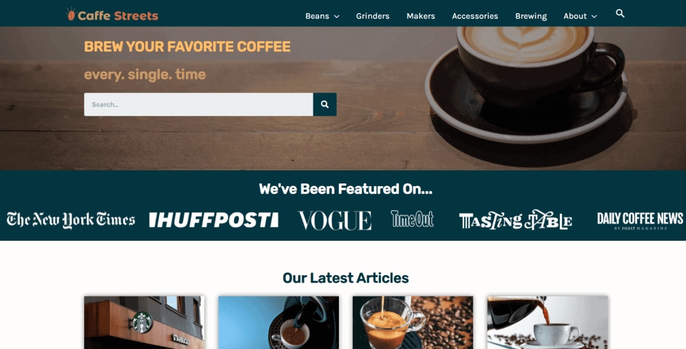
01 Caffe Streets
Caffe Streets is an engaging website with an intuitive header menu, high-quality images, and clear navigation. Its style isn’t complex but still up-to-date. The search bar is easily noticeable, just as the names of big companies they’ve been featured on. Their articles are put into smaller boxes that don’t overload the page. All in all, it looks nice and trustworthy, which engages visitors right from the start.
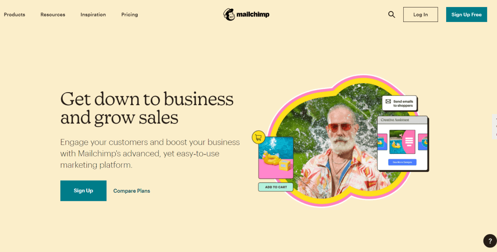
02 Mailchimp
Mailchimp is a well-known e-mail marketing company. Their layout contains the full-screen image and hidden header menu. It looks extremely simple and doesn’t overwhelm viewers, while the colors give a sense of calamity and assurance. The negative space between the elements here is pretty big that is also pleasant for the perception. Their layout is easy to navigate, and there are enough links that can be found in different sections of the page.
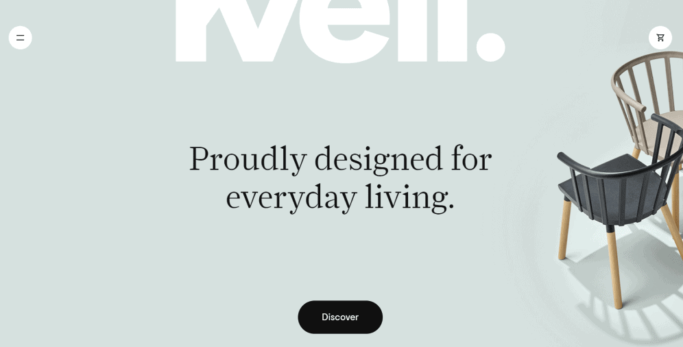
03 Kvell
Kvell is another amazing company whose purpose is to make contemporary and functional designs attainable to everyone. Their layout is also extremely user-friendly since it has a full-screen image and hidden links in the menu. Each link leads users to a new web page that is colored differently but still designed in a similarly simple way.
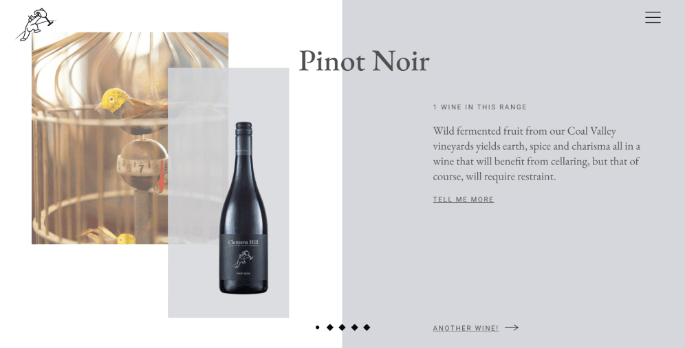
04 Clemens Hill
Clemens Hill is a wine company that was founded 20 years ago. Its website has a split-screen layout where images are put on the left side while the text block is on the right one. Their colors are soft and appealing, there are enough negative spaces, and the navigation system is amazingly intuitive.
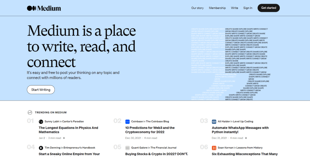
05 Medium
Medium is one of the most popular blogging platforms that provide visitors with a huge amount of information. As long as it’s a heavy-content website, the layout was made to help people perceive information without getting overwhelmed. It has a multi-column grid with a complex hierarchy and implemented small illustrations. There is also enough negative space that helps not overload the page and allows users’ eyes to rest. Overall, this style is close to the magazine layout and is perfect for resources with a lot of text publications.
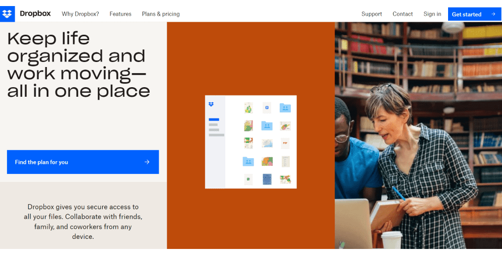
06 Dropbox
Dropbox has a complex layout with a lot of elements, which makes it amazingly dynamic. Here users can learn more with the help of the header menu or scroll down and find more information and links. Dropbox has numerous creative visuals and a simple navigation system that makes this layout even more engaging. Even though the website has a lot of content, it’s very intuitive and user-friendly.
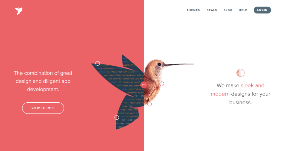
07 Engine Themes
Engine Themes is a great example of a split-screen layout that is divided into two vertical parts. Both of them contain a piece of text and share the same image but are colored differently. The website has a header menu and multiple links to other pages that you can find while scrolling down. The simplicity of design and easy navigation also makes this layout a great choice for this type of website.
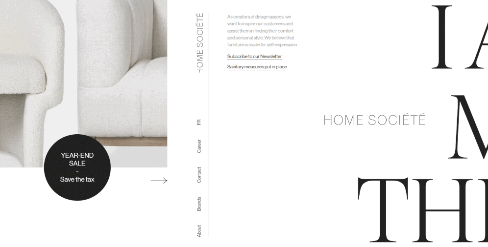
08 Home Societe
Home Societe gives us a brilliant opportunity to see a seamless asymmetrical split-screen layout. The block on the left side contains an image and vertical navigation, while the block on the right gives us a small piece of information with the bigger image. The transition between these two blocks is very gentle, and the soft colors make the whole page even more appealing.
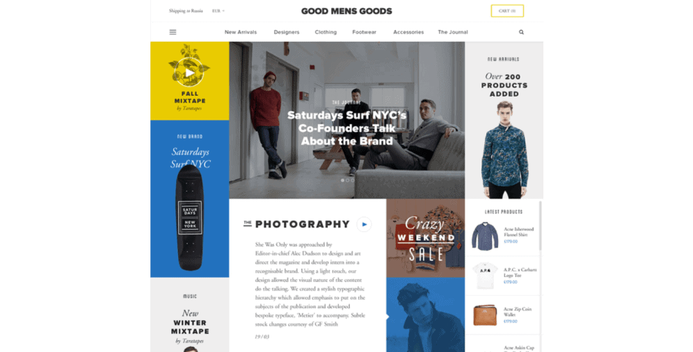
09 Good Mens Goods
This layout is box-based, engaging, and vigorous. There are numerous sections with both visual and text content along with the header menu. The bright colors perfectly suit the dynamic of this website, while negative space does its job to not overload the page.
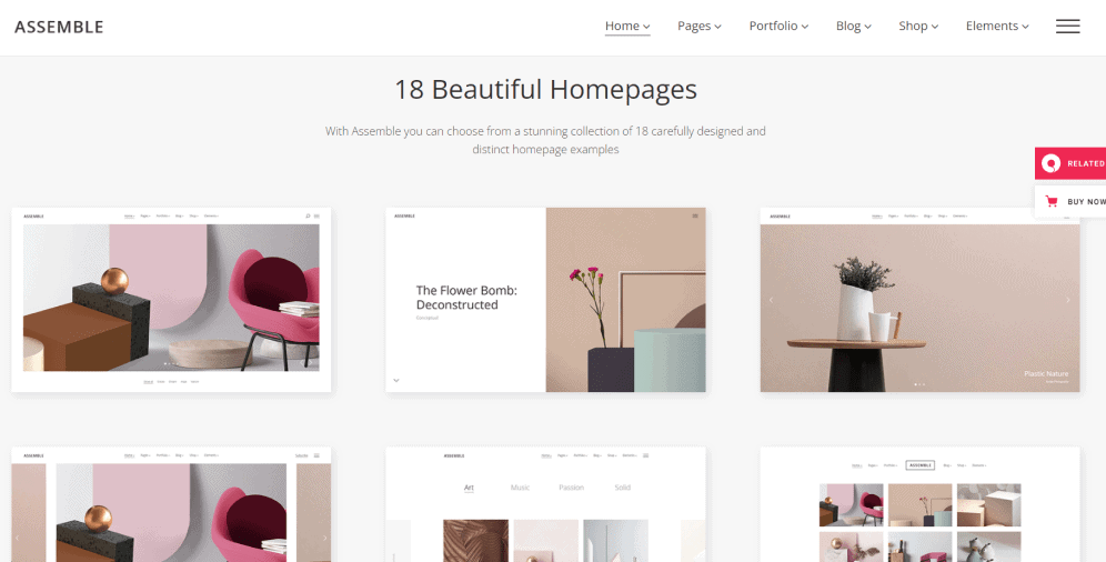
10 Assemble
Assemble’s layout is a grid of cards that hide lots of information under the beautiful, high-quality visuals. Such a structure allows providing users with a big amount of information while looking clear, fresh, and appealing. This layout is highly responsive and shows its elements with equal hierarchy. It’s a great choice for heavy-content websites that care about users’ experience.
On a Final Note
The website layout is a critical component of any website, as it can significantly impact its conversion, usability, and engagement rates. A well-designed layout should guide users through the site seamlessly, ensuring they reach their destination with ease. While the process of creating a website layout may seem daunting, we’ve provided some helpful tips to make it a little easier.
This article has explored how to design a website layout and provided some of the best website layout ideas for various types of businesses. We’ve emphasized the importance of a proper layout and discussed its primary goals. If you have any questions or would like to learn more about website layout design, don’t hesitate to contact our team. We’re always available to provide support and answer any questions you may have.

Copied!