Outline:

We think we are expressing everyone’s sentiment when we say that we’re happy that Christmas is finally here so that 2020 would be over. This year has been quite something, hasn’t it? The only thing that could make it somewhat bearable is if we dive into a consumerism pool and look through Christmas-related stuff online.
What happens when millions of people start browsing through websites in search of that perfect emerald turtleneck for their uncle that he’ll wear only once – at the Christmas table? That’s right, it means more visitors, more conversions, and more profit. Do you know how much Americans spend during the holiday season? Almost $1,000 each, and the number continues to grow every year, with e-commerce taking up a big chunk of the overall share.
Being the wise business owner that you are, you will jump on the Christmas bandwagon, and our UI design agency is going to help you with that! The variety of holiday-inspired decorations is astounding: from advertising gift cards to discounts and simply exciting visual experiences. Here’s our list of examples of how to decorate your website for the festivities.
Sephora
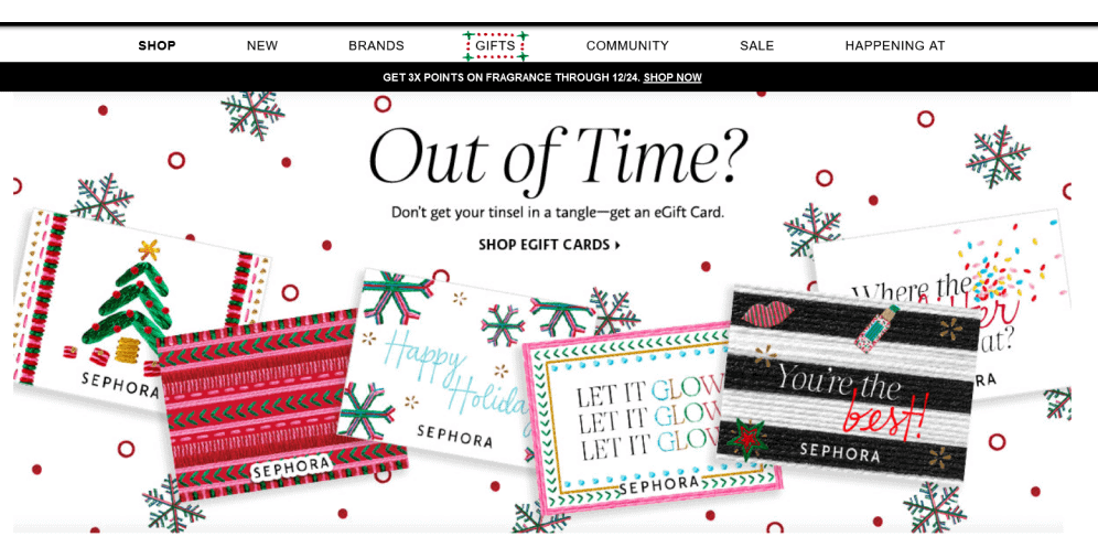
Being a world-known retailer of beauty and personal care products binds Sephora to be oriented on the outward appearance of their website and explore Christmas-related marketing possibilities. Christmas is a perfect time to treat yourself or your closest ones with a fancy beauty box or a gift certificate for future purchases.
That’s what Sephora focused on. If you’re in desperate search of a last-minute present, Sephora allows you to buy an eGift card quickly. It is a wonderful example of how you can advertise your product and incorporate a cheerful and holiday-inspired mood into it seamlessly.
The website design itself is not changed with any Christmas plugin per se. However, it usually features an editor’s picks or an eGift card ad, with traditional holiday colors and icons incorporated into the overall layout: snowflakes, red and green dots, and shapes resembling a Christmas tree. The clarity and transparency of the visuals lend themselves well to the Sephora brand style and don’t overwhelm the visitors with pushy advertising.
Starbucks
Another example of advertising gift cards on the main page is Starbucks. For whatever reason, coffeehouses are associated with something exciting and cheerful, just like Christmas! You can make yourself a cup of coffee with cinnamon, get a piece of crunchy gingerbread, and chill in the company of people you happily tolerate.
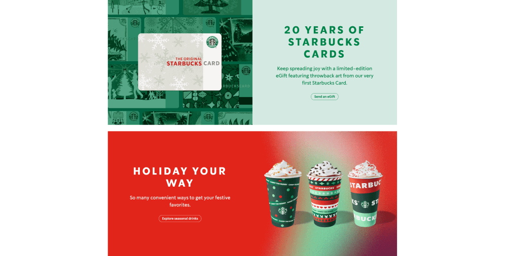
Starbucks takes this idea seriously and fully implements this association in its marketing strategy. They’ve been providing their clients with special Starbucks gift cards for ages, but this year they decided to celebrate the 20th anniversary of that and adhere to their classic original card.
The design of the card is perfectly simple – it is a white canvas with a Starbucks logo and delicate snowflakes as a background layout. Below the gift card ad, there is a feature of Starbucks Christmas-special seasonal drinks such as caramel brulée latte and peppermint mocha.
The only three colors that are used are green, red, and white – the classic Christmas colors, as well as different hues of them, just for the sake of not getting boring. Statistics show that it works magic because the Christmas set has been extremely popular for several years now.
Tiffany&Co
Tiffany & Co is an incredibly popular luxury jewelry retail company based in New York City that also didn’t overlook the Christmas theme. The issue for such high-end companies during the holiday season is to celebrate the festivities while remaining true to their brand identity because it constitutes a huge part of what they represent for their clients.
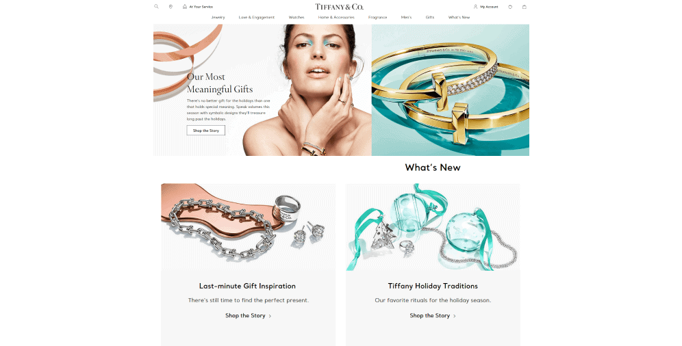
In order to do that, Tiffany & Co added exquisite yet distinct and familiar details: lots of white and gold, bright and spacious layouts with unpredictable contrasting hues such as turquoise and gray that are not usually associated with holidays but somehow emit that magical energy everyone craves at the end of the year.
Thе website is carefully broken down into categories, including specific categories for gifts. There is a separate section “for her” where you can find more generic presents that have been popular for years now. For people who are feeling adventurous or for someone who doesn’t have a lot of time, there are sections like “Our most meaningful gifts” or “Last-minute gift inspiration” picked by the editor.
Paperchase
Paperchase is a chain of stationery stores, so it’s only natural that they would utilize the holiday theme and apply it to their advantage. Stationery, wrap and presents – that is always needed during the Christmas season. In many ways, such companies as Paperchase represent what Christmas is perceived to be.
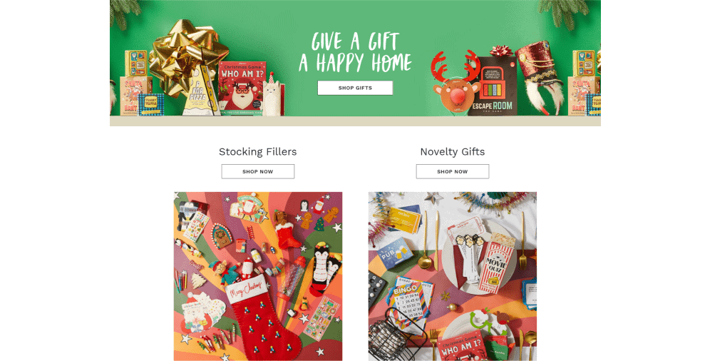
Their website fully reflects that. When you access the main page, everything screams Christmas – from a colorful animated board promising sales to separate Christmas-related sections. There are penguins, deer, sparkles, Christmas trees, red socks, crackers, lights, Santas, and everything else you can think of when looking for a gift.
The website itself is quite simple and uncluttered, but it goes wild in its special Christmas sections – different decorations, wrapping paper, and cards are presented in abundance. There are numerous photos of each of them to give a customer a better idea of what they’re getting.
Also, Paperchase heavily promotes the “3 for 2” sales scheme, where you buy 3 products, and you get the cheapest one for free, with the catchy animated icons.
Baudville
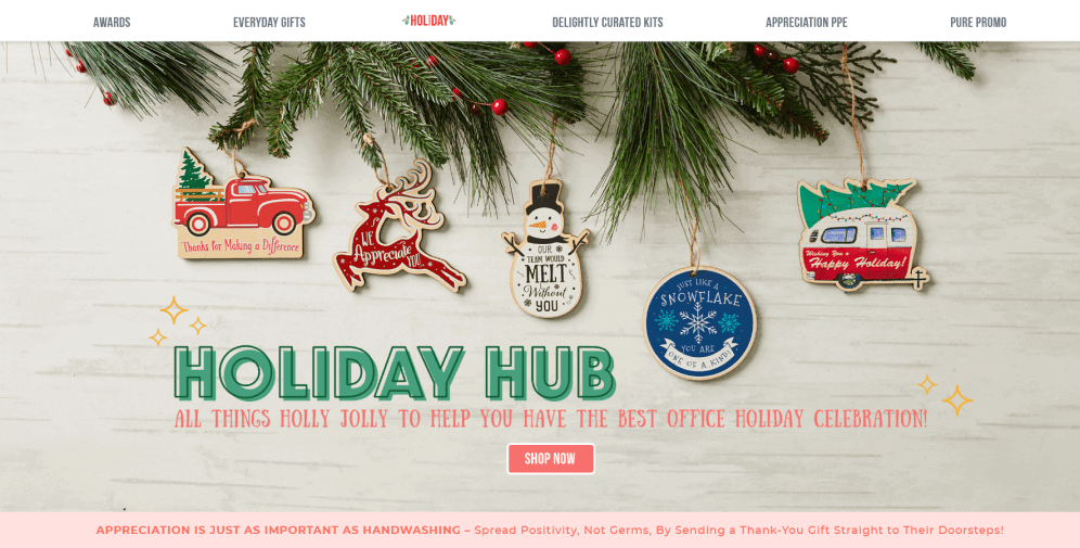
Usually, we associate Christmas website design with the companies that sell products directly to the customers, but they’re not exclusive when it comes to redecorating websites for holidays. Such B2B companies as Baudville, an employee recognition solution, are happily jumping into the pool as well.
Like many other company websites, Baudville doesn’t go too overboard with the decorations, focusing mainly on the content side of it – they have a special section dedicated to the holiday gifts. It is made in contrasting red color so that it can be easily recognized when you’re hastily looking for a gift for your colleagues or employees.
The section itself features a gift shop slide and different filters you can use to find the best present quickly and easily. As with any other Christmas decoration, the main colors here are white, red, and green.
Microsoft
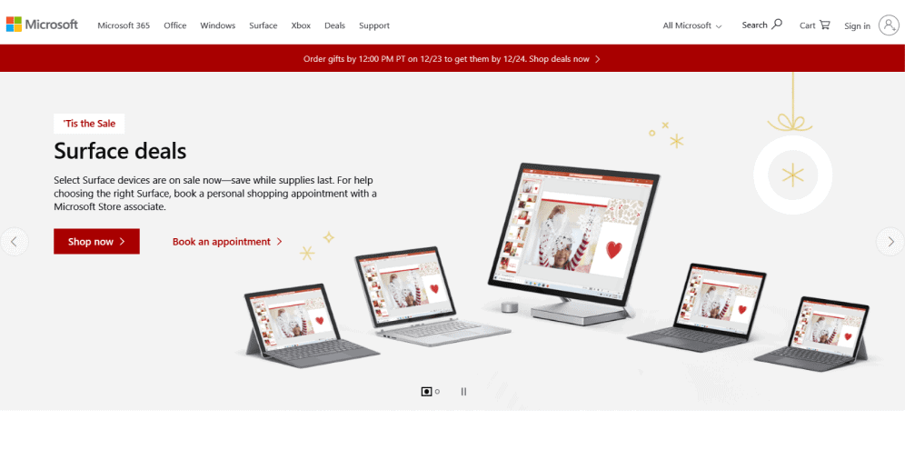
Following its signature minimalist style, Microsoft fully uses the red, green, and white color scheme. Red is mainly used for CTAs and contrast, white serves as a “filling” color, and green is applied for breaking down different parts of the page.
With that red banner and CTAs, Microsoft promotes the “Bundle up and save” scheme where they tell you how much you can save if you buy a product till Christmas. You can even book an appointment with the Microsoft Store representative who can help you to choose the gift with the best quality-price ratio for your loved ones.
Even though the decorations are not very prominent, they do the job – attract viewers’ attention to the sales and deals and increase conversions. What more would you want?
Fitbit
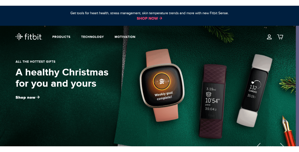
We’re used to Christmas web pages being all red and white, sparkly and fun, but what about a Christmas website that has a darker and less stereotypic holiday feel to it? Welcome to Fitbit, a company that manufactures trackers, fitness bracelets, and consumer electronics.
Staying true to the company’s austere nature, the Fitbit website doesn’t have an overwhelming number of elements and pages. The first thing you notice when you access the portal is several smartwatches laying in a green fabric as if they’re gifts ready to be wrapped up and presented to your close ones.
The second thing you notice is, of course, a CTA made in contrasting white color. They even let you know how much you’ll save if you order now. Various filters, a clear distinction between product categories, and thorough descriptions help to find the gift best tailored to your needs. If that’s not enough, Fitbit even has the “Gift of the year” page where you can buy a smartwatch that has been the most popular product throughout the whole year.
John Lewis
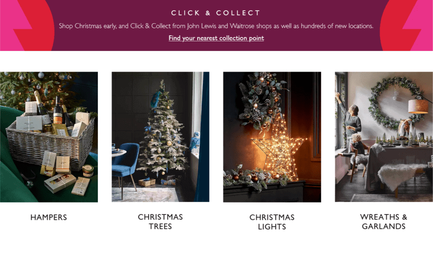
John Lewis is a chain of high-end retail stores in the UK. You can find anything there – from kitchen storage products to floor lamps, so it’s only natural that they have a separate section dedicated to Christmas.
The Christmas section on the John Lewis website is all-encompassing. It is primarily made in two colors: white and gold, which reflects the Christmas theme without being too predictable, and manages to bring the classic John Lewis character.
Besides the abundance of gifts and presents, there are several very useful functional features. You can save your time and look through several specific categories: Christmas gifts for her or him, gifts for children, Christmas cards, different decorating themes, and many more.
Another useful thing is the “Inspiration & Advice” section – you can recreate the Christmas of your childhood or style an exotic modern holiday for your family. The John Lewis website even provides an opportunity to take a virtual tour of Christmas shopping if you don’t have enough time to go shopping and need to check where to go to save a bit of time.
Warby Parker
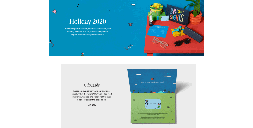
Warby Parker, as well as some other companies on this list, choose not to go delirious with the design for Christmas. The company sticks to the simplicity of its original design and adds subtle holiday-themed refinements.
The landing page itself isn’t redecorated for Christmas in any special way, but it features a CTA button that says “Feeling festive? Shop holiday gifts!” which you can click and go right to the holiday gifts and accessories picks of the year.
Overall, Warby Parker is an incredible example of the outstanding use of CTA and UX/UI design. Besides the simple and minimalist design, it is highly functional and easy to use. When you access the Christmas webpage, there is an ad for gift cards. You flow seamlessly through all the order steps and get a gift mailed right to your loved ones’ doorsteps!
Warby Parker also has a special holiday-related FAQ section about the orders, shipping, and savings offerings (for example, such as “Add a pair and save”) where you can get assured that your purchase will be sent just in time and nothing gets lost in the Christmas transportation chaos.
La Colombe
As with Starbucks, La Colombe adheres to the idea that there is something festive and satisfyingly comforting about having a hot drink in the company of friends. Being a coffee roasting company based in the US, La Colombe couldn’t ignore the winter theme and fail to channel the Christmas spirit.
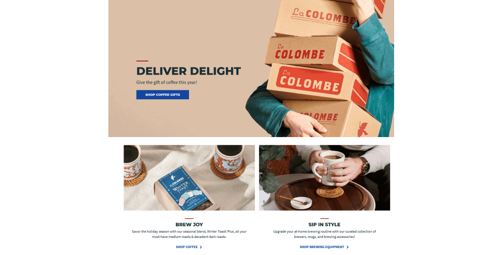
La Colombe Christmas homepage gets right into it. You’re welcome to pick a top-rated present or get a seasonal blend called the Winter Roast the minute you access the website. The “gifts” section is highlighted with the help of a darker hue and a star symbol so that it’s always visible no matter where you go on the website.
Overall, the La Colombe Christmas design doesn’t include anything groundbreaking – they added wintry colors and schemes, made sure to include a lot of white space and included several clear-cut photos of their products and happy people enjoying the coffee time. It works wonders for them since it gives visitors a chance to experience a Christmas wonder while being true to the brand’s attributes.
Besides brand websites, there is also such a thing as social media decorations. You can add various Christmas plugins, filters, and fonts, change your background or profile pictures on Facebook, Instagram, or Twitter.
Another important thing to remember is mailouts. One of the most vital parts of any business is establishing a strong and positive relationship with your customers and your partners. Reminding them that you care about them and wishing them joy and happiness in the upcoming year is a sign of a loyal and committed companion.
Let’s give a quick overview of the tips that might help to redecorate your website for Christmas or any other holidays:
- Take good care of your original branding. Impressing customers is an admirable goal, but they have to remember you for what your company specifically represents. If you focus too much on the Christmas side of it, they won’t know who you are when the holidays are over.
- Echoing that, judge the extent of your possible decorations based on the nature of your company. If you manufacture coated bearings for other technical companies, seeing sparkly unicorns on your website might seem weird and be a potential turnoff.
- While it is completely up to you, going full-on “hero of the TLC’s “My Christmas Obsession” episode” might not be a perfect business move. Yes, it is an amazing holiday – both spiritually and profit-wise – but it will end, and you will have to live with your scarred reputation.
- Focus on the message rather than plain decorations. Again, it depends on your specific activities, but more often than not, all those embellishments aim to orient the customers towards sales, discounts, and special offerings. And get them to laugh at the animation of Santa running after an elf who stole his presents that you put on your main page. That’s what Christmas is all about, after all.
- Speaking about logos – it might be a wonderful idea to change up your logo and other brand attributes a bit. Add something fun or wintry to them while making them recognizable still.
On a final note
Christmas is indeed a magical time – people completely forget about their job, house duties, and personal life, frantically looking for a present for their second cousin’s ex-wife. For some people the holidays are the most dreaded time of the year because it means they won’t sleep, they won’t eat, and eventually, they will have to settle for a vase no one really wants or needs and that was expensive even with the discount.
If you’re a business owner, you can ease their suffering through a carefully tailored set of sections dedicated to Christmas products or holiday sales. And that may be achieved with the assistance of B2B web design services provided by diverse companies, such as ours, for example. Highlighting those sections with various Christmas design arts, WordPress Christmas themes, or banners and icons will aid them to get through the majority of your offerings while picking the right gift and enjoying the festive mood of it without wanting to vomit. Isn’t it the most wonderful thing about having your own company?
If you’re unsure about Christmas website decoration or if you want to learn more, feel free to contact us – we will answer all your questions and give you other exciting examples of the holiday website design.


