Outline:
Have you ever looked at a design so colorful, so vibrant, that you couldn’t take your eyes off it? That’s the magic of a maximalist color palette—bold, expressive, and unapologetically eye-catching. But let’s be honest: throwing a bunch of colors together isn’t enough. The real trick lies in creating harmony amidst the chaos.
Maximalist color palettes aren’t just about being loud—they’re about being intentional. When done right, they can evoke emotion, tell a story, and transform a brand’s identity. In this article, we’ll break down the art of maximalist palettes, comparing them with minimalism, exploring their psychological power, and sharing practical tips to make them work for your projects.
Ready to dive into the world of vibrant chaos? Let’s get started.
Minimalism vs. Maximalism in Design
When it comes to color palettes, minimalism and maximalism are like two sides of the same coin. They share a love for intentionality but take vastly different approaches to achieving it.
Minimalism: The Art of Restraint
Minimalism is all about simplicity. It thrives on neutral tones, muted colors, and plenty of white space. The goal? To strip away distractions and let the essentials shine. For example, a minimalist palette might include soft grays, gentle blues, and a single accent color like mustard yellow. It’s calm, controlled, and perfect for designs that need to feel professional or understated.
Maximalism: The Joy of Expression
Maximalism takes a completely different route. It revels in complexity, layering bold and contrasting colors to create a sense of energy and excitement. Think about hot pink paired with electric blue or a mix of jewel tones splashed across a website. It’s not about holding back—it’s about using color to evoke emotion and tell a story.
Why the Comparison Matters
Understanding these approaches is key to choosing the right one for your project. Minimalism works beautifully for brands focused on simplicity, clarity, and functionality. Maximalism, on the other hand, shines when you want to stand out, convey vibrancy, or create an unforgettable user experience.
At their core, both styles are tools. Knowing when to go bold and when to pull back is what separates good design from great design.
Maximalism in Web Design: Functions and Aims
Maximalism in web design isn’t just about making a website look bold—it’s about creating an experience that captivates, engages, and communicates a brand’s unique story. By using vibrant color combinations, maximalist design can achieve specific goals that minimalism might not fully support.
01 Capturing Attention in a Sea of Sameness
In today’s crowded digital space, grabbing attention is half the battle. A maximalist web design, with its bold and diverse color palettes, ensures that your website doesn’t just get noticed but lingers in your audience’s mind. Bright, contrasting hues create a sense of movement and energy, drawing the eye to key elements like maximalist logo, call-to-action buttons, or product showcases.
02 Guiding Emotion and Behavior
Maximalism isn’t just about visuals; it’s about feelings. By strategically combining warm and cool tones, you can evoke specific emotions that drive user behavior. For example:
- Bright reds and oranges can create urgency and excitement, encouraging quick decisions.
- Cool blues and greens provide balance, calming users during complex interactions like filling out a form.
A maximalist palette allows designers to play with these emotional triggers more dynamically than a minimalist approach.
03 Telling a Richer Brand Story
Every brand has a personality, and maximalist design brings it to life. A vibrant, multi-layered color palette can express creativity, luxury, or even rebellion. For example, a fashion brand might use bold neons to highlight its edgy identity, while a luxury resort might lean into jewel tones to evoke sophistication and exclusivity.
04 Showcasing Creativity and Personality
A maximalist web design offers endless opportunities for storytelling. By layering colors, patterns, and textures, you can create an experience that speaks directly to your brand’s personality. This approach is especially effective for creative industries like fashion, music, or entertainment, where standing out is part of the game.
05 Amplifying Branding
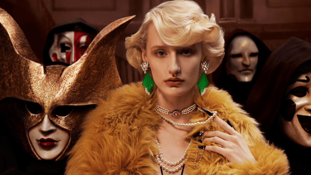
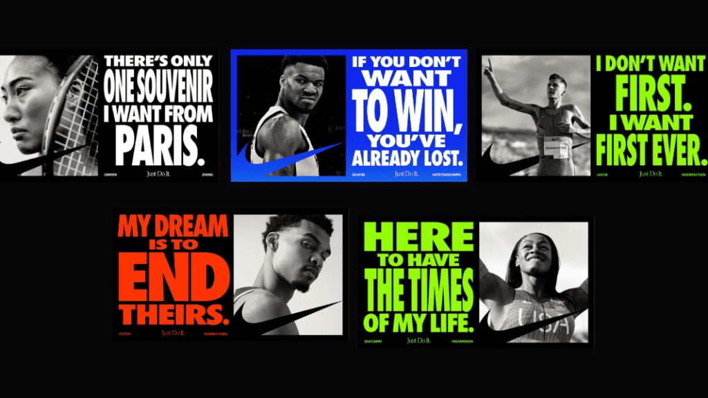
Maximalism allows brands to experiment with visual identity in ways that minimalist approaches can’t. It creates room for bolder logos, dynamic typography, and more immersive experiences. When done right, every pixel reinforces the brand’s message, making it memorable and impactful. It is easy to see how Nike does this in its 2024 Olympics campaign.
Color Psychology and the Impact of Maximalist Color Palettes
Colors are far more than mere aesthetics; they serve as potent communicative tools. They can trigger emotions, shape perceptions, and even influence decision-making. When it comes to maximalist color palettes, the stakes are even higher. These bold combinations have the potential to evoke stronger emotional responses and create memorable user experiences.
How Colors Influence Perception and Behavior
- Warm Colors: Shades like red, orange, and yellow radiate energy and warmth. They’re great for creating excitement or a sense of urgency, which is why they often appear in sales banners or call-to-action buttons.
- Cool Colors: Blues, greens, and purples are calming and trustworthy. They’re perfect for balancing out a bold design and offering moments of visual relief.
- Contrasts: Maximalist palettes thrive on contrasts—pairing warm and cool tones, light and dark shades. This interplay keeps the eye engaged and guides users through the design.
Maximalist Color Palettes as Emotional Amplifiers
Want to create joy? Combine vibrant yellows with playful pinks. Need to establish luxury? Deep jewel tones like emerald green and sapphire blue can exude sophistication. These palettes can make users feel part of something exciting and larger than life.
Cultural and Contextual Considerations
Colors carry different meanings across cultures, and a palette that resonates in one region might send the wrong message in another. For example, while white is associated with purity in Western cultures, it signifies mourning in some Eastern cultures. Green often represents nature and growth in many contexts, but in certain regions, it might carry religious or political connotations.
For designers, understanding these nuances ensures your maximalist palette resonates globally—or locally, depending on your audience.
Why It Matters in Maximalist Design
Maximalist color palettes go beyond aesthetics. They create an emotional journey, guiding users to connect with your brand in a way that feels authentic and unforgettable. When wielded with intention, these palettes become not just design elements but powerful storytelling tools.
Benefits of Maximalist Color Palettes
Maximalist color palettes do more than just catch the eye—they serve as strategic assets that can amplify your brand and engage your audience. When used effectively, these vibrant combinations offer unique advantages that go beyond what minimalism can provide.
- Unforgettable Visual Identity
A vibrant, maximalist palette ensures your design leaves a lasting impression. Bold colors are harder to forget, especially in a sea of muted tones. Whether it’s a website, a campaign, or packaging, maximalist palettes make your brand instantly recognizable. - Enhanced Creativity and Storytelling
Maximalism gives you room to experiment. With a broad spectrum of colors, you can create layers of meaning and emotion. A bright, multicolored layout might tell a story of joy and diversity, while a palette of deep, rich hues can evoke mystery and sophistication. - Emotional Connection
Colors are deeply tied to emotions, and maximalist palettes amplify this connection. They invite users to feel something—excitement, nostalgia, or even a sense of adventure. This emotional resonance strengthens your brand’s relationship with its audience. - Breaking the Mold
Maximalist palettes signal that your brand isn’t afraid to take risks. In industries where minimalism dominates, going bold can set you apart and position your brand as innovative and fearless. - Encouraging User Engagement
A well-crafted maximalist palette draws users in, guiding their eyes across the design. The energy and complexity of these palettes keep users engaged longer, increasing their interaction with your content.
Potential Challenges with Maximalist Color Palettes
Maximalist color palettes are powerful, but they might come with challenges. When not carefully crafted, they can overwhelm, confuse, or even alienate your audience. Understanding these concerns helps you avoid pitfalls and ensure your design remains impactful.
- Risk of Overwhelm
Maximalist palettes thrive on complexity, but too much can backfire. Overloading a design with clashing colors and patterns might confuse the viewer rather than captivate them. The goal is to draw attention, not cause visual fatigue. - Cohesion Challenges
Creating harmony within a maximalist palette isn’t easy. Without a clear structure or hierarchy, the design can feel chaotic. It’s essential to choose colors that work together while still delivering that signature boldness. - Accessibility Issues
Not everyone experiences colors the same way. Poorly contrasted palettes can make your design inaccessible to users with visual impairments, such as color blindness. Ensuring strong contrast and testing for accessibility compliance is non-negotiable when using a maximalist palette. - Scalability Problems
Maximalist designs can be tricky to scale across platforms and formats. A palette that looks stunning on a desktop might lose its impact on a mobile screen or printed material. Simplifying elements for smaller formats while retaining the essence of the design is a necessary skill. - Dilution of Message
When every element of your design is competing for attention, the core message can get lost. It’s crucial to strike a balance where the color palette enhances the content, not overshadows it.
Tips for Creating the Perfect Maximalist Palette
Crafting a maximalist color palette requires more than throwing bold shades together. The goal is to achieve harmony within the chaos, ensuring your design feels intentional and impactful. Here’s how to make your maximalist palette work for you:
#Start with a Strong Foundation
Choose one or two base colors to anchor your palette. These foundational tones will provide stability, allowing you to layer brighter or contrasting shades without overwhelming the design. For example, a deep navy or earthy olive can ground a palette of vibrant pinks and yellows.
#Use Color Families for Depth
Maximalist palettes benefit from layering shades within the same family. Using variations of one hue—like light lavender, royal purple, and deep plum—adds richness and complexity without veering into chaos.
#Play with Contrasts
Contrasting colors are the heart of maximalism. Pair warm and cool tones, or mix saturated brights with softer pastels. For example, electric blue pops beautifully against coral orange, while mustard yellow contrasts playfully with teal.
#Consider Emotional Impact
Think about what you want your colors to evoke. Reds and oranges can energize, while greens and blues soothe. Combining these effects thoughtfully ensures your palette aligns with your design’s goals.
#Test Your Palette in Context
A palette might look great in isolation but fall flat when applied to a full design. Mock up your colors in different scenarios—websites, mobile screens, print materials—to ensure they’re versatile and effective.
#Keep Accessibility in Mind
Maximalist palettes can risk alienating users with low contrast or overly complex visuals. Always test for readability, especially for text-heavy designs. Tools like contrast checkers can help you ensure compliance with accessibility standards.
#Simplify Where Necessary
Even in maximalism, less can sometimes be more. If your palette feels too busy, pare down secondary or background elements. This doesn’t mean abandoning boldness—it’s about knowing where to draw the line.
#Evolve with Feedback
Maximalism thrives on experimentation. Don’t be afraid to tweak your palette based on user feedback or performance analytics. Iteration often leads to the most harmonious results.
By following these tips, you can create maximalist color palettes that are not just visually stunning but also purposeful and effective. They’ll tell your story while keeping your audience engaged and inspired.
Top Picks for Maximalist Color Palettes
Maximalism celebrates abundance and boldness, creating an environment full of excitement, energy, and expression. Here are five of the best maximalist color palette combinations to achieve this daring approach and the contexts where they can be effectively applied.
#1 Neon Riot: Electric Blue, Acid Green, Hot Pink, and Vivid Yellow
This combination of bright, neon colors instantly energizes a space or digital environment. Electric blue and acid green bring a sense of urgency, while hot pink and vivid yellow create a vivid contrast that grabs attention. The interplay of these intense shades can communicate a sense of fun, boldness, and unconventional creativity.
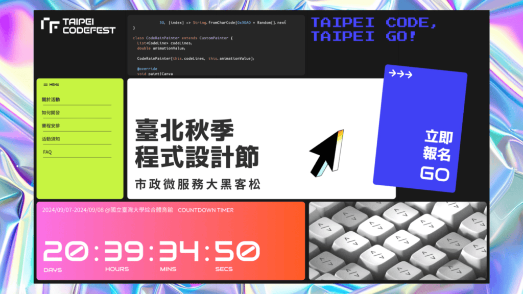
Where to Use It: This palette works perfectly for youth-centric brands, events, or products that thrive on high energy and rebellion, such as music festivals, extreme sports brands, or fashion lines aiming to appeal to a younger, edgy audience. It also lends itself well to website designs where grabbing the user’s attention is paramount—especially for limited-time promotions or pop-up ads.
#2 Jewel Box: Emerald Green, Ruby Red, Sapphire Blue, and Amethyst Purple
The jewel-toned palette creates a sense of luxury, opulence, and richness. The combination of deep emerald, ruby, sapphire, and amethyst hues adds depth and a timeless appeal that draws from the elegance of precious stones. These colors, when used together, evoke a lavish feeling that’s bold but balanced, invoking royalty and splendor. The tones we used in our work for Historiart are similar to these.
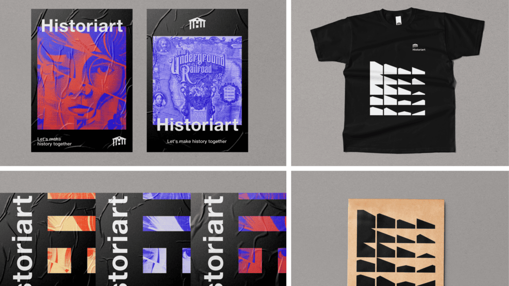
Where to Use It: Jewel tones are ideal for luxury branding, especially in interior design, fashion, or lifestyle products. They can also be effectively used in high-end eCommerce websites, giving the interface an upscale and sophisticated feel that communicates exclusivity and opulence to customers seeking premium experiences.
#3 Tropical Sunset: Fiery Orange, Deep Magenta, Golden Yellow, and Teal
Drawing inspiration from a warm tropical sunset, this color palette evokes warmth, joy, and relaxation. Fiery orange and deep magenta create an eye-catching blend of heat, while golden yellow brings brightness and teal adds a cool, balancing element. Together, these colors craft a vibrant, almost nostalgic mood.

Where to Use It: This palette is perfect for travel-related branding or any hospitality industry endeavor, such as hotel websites, vacation rental apps, or beachwear brands. It can also work for wellness and lifestyle products seeking to convey a carefree and inviting atmosphere, encouraging people to escape to their dream destination.
#4 Pop Art Punch: Cobalt Blue, Tomato Red, Lemon Yellow, and Black
Inspired by the bold contrasts of pop art, this palette pairs primary colors with black to create sharp, graphic effects. Cobalt blue, tomato red, and lemon yellow give a strong nod to classic comic book aesthetics, while black adds emphasis and anchors the bright colors, preventing them from overwhelming the design. Let’s look at this example designed by My Name is Wendy creative studio.
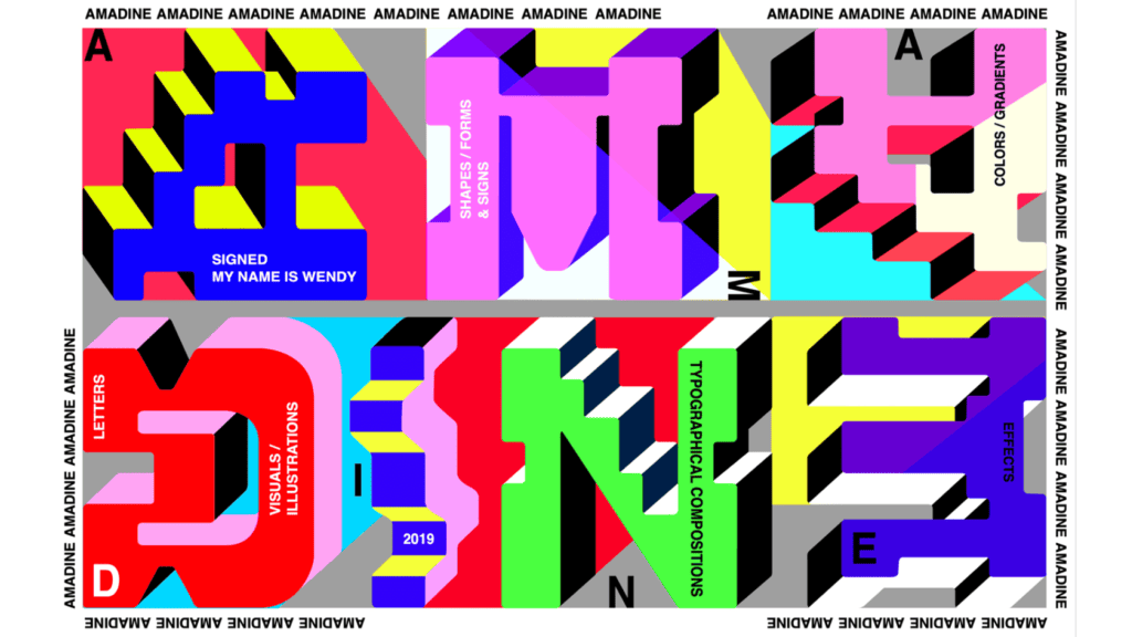
Where to Use It: The Pop Art Punch palette is great for creating eye-catching posters, promotional materials, or branding for modern art exhibitions, creative agencies, or retro-themed products. It works especially well in environments where playful irreverence and nostalgia are key elements, adding a strong, memorable visual identity.
#5 Botanical Burst: Forest Green, Mustard Yellow, Coral Pink, and Burgundy
This natural yet rich color palette takes its inspiration from the organic world, blending the lushness of forest green with the warmth of mustard yellow and coral pink, while the burgundy adds depth. These colors together create a harmonious yet vibrant look, striking a balance between natural tranquility and colorful liveliness.
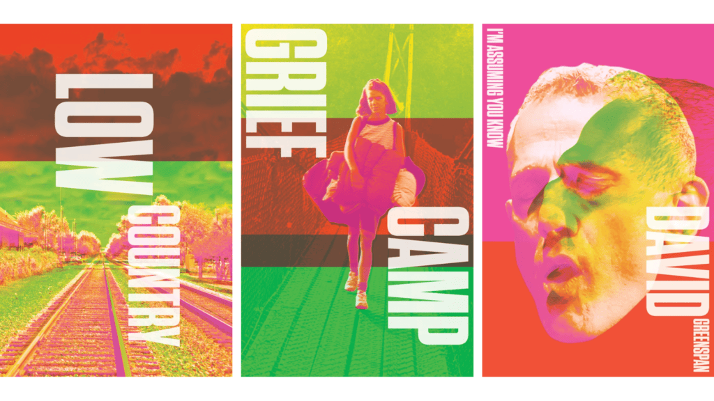
Where to Use It: Botanical Burst is well-suited for brands focusing on sustainability, home decor, or wellness. It works beautifully for nature-inspired products or organic beauty brands, evoking a sense of connection to nature but with a lively twist. It’s also ideal for digital content that aims to blend earthy authenticity with a vibrant edge, making it perfect for blog layouts, social media graphics, or eco-friendly campaigns.
On a Final Note
Maximalist color palettes are a celebration of creativity, boldness, and individuality. They have the power to turn ordinary designs into unforgettable experiences, leaving a lasting impression on audiences. But as with any design approach, success lies in the execution—harmony amidst the chaos is the ultimate goal.
From understanding the psychology of colors to crafting intentional contrasts, maximalism isn’t just about being loud; it’s about being purposeful. Whether you’re creating a vibrant e-commerce website, a dynamic brand identity, or an engaging portfolio, the right maximalist palette can amplify your message and connect with your audience on a deeper level.
As you experiment with maximalist palettes, don’t forget to keep accessibility, scalability, and your brand’s unique story in mind. With thoughtful planning and a willingness to embrace boldness, you can make your designs stand out while staying true to their purpose.
So, are you ready to dive into the world of color-packed chaos and create something unforgettable? The canvas is yours— contact us to embark on this artistic adventure together.
