Outline:
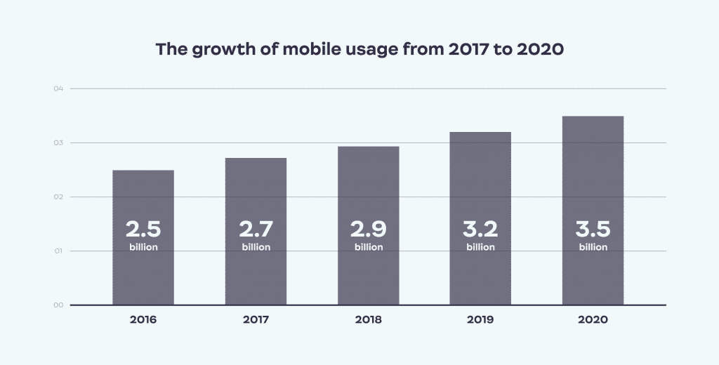
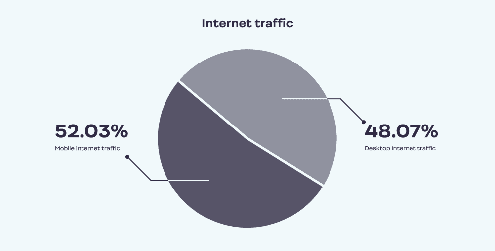
Over the past few years, mobile devices have become widely used and acknowledged as the primary form of digital media, with the number of mobile users increasing exponentially. Consequently, there is a growing demand for websites that are specifically tailored to mobile devices. In fact, it is estimated that 60.67% of the world’s web traffic in 2023 is spent on smartphones, indicating that mobile usage is a trend that is here to stay. As a responsive web design company, we would like to draw your attention to this phenomenon.
Designers have not overlooked this shift in popularity and have shifted their focus from desktop to mobile devices. Clients often prioritize a mobile solution without considering their desktop version, prompting designers to use a “mobile-first approach” to meet this challenge.
However, many designers still adhere to responsive design, a classic approach to creating desktop platforms. This begs the question: how does responsive design fit into this new reality where mobile-first design seems more appropriate? What exactly does the term “mobile-first design” mean? Our UI UX design company has prepared a comprehensive guide that answers these and many other questions.
Mastering Mobile-First Design: Essential Features
Mobile-first design involves creating web pages specifically tailored for mobile devices, rather than desktops, using techniques to ensure a smooth and optimized user experience. To achieve this, designers focus on certain elements that define mobile-first design.
Firstly, scrolling is favored over clicking on never-ending new pages, making it easier to read information in blocks. Secondly, interactivity and navigation must be easy to access and click on, with CTAs usually placed in the center of the page in contrasting colors to make them more visible. Site navigation and search tools should be easily discoverable.
Thirdly, concise content is critical since mobile screens are smaller than PCs or laptops, requiring designers to present information in a digestible manner that allows users to appreciate the platform’s visual aspect. Lastly, personalization is a key element of ensuring viewers reach the content they need quickly, using relevant search results, filters, and removing distractions and pop-ups.
Exploring the Significance and Principles of Responsive Web Design
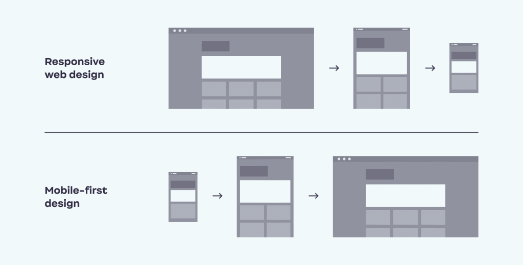
While mobile-first design is gaining popularity, responsive design remains the gold standard for designing desktop platforms. Essentially, responsive web design is a design approach that adapts to different display sizes, allowing the website to fit into the format and dimensions of various devices such as tablets, phones, and laptops. It’s crucial for companies that want their websites to be accessible across different media and reach a wider audience.
Responsive design ensures that users can switch between devices without losing any important content and that the design, user interface, and visual components of the platform look consistent across different media. While mobile-first design is always responsive, responsive design may not be designed primarily for mobile phones and often starts with desktop interfaces.
The key principle of responsive design is to create a coherent and clear experience for users across devices, taking into account the differences in layout and size. The goal is to provide users with a similar experience, regardless of the gadget they use, through the flexibility of the website’s arrangement.
However, when customizing a desktop website for mobile devices, certain alterations may be necessary as some content may get “lost in translation”, resulting in a less satisfactory user experience. Therefore, it’s important to consider designing for mobile devices first, as it allows designers to prioritize and simplify the content, making it easier to adapt to larger devices later on.
Key Differences Between Responsive Design and Mobile-First Design
When launching a website, choosing between mobile-first design and responsive design is a critical decision that requires careful consideration of the pros and cons of both. To help you make an informed decision, we’ve compiled a list of the advantages and disadvantages of each approach.
The Pros and Cons of Mobile-First Design: Is It Right for You
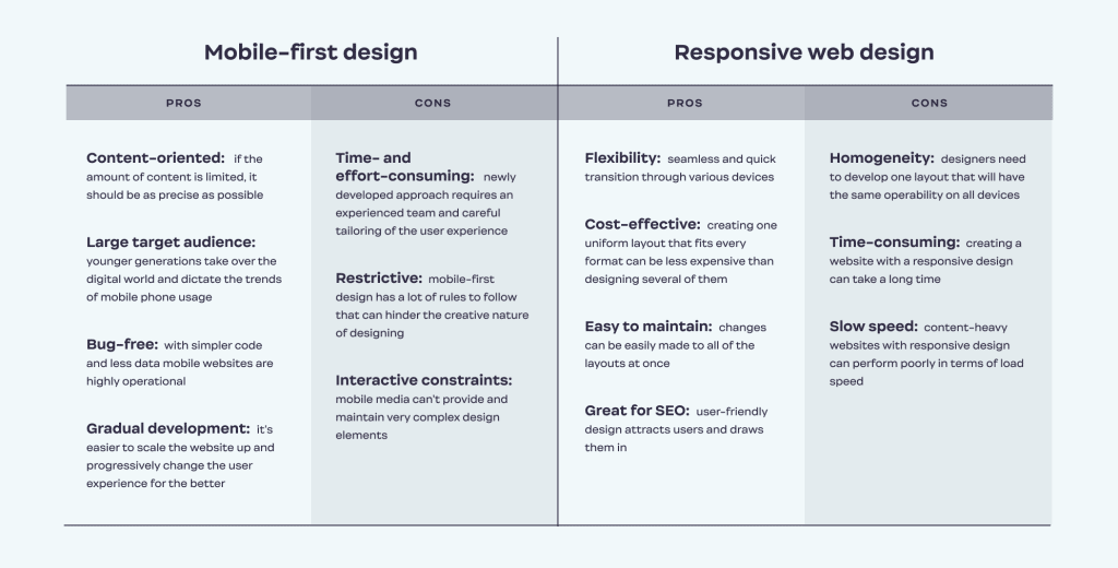
Mobile-first design is a relatively new approach that requires designers to create a condensed version of the website with scaled-down content right from scratch. Here are some pros and cons:
Pros:
- Condensed content that meets the need for a digestible and concise format.
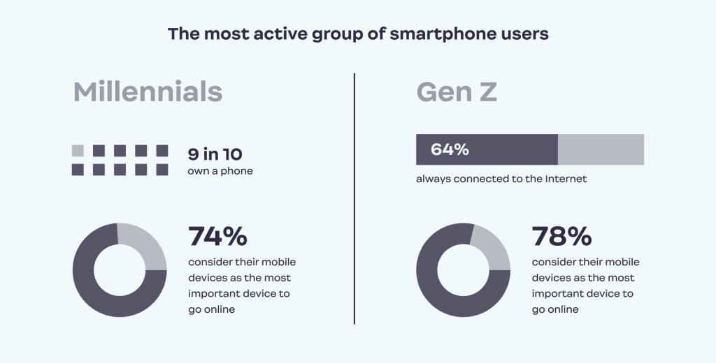
- Appeal to younger generations that use smartphones the most.
- Simpler code that makes mobile websites faster to download and work with.
- Customizable user experience for mobile devices that can be scaled up for desktop or tablet versions.
Cons:
- Requires a great deal of experimentation and dedication.
- Impedes creative endeavors.
- Hinders the usage of some animations, plugins, and other features.
Weighing the Pros and Cons of Responsive Web Design: Is It the Way to Go
Responsive web design is fluid and flexible, building up content gradually with regard to the media it appears on. Here are some pros and cons:
Pros:
- High level of versatility and adaptability.
- Reduces costs by not creating separate designs for different platforms and devices.
- Great for SEO optimization.
Cons:
- Challenging to create one design that is equally effective and remarkable in several formats.
- Time-consuming to create or redesign a website.
- May load slower on smartphones if the website is image- or content-heavy.
In conclusion, both mobile-first design and responsive design have their strengths and weaknesses, and the decision depends on your business needs and objectives. By understanding the difference between mobile first and responsive design, and the pros and cons of each approach, you can make a reasonable decision that will best serve your website and its users.

Adaptive Web Design Explained: Creating Websites for Multiple Devices
Adaptive design is another approach to creating websites that differs from responsive design. While the two terms are often used interchangeably, websites are frequently designed using both methods. Let’s take a closer look at adaptive design and how it differs from responsive design.
Adaptive design assumes that one layout cannot fit every screen size, but several layouts must be created, each specifically tailored for a particular device. Typically, designers build different layouts for mobile phones, tablets, and computers. When the website is activated on a specific gadget, the corresponding layout is applied.
Responsive design, on the other hand, involves creating an extremely flexible platform that can work with the same effect on any device. While it is more challenging to build, it is also more flexible than adaptive design, which requires separate layouts for specific devices.
The Pros and Cons of Adaptive Design
One advantage of adaptive design is that it is less time- and effort-consuming than responsive design. Designers can focus on creating a few separate layouts for different formats with less flexibility. However, websites with adaptive design only work well within the range of specific formats that they have been developed for.
In contrast, responsive design can operate on as many screens as necessary, providing a consistent user experience across devices. Therefore, it may be a better choice for websites that need to be accessible across a wide range of devices.
Designing for Success: What Approach Is Right for Your Website
When deciding on the design approach for your website, there is no one-size-fits-all solution. The choice between mobile-first and responsive design largely depends on your business goals and target audience.
While responsive design has been the standard for over a decade, mobile-first design is becoming increasingly popular. However, blindly following the latest trend without considering your audience’s behavior and preferences may not yield the desired results.
Before making a decision, it’s crucial to define your target audience and their habits. Do they primarily use computers or mobile devices to access your website? This information will help you tailor your online presence to fit their needs and avoid potential business mistakes.
User experience should always be a top priority, regardless of the design approach chosen. While users may not be able to tell the difference between responsive and mobile-first design, they will notice if they can’t find the information they need or if the user experience is poor.
If you’re still unsure about which design approach to choose, it’s always a good idea to seek professional advice. At our design company, we take the time to thoroughly study our clients’ businesses and offer tailored solutions to help their business thrive.
The Essential Guide to Creating a Mobile-First Web Design
With the increasing use of smartphones, it has become vital for businesses to have a mobile-first web design strategy. Here are some steps to create an effective mobile-first web design:
Choose Captivating and Concise Content
When it comes to mobile-first design, the content on your website should be concise yet informative. Make sure that you’re providing customers with enough information, while keeping it easy to read and navigate.
Create a Distinct and Memorable Visual Identity
Your mobile-first design should not only be visually appealing but should also be distinct and memorable. Consider your brand attributes and ensure that your design is consistent and bold.
Prioritize User Experience and Accessibility
The user experience is essential to a successful mobile-first website. Consider accommodating buttons and touchpoints for swiping and pushing, using CTAs that are fit for mobile devices, and making sure your website’s load speed is fast enough.
Test Vigorously Across Multiple Platforms
Testing is crucial to ensuring that your mobile-first website works perfectly. Be sure to perform cross-platform and cross-browser testing regularly to keep up with the latest trends in mobile phone technology.
By following these fundamental steps, you can create a mobile-first web design that is functional, informative, and easy to use.
Top 5 Examples of Mobile Website Design to Inspire Your Next Project
As a design agency with expertise in mobile web design, we’ve curated a list of our top 5 favorite examples to inspire your next project. From real estate to productivity apps, these websites have successfully integrated responsive design principles to provide seamless user experiences across all devices.
01 Virtuance: Real Estate Marketing Made Easy
Our own website, Virtuance, stands out in a crowded industry with a modern and functional design that provides clear navigation and a smooth checkout flow. With a focus on mobile users, our site is a testament to the benefits of a mobile-first approach.
02 Typeform: Interactive Forms with Flair
Typeform’s desktop website features complex design elements, yet their mobile site is a beautiful and simplified version that doesn’t compromise on creativity. The unique and playful visuals remain intact, ensuring a sophisticated yet fun user experience.
03 Adobe: Streamlined Navigation for Services
As a leading provider of creative software solutions, Adobe’s mobile website offers simple and easy-to-navigate blocks of information that can be expanded with a click. The mobile menu remains visible throughout the site, making it easy to move around quickly and efficiently.
04 Apple: Showcasing Visual Appeal
Apple’s mobile website features striking visuals that showcase their products while providing just enough information to entice users to learn more. With intuitive scrolling and distinct icons, the site offers a seamless user experience.
05 Evernote: Effortless Note-Taking on Mobile
The mobile version of Evernote, a popular note-taking and productivity app, provides a sharp and consistent design with a clear color scheme and bold CTAs. The user interface is easy to use and navigate, making it effortless to capture and organize your thoughts on the go.
On a Final Note
In today’s digital landscape, responsive web design is no longer a novelty, but rather a technical standard. In fact, most mobile-first designs are responsive by nature, but the reverse isn’t always true. While responsive design is the norm and commonly used by most designers, the mobile-first approach demands a conscious effort and significant resources.
Mobile-first design is more than just a design strategy; it prioritizes the mobile experience and places a high value on mobile users. Adapting desktop mechanisms to be mobile-friendly can be challenging, but careful analysis and content categorization can make a significant impact.
What are your thoughts on responsive and mobile-first design? Which approach do you prefer? Share your ideas with us! And if you need help improving the mobile version of your website, don’t hesitate to contact Ester Digital.

Copied!


