


Time is money.
We don’t like
wasting
either.
Neither
Do you.
Local websites

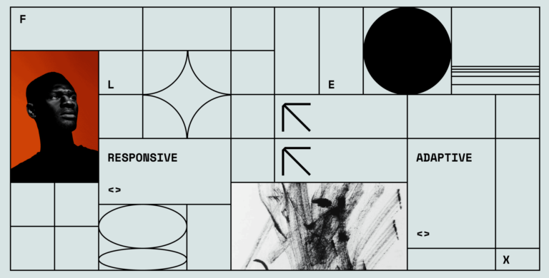
One Site, Any Device: Responsive Solutions for Businesses
The challenge many businesses face is offering a seamless, efficient, and satisfying user experience across all devices – desktops, laptops, tablets, and mobile phones. If your website doesn’t respond or adapt to different screen sizes, you risk losing potential customers, as they will likely move on to a site that provides a better user experience.
We offer an effective solution to this problem – our responsive web design services. Recognizing the importance of versatility in a world where digital consumption habits are rapidly evolving, we focus on creating responsive websites that offer a seamless user experience on any device. Our websites are designed and developed to automatically adjust and adapt to any screen size, offering an optimal viewing and interaction experience.
Choosing our responsive web designing services presents a myriad of benefits for your business.
Let us take your business to the next level with a responsive website that not only meets today’s standards but is also ready for the future.
Expert Responsive Website Design Solutions
Comprehensive Responsive Web Design
Our designs adapt seamlessly to any screen size, be it desktop, laptop, tablet, or mobile device. This means your website will always look and perform its best, regardless of how users access it. The adaptive design creates a seamless and satisfying user experience, increasing user engagement, and helping your business make a lasting impression.
User-Centric Approach
At the heart of our design process is a user-centric approach. We place your audience at the center of our designs, ensuring every element, from layout to typography, contributes to a satisfying and intuitive user experience. This approach not only enhances user engagement but also drives conversions, turning casual visitors into loyal customers.
SEO-Friendly Design
Our responsive web designs are not just about visual appeal and functionality; they’re also designed with SEO in mind. Responsive website design is favored by search engines, meaning your site is more likely to rank higher in search results, enhancing your online visibility and driving more organic traffic to your site.
Future-Proof Solutions
The digital landscape is constantly evolving, and so should your website. Our responsive web designs are future-proof, built with scalability in mind to adapt to new devices and screen sizes as they emerge. By choosing us, you’re not just preparing for the present; you’re future-proofing your digital presence.
Great variety of digital devices these days leaves no other choice for web designers than to consider the array of screen sizes during their work process. There are miniature smartwatch screens, huge computer monitors, everything in between — and all of them demand their own approach. So, it’s no wonder that designers’ jobs may be…
For the past few years, mobile has become universally prevalent and acknowledged as the dominating form of digital media. The number of mobile users is increasing exponentially, as well as the demand for websites that are tailor-made specifically for mobile devices. In 2020, it was estimated that half of the web traffic worldwide is spent…

The web design industry evolves heavily as the world advances. The technology flourishes, bringing brand-new and fresh design decisions and requiring new formats. What used to be a monologue now has turned into an engaging communication. That means that efficient contemporary design should be meaningful and powerful enough to provide users with great experiences. Given…
Your Partner in Digital Excellence
Our Core Values
As a competent responsive website design agency, we believe in fostering strong, transparent relationships with our clients, where your success is our success. Our approach is always honest and straightforward, prioritizing your needs over everything else. We’re committed to understanding and addressing the unique challenges your brand faces, offering tailored solutions that set you apart in the digital landscape.
Client-Centric Approach
Our client-centric approach to a responsive web design means we treat each project as a unique endeavor. We don’t offer one-size-fits-all solutions; instead, we take the time to understand your business, your brand, your audience, and your goals. This insight allows us to craft a responsive website that truly resonates with your audience and aligns with your business objectives.
Cutting-Edge Technology
We embrace cutting-edge technology to deliver innovative solutions that stand the test of time. We harness the latest web design trends and development technologies to build websites that are not only visually stunning and user-friendly but also SEO-optimized, fast, and secure.
Proven Expertise
Our team is composed of responsive website design professionals who excel in their fields. From strategy and design to development and support, we deliver excellence at every step of the way. Our expertise and dedication to quality have earned us a reputation for delivering effective and impactful digital solutions that drive business growth.


For one-time needs that require a more agile approach – we work with your team on projects that have a clearly defined brief, budget, and timeline.

Drawing on all our experience solving most complex problems and immersing ourselves with your team as Creative Directors.

An ideal fit for companies that have ongoing design needs – we work with you to build out the deliverables needed to drive your marketing efforts.
Crafting Seamless Digital Experiences
Our transparent and collaborative approach to responsive website design means you’re not just a client; you’re a partner. With us, you’re always part of the process, and your satisfaction is our ultimate goal.
Every successful project starts with a deep understanding of our client’s needs and objectives. As a responsive web design company, we kick things off with a comprehensive discovery session, where we dive into your brand, your audience, and your goals. This phase allows us to tailor our responsive website design service to address your unique challenges and needs.
Our next step is to plan the user experience. Based on our understanding of your audience and your goals, we create wireframes that outline the structure of your site, the user pathways, and how the site will adapt to different devices. The result is a blueprint for a website that provides an optimal user experience across all devices.
Armed with our wireframes, we proceed to the visual design phase. Here, we craft the look and feel of your website, ensuring it aligns with your brand’s identity and resonates with your audience. Our design team ensures that the visual elements of your site not only look good but also enhance usability and accessibility, regardless of the device used.
Once the design is approved, our development team steps in. They turn the designs into a fully functional, responsive website. We adhere to the best coding practices, ensuring your site is not only responsive but also fast, secure, and SEO-friendly. Rigorous testing follows the development phase, where we ensure everything functions as it should across all devices and browsers.
When you’re happy, and we’re confident in the performance of the site, it’s time to go live. But our work doesn’t stop there. We monitor your site’s performance, offer ongoing support, and make necessary adjustments to ensure your responsive website continues to deliver optimal results.
Contact us today