
Outline:
Nowadays, good health is not merely an advantage to have, but an urgent necessity. With more modern and technological features, the best medical web design for healthcare platforms and websites are transforming into irreplaceable mechanisms for managing therapy plans and scheduling visits.
The year 2020 became a turning point when healthcare took the informational forefront across the globe. Following the COVID-19 crisis, people have come to appreciate the importance of healthcare-related platforms that can help track one’s treatment progress or provide crucial medical data. However, many such platforms are either too complex to navigate or simply unappealing visually. Users’ demand for user-friendly and inviting healthcare platforms is growing every day. But what comprises an excellent and efficient healthcare website design?
Let’s begin with the fundamental aspects — customized tools and features, impressive load performance, various integrated messengers, mobile-friendly and responsive design, and easy-to-use interfaces, all while paying special attention to the security of the data the website receives. As we’ve mentioned before, people pay more attention not only to the content and functionality but also to the form and arrangement, so having an aesthetically pleasing website is essential.
Here at Ester Digital, we collaborate with various healthcare businesses and provide them with opportunities that can help them further their development and support the worldwide demand for technologically advanced and highly effective healthcare solutions. We share our list of the best healthcare website designs we admire and use as inspiration when working on our own projects.
The Art of Healthcare Website Design: A Case Study on Evryman
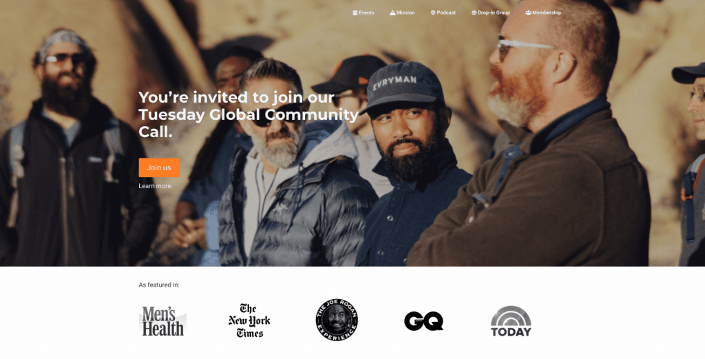
Evryman is a platform that offers men group therapy sessions, retreats, and bonding experiences to help them overcome the everyday challenges associated with the changing paradigm of modern masculinity. The platform understands the importance of men’s mental health and creates a safe space for them to share their feelings and experiences with others.
Ester Digital collaborated with Evryman to develop their brand positioning through their website. As part of the partnership, Ester Digital helped Evryman to apply their already existing visual identity to the website, ensuring that it aligns with their brand values and appeals to their target audience.
The Evryman website is designed to foster a sense of community among its users. It welcomes men from all walks of life and provides them with all the necessary information about Evryman retreats and mental health programs. Through the website, men can learn more about the platform’s mission and values, as well as access resources to help them improve their mental and emotional wellbeing.
In summary, Evryman’s partnership with Ester Digital has enabled the platform to develop a compelling online presence that effectively communicates its core values and mission. The website has become a hub for men to connect with each other, find support, and access the resources they need to lead healthier and happier lives.
Transforming the Patient Experience: One Medical’s Website Design
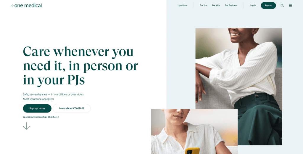
One Medical is a premium-class primary care practice operating in the United States with a core mission of establishing trust-based relationships with clients. The company aims to provide every patient with a healthcare advocate who can efficiently navigate them through the complexities of medical information.
The One Medical medical web design is an embodiment of the company’s brand attributes, with a sophisticated and modern outlook that reflects its exceptional level of expertise in the healthcare field. The website design showcases bright and sleek offices through its carefully selected photos, which aligns with the company’s purpose of delivering people-centered healthcare. Moreover, every design element echoes the company’s core values and purpose, thereby creating a cohesive and harmonized visual identity that resonates with visitors to the website.
The Future of Healthcare Online: ZocDoc’s Website Design
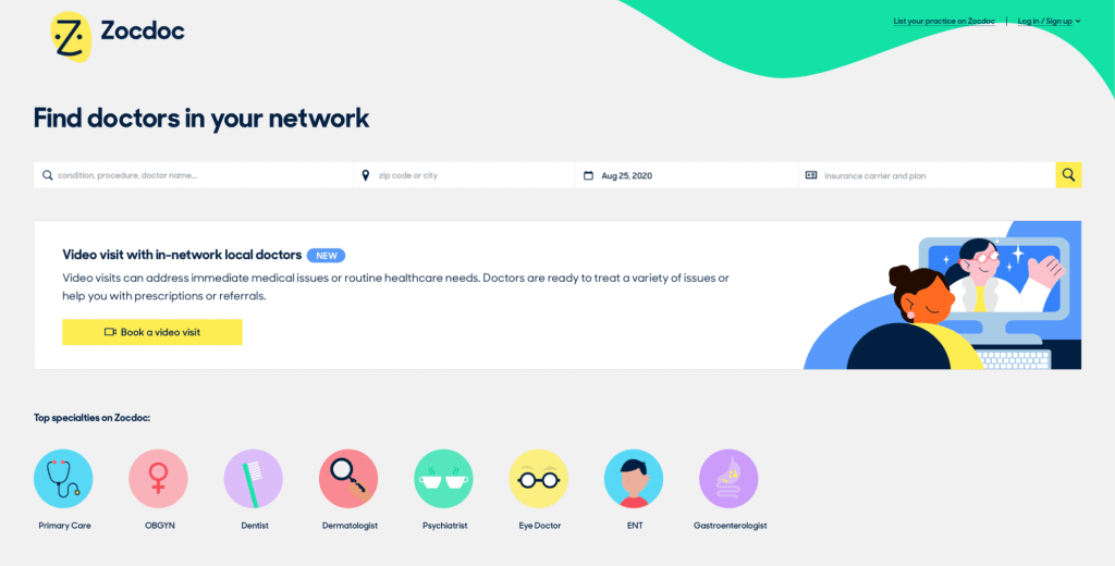
Zocdoc is an online platform that offers medical appointment scheduling services, with the goal of facilitating a better healthcare journey for its users. The website’s design, featuring a colorful palette and custom illustrations, aims to provide an engaging and enjoyable user experience.
Zocdoc’s primary focus is to make online doctor visit scheduling as stress-free and effortless as possible. To achieve this, the website offers several useful functionalities, such as a meticulous filtering and search system, a built-in map, an option for users to book a video visit, and the ability to create a personal account. These features make the booking process transparent and accessible for everyone, ensuring that users can easily find the right doctor and schedule an appointment that suits their needs.
Overall, Zocdoc’s user-friendly interface and practical functionalities have made it a popular choice for those seeking convenient and hassle-free medical appointment scheduling services.
Designing for Accessibility: The Story of Mayo Clinic’s Medical Website
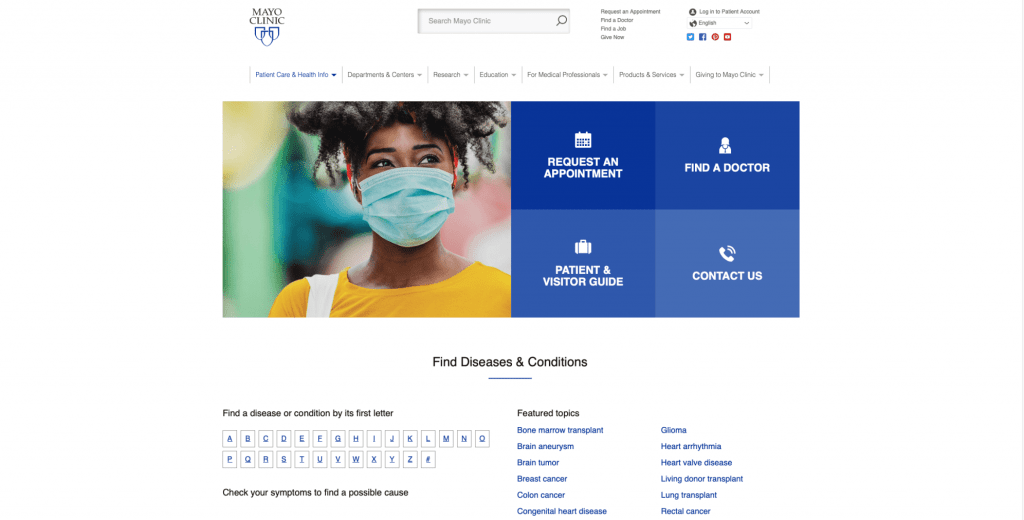
Mayo Clinic, as an academic medical center, boasts one of the most effective websites in the healthcare industry that provides healthcare data and information in a concise and easily understandable manner. The website’s clean and uncluttered design emphasizes the primary services provided by the center, ensuring that they are prominently displayed on the homepage. With its sharp layout, clear navigation, and well-organized information, Mayo Clinic’s website establishes itself as one of the country’s leading medical centers. This achievement is not only due to its excellent website but also the quality of the medical care and services it offers.
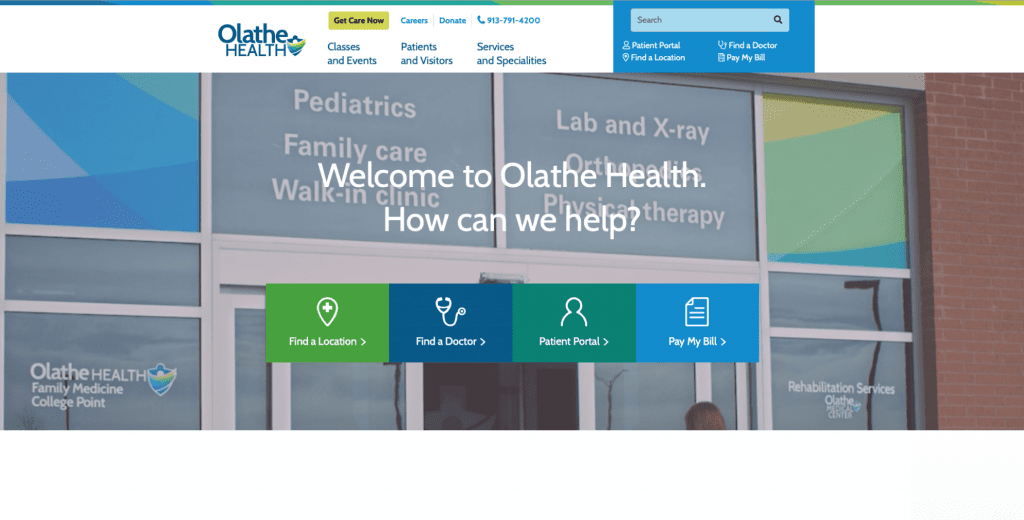
Transforming Healthcare Communication: Olathe Health’s Web Design Approach
Olathe Health is a leading regional health network that delivers top-notch medical services across several US states. The network boasts an extensive team of highly trained specialists who are available to cater to patients’ diverse healthcare needs. One of the best features of Olathe Health is its website, which provides comprehensive and insightful healthcare-related information.
Upon accessing the website, the user is greeted with a short video highlighting the medical services offered by the network. The website’s user interface is designed with various search systems, location options, and navigation buttons, making it easy to navigate, even for users with limited experience in using such platforms. This website is not only visually appealing but also highly informative. Visitors can find valuable information on the site, such as details on medical conditions, treatment options, and the network’s specialists.
Overall, Olathe Health’s website serves as an excellent resource for patients seeking medical assistance. The website’s design and content reflect the network’s commitment to delivering high-quality medical care and promoting patient satisfaction.

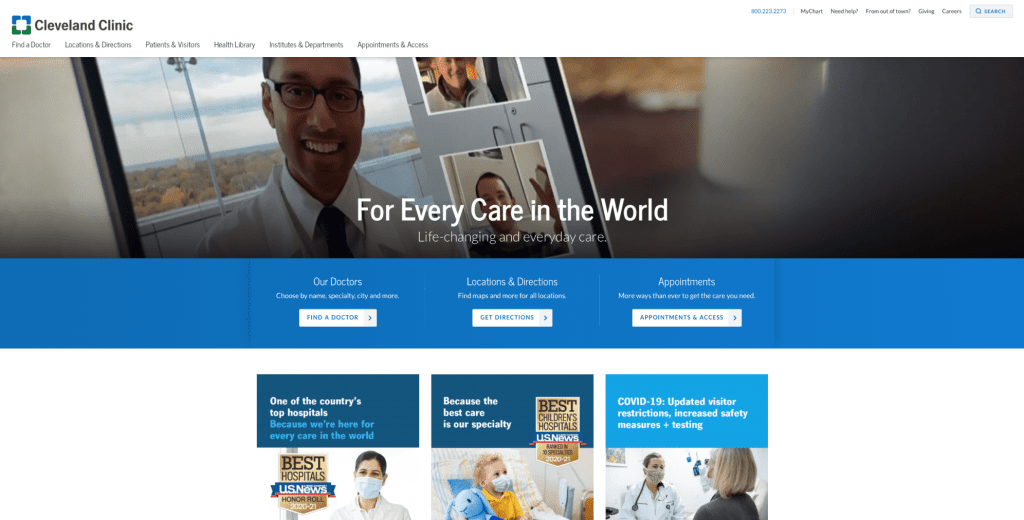
The Cleveland Clinic Experience: Revolutionizing Healthcare Websites
The Cleveland Clinic website is highly user-friendly, with a clear and concise organization that caters to both patients and doctors. It effectively saves time for users by providing easy access to the information they require, without the need to scroll through endless pages.
Furthermore, in response to the COVID-19 pandemic, the Cleveland Clinic has taken a proactive approach by keeping its platform updated with the latest information about the disease. Additionally, the website provides online appointments and checkups for individuals who may have contracted COVID-19.
Apart from its practical features, the website also has a friendly and inviting appearance that sets it apart from the clinical and intimidating look of many other medical platforms. Users can easily locate doctors in their local areas and schedule appointments with ease.
In summary, the Cleveland Clinic website is a well-organized and user-friendly platform that provides relevant and practical information to its users. It also manages to maintain a welcoming and approachable persona, making it an ideal destination for individuals seeking reliable healthcare resources.
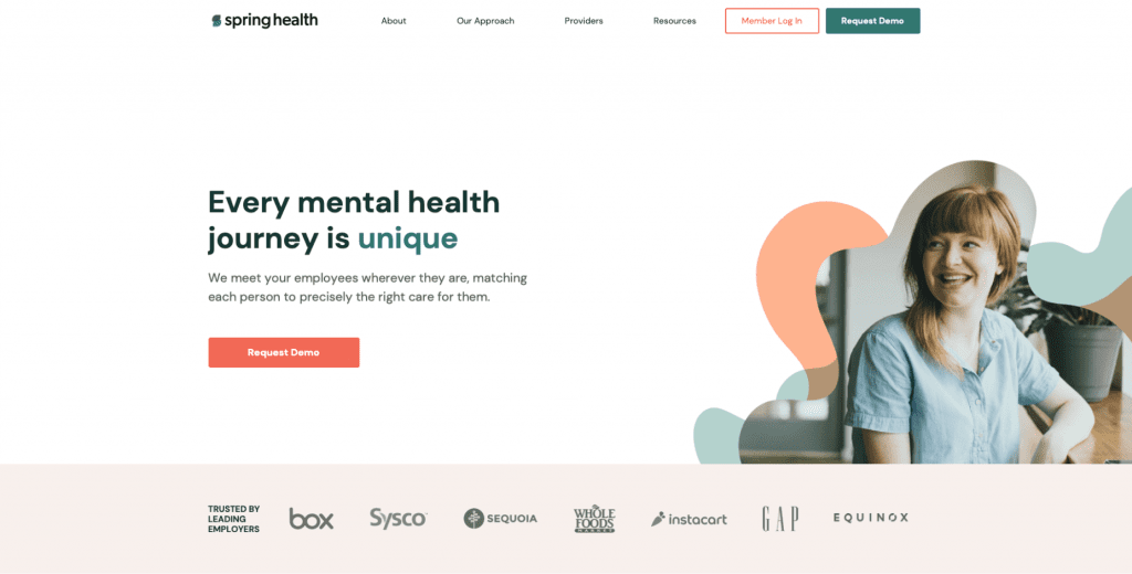
Designing a Better Healthcare Experience: Lessons from Spring Health’s Website Design
The Spring Health platform is designed to provide organizations with a comprehensive mental health benefits program for their employees. The Ester Digital team was responsible for redesigning the Spring Health website with the aim of creating a user-friendly “mental health hub” where individuals can feel safe and secure when seeking help from specialists.
To achieve this goal, the website incorporates several proprietary machine learning technologies and AI tools, which are seamlessly integrated into the website’s overall design. The platform is structured in such a way that long-scrolling pages do not appear overloaded. Moreover, a tranquil color palette and a well-organized arrangement of information contribute to a calm and inviting user experience.
To further enhance the user experience, the website features engaging elements such as videos, animations, custom-made illustrations, data visualization tools, and pop-ups. These elements help to create a more interactive and enjoyable user experience. Overall, the redesigned Spring Health website serves as an accessible and helpful platform that empowers individuals to take control of their mental health.
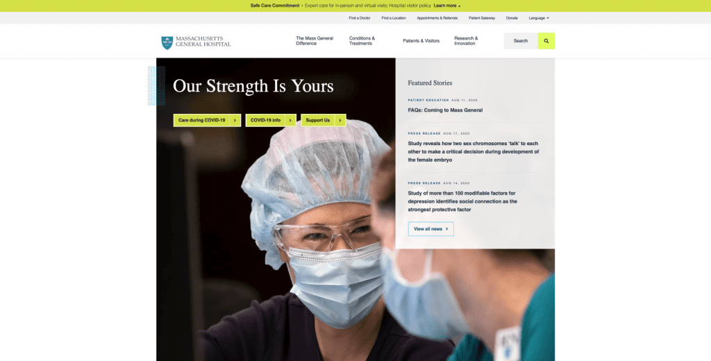
The Power of User-Centered Design: A Review of Massachusetts General’s Website
As one of the oldest and most prestigious hospitals in the country, Massachusetts General Hospital’s medical web design reflects the institution’s professional integrity. While the visual identity may not be the most cutting-edge, the level of the hospital’s competence is readily apparent.
The website’s main page is centralized with layers of content, and it lacks static design elements, which creates an intuitive navigation and a focus on user groups. This unique and rewarding user experience includes essential medical information for patients, as well as the latest research studies conducted in partnership with Harvard Medical School. Consequently, the portal is useful not only for patients but also for medical professionals.
Overall, Massachusetts General Hospital’s website design is a testament to the institution’s reputation as a leader in healthcare. Its well-organized content, intuitive navigation, and inclusion of cutting-edge research studies make it a valuable resource for patients and medical professionals alike.
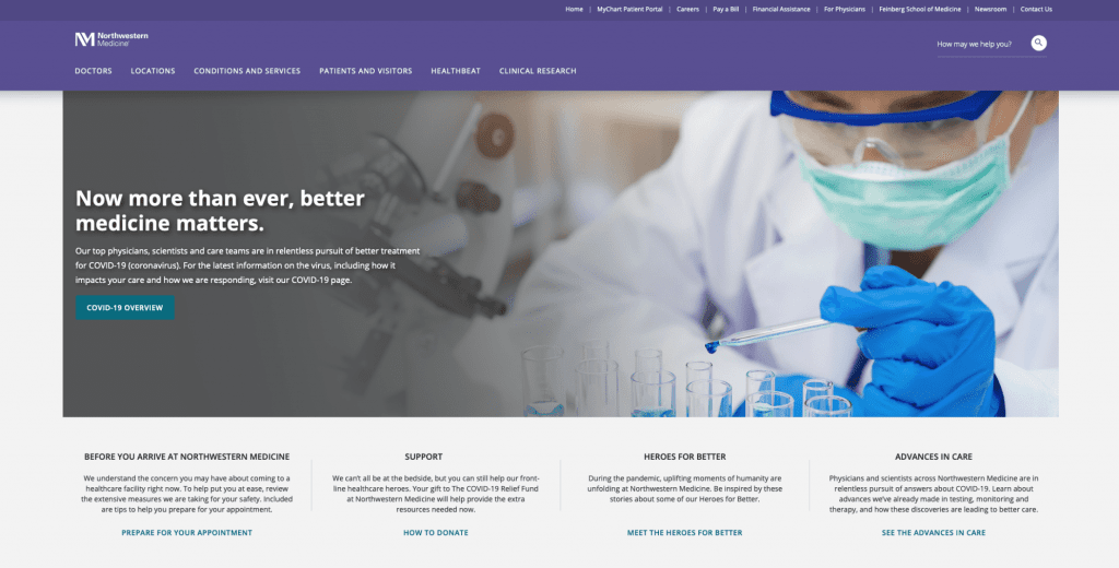
Navigating Healthcare with Ease: Northwestern Medicine’s Streamlined Web Design
Northwestern Medicine is a prominent healthcare group operating in Northwest Illinois, consisting of twelve hospitals and numerous medical facilities. Like most hospital websites, their website offers a wealth of medical information, as well as comprehensive lists of clinicians and practices.
For patients seeking faster and more efficient communication with their healthcare providers, the website features the MyChart Patient Portal. Additionally, users can peruse photos of the institution and its researchers, providing a more personalized experience.
The platform boasts a transparent interface, clear and bright design, and a descriptive and detailed main page, all of which ensure a positive and beneficial user experience. Overall, Northwestern Medicine’s website serves as an invaluable resource for individuals seeking reliable medical information and access to top-quality healthcare services.
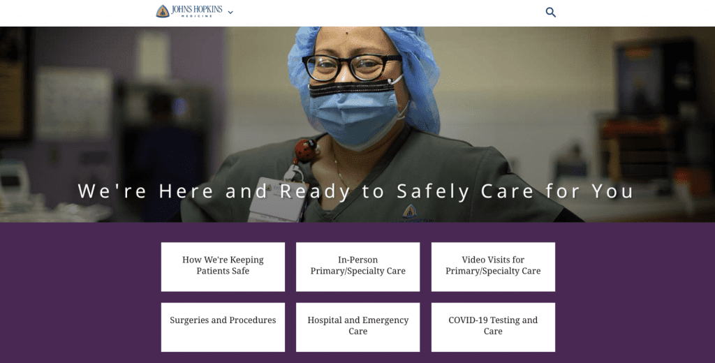
Innovative Medical Web Design: Johns Hopkins Medicine
Johns Hopkins Medicine is a prestigious biomedical research and hospital facility located in Baltimore, Maryland, known for its outstanding contributions to the field of medicine. The facility’s logo, a triangle symbol, is a reflection of its mission of research, education, and patient care. The blue and yellow color scheme used in the logo is also utilized throughout the website, creating a cohesive visual identity that enhances the user experience.
Apart from its recognizable logo, the website is an extensive resource for all kinds of health-related information. It provides patients with the opportunity to schedule appointments or get acquainted with clinicians in their local area. The website’s comprehensive range of services includes everything from preventative care to specialized treatments, and patients can also access educational resources to learn more about their health and wellbeing.
With its focus on research, education, and patient care, Johns Hopkins Medicine is one of the most respected medical organizations in the US. The website serves as a vital tool for patients looking to learn more about their health and access the best possible care.
On a Final Note
Healthcare websites can be dull and tedious, but they don’t have to be. With the right design, it’s possible to present intricate and complex information in an engaging and lively way. At Ester Digital, we have created multiple healthcare websites using a consumer-centric design approach that focuses on each customer’s specific needs. Healthcare platforms are rapidly gaining popularity, so if you’re considering developing one for your medical organization, now is the time to act.
We have discussed ten healthcare websites that we believe are the best in terms of healthcare website design and coherence, and we have also shared our experience of creating a few of them. If you’re still unsure about launching or redesigning your healthcare website, feel free to contact us. We are always ready to take on any challenge to help you expand your business opportunities.

Copied!


