
Outline:
For several years, tourism has been a significant contributor to the global economy, and many countries rely on this sector for their GDP growth. However, the COVID-19 pandemic presented an unparalleled challenge to the industry in 2020. With most countries imposing travel restrictions or in lockdown, tourism faced immense pressure to stay afloat.
With the internet being the primary source of information for many people, travel websites have become crucial in providing comprehensive details about tourism services and attractions. It’s no wonder that tourism companies invest heavily in their online platforms, ensuring they are as user-friendly as possible.
As a web design agency that has worked with various travel agencies, we understand the importance of creating exceptional travel websites in 2023. We’ve compiled a list of some of the best travel website designs to get you inspired
Captivating Travelers: Must-Have Features for an Outstanding Tourism Website
Before we start exploring the best travel websites, let’s define what makes a great tourism platform and what features you should consider when designing one in 2023.
- Visually Appealing Design: A clean, modern, and visually appealing design is crucial for capturing visitors’ attention. High-quality images and videos showcasing the destination’s highlights, culture, and natural beauty are essential for evoking a sense of wanderlust.
- Easy Navigation: A user-friendly interface with clear navigation menus and a logical site structure ensures that visitors can quickly find the information they’re looking for. Including a search function, filters, and categorization of content can further enhance the browsing experience.
- Mobile Responsiveness: A responsive design ensures that the website is accessible and functional on various devices, including smartphones and tablets. This is important as a significant portion of users access websites on mobile devices, especially while traveling.
- Informative Content: Provide detailed, up-to-date, and accurate information about the destination’s attractions, accommodations, restaurants, and activities. Content should be written in a captivating and engaging manner, enticing visitors to explore and plan their trip.
- Multilingual Support: Offering content in multiple languages increases the website’s accessibility to a broader audience, ensuring that travelers from different linguistic backgrounds can comfortably navigate and understand the information provided.
- Interactive Maps: Incorporate interactive maps that allow users to explore the destination, find nearby attractions, and get directions. This helps visitors plan their routes and visualize the proximity of various points of interest.
- Personalization: Personalized recommendations based on users’ preferences and interests can enhance the user experience and make the website more relevant to individual visitors.
- Social Media Integration: Incorporate social media sharing buttons and feeds, allowing users to share their favorite attractions, accommodations, and experiences with their networks. This not only amplifies the destination’s reach but also adds a layer of social proof.
- Reviews and Testimonials: Including reviews and testimonials from previous visitors adds credibility to the website and helps potential travelers make informed decisions about their trip.
- Online Booking and Reservation System: A seamless and secure online booking system for accommodations, tours, and activities simplifies the planning process for travelers and increases the likelihood of them making reservations directly through the website.
- Contact Information and Support: Provide clear contact information and support options, such as email, phone, or live chat, to assist visitors with any questions or concerns they may have while planning their trip.
By integrating these features, a tourism website can effectively engage visitors, provide valuable information, and ultimately inspire them to book their next adventure.
Best Travel Website Design Examples
Here are some examples of travel websites that excel in design and functionality. These websites showcase various aspects of an effective tourism website, such as visually appealing designs, easy navigation, informative content, and more.
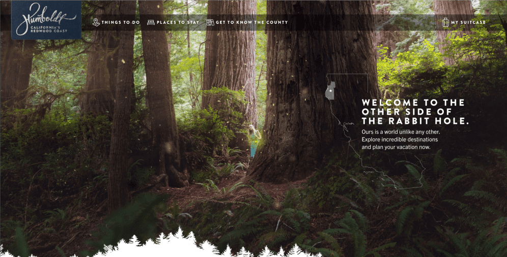
Experience an Immersive Adventure with Visit Humboldt’s Game-Inspired Travel Website Design
Travel websites often feature beautiful images of faraway destinations but provide minimal information about the services and tours available. However, Visit Humboldt, a travel agency website, is a refreshing change from this norm.
Humboldt County, California, is renowned for its redwood forests and well-developed hiking trails, and Visit Humboldt’s web design provides an immersive adventure for visitors. The one-page, game-inspired interface allows users to choose between activities, places to stay, and interesting spots to visit. Users can add their preferred options to a virtual suitcase, which will be planned and scheduled to create a personalized travel itinerary.
Visit Humboldt’s website design features clickable elements and interlinked pages, ensuring visitors stay longer on the site, improving the company’s SEO parameters, and creating a memorable brand voice. The interactive user experience of the site makes it difficult to leave, as users can watch beautiful scenery, learn about the various regions of Humboldt County, and experience the whimsical and magical character of the California countryside.
If you’re looking for an innovative and engaging travel website design, Visit Humboldt is the perfect choice.
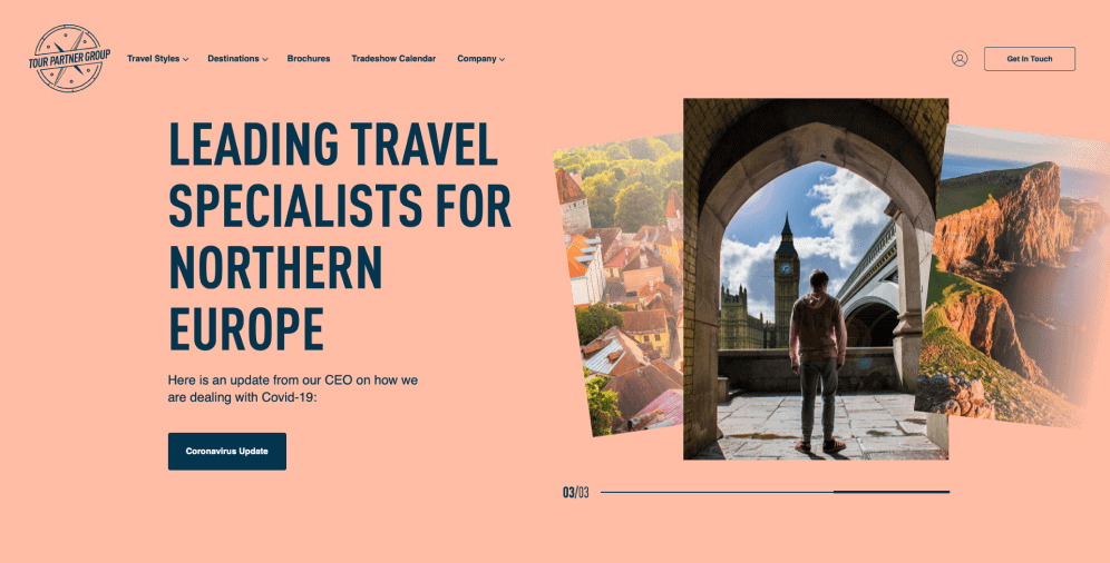
Tour Partner Group Website Development and Design: User-Friendly and Functional with a Corporate Look
Tour Partner Group is a collective of destination management companies from various European travel agencies that specialize in providing tailor-made tours in the United Kingdom, Ireland, the Nordics, and the Baltic states. The Tour Partner Group website is incredibly user-friendly, with a variety of photos, readable text, and easy navigation. Visitors can browse the company’s main destinations, brochures, and learn more about their history and services.
Ester Digital developed and designed the Tour Partner Group website, ensuring it was bold, colorful, and functional, with a clear corporate look and sleek visual architecture. The designers made sure to balance the bright corporate colors with a welcoming and inviting design that supports the website’s usability. Micro-interactions, animations, and icons were added to enhance the user experience, and the mobile version of the platform was optimized for all devices.
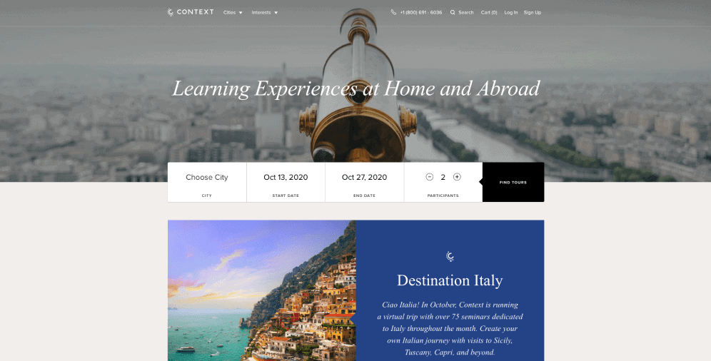
Context Travel: A Travel Agency Website with a Smooth and Transparent Design
Context Travel is a travel company that provides tours with specific themes and objectives, such as art, Jewish heritage, cuisine, and more. All tour guides are highly trained and specialize in their respective areas, providing expert knowledge about topics and locations that visitors are interested in.
The Context Travel website design is smooth and transparent, focusing on clearly arranged information blocks rather than flashy photos or colorful images. The website’s tone does not overtly advertise its expertise, but the platform’s design appeals directly to its audience’s needs. Context Travel is a prime example of a travel company that has tailored its position in the market to provide customers with a special and memorable experience.
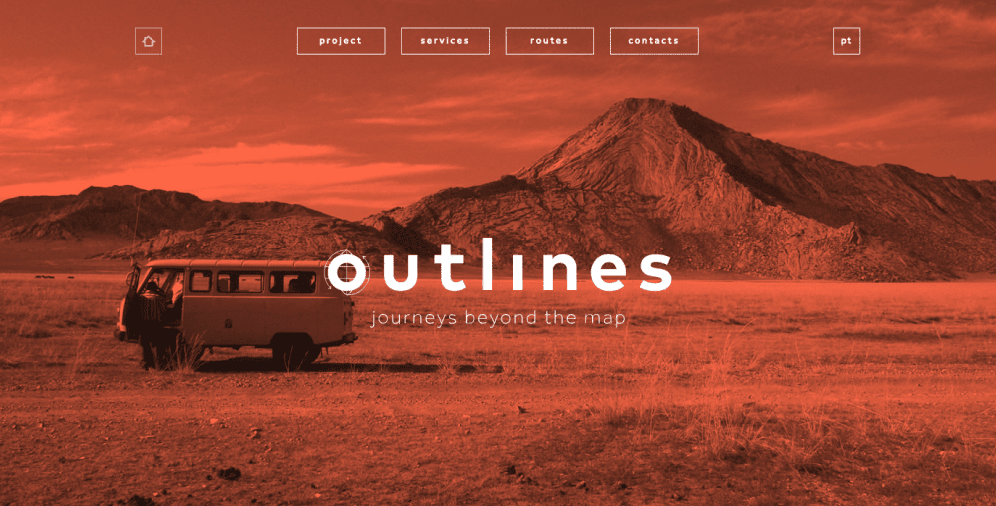
Outlines: How Color Palette Can Boost Your Travel Website Design
Outlines is a travel agency that caters to non-tourists by promoting a low ecological footprint, supporting local communities in the places they visit, and expanding travelers’ horizons emotionally, as well as physically and geographically. The Outlines website design reflects this unconventional approach, with Mars-like landscape photos and neatly arranged information blocks that focus on the company’s message.
The website’s orange color is used consistently throughout, even in small details such as transport icons, to ensure cohesiveness and brand recognition. The company’s routes are listed according to difficulty mode, with each trip described thoroughly, including the number of participants and main destination points. Their creative approach to traveling is reflected in the use of contrasting colors and additional icons that serve illustrative purposes.
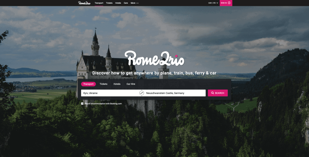
Rome2Rio: The Travel Agency Website with Ultimate Functionality
Rome2Rio is a travel agency website that offers innovative and practical tools for finding transportation around the world. Although the website’s design is not the most distinctive or eye-catching, its functionality more than makes up for it. Rome2Rio’s tools facilitate the process of finding transportation, providing several alternatives and transportation types at a time.
This travel agency site is particularly useful for those planning a long-distance journey or on a budget and need to see all possible financial options. Rome2Rio carefully plans the trip and shows the cheapest ways to travel along the entire route. In addition to transportation schedules, the website can track bookings for hotels, airports, and car rides. Visitors can create an account and manage all their booking details themselves.

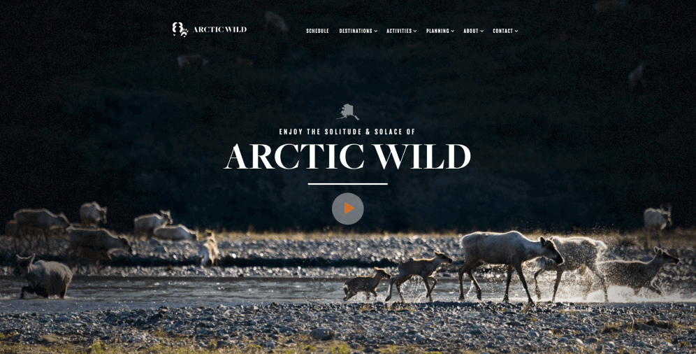
Arctic Wild’s User-Friendly Tourism Website: Your Guide to Alaska
Arctic Wild is a tourism website dedicated to the areas near Fairbanks, Alaska, offering classic hiking, rafting, camping, and photography trips. Visitors can view all scheduled trips, make reservations, and request custom-made trips tailored to their specific needs. The website’s navigation is clear, and all calls to action and clickable elements are easy to find and use.
The homepage features breathtaking photos of nature and an incredible presentation video. The harmonious and serene color scheme of the site evokes a sense of tranquility and peacefulness that is associated with Alaska. The website provides an enjoyable user experience, with information that is well-balanced and informative. Visitors can check out the places they plan to visit and see the profiles of guides who will navigate them through the wilderness, contributing to the platform’s personable feel.
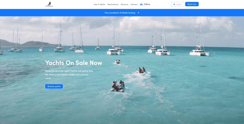
The Yacht Week: Engaging Website Design
The Yacht Week is a travel company website that provides an exclusive one-week yachting experience. Visitors can choose between their customized traveling plan or a scheduled-out package. They can also choose their crew, hire skippers and hosts, or find new members to add via a special search tool if their team is less than 12 members.
The website’s white and blue color palette and large negative space areas fully explore the sea theme. The site features numerous inviting photos of people enjoying the sun and having fun on yachts. Visitors can feel the light sea breeze and can’t help but be tempted to try out The Yacht Week’s services.
As an industry leader in the given niche sphere, The Yacht Week’s navigation tools are impeccable, and the information provided on the website is full and detailed. The platform also features a nicely structured blog with insights and promotional materials.
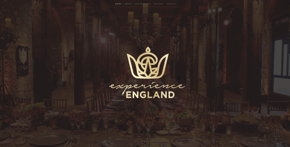
Experience England: Elegant and Premium Design
Experience England is a travel agency that provides luxurious and unique events and tours across Wales and England, including London. The website’s elegant and premium design is designed to appeal to even the most demanding clients. The platform is concise, with no overwhelming CTAs, photos, or data blocks. Experience England knows its target audience and appeals directly to them.
The Ester Digital team worked on the travel agency logo and branding, and the logo appears across all website pages. The color palette of royal blue and gold exudes poise and excellence. The site features photos of the locations where they hold meetings and destinations of some of the tours the company provides. The simplicity and subtleness of the website design lend itself to the brand’s mission to be creative but laconic, relying on the niche they take up and the audience they’re appealing to.
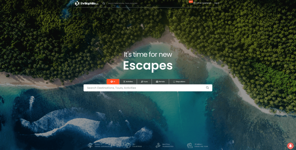
Thrillophilia: Simple and Effective Website Design
Thrillophilia is a travel agency website that offers a variety of extreme activities such as helicopter rides, paragliding, hot air balloon rides, bungee jumping, rafting, and many more. The landing page features CTAs that allow visitors to filter all the available destinations, activities, and locations and book the tour of their choice.
Thrillophilia makes the most of CTAs to hook and draw in users, and the platform also provides an impressive set of statistics on how well the company is doing, listing the number of users, travel experiences, and countries. The website design is simple and straightforward, with no flashy details or colors to detract attention from the numerous pages, CTAs, and blocks of information.
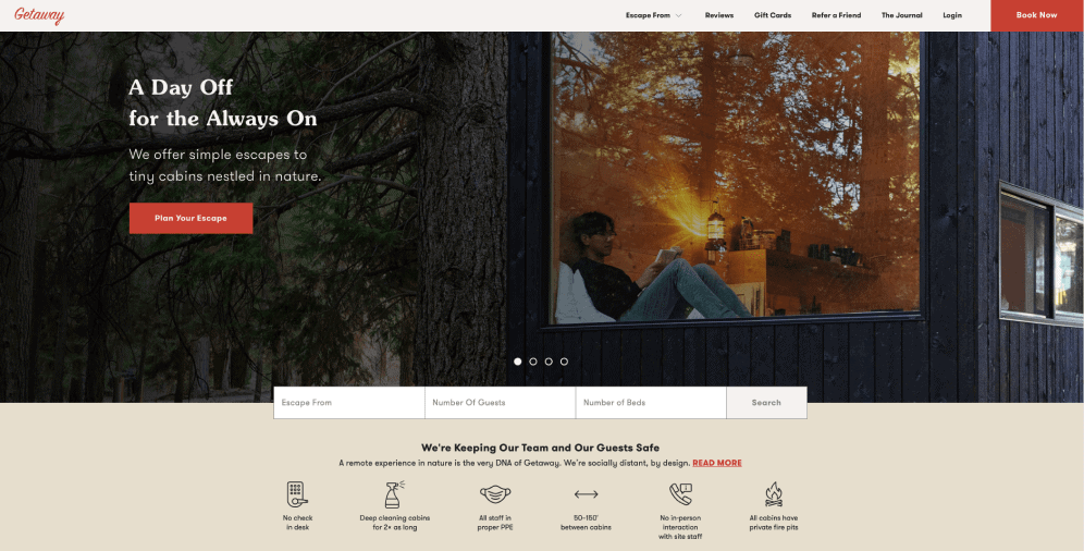
Getaway: The Role of UI/UX Design
Getaway is a travel agency website that provides an escape from the big city to a serene and worry-free break somewhere in the woods, far away from civilization. The website features loads of stunning photos, easy navigation tools, visible CTAs, and a calming color palette. The Getaway team also works on the Getaway Podcast, Getaway Book, Getaway Shop, and The Journal, providing insights, guides, and tips on how to stay sane and deal with modern life challenges.
Getaway offers a perfect solution for people who want to decompress in nature and reconnect with what matters most to them. The website’s design and content focus on providing a calming and relaxing user experience, with easy navigation tools and clear CTAs.
On a Final Note
Travel websites are often associated with overwhelming pop-ups, slow loading times, and excessive images. However, this doesn’t have to be the case. Ester Digital has compiled a list of the best travel website designs in 2023 that demonstrate the potential for travel websites to appeal to various audiences, whether they operate locally or globally, offer exclusive experiences, or cater to a broad range of interests.
There are endless ways to enhance a website’s design, including bold color palettes, informative CTAs, and creative visual arrangements. However, the design of a travel website should reflect the travel agency’s approach, whether it’s a small company or an industry leader. Clear and concise messaging is critical to ensure that travelers don’t end up disappointed with their trip after traveling thousands of miles.
If you’re unsure about how to create a successful travel website, the Ester Digital team is here to help. Contact us for assistance with designing and developing a platform that accurately represents your travel agency and appeals to your target audience.

Copied!


