Outline:
Design is a crucial element of any website, bringing together form and function to create a cohesive user experience. However, UI\UX trends and branding policies can shift over time, leading to inconsistencies and potential issues. A design audit can help solve these problems, ensuring that your website is consistent, relevant, and intact. In this post, we’ll dive into the process of a website design audit, exploring its purpose, scope, and benefits.
We’ll also discuss the difference between a design audit and a UX audit, highlighting the importance of both in achieving a holistic and positive user experience. By the end of this post, you’ll have a better understanding of why a design audit is a critical part of maintaining your website’s equilibrium and how it can pave the way for an excellent and reasoned design strategy.
What Is a Design Audit
When you look at your website, you see the unity of form and function. Design is a complex mechanism that brings all on-site elements together, and if done well, it elevates your performance and keeps your branding consistent, providing a holistic user experience.
Since trends can change and your branding policy might shift direction, you may want to redesign or breathe life into what you already have. It seems painless unless you start noticing some inconsistencies, either during or after the process. It could be little things at first, but they can snowball your website UI\UX into a mess. An excellent design audit is what can melt that discrepancy.
In a nutshell, a website design audit is a process of analyzing all the design elements you employ. Its main purpose is to keep the design on point, ensuring it is consistent, relevant, and intact. However, the level of detail and scope of an audit can vary based on the specific needs of a website and its users. An intensive audit gives you a full and detailed picture of the current state of the site. It shows what your users are struggling with and delineates the pain points in the overall design system so that you can fix these issues.
An audit can pave the way for an excellent and reasoned design strategy. It is an incentive to make only relevant and valuable design decisions. Ultimately, conducting an audit is the best way to maintain your website design equilibrium, ensuring it provides customers with an impeccable experience.
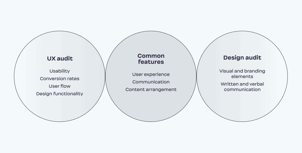
When speaking about the design audit process, it’s crucial to understand that it is not solely visual testing. It requires assessing all forms of visual, written, and verbal communication as well. At the same time, a website design audit is not equal to a UX audit. At their cores, website design is the means of interaction, while UX design is the tool. Therefore, the design audit focuses on the branding issues and consistency of form, while the UX audit evaluates the way users interact with that form, meaning usability. It also concerns conversion, user flow, information arrangement, and communication and feedback tools. However, there can be overlap between the two types of audits, and both rely on data- and research-supported methods to achieve a holistic and positive user experience. These overlapping areas include assessing user behavior, identifying pain points, and developing solutions to enhance the overall user experience.
While a UI audit and a UX audit are distinct processes, there are points of overlap between them. Both types of audits rely on data- and research-supported methods to analyze the website’s look and feel and user experience. For example, both may use surveys, interviews, and analytics to gain insights into users’ behaviors, preferences, and pain points.
Moreover, both audits aim to achieve a holistic and positive user experience, although they approach this objective from different angles. A design audit focuses on the visual and branding elements of a website, examining its consistency, relevance, and overall aesthetics. Meanwhile, a UX audit evaluates the website’s usability, user flow, and information architecture to ensure that it meets the users’ needs and expectations.
Despite their different foci, both audits can benefit from collaboration and communication between the UI and UX teams. By sharing insights and working together, they can develop a more comprehensive and effective strategy to enhance the website’s design and user experience.

Why Does Your Website Need a Design Audit
Over time, some visual elements can become mismatched, which influences how users perceive your brand. Such website design can transmit the mixed signals that confuse viewers. As a result, you get a broken line of communication that spreads unfavorable impressions of your brand. That is why visual consistency is paramount, and a design audit can show whether the customers perceive the website as a whole and receive the same message across all touchpoints throughout their journey.
Every UI\UX team tries to do its best to create an excellent visual form and support it with strong messaging. However, being too invested in the product and its constituents deprives you of seeing the big picture. A similar problem arises when working with large-scale projects. In such a vast of data, it’s easy to lose the point. But an audit is what can lead you and your team through it.
However, it is worth noting that not all UI\UX teams may always try to create an excellent visual form and support it with strong messaging, as priorities and goals can vary across different teams and organizations. Additionally, while an audit can certainly help guide a team through large-scale projects, it may not be the only solution to addressing the challenge of maintaining a big-picture perspective.
When auditing the designs, you can also involve third parties in the process. No doubt, designers comprise a significant part of the audit, as they are the ones who know the design behind the visual representation. But since they have participated in creating the audited product, it can be difficult for them to examine it critically. External auditors have a fresh look at the platform, as they are not closely familiar with it.
It’s important to note that the involvement of third parties might also have some drawbacks, such as lack of familiarity with the brand or the website’s specific goals and objectives. As such, it’s important to carefully consider the expertise and experience of any external auditors and ensure they have a good understanding of the project’s context.
Ester Digital strongly believes that performing a design audit is imperative when working on design projects. We always deliver only a research-proven strategy that is sure to be pertinent to your brand.
Figma’s share on the design market was 63% in 2021, and grew to around 80% by end of February, 2023.
How to Conduct a Design Audit
When it comes to the design audit process, it’s crucial to stay organized to avoid making more mistakes than your design might already have. It takes a dedicated approach to details, and at the same time, it’s paramount that you see the big picture. Thus, adhering to a clear step-by-step guide is the smartest solution. It allows you to reach the objectives and don’t get off the path.
Step#1 Collect and Analyze the Visual Assets of the Website
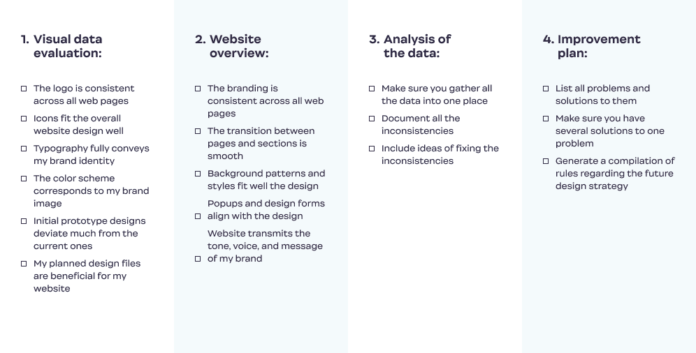
First things first, you need to gather all the visual data you employ and review your website’s internal configuration. Every single detail is significant. This initial step includes the following points and questions to answer:
- Logo in all formats: Does the logo describe your brand as it is now? Does it still match your brand identity and vision?
- Icons: Do your icons fit the overall website design?
- Samples of the fonts: Does the current typography convey the vision of your brand? Does it fit the visual hierarchy (the use of bigger fonts for headers and titles and smaller ones for body copy)?
- The color palette of your website: Does the color scheme correspond to your brand identity? Is it suitable for the message you want to convey? Does it carry the tone of your brand?
- Landing page design: Is it appealing and relevant enough? Are your CTAs eye-catching? Is the branding here consistent with that of the website?
- Initial design files: Does your current design deviate much from the original prototype?
- Design files you plan to release: How are they beneficial to your brand? How do they differ from the current ones?
Put all the data in one place – be it a PDF copy or an online management tool. Choose a format of your compilation file that is easy to view, read, and share. Also, you can create a physical copy for better visualization.
Once you have all of that, examine the list and search for inconsistencies. Doing this data accumulation enables you to analyze all of your design elements separately, yet altogether as a whole. It helps you to spot the dissonance in the system and explore how components can influence one another.
Step #2 Overview Your Website
Inconsistencies in UI\UX work against your branding, heavily influencing the brand identity. At this stage, you need to look through the website and consider the following questions:
- Is the branding consistent across all web pages? Is the transition between the pages and sections of the website smooth due to design?
- Do the background patterns and styles stay the same throughout the journey?
- Do similar sections adhere to the same design conventions?
- Are the popups and design forms in alignment with the branding?
- Does the website transmit the tone, voice, and messaging of your brand?
When answering these questions, you’ll know whether the design goes hand-in-hand with a brand idea or blocks it and entirely alters its direction. With that knowledge, you will be able to reveal the pitfalls followed by wrong design decisions and eliminate them, improving your website performance.
Step#3 Document Your Findings
Once you overview, analyze and synthesize, it’s time to document what’s good, acceptable, and potentially destructive in your website design. Let the inconsistencies dictate the course of future design strategy. Include your ideas on fixing the flaws and suggestions on preventing their recurrence. For better results, you can present your findings to your team members and launch a brainstorming session so that collectively you reach more ideas for improvement.
Step#4 Set up an Improvement Design Strategy
Based on your previous work, create a solid improvement plan. Not only should it solve the existing problems but introduce a compilation of rules for any future design. Think out each step and attach as many solutions to one problem as possible. A wide choice of assets will help you to avoid failure – you can always adhere to a plan “B” in emergencies, not breaking the process. All in all, the purpose is to guide you through the improvement stage so that you won’t lose direction and come back to the same mistakes.
For better understanding, Ester Digital created a website design audit checklist. Save it to keep your audits consistent and make them successful.

On a Final Note
There is nothing permanent except change. And as time passes, it’s natural and even necessary to alter the direction. But how to reach that objective successfully without going under the risk of ruining what you already have? The answer is to perform an audit.
Despite it being a meticulous process that takes much attention and time, a design audit is a valuable tool for maximizing the potential of your website. It brings consistency into the design, which positively influences the user experience. Ultimately, it urges you to focus on long-term solutions. Therefore, it helps you not only to make the change but make it permanent.
If you’re still uncertain about how to perform a design audit, feel free to contact us. We will provide you with the best solutions and present detailed checklists on your case if necessary.


