Outline:
If we were to count the number of products and services that companies introduce and promote every day, it would be overwhelming. The sheer volume of information consumed digitally means that online promotion is an indisputably reliable strategy. But what is the best way to advertise a product or service online?
A landing page is an excellent tool to acquaint viewers with your offer and encourage them to take action, ultimately increasing your conversions and expanding your client pool. But how exactly does a landing page work, and what are its key elements? How can you create an effective landing page? What distinguishes it from a homepage? If you’re not already overwhelmed with questions, keep reading the guide that our UX UI design agency prepared for you.
What is a Landing Page: The Key to Converting Visitors into Customers
A landing page is a web page created for a specific marketing campaign, designed to achieve a particular goal. Its main purpose is to encourage visitors to take action by using call-to-action buttons (CTAs), thus obtaining their contact information, generating leads, and converting them into paying customers. Landing pages typically contain various CTAs, such as “buy now,” “contact us,” “submit a form,” or “register for a course.”
Marketers usually use two types of landing pages: lead generation landing pages and click-through landing pages. Lead generation landing pages gather “lead” data from customers, such as their contact information and other user-specific data, through CTA forms. This approach helps marketers understand their target audience better and collect the focal points that determine their interests and preferences. This data can then be used to tailor future marketing campaigns to their specific needs.
Click-through landing pages, on the other hand, direct users to pages where they can complete a specific action. This is typically achieved through a CTA button, such as “register here” or “sign up for a demo version.”
So, how does a landing page work? There are several key elements that make up a successful landing page. The first is the “above-the-fold” section, which is the content that users first see when they access your website. This section should immediately grab the user’s attention and provide them with the information they need to understand the purpose of the landing page.
The next elements are the headline and hero shot, which are a phrase and an image that work together to engage users and encourage them to take action. Once visitors have understood your message and what you are advertising, they are more likely to click on a CTA button, which is the final element of a classic landing page.
Other essential elements of a landing page include a list of the main benefits of the product or service being offered, social proof that reassures users that you are a legitimate and trustworthy business, and a conclusive argument that encourages viewers to take the desired action.

The Advantages of Having a Landing Page: Essential Information for Business Owners
Why is having a landing page important? Let’s explore the key benefits.
#1 Increasing conversions
The most evident benefit of having a landing page is that it’s directly related to a specific marketing offer, making it more likely to attract interest than a general website or platform. Landing pages immediately showcase what is being offered and guide users to take action, which is beneficial for business owners. A well-designed landing page can improve the user experience, analyze user behavior, and collect essential data on the target audience. This, in turn, leads to a significant increase in conversions in the future.
#2 Finding Effective Strategies
A landing page is an excellent opportunity to experiment with various design themes, tools, and visual elements that might not work on other website pages. While landing pages usually follow the brand design, creative variations can be useful for increasing conversion rates and learning what works and what doesn’t.
#3 Boosting Brand Credibility
Landing pages are a effective way to introduce your brand to new users and turn them into paying customers. They provide a summary of what the brand does and what it can offer, so telling clients right away how they can benefit from the brand’s services enhances brand recognition and expands the client base.
Now that we have explored the benefits of landing pages, it is significant to understand how they differ from homepages and common web pages. While all three present business objectives and aims, they do it differently.
Landing Pages, Web Pages, and Homepages: Understanding the Differences
Before we delve into the differences between a landing page, a homepage, and a regular web page, let’s define each of them. A web page is a typical page on a website that provides comprehensive information about a company’s products or services. These pages cover various topics related to business activities and often include crucial pages, such as contact and about us pages.
Web pages are the foundation of a website, serving as a reference point for every other representative element of your digital presence. Their primary purpose is to provide information about the company’s activities, increase traffic, or perform specific functions, such as scheduling an appointment or selling a product.
A homepage is a type of web page that primarily aims to encourage visitors to explore other pages on the website. It serves as a central navigational point, and every other web page is connected to it. As the first page visitors encounter when accessing a website, a homepage forms the first impression of the entire digital platform.
Now, you may be wondering about the differences between a landing page, a homepage, and a regular web page. While web pages serve a more general purpose and have a wider functionality, landing pages are created with a specific marketing campaign in mind. They are tailored and focused, usually with a single call-to-action (CTA) button and minimal navigation links.
On the other hand, homepages typically give more general information without getting into the specifics of a particular product or service. Homepages are filled with links, both in the menu and footer, allowing visitors to navigate to other web pages. Unlike landing pages, people often stumble upon a homepage while searching for a company’s name or browsing the web.
Another difference between landing pages and homepages is the audience. Typically, people visit landing pages after they have learned something about a company, which increases the likelihood of conversion. In contrast, homepages are the first page visitors encounter when searching for a company’s name, so they serve as an introduction to the company’s digital presence.
Given the specific purpose of a landing page, their design requires a lot of work and a particular toolset. Therefore, it is vital to consider definite design strategies that can help you jumpstart your marketing campaign and boost conversions to the fullest.
From Concept to Creation: Designing a Winning Landing Page
Before embarking on your landing page creation journey, there are several things to consider. The first step is to gather as much background information as possible on different subjects to ensure that your landing page is tailored to your specific customer base.
Careful and thorough buyers’ research is necessary to identify your audience and cater to their specific needs. You can use your current customer data or collect data on a new client pool. However, it is essential to focus on your audience to increase your chances of success. If your landing page tries to appeal to as many buyers as possible, it is less likely to get noticed.
The second consideration is formulating what you’re offering, which must be distinguishable, particular, and unique. Your offer should coincide with the user persona you’ve established before. You must think about how your product is different from others and how it will solve your customer’s problem. Otherwise, your marketing campaign will fail.
Another important aspect to consider is the user’s journey and behavior. It is crucial to note how potential customers flow through your landing page, what goes through their minds, and how the page’s content affects their willingness to engage. You should think about data blocks that can echo the different stages of a user’s digital movement.
Now that you have done all the research and preparation mentioned above, it’s time to design your landing page:
#1 Craft an Appealing Narrative
The first and most crucial step in the landing page creation process is to provide key information on the product and list its benefits. Your landing page’s headline, call-to-action (CTA), and footer should be informative, concise, and straight to the point.
Don’t forget about your unique value proposition. It is the core of the landing page and answers the customer’s question: “how is it going to improve my life?”. You should feature this notion repeatedly without being intrusive. A list of benefits in bullet points is an effective way to do this. However, the list shouldn’t promote how great you are, but rather how great the user’s life will become with your product.
After the list of benefits, the CTA is the second most vital part of the landing page. CTAs should be actionable and easy to find, with encouraging words that will tempt viewers to use your product or service. The CTA should logically correspond with the other text content to avoid confusion.
The footer is a convenient place to put your contact information because users who scrolled through the whole page are ready to get in touch with you or ask further questions.
#2 Incorporate Stunning Imagery
When the text content is ready, complement it with appropriate design elements. The focus is on making users click, so the most focus is placed on the CTA. Use a contrasting color or a unique way of clicking to make it stand out. Visual cues like arrows, symbols, or pictures of people looking at the button can also point to your CTA. Your design should smoothly direct users to scroll and convert with the help of different visual accents and carefully divided blocks.
It’s more practical to place the CTA above the fold, at the top of the page, so users won’t have to scroll through the page. However, studies show that landing pages with only one CTA have a higher conversion rate than those with several.
Your landing page should be consistent with your existing corporate presence. Even though it’s not precisely part of your branding journey, it should align with your company’s branding style, including color palette, fonts, shapes, and animated elements. You may also explore your creative side and add new design components.
#3 Provide Detailed Information
To effectively showcase your product or service on a landing page, it is crucial to provide detailed information that answers any questions potential customers may have. One effective method is to use short video or animation, which can give viewers a better idea of the product’s appearance, usage, and functionality. Videos are also more likely to capture the attention of visitors than text with images. However, static visuals such as a 360-degree view or product demos can also be efficient in helping visitors envision themselves using your product or service.
#4 Include Social Proof
Establishing trust is essential for converting visitors into customers. Displaying reviews and testimonials on your landing page can help establish credibility and trust in your product or service. To be effective, testimonials should come from real people and include specific details about their experience. Visual aids and pictures of the product in use can also be helpful in building trust.
When incorporating testimonials, it is important to avoid using fake reviews and to use exact numbers and particular data to prove your expertise. Additionally, it is crucial to ensure that your testimonials are visually appealing and fit the overall design of your landing page.
#5 Conduct A/B Testing
After creating a landing page, it is important to conduct A/B testing to evaluate how users interact with different elements of the page and how quickly they leave or convert. It is crucial to view the testing process from the user’s perspective and analyze metrics, such as scroll maps and session recordings, to identify areas that need optimization.
It may be necessary to repeat the testing process multiple times to ensure that all confusing points have been identified and addressed.
#6 Promote Your Page
o drive traffic to your landing page, it is important to promote it through various channels such as social media, email marketing, or online correspondence. The choice of platform should align with your end goal. For example, if you want to expand your email marketing list, social media platforms that your target audience uses would be effective. Alternatively, if you want to advertise a new line of products or services, you can post a link to the landing page on your website or in online correspondence. By productively promoting your landing page, you can increase conversions and achieve your business objectives.
Extra Hints for Crafting a High-Converting Landing Page
After following all the steps to design a landing page, you may still find that your page isn’t attracting as many visitors or generating as many conversions as you would like. In this case, there are a few additional insights we would like to share with you.
- First, it’s essential to clear out any clutter from your landing page. While this may seem obvious, many landing pages are overloaded with unnecessary or confusing information that overwhelms users. Remember that the primary goal of a landing page is to convince users to try out your offer, so avoid coming across as a pushy or unprofessional shopkeeper.
- Another crucial consideration is designing your landing page to be mobile-friendly. With so many users accessing the internet through their mobile devices, creating a responsive or mobile-first landing page is a smart marketing move;
- If you’re feeling overwhelmed by the process of creating a landing page, there are various landing page builders available that can assist you, such as Carrd, Leadpages, or Wix. These platforms can help you transform your business objectives and marketing goals into an effective landing page design.
Finally, if you’re still struggling to create an effective landing page, don’t hesitate to contact us. We can take care of the heavy lifting for you. And if you’re simply looking for landing page inspiration, we’ve got you covered!
Top Landing Pages to Learn From and Apply to Your Own Site
Airbnb
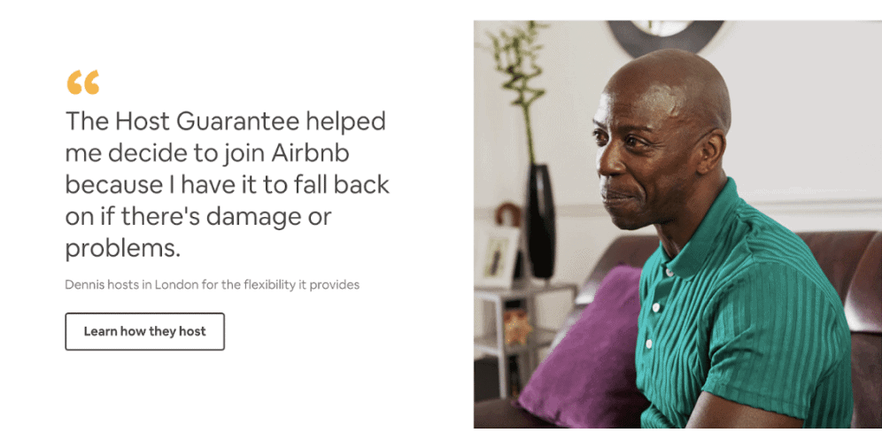
Airbnb is an online service that helps to find houses and rooms to rent all around the world. The service utilizes a great deal of personalization: based on your location, and the number of guests you can host, the service can estimate how many monthly earnings you can get. The landing page has a clear-cut design, testimonials, several cozy photos, and sharply defined data blocks that feature only hosting-related info and a CTA of contrasting color.
Lyft
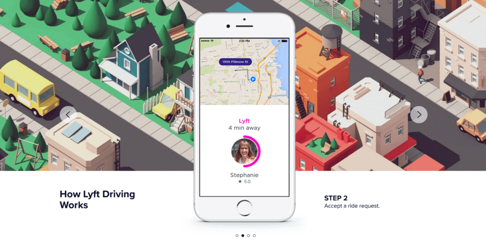
As most landing pages, Lyft’s “Drive with Lyft” page doesn’t feature a lot of design eccentricities: it remains consistent with its branding colors, doesn’t have any distractions, is straight to the point, listing the benefits and providing visual examples of how to use the app. On top of that, the landing page includes a FAQ section where you can learn more about the sign-up process. Lyft earns extra marketing points for having a feedback survey for people who aren’t ready to engage, as well as for a smooth but effective mechanism of addressing those who are ready to take action right away and those who need to get additional info by putting two CTAs in different places accordingly.
Codeacademy
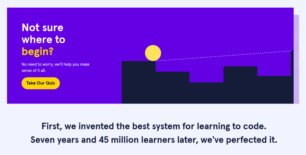
Codeacademy’s landing page hits the right balance between having a creative yet sleek design as well as managing to utilize its branding elements. It builds trust with the users by using such phrases as “no need to worry, we will help” and “it’s time to start investing in yourself”. The simplicity of the subscription form, detailed step-by-step description of the e-learning website design process, and social proof (“join the millions”) lend themselves to the accessibility and reliability of this landing page. You can even take a quiz that establishes your programming personality and helps to cater more to your learning needs.
Unbounce
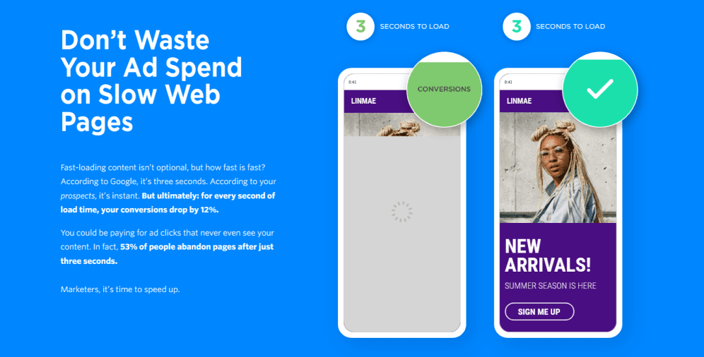
We admit – it’s a little meta to advertise a landing page of a landing page design company, but who to listen to if not the experts in the area? Unbounce’s landing page masterfully sets the “problem-solution-details” arrangement: it features a self-explanatory animation showing the effect of loading speed on conversion, ways to increase the loading speed, and CTA and pricing schemes. If you’re not convinced that Unbounce is what you need by the end of the page, then you weren’t really paying attention.
Shopify
Some homepages may serve as landing pages and Shopify is a great example of how this might work. It may seem overwhelming at first glance due to the different design elements, but it doesn’t deter the attention. The text is mainly composed of bullet points or simple phrases that aim you to sell at Shopify. There are no such things as long registration forms, or clumsy and over-the-top visual features – the page is user-friendly and a joy to engage with. Shopify uses the free trial CTA across the whole page which makes it easy for the user to subscribe right away without having to look for the said button or page themselves.
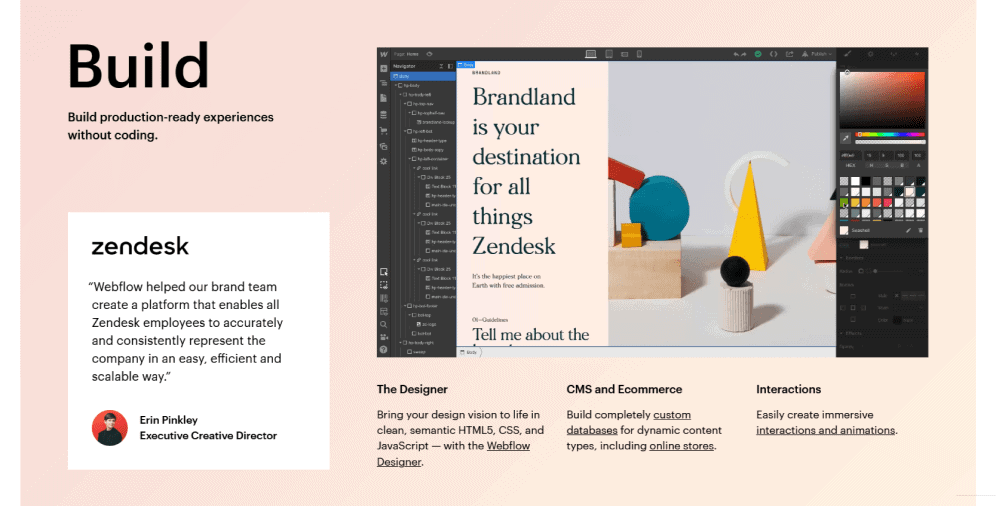
Webflow
Webflow is another web design tool that helps developers build custom websites from scratch. The layout of the landing page is extremely concise and almost airy, giving you the sense that these people don’t beat around the bush. The main feature of the page is a three-block structure consisting of “Build-Launch-Grow” sections. Each of them has a GIF incorporated into the block showing the viewers the details of the developing process. Stunning and modern design, subtle lists of benefits, as well as carefully placed reviews help to create trust and turn visitors into customers.
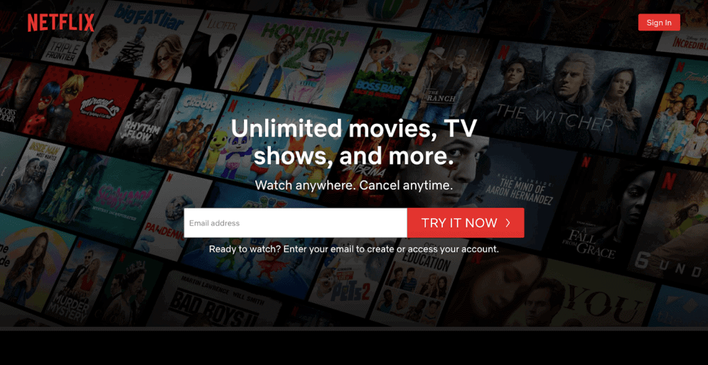
Netflix
Using verbs and clear phrases that urge viewers to take action is a great way to increase conversion. That’s what Netflix does well. It might seem like an outdated approach, but it works: there’s really no need to advertise the benefits of TV and streaming videos, so the company focuses on the financial advantages of using the service. Classic Netflix’s dark color palette with contrasting red adds to the brand recognition and improves the level of trust the viewers familiar with Netflix already have.
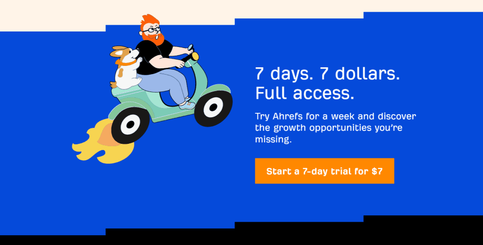
Ahrefs
Ahrefs is a popular tool for analyzing SEO parameters and backlinks. Its landing page is an incredible example of how you can both promote your brand story and advertise the service without being too grandiose and self-indulgent. The headlines are clear yet informative, the various videos, animations, and illustrations explain everything in detail, the numbers and big names support the Ahrefs claim at being the best at what they do. The color palette used here might be unconventional, but it’s instantly recognizable and is great for “watering down” possible complexities and confusions, making it more fun and entertaining to use.
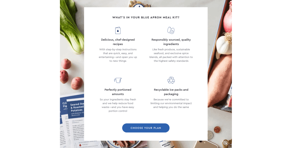
Blue Apron
Blue Apron is a meal kit delivery service based in the US. Their landing page features a video showing how Blue Apron works and what are the benefits of using it, evoking positive and familial feelings. Besides that, it’s full of symbols and illustrations that serve not only as design elements but also have a complementary descriptive purpose. Another interesting thing Blue Apron has is its use of colors – blue is not a typical color for a CTA since it’s not as actionable as a red or orange button. However, they play around with their name and incorporate the “blue” part of the “Blue Apron” and make it work.
Upwork
Upwork is a freelancing platform that connects employers with employees. Its minimalistic design and an unusual color palette reduced to white and green colors offer an open and honest dialogue between “clients” and “talent”. The page is equally oriented towards both target audiences and never puts focus on one of them in particular. Social proof examples feature both text and photos of former clients which solidifies the trust and shows that Upwork has strong connections with its customer base. Upwork breaks down its services into several categories making the process seem more personalized and tailored to your needs.

On a Final Note
Landing pages serve a specific purpose beyond showcasing your business. While they are created to promote your products or services, their primary goal is to increase conversions and build trust with customers through a marketing campaign. In contrast to a homepage or other web pages, landing pages are more short-term oriented and depend on a specific segment of your target audience.
Creating a well-designed landing page can make a significant difference for your business, as it provides valuable insights into your viewers’ behavior and preferences. By experimenting with different landing pages, you can gain a better understanding of your audience and improve your marketing strategy. However, it’s important to remember that simply creating a landing page is not enough. To get positive outcomes, you need to promote it and make the most of your social media accounts.
If you have any questions about landing pages or need help building one, feel free to contact us. We are here to assist you in creating an effective landing page that drives conversions and establishes trust with your customers.

Copied!


