Outline:
In the realm of architecture web design, the ability to balance aesthetic appeal with functionality is crucial. Architecture websites serve as digital portfolios, showcasing a firm’s creativity and expertise while ensuring a seamless user experience. By leveraging design elements such as minimalist layouts, immersive visuals, and intuitive navigation—including features like the hamburger menu—firms can captivate visitors and communicate their unique brand identity. Collaborating with professionals, such as a web design agency NYC, ensures these critical aspects are executed flawlessly, creating websites that resonate with their audience. Each of the examples we’ll explore demonstrates how thoughtful web design can enhance both visual storytelling and user engagement, setting a benchmark for excellence in the architecture industry.
01 SMP Architecture – Immersive Visuals with a Professional Touch
SMP Architecture’s website exemplifies how immersive visuals can engage visitors and set a professional tone.
The homepage of the SMP Architecture website is anchored by a stunning full-page drone video that immediately captivates visitors. This video goes beyond being merely eye-catching; it acts as a powerful storytelling tool, showcasing the precision and scale of the firm’s architectural designs. By presenting their work in such a dynamic manner, the site establishes a strong emotional connection with viewers right from the start.
As users navigate through the site, they experience seamless transitions between sections, ensuring that the browsing journey is smooth and engaging. The intuitive flow of the design guides visitors naturally through the portfolio, making it easy to explore the breadth of the firm’s work without feeling overwhelmed. This attention to detail in user experience enhances both accessibility and interaction.
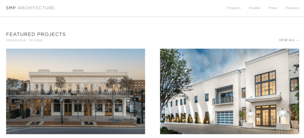
Complementing the visuals, the website employs clean typography and consistent layouts that lend a polished and professional appearance. The emphasis on readability ensures that every element—from project descriptions to navigation menus—contributes to an effortlessly cohesive design. These thoughtful choices reinforce the firm’s credibility and highlight their commitment to excellence in architecture web design.
This design showcases how visuals, combined with functionality, can leave a lasting impression on users while maintaining the clarity necessary for effective communication. SMP Architecture’s site exemplifies the potential of integrating storytelling into digital design to enhance user engagement. Their use of minimalist website design ensures that the content remains the focal point without unnecessary distractions.
02 Gluck Plus – Multi-Layout Homepage for Maximum Flexibility
Gluck Plus combines flexibility and creativity through its innovative multi-layout homepage, setting a benchmark in how modern architecture firms can engage their audience effectively.
Design features:
- Homepage Layout: The homepage offers users the flexibility to explore projects in multiple formats, accommodating various preferences and creating an inclusive browsing experience. Whether users prefer a quick overview or detailed insights, the adaptable layout provides options for everyone.
- High-Quality Imagery: Stunning, strategically placed visuals highlight key projects, ensuring each image is both eye-catching and informative. This careful curation draws the visitor’s attention to the most impactful architectural works without overwhelming them.
- Enhanced Interactivity: Subtle animations add depth to the user experience, creating a dynamic interface without compromising usability. These touches elevate engagement while maintaining a sleek, professional look.
- Innovative Navigation: The inclusion of a hamburger menu keeps navigation clean and unobtrusive, ensuring users can easily access all site sections. This modern approach to navigation aligns perfectly with current trends in architecture web design.
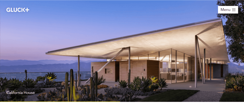
The website’s design reflects an emphasis on adaptability and user-centric experiences, making it appealing to a wide range of audiences. Additional features, such as seamless scrolling and contextual project descriptions, ensure that users are consistently engaged without being overwhelmed. The inclusion of call-to-action sections further guides visitors to explore the firm’s portfolio in-depth, enhancing user interaction. By integrating creative visuals with seamless functionality, Gluck Plus has established a digital presence that is both inviting and highly effective. Their collaboration with a web design agency nyc is evident in the thoughtful layout and user-friendly elements, which demonstrate a mastery of minimalist website design principles. This balance of aesthetic appeal and usability underscores the importance of crafting digital environments that resonate with diverse user needs while pushing the boundaries of architecture web design innovations.
03 Powerhouse Company – Dynamic Animations for a Memorable Experience
The website for Powerhouse Company demonstrates how dynamic animations can elevate user engagement and create a memorable digital experience. Bold animations are seamlessly integrated throughout the site, transforming static project presentations into vibrant, interactive showcases. Each animation is carefully timed to draw attention to specific elements of their architectural projects, creating a sense of discovery and inviting users to explore further.
What sets the site apart is its unique interface, which blends creativity with functionality. The design encourages exploration while maintaining clarity, ensuring that visitors are never lost as they navigate through the content. The balance of aesthetics and usability is evident in every element, from the way information is organized to the intuitive placement of interactive features. This approach ensures that even first-time visitors can easily find what they are looking for.
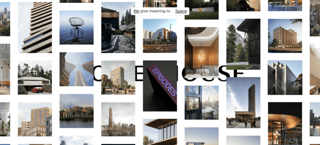
A carefully crafted user flow guides visitors effortlessly through the site, supported by clear calls to action and logical content organization. Each section transitions smoothly into the next, creating a cohesive journey that keeps users engaged. The logical layout and interactive elements are a testament to the meticulous design process, likely in collaboration with a web design agency nyc, which helped transform the website into a storytelling powerhouse.
Through its innovative use of animations and a user-focused design, Powerhouse Company’s website stands out as a prime example of architecture web design done right. It highlights how thoughtful design choices can turn a website into a dynamic tool for engagement and storytelling, setting new standards for digital presence in the architecture industry.
Powerhouse Company’s site highlights the potential of animations to create a more engaging and interactive user experience. It demonstrates that thoughtful design can turn a website into a powerful storytelling tool. Their collaboration with a web design agency nyc has likely played a role in crafting this innovative digital presence, ensuring both visual appeal and practicality.
Powerhouse Company’s site highlights the potential of animations to create a more engaging and interactive user experience. It demonstrates that thoughtful design can turn a website into a powerful storytelling tool. Their collaboration with a web design agency nyc has likely played a role in crafting this innovative digital presence, ensuring both visual appeal and practicality.
04 Yellow House Architects – Minimalism for Maximum Impact
Yellow House Architects’ website is a masterclass in minimalist website design, focusing on clean and effective presentation.
Streamlined Simplicity That Stands Out:
- The design prioritizes visual storytelling, ensuring that every project takes center stage. By employing a minimalist approach, the website eliminates distractions, allowing the architecture to command the viewer’s full attention.
- Negative space is strategically utilized to draw the eye toward key elements, enhancing both the aesthetic and the functionality of the site. This thoughtful use of white space improves overall readability while guiding the user naturally through the content.
- Navigation is straightforward, ensuring users can access every part of the website with ease. The menu’s simplicity, combined with its intuitive structure, reflects the overarching minimalist philosophy, making the site accessible and user-friendly.
- Additional features, such as subtle hover effects and well-placed call-to-action buttons, add layers of interactivity, encouraging users to explore deeper into the portfolio. The seamless integration of these elements exemplifies a refined approach to architecture web design.
- The inclusion of a hamburger menu further contributes to the clean and organized navigation, underscoring the site’s commitment to functionality while maintaining a sleek visual aesthetic.
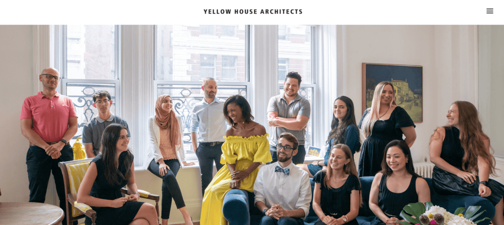
This minimalist approach ensures that the focus remains on the firm’s work, demonstrating the power of simplicity in web design. Yellow House Architects’ site is a testament to how less can truly be more in the digital space. The inclusion of a hamburger menu adds to the clean and organized navigation, a feature often recommended by experts in architecture web design.
05 Archi Graphi – Simplicity Redefined
The website for Archi Graphi exemplifies the beauty of simplicity through its minimalist aesthetic.
Subtle Elegance in Every Detail:
- High-quality visuals paired with a clean, harmonious color palette dominate the design, with neutral tones providing a calming backdrop. This aesthetic allows the projects to shine and ensures the focus remains on the architectural excellence showcased.
- Navigation is crafted with simplicity in mind, ensuring users can effortlessly access project details. A streamlined menu structure avoids clutter, enabling users to stay immersed in the site’s content without distractions.
- The strategic use of white space amplifies the impact of key content areas, creating an open, breathable design that enhances the user’s visual journey. This thoughtful application of negative space elevates the overall design.
- Additional enhancements, such as intuitive hover effects and dynamic transitions, subtly draw the user’s attention to project highlights without overwhelming the browsing experience. These refined touches contribute to a smooth, interactive journey through the site.
- A functional hamburger menu integrates seamlessly into the layout, ensuring navigation remains both accessible and unobtrusive. This feature aligns with the minimalist approach, emphasizing clarity and user focus while setting a modern tone.
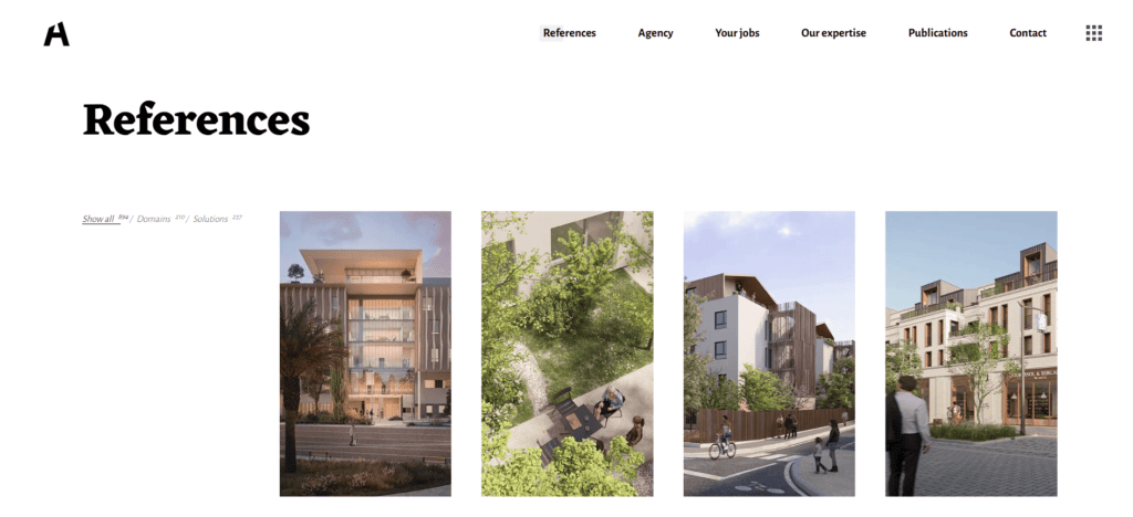
Archi Graphi’s design proves that simplicity can be both functional and visually striking. By focusing on clarity and usability, the website offers an experience that is both engaging and efficient. The thoughtful implementation of minimalist website design ensures that the visuals are the primary focus, aligning perfectly with the goals of architecture web design.
06 Bjarke Ingels Group – Interactive Design at Its Best
The website for BIG stands out for its dynamic and interactive design elements.
Interactive Elements That Elevate User Engagement:
- Hover effects and animations enhance the browsing experience by creating an interactive journey for users. These elements offer subtle feedback, making navigation intuitive, enjoyable, and more immersive, keeping users engaged throughout their visit.
- Multimedia storytelling is a standout feature, seamlessly integrating text, video, and high-quality imagery to present projects dynamically. Each medium complements the others, weaving a rich narrative that highlights various aspects of their architectural designs.
- A meticulously crafted navigation structure simplifies exploring their extensive portfolio. Categories and filters are thoughtfully organized, allowing users to find specific projects effortlessly. Additional breadcrumbs and contextual hints ensure users never feel lost as they navigate the site.
- Interactive transitions between sections create a cohesive flow, making the journey through the portfolio feel smooth and uninterrupted. This attention to detail encourages prolonged engagement, showcasing the firm’s projects in their best light.
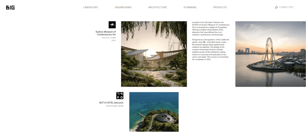
BIG’s approach demonstrates how interactivity can enhance user engagement while maintaining an elegant design. The site’s innovative features reflect the firm’s commitment to pushing boundaries in both architecture and digital design. Their collaboration with a web design agency nyc has helped craft a site that stands as a benchmark for architecture web design excellence.
07 Foster + Partners – Sleek and Modern Aesthetic
Foster + Partners’ website reflects their innovative architectural vision through sleek design.
Innovative Simplicity and Modern Aesthetics:
- High-resolution visuals showcase projects in stunning detail, with each image thoughtfully paired with concise descriptions. These descriptions provide valuable context while ensuring the visual elements remain the primary focus, avoiding any sense of overwhelm for the user.
- The design achieves a modern aesthetic by leveraging consistent typography and a carefully curated, limited color palette. This cohesive design language not only reinforces the firm’s brand identity but also creates a polished and professional look.
- User-friendly navigation ensures visitors can easily explore the extensive portfolio without frustration. The intuitive menu structure and strategically organized layout enhance accessibility, making the content approachable for a diverse audience.
- Subtle interactive elements, such as hover effects and smooth scrolling transitions, add an engaging layer of sophistication to the user experience. These features create a seamless journey through the site, encouraging visitors to spend more time exploring.
- A well-placed hamburger menu offers unobtrusive access to deeper site navigation, aligning with modern trends in architecture web design. This feature ensures the website remains clean and minimal while still being functionally robust.
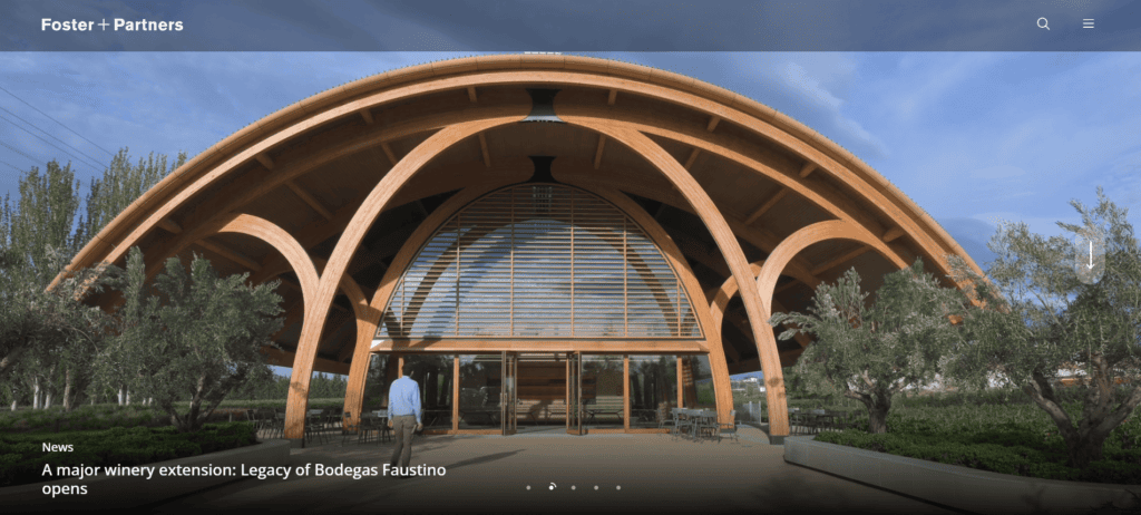
This sleek design underscores the importance of clarity and modernity in presenting architectural excellence. Foster + Partners’ site serves as an example of how thoughtful design can elevate a brand’s digital presence. The inclusion of modern navigation tools, such as a hamburger menu, enhances the usability of this outstanding example of architecture web design.
08 FFEKT Architects – Sustainable Design with a Digital Edge
EFFEKT Architects’ website blends sustainability with innovative digital design.
Sustainability Meets Innovation in Digital Design:
- The clean layout emphasizes eco-consciousness, seamlessly reflecting EFFEKT Architects’ architectural philosophy. By focusing on streamlined design, the website mirrors their core values, resulting in a cohesive and impactful brand identity that resonates with their audience.
- Interactive elements, including smooth scroll animations and hover effects, engage users by adding a dynamic layer to the browsing experience. These features encourage deeper exploration and create a sense of movement that aligns with the firm’s progressive approach to design.
- A carefully selected neutral color palette further reinforces their commitment to sustainability and modernity. Earthy tones, subtle contrasts, and harmonious hues convey their environmentally conscious ethos while maintaining a polished and professional appearance.
- Additional highlights include strategically placed call-to-action buttons and intuitive navigation paths. These elements guide users effortlessly, ensuring they remain immersed in the firm’s portfolio while easily accessing essential information.
- A modern hamburger menu integrates seamlessly into the design, providing unobtrusive yet efficient access to various sections of the website. This feature underscores the importance of clean, user-centric navigation in architecture web design, making EFFEKT’s site a standout example of innovation.
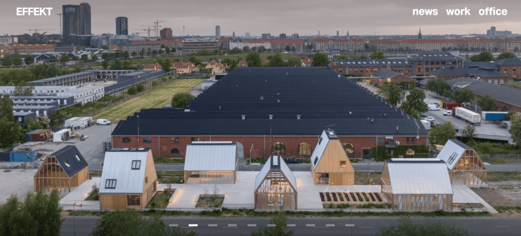
EFFEKT’s website showcases how digital design can reflect an architectural firm’s values. By aligning their online presence with their mission, they create a strong and memorable brand. The integration of modern navigation tools, such as a hamburger menu, further enhances the site’s usability, making it a standout example of architecture web design.
09 MAD Architects – Bold Creativity with Artistic Design
The website for MAD Architects is a testament to bold creativity and artistic expression.
Dynamic Creativity in Every Element:
- Artistic layouts with bold imagery and animations create an immersive experience, transforming each page into a curated gallery. These layouts showcase their projects as true works of art, leaving a lasting impression on visitors and inspiring them to explore further.
- Unique scrolling effects guide users effortlessly through the portfolio, seamlessly weaving storytelling elements into the browsing journey. These effects not only enhance the narrative flow but also add an element of surprise, encouraging prolonged engagement.
- A hamburger menu integrates flawlessly into the clean design, ensuring navigation remains both intuitive and unobtrusive. This minimalist navigation tool reflects a user-centric approach, allowing visitors to focus on the content without distractions.
- Additional highlights include dynamic transitions and interactive elements that respond to user actions, creating a sense of connection and engagement. The combination of these features underscores the innovative spirit of architecture web design, making the site both functional and memorable.
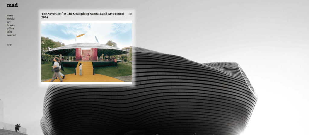
MAD Architects’ site embodies the idea that bold design can leave a lasting impression. By prioritizing creativity and innovation, they create a digital presence that is both inspiring and impactful. Their collaboration with a web design agency nyc ensures that the website aligns with industry-leading standards in architecture web design.
10 Zaha Hadid Architects – Futuristic Design Excellence
The website for Zaha Hadid Architects reflects their reputation for innovative and futuristic designs.
Futuristic Innovations in Digital Storytelling:
- Fluid, futuristic design elements embody the essence of the firm’s architectural style. The site seamlessly integrates form and function, creating a digital extension of their groundbreaking work. This cohesive design ensures that every visual and structural choice aligns with the brand’s innovative ethos.
- Dynamic visuals and multimedia content elevate the user experience, bringing each project vividly to life. Videos, high-resolution images, and interactive elements create a captivating and immersive narrative that keeps users engaged while offering deep insights into the firm’s architectural vision.
- Sophisticated navigation ensures that exploring the site feels intuitive and rewarding. Clear calls to action and a well-organized structure make it simple for users to access vital information, browse projects, and connect with the firm. Additional elements, like smooth scrolling and context-aware menus, enhance usability and maintain engagement.
- The incorporation of subtle animations and transitions adds depth and a sense of modernity to the browsing experience. These touches make every interaction feel fluid, reinforcing the futuristic design approach while ensuring the user journey remains seamless and memorable.
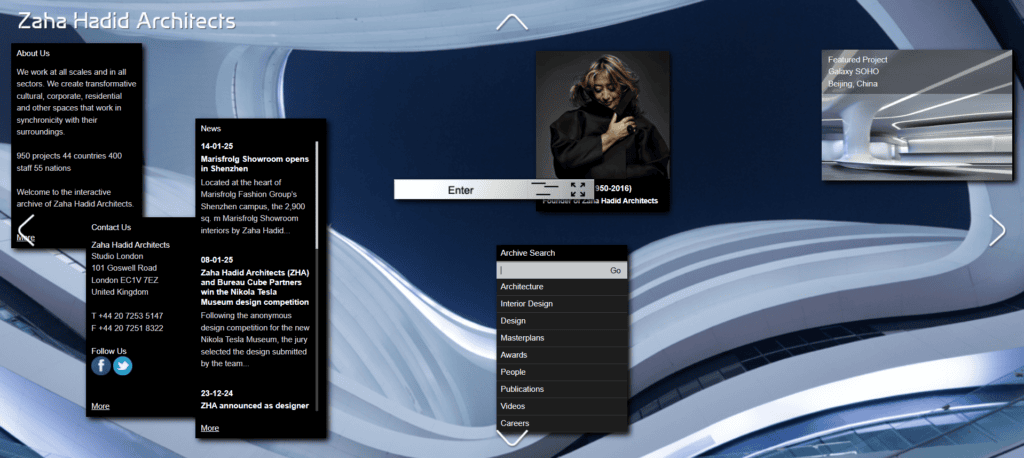
Zaha Hadid Architects’ site exemplifies how web design can align seamlessly with a firm’s architectural philosophy. By embracing futuristic elements, they set a benchmark for innovation in digital design. The inclusion of a hamburger menu and seamless navigation showcases the importance of user-centric design in architecture web design.
On a Final Note
As these examples demonstrate, the best architecture websites combine aesthetic brilliance with functional excellence. From minimalist website design to dynamic animations and interactive features like the hamburger menu, each site highlights unique strategies to engage and inspire users. By partnering with experts, such as a web design agency nyc, architecture firms can craft digital experiences that not only showcase their work but also reflect their brand identity. The future of architecture web design lies in embracing creativity, technology, and user-centric design. To learn more or discuss your project, feel free to contact us.
