
Outline:
In today’s world of web and app design, the hamburger menu has become an iconic feature. Consisting of a triple bar icon that, when clicked, displays a website’s navigation options, it has gained widespread recognition and popularity. Despite this, there is an ongoing debate within the web design community regarding its effectiveness and impact on user experience. In this article, we will examine the history and evolution of the hamburger menu, explore its pros and cons, and provide guidelines on when to use and when to avoid it.
We will also look at alternative navigation options and provide inspiration for creative solutions. Finally, we will stress the importance of ensuring that any navigation choice is made with the user experience in mind, and offer assistance from Ester Digital in making the right decision for your website or app.
To Hamburger or Not to Hamburger: The Pros and Cons of the Iconic Menu Design
In summary, a hamburger menu is a navigation tool represented by a triple bar icon that, when clicked, displays a website’s navigation options. It gets its name from its resemblance to a burger with its three horizontal lines representing a top bun, a patty, and a bottom bun. The icon can also be referred to by other names, such as a sandwich, hotdog, triple bar, double oreo, side menu, or navigation drawer.
The primary function of this type of menu is to switch the navigation between the main screen and a side menu, allowing designers to include more features without overwhelming the main page. However, some users may find it confusing or require additional actions to access the navigation, which can affect their experience. Despite this, the hamburger menu remains highly popular in contemporary web design.
The Evolution of the Hamburger Icon: From Xerox Star to UI/UX Design Standard
In the 1980s, the first hamburger icon was created for Xerox Star by a user interface designer named Norm Cox. Cox considered several symbols to represent the side menu, but found that a downward-pointing triangle could easily be misinterpreted as a pointer rather than a selection of options. Abstract symbols such as the plus sign and asterisk were also deemed unfit to represent the menu concept. Ultimately, the simple four-lined hamburger image was chosen as the most suitable icon for a list of workable items. It was visually clear, easy to understand, and functionally memorable.
Despite its creation, the hamburger icon went highly unrecognized for almost 30 years. However, in the late 2000s, designs became more responsive to the user behavior and environmental factors, such as platform, screen size, and orientation. Mobile websites and apps faced significant challenges in balancing creativity and functionality while accommodating smaller screens. The hamburger icon offered an effective solution, providing excellent functionality while taking up minimal screen real estate.
This menu gained popularity and appeared in various apps, including Twitter and Facebook, and was eventually adopted by most of Google’s apps. As a result, it achieved official recognition and became a standard in UI/UX design.
Is the Hamburger Menu Worth the Hype: A Look at its Pros and Cons
The value of this type of menu has been widely debated within the web design community, with some believing it to be a valuable tool while others reject its efficiency. Here are some advantages of the hamburger menu:
Pros:
It is recognizable: The menu has been around for decades, and its purpose and function are widely understood. It is a universal sign that is recognized everywhere, and its standard doesn’t require decoding or translation into other languages.
It contributes to a cleaner design: By hiding items behind the menu, the menu keeps the overall design free of clutter and enables a smooth user experience. It is especially effective for mobile websites or apps, where screen real estate is limited.
It simplifies navigation: The menu allows designers to highlight primary navigation by moving secondary menu options from the main screen to a side menu. This makes the navigation more structured and transparent and relieves the weight of numerous options on the user.
It provides direct access: Clicking on a hamburger button provides users with direct access to their preferred item, saving them from having to navigate through numerous pages in sequential order. This streamlines the interaction and improves the user experience, especially on mobile devices, where users expect quick access to functionality.
Although some may argue that the menu requires an extra step for users, it is an efficient and effective way to provide users with direct access to their desired content without cluttering the main screen.

Cons:
Despite its popularity, it does have some drawbacks, including:
It is hard to discover: Some designers believe that the hamburger menu is difficult to find as it obscures the content behind the icon, providing no information scent and requiring extra work from the user to figure out what’s behind it. There are at least three reasons for this: the small size of the icon or blended background and icon colors that make it almost invisible, its position in the top left corner that is the same as a back button, and not everyone is familiar with a navigation drawer.
It creates extra effort: When features are hidden behind the hamburger icon, it takes longer for users to discover them. Users have to click on the icon, then on the tab, and then search for the right options in sub-sections, which can cause frustration as most prefer to act immediately. Anything requiring extra effort from users is often seen as taboo in web design.
It is hard to reach on mobile: On mobile, the hamburger menu can be difficult to click on without interfering with the user’s progress. Users struggle with it because of the small screen resolution or a tiny button itself, often requiring several attempts to open the menu, which can cause annoyance and dissatisfaction.
In conclusion, while the hamburger menu is recognized as a useful tool for web design, it does have its limitations, particularly in terms of user experience.
User Experience First: Avoiding Common Mistakes with the Hamburger Menu
If you are considering implementing a hamburger menu in your design, it’s essential to consider the context of the app and analyze its compatibility with the central purpose of the app. Here are some guidelines on when to use and when not to use this type of menu:
When to use a hamburger menu:
- Hide secondary features, bringing exposure to the primary ones
- Save screen real estate
When to not use a hamburger menu:
- It hides core features
- Your website is already interaction heavy
- It interferes with native navigation
To provide the best user experience, you should ensure that the options behind the hamburger menu are less significant to the user experience and don’t hide core features. In addition, avoid using it if your website is already interaction heavy, as it can overwhelm the user. Finally, don’t use a hamburger menu if it interferes with the device’s native navigation, as users tend to employ native options when surfing the web on their mobiles. Remember, always think about the user experience first and reduce the number of possible touchpoints to ensure that it is valuable and smooth.
Hamburger Menus: Balancing Functionality and User Experience
Also, it is helpful to examine some peculiarities of hamburger menu behavior on mobile and desktop devices. According to a study by Nielsen Norman Group, users tend to use it on mobile websites more than on desktops. Desktop users are apt to rely heavily on the search bar to access the preferred item quickly, rather than clicking on several buttons.
Another crucial point to consider is that completely hidden navigation is less appealing than visible navigation, regardless of the device. People are significantly more likely to use navigation when all the options are visible.
However, a hamburger menu can be a valuable asset for mobile websites and apps, as it works as a space-saving mechanism that cleans up screen real estate, allowing for a structured and smooth design. Be sure to have at least four or more options to hide. If you have fewer, it’s better to show your top-level navigation links on the main page, shifting to visible navigation.
In general, the decision to use a hamburger menu entirely depends on your specific goals and the environment you have to put inside it. As simple as it is, a hamburger menu that works for one website or app may not necessarily bring the same value to another.
Hamburger Menu Inspiration
Once we’ve established the ways in which a hamburger menu can please or displease the users on both mobile and desktop, let’s look at a few delicious examples that will make your mouth water. Here are the top 10 responsive website hamburger menu examples:
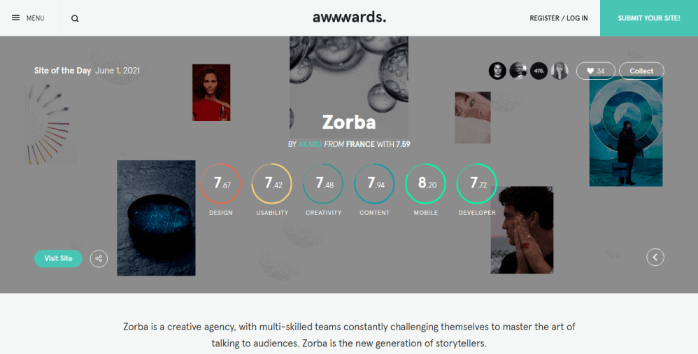
01 Awwwards
Awwwards hamburger menu offers users the ability to access the information without suffering from navigation clutter, avoiding any extra noise of vast content. It has an extensive list of features that opens up in a side menu when clicking on the icon. What we liked the most about Awwwards is that it supplements the hamburger button with a “Menu” label. This input makes the navigation easy and comprehensive, thus transparent.
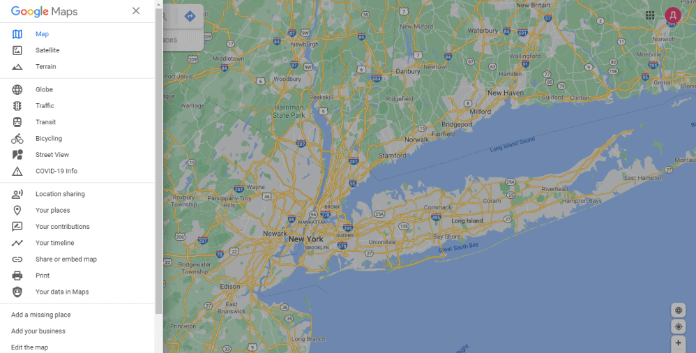
02 Google Maps
Google Maps website is a content-first platform. Thus, it dedicates almost all the screen real estate to a map with only a few key UI elements, including zoom-in and zoom-out tools and a prominent search bar at the top. The secondary navigational points are out of the user viewport, placed in a hamburger menu. It naturally shifts focus to the primary content, making the purpose of a website easy to comprehend.
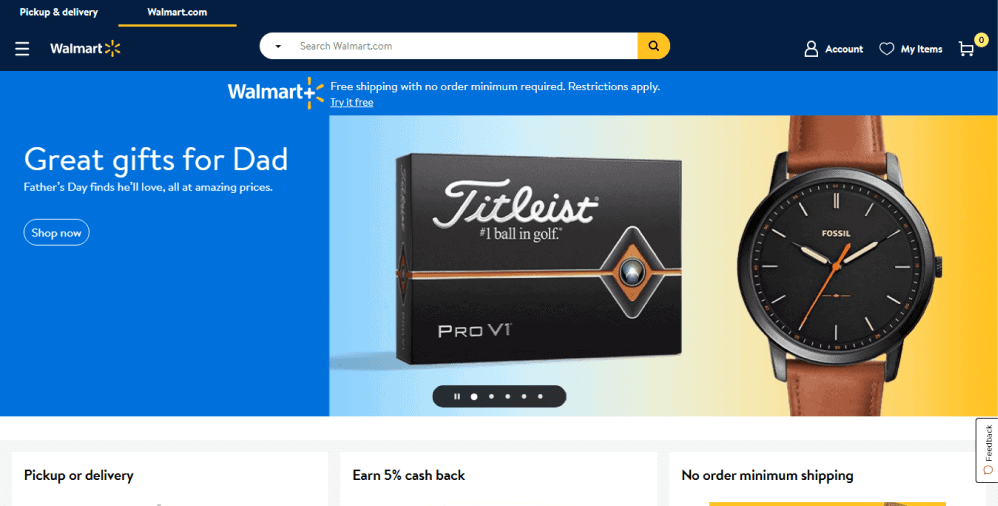
03 Walmart
For big brands with complex products or an abundance of features, a hamburger menu is something to consider. Walmart successfully implements one into its website’s functionality. Its clear-cut hamburger menu icon perfectly fits the website header design in terms of position and color, making it easy to digest. Once opened, the menu presents a complete list of categories and subcategories of goods along with other options. It allows consumers to navigate through such heavy content without any obstacles.
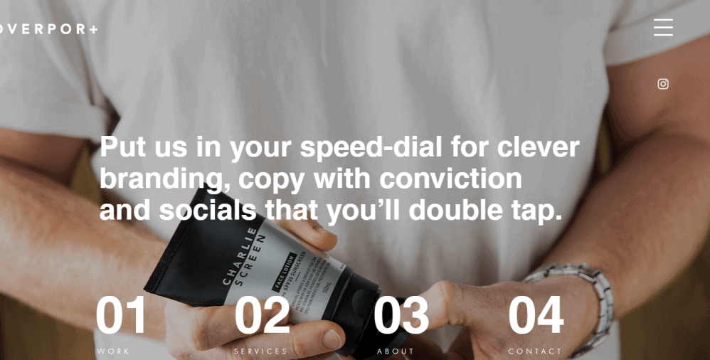
04 Overport
An Australian branding agency, Overport, uses a hamburger menu to save space on their homepage to display impressive visuals, exemplifying their works. It is a perfect solution to bring primary content to the storefront, not impeding the functionality. Their full-page hamburger menu opens up into a clean, minimalist, and contrastive design, providing users with a joyful and seamless experience.
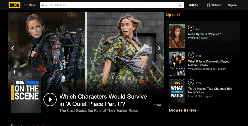
05 IMDb
The hamburger menu of the IMDb website stands out for many reasons. It delicately covers all the content, placing it according to categories, which greatly improves the platform’s usability. Although the color palette is simple, it catches attention immediately because of the contrast so that nothing will escape the user’s sight. Besides the original three-lined icon, it also features a “Menu” label, making it even more recognizable.
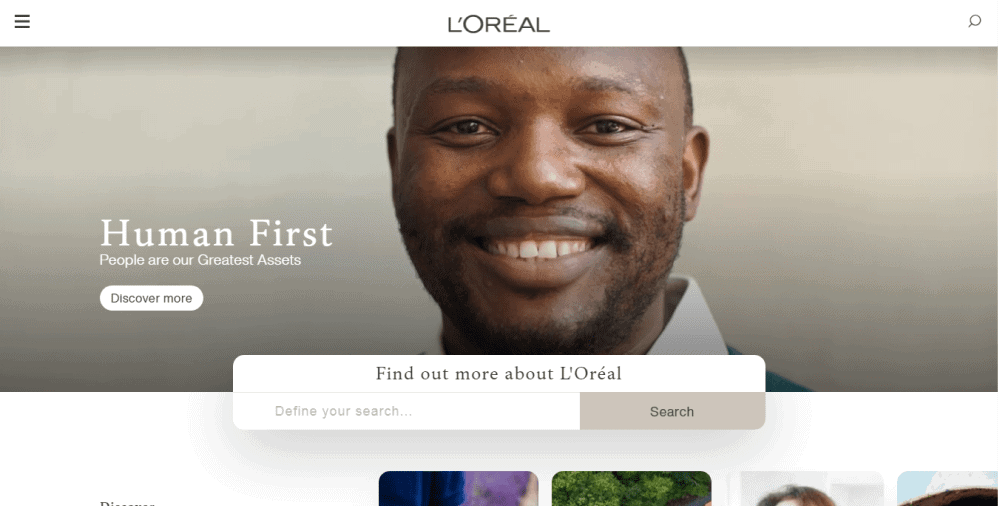
06 L’Oreal
As you arrive on the L’Oreal website, you can immediately see a simple three-lined hamburger menu icon at the top of the screen. When hovering over the icon, it changes the color, which makes the user experience interactive and pleasant. The menu involves several navigational items and subcategories seen when clicking on an arrow sign. Such an architecture makes the overall navigation well-structured and clutter-free.
07 Frankie Ratford
Another decent example of a great hamburger menu is that of the Frankie Ratford business website. It features a prominent hamburger icon at the right-hand corner of the screen that is highly visible due to the minimalist design of the main page.
As it opens up, you can see a bright pink lightbox with few navigational items on the list. Sometimes, simplicity is the key.

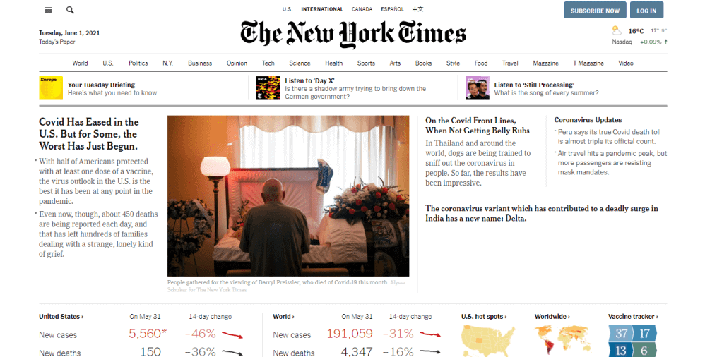
08 The New York Times
The New York Times website’s elegant hamburger menu offers users what they need right away. It gathers all the news in one place, dividing it into categories and subcategories for better navigation. That allows readers to come to the preferred content block in just a few clicks. The design is minimalist, and it doesn’t impede the perception of heavy information within the menu.
09 8590 Group
8590 Group is a creative media agency that aims at showcasing its works to potential clients. Its main screen space is occupied by an impressive visual of one of their relevant projects, while others can be found in the hamburger menu. Here, a hamburger menu acts as a valuable space-saving mechanism, allowing for better content architecture.

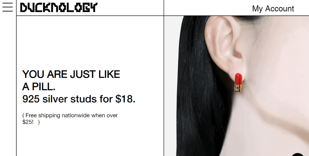
10 Ducknology
A classic hamburger menu icon of the Ducknology online store is placed at the upper left-hand corner of the platform. This strategic placement guarantees that users will click to see what’s hidden behind and discover more about the brand and its products.
Top 10 Mobile Mobile and App Hamburger Menu Examples
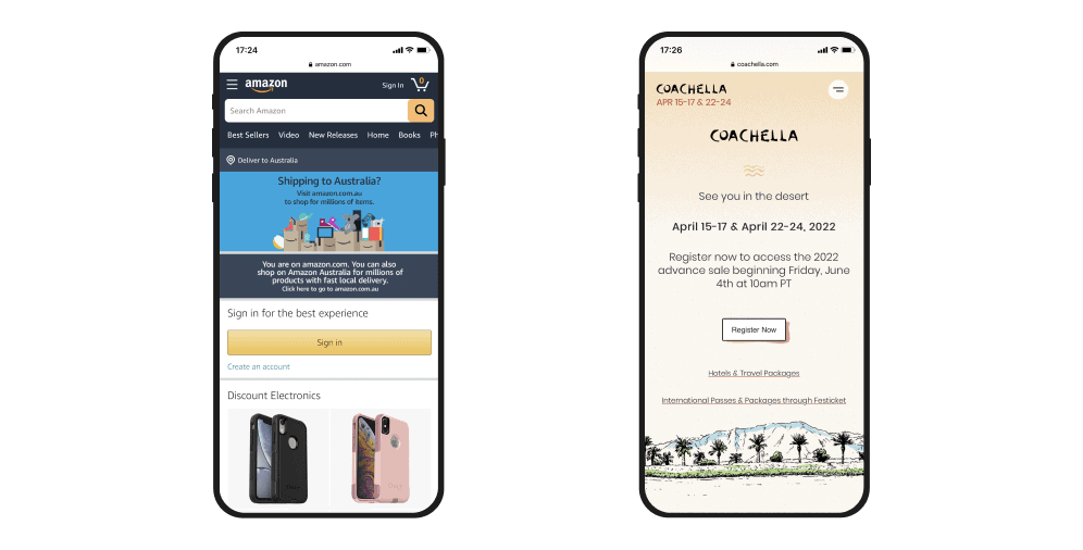
01 Amazon
E-commerce giant Amazon is a great example of using the hamburger menu properly. It features a distinctive three-lined icon at the top of the screen that allows users to find what they are looking for as soon as they open up the mobile website. The menu comprises a complete list of categories and content blocks that help shoppers to navigate the platform easily.
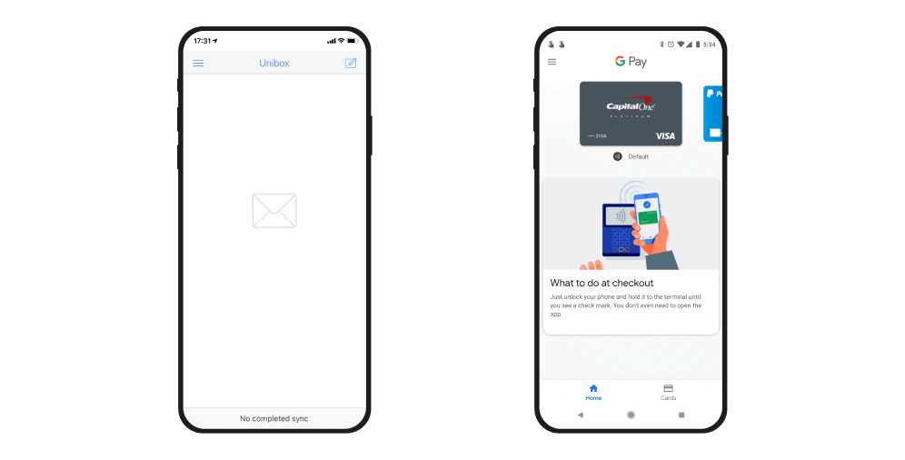
02 Google Pay
When you are busy checking out of an online shop, the last thing you need is to navigate through dozens of items when accessing your Google Pay account. Hopefully, designers have seen that and implemented an excellent hamburger menu that hides secondary options, advancing high usability and a smooth user experience.
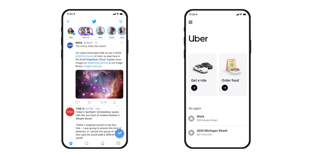
03 Twitter
As you arrive at your Twitter feed, you can notice a small hamburger icon at the top left corner of the screen. It opens up a list of options that direct you toward the desired page. Such an approach allows users to navigate the app and easily switch between its functionalities.
04 Plex
Plex app allows watching movies and TV shows, listening to podcasts and music of all kinds. Being packed with vast content and numerous information blocks, it does its best at providing users with an easy way of surfing the platform. Its hamburger menu features all the categories, allowing users to get the preferred media almost effortlessly.
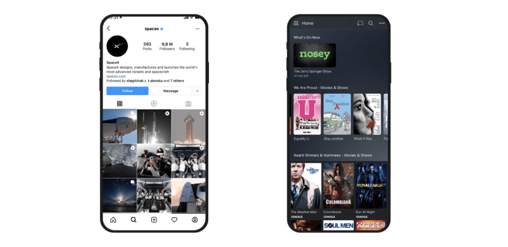
05 Instagram
Being one of the most famous social media apps, Instagram also manages to put the hamburger menu to great use. It allows users to go through their publications without struggling with any disturbing items. The secondary options are hidden behind the hamburger icon at the top right corner. It advances better usability and doesn’t interfere with the central purpose of the platform, bringing visual performance to the storefront.
06 Uber
Just as in Google maps, the whole screen of Uber is dedicated to the map because its primary goal is to help users to schedule a car. Its secondary navigation points don’t directly correspond to the main aim, thus are less likely to be used every time users open it. That’s why designers put them out of view until clicking on a hamburger menu icon on the top left.
07 Coachella
Another excellent example of a hamburger menu is that of the Coachella app. When users open up the menu, they see various options with small images above the features. Its dazzling design captivates from the first seconds, urging visitors to explore every option from the list.
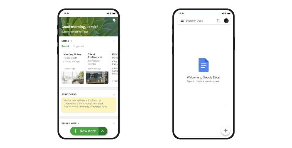
08 Google Docs
The Google Docs app makes showing the users all their most recent files a priority. Thus, the rest of the secondary navigation features are hidden out of the way behind a hamburger menu. That practice facilitates the user experience and goes hand-in-hand with the purpose of the platform.
09 Unibox
Unibox is an app that helps you to keep control of your mailbox, grouping them by the sender. It has quite a simple functionality and stores its options behind the hamburger menu. That contributes to the cleaner design of the app and greatly improves its usability.
10 Evernote
Evernote app uses a bottom hamburger menu placed at the left corner of the platform. Such a disposition makes the menu always at the viewport of the user. When you open it, you can see some additional options and features. These are not so vital to the central purpose of the platform and are hidden so as not to overload the main screen.
Ditching the Hamburger Menu: Creative Alternatives for a Better User Experience
Once again, a hamburger menu is not an optimal decision, and sometimes it’s better to avoid it. If immediately viewable features are more of a priority than screen real estate, or you don’t have enough functions to hide behind the hamburger button, don’t use it. If the button would interfere with the native navigation, or you’re not sure about the users easily understanding the icon – pick another solution. Thankfully, there are many alternatives to choose from:
Labeled menu
A hamburger menu can be more recognizable and transparent when labeled with the word “Menu.” This erases confusion of what is behind the button, which significantly increases the number of clicks as compared to an ordinary three-lined button. It is a suitable alternative if you don’t want a significant change but need to increase conversions.
Bottom navigation
This type of navigation has been adopted by such industry giants as Facebook, Buffer, and Flipagram, and for good reasons. First, bottom navigation allows users to see the core features and functionalities immediately on the home screen. Also, it tells users what page they are surfing. Finally, it provides direct access to all of the features, allowing users to rapidly switch between pages using a single click without returning to the home screen.
Floating hamburger menu
Being instantly prominent, a floating hamburger menu acts as an easily accessible and recognized navigation drawer. It allows users to open up a menu whenever they are on the page. Its prominent positioning signifies the importance and drives users toward actually using it. Although the floating hamburger menu saves screen real estate, it can hide the content when used on mobile devices without being responsive.
Responsive navigation
If you use both mobile and desktop versions of a website, a responsive navigation menu is a valuable asset to have. In a nutshell, it is a menu that responds based on the viewer’s screen size, allowing users to enjoy the platform regardless of the device.
Still, there are some pitfalls to consider. If you have less than four navigation links on the desktop, don’t hide them behind the hamburger on mobile. The links are few, so you can easily show them on the screen. It will eliminate confusion among users and erase any significant disparity between the versions, signalizing they come to the right place.
Parallax scroll
One more decent alternative is the parallax scroll. It creates a smooth and delicate user experience, making navigation through the platform easy and intuitive. However, it offers sequential access rather than a direct one, which can heavily slow the navigation process. In other words, users need to scroll through several pages to get where they need. For better effect, it can be complemented with a navigation bar on the top of the screen indicating which page it is that keeps users from getting lost within pages.
Slide-out navigation tabs
This alternative allows maximizing the screen real estate because being entirely hidden over the page. It uses gesture control that means users can simply swipe right to pull up the menu. It suits the websites with many options and features, not allowing them to impede the interaction but directly access them from the navigation drawer. However, it may cause interference with page UI design, which is a significant drawback to the platform’s usability.
Navigation with vertical lettering
Looking increasingly fresh and trendy, vertical lettering navigation naturally stands out from the others. It is compact yet informative: just a narrow line on the left-hand corner of a page. It’s especially a perfect solution for contemporary designs. Still, it might be visually weighty as it stretched almost to the height of the screen.
Combination navigation
As the name implies, combination navigation encompasses several navigation options, bringing the best of each. For instance, you can use both a hamburger menu with a menu label and a prominent search bar. It widens the possibilities.
Contact Ester Digital for Expert Advice on Choosing the Right Navigation Solution
When deciding to use a hamburger menu, it’s crucial to ensure that it’s done for the right reasons and follows best practices. When utilized and designed correctly, it can significantly improve user experience and make your content more accessible.
However, it’s essential to consider alternatives if the hamburger menu isn’t the best fit for your platform. Remember that implementing it requires focusing on multiple factors simultaneously and shouldn’t be a decision based solely on trends.
Contact Ester Digital for assistance in determining the best navigation solution for your website or app.

Copied!


