Outline:
According to recent Statista research, the number of internet users reached 5.35 billion in January 2024. It means that websites are one of the most effective forms of business promotion. That’s why the look and feel of a website emerges as a pivotal factor, merging visual allure with functional grace to create unforgettable user journeys and experiences.
This exploration sheds light on how each component, from the subtle hues of colors to the intuitive user interfaces, significantly influences the audience’s perception of a web platform. By analyzing the elements that are instrumental to the website’s aesthetic and usability, our article seeks to illuminate the profound impact of design choices on user engagement and satisfaction.
The Essence of Website Look and Feel
First, you need to examine how the careful combination of design elements defines the website look and feel, to create a modern website that resonates with users on various levels.
The look and feel of a website involves a combo between aesthetics and functionality, where choices in typography, color, layout, and interactive elements are not just about beauty but about creating intuitive pathways for users to navigate and interact with content effortlessly. Thus, website look and feel helps the site capture the visitor’s attention through visual appeal and offer a seamless user experience at the same time.
So, by integrating these insights, web design transcends mere appearance to become a strategic tool for digital storytelling and user involvement, thereby laying the foundation for a site’s strong identity and success in the overcrowded digital environment.
Who Creates the Look and Feel of a Website
The look and feel of a website are primarily created by web designer and front-end developer teams. Web designers create the visual aspects, deciding on layout, typography, color schemes, and imagery, ensuring the site is visually coherent and aligns with the brand’s identity.
Front-end developers implement these designs into a functional site, using coding languages and ensuring the site’s design is responsive and user-friendly.
Together, these teams collaborate to build a cohesive and engaging online experience, reflecting the website’s purpose and audience’s needs.
Essential Elements of Website Look and Feel
The unique character of a website is shaped not only by its visual design but also by the user’s interaction experience. This dichotomy is encapsulated by the notions of ‘look’ and ‘feel’, which jointly forge the user’s overall experience.
Delving into these concepts individually allows for a deeper insight into their role in bolstering a site’s appeal and functionality. Let’s dissect these facets to identify the essential elements that forge a unified and engaging digital space.
Elements Influencing a Website’s Aesthetic Appeal
Color Palette sets the website’s mood and psychological ambiance, mirroring the brand’s essence and molding user perceptions. Careful color selection can direct user focus and elevate the site’s visual allure.
The Typeface variety and layout on the page affect legibility and ambiance. Maintaining consistency in font usage enhances brand recognition and contributes to the visual consistency of the site.
Visual Content and the incorporation of crisp, relevant images, illustrations, and videos enriches the website’s story, boosting engagement and resonance. Custom visuals bolster brand narrative and foster user connection.
Design and Aesthetic Arrangement of content, while intersecting with functionality, relates to how information is visually organized. Effective use of design grids, spacing, and symmetry aids in achieving visual clarity and equilibrium.
Elements Enhancing a Website’s Usability
The Architecture of the site’s navigation influences the ease with which users can browse and comprehend the site. A straightforward, coherent, and stable navigation setup promises a more fluid visitor experience.
Interactive Features elements such as buttons, forms, and sliders is crucial. These components should facilitate user interaction with the site efficiently, allowing for straightforward completion of actions.
User Experience Design encompasses the site’s usability, accessibility, and interactive design, aimed at delivering a satisfactory and inclusive user experience. It involves tailoring design to various user needs, ensuring clarity of content, and fostering a dynamic and responsive site environment.
Website Performance, meaning the speed at which a website loads and its responsiveness are key to user satisfaction. Enhancing the website’s performance across different devices and web browsers is critical for sustaining a positive user experience.
How Website Aesthetics Shape User Interactions
The look and feel of a website directly influences how users perceive and interact with a site, especially in the context of B2B website design. Emotional connection is the first interaction point, where a web design can arouse feelings that align with a brand’s identity and foster a deeper relationship with the audience. This emotional engagement helps enhance brand perception, as it transforms the website from a mere digital platform into a representation of the brand’s values and ethos.
Also, the site’s aesthetics impact trust and credibility of business, as a professional and modern design instills confidence in users, assuring them of the brand’s reliability and expertise. Every business owner knows that trustworthiness is a key factor in a user’s decision to engage with the content, products, or services offered. That’s why this factor is particularly important while creating a modern website.
Furthermore, to raise your conversion rates and user retention, make your website visually appealing and intuitively navigable. It’ll encourage users to explore more and increase the likelihood of converting visits into actionable outcomes, whether it be inquiries, sales, or subscriptions. User retention is similarly affected, as a positive initial interaction increases the chances of users returning, thereby fostering a loyal user base.
As a result, the strategic integration of design elements is essential for creating successful online interactions, particularly in the environments where the stakes for professionalism and trust are high.
5 Unconventional Strategies to Improve Your Website Look and Feel
01 Harness Psychological Design
Embrace Gestalt principles and psychological cues to craft an intuitive layout. Employ patterns, symmetry, and contrast to captivate attention and simplify navigation. Experiment with shapes, colors, and layouts to evoke emotions and steer user behavior.
02 Create Storytelling
Infuse your website with narrative elements that chronicle your brand’s journey and ethos. Blend imagery, text, and interactive features to weave a compelling tale that resonates with your audience. Story-driven design enhances memorability and fosters emotional connections.
03 Embrace Dynamic Elements
Add vibrancy with animated backgrounds, scrolling effects, or interactive infographics. Ensure these dynamic features complement your messaging and functionality, enriching user engagement without sacrificing usability. Such additions inject sophistication and interactivity into your website.
04 Prioritize Emotional Design
Design a visual and experience that elicits specific emotions related to your brand’s essence. Choose colors, imagery, and typography that evoke the desired emotional response, whether it’s inspiration, excitement, serenity, or trust. Aligning design with emotional tones fosters deeper connections with the users.
05 Consider Ethical Design Practices
With growing concerns about privacy, data security, and digital well-being, websites are prioritizing ethical design practices. This includes transparent data collection policies, user-friendly privacy controls, and mindful design choices that prioritize user trust and empowerment.
These innovative strategies can help you achieve an exceptional and personalized look and feel for your website. However, ensuring consistency across all elements is paramount to making this vision a reality.
Maintaining a Consistent Look and Feel Throughout The Site
Consistency is vital for solidifying brand identity and ensuring a fluid user experience throughout a website. By applying uniform color schemes, typography, and layout structures, you establish a clear visual language that aids user recognition and navigation, enhancing their confidence and trust in the brand.
Embrace a Style Guide: Create a detailed style guide that outlines your color palette, font styles, button designs, and other UI elements. Adherence to this guide ensures every website element reflects your brand’s visual identity, fostering a cohesive look.
Ensure Navigation Uniformity: Keep the navigation menu easily accessible and consistent across the website. Uniform navigation aids in user orientation, making their journey through your site as smooth as possible.
Standardize Headers and Footers: Utilize consistent header and footer elements to provide stability throughout the user’s journey. This helps in maintaining a familiar environment, enabling easy access to key sections and information.
Use Templates for Common Elements: Implement templates and components for recurring site elements. This approach ensures uniformity and makes site-wide updates more efficient.
Allow for Flexibility: While maintaining overall consistency, allow some flexibility to emphasize different sections or features. Ensure these variations still align with the overall design language to avoid confusion.
Conduct Regular Reviews: Periodically review your website to ensure that all elements remain consistent, especially after adding new content or features. This helps in identifying and correcting any deviations from the established design.
Peeking into the Future Trends in Website Look and Feel
With the daily development of technologies, websites can’t be at a stop of the digital advancement. That’s why at the hands of time, website aesthetics absorbs emerging design trends. We can see it in the innovation in website redesign services that sets the stage for transformative user experiences. For instance, for those pondering how to design a small business website, the trajectory is leaning towards bespoke, engaging interfaces that resonate on a personal level.
The creative minds steering the look and feel of a website are tapping into the realms of artificial intelligence and virtual reality, crafting spaces that are deeply interactive. This evolution heralds a new dawn where digital spaces are more inclusive, accessible, and tailored to the dynamic needs of the modern web user. Let’s delve into the technologies that re-energize websites.
Shaping Personalization with AI
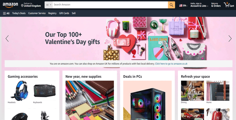
Artificial Intelligence can significantly transform the online retail landscape. One of the prime examples of this is Amazon’s website, which uses AI for a personalized shopping experience. It also offers customization options that cater to the preferences of individual users. By analyzing user behavior, preferences, and interaction patterns, AI enables Amazon to dynamically adjust content, recommend products, and even modify visual elements, setting a new standard for website look and feel.
Blending Skeuomorphism with Parallax Scrolling
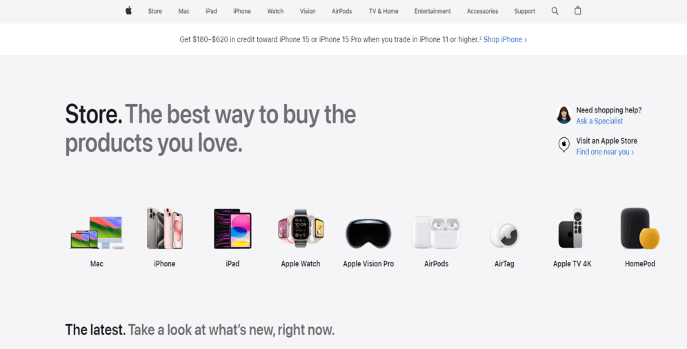
Apple’s website blends the tactile allure of skeuomorphism with the depth of parallax scrolling, creating an environment where storytelling and product showcases converge seamlessly. This design philosophy not only captivates but also immerses users in a uniquely memorable digital journey, setting benchmarks for aesthetic elegance and user engagement.
Dynamic Aspects of Typography and Microinteractions
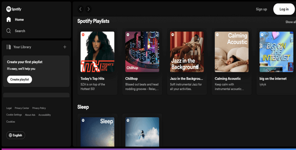
Spotify brings music to life on its platform, employing kinetic typography and nuanced microinteractions. The dynamic text movement on playlist landing pages and artist introductions transforms routine browsing into an engaging narrative experience, complemented by subtle animations that respond to user interactions, adding a tangible layer to the digital experience.
Elevating Content Strategy with Minimalist Hero Sections
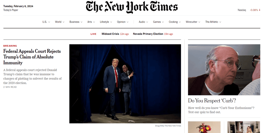
The New York Times’ feature articles often use text-only hero images to make a powerful visual statement. Opting for bold, text-only lead images, they leverage striking typography to captivate readers from the outset, proving that simplicity, paired with powerful content, can create profound visual impact.
Innovating Layouts with AI Visuals
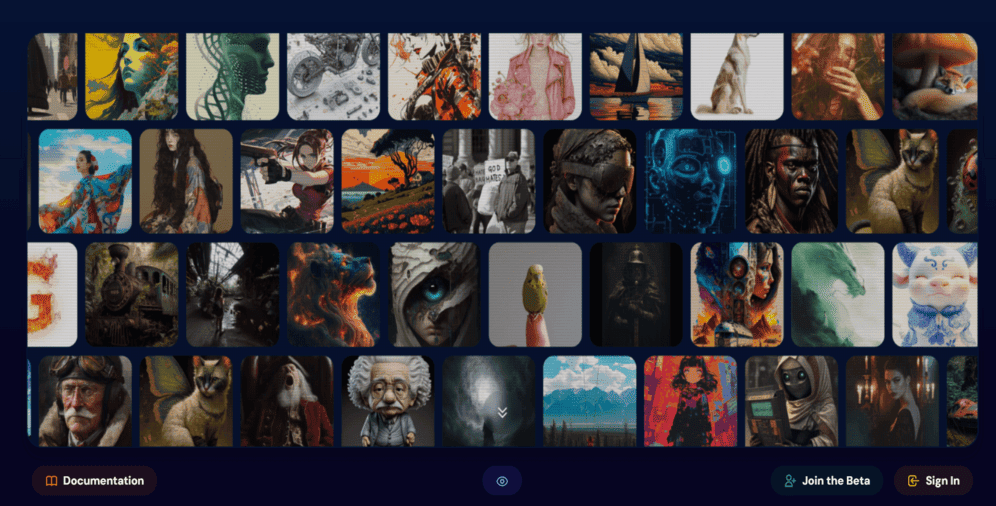
With the continuous development of artificial intelligence, it has become easier to create images for websites. An excellent tool for this purpose is Midjourney that enables transforming words into breathtaking digital artworks and visuals. This forward-thinking use of AI significantly empowers the website look and feel with distinct, AI-crafted visuals.
On a Final Note
Crafting a website with a polished look and feel is crucial for driving positive business outcomes. A well-designed website unlocks a plethora of benefits, including heightened brand awareness, increased customer acquisition, enhanced online visibility, alignment with audience preferences, bolstered credibility, and more.
The evolving landscape of web design continues to influence our digital interactions, underscoring the enduring importance of a website’s aesthetic and user experience in driving innovation.
By considering the insights and recommendations shared above, you’ll be equipped to create a standout look and feel for your website, capitalizing on its full potential. If you’re seeking professional assistance, don’t hesitate to reach out to us. We’re here to help bring your vision to life.

