Outline:
In today’s digital era, the vast array of digital devices available in the market has made it imperative for web designers to consider various screen sizes during the design process. From tiny smartwatch screens to large computer monitors, every screen size demands a unique approach, making the job of designers extremely challenging. However, selecting the appropriate design can simplify the process to a great extent.
To choose the perfect design for your project, it’s essential to understand the difference between responsive vs adaptive web designs. In this article, we will delve into these two concepts and explore which option fits best for your needs and requirements.
Responsive Web Design: A Popular Choice for Modern Websites
Responsive web design is one of the most popular choices for modern websites, owing to its ability to adjust all the content, navigation, and other web page elements to fit the user’s screen perfectly. This design approach uses a flexible layout that automatically conforms all UX design components to adapt to any screen size.
Unlike fixed layouts, responsive design is fluid and does not require numerous fixed layouts for various screen sizes. However, during the design process, designers must keep in mind different screen sizes and create a viewport for mid-resolution. Then, they can use media queries to adjust the design for low and high resolutions when required.
The Benefits and Drawbacks of Adaptive Web Design
When it comes to adaptive web design, designers need to build multiple versions of a web page to ensure that it looks great on the user’s device. This approach forces designers to create different layouts that are modified specifically for different screen sizes, unlike responsive design, which uses a single page that adjusts to various devices.
In technical terms, CSS media queries are used for responsive design on websites created with adaptive design. Additionally, JavaScript-based enhancements are applied to modify the website’s HTML markup depending on the device’s features.
Despite its need for multiple layouts, adaptive design allows designers to keep their content in one place and share it with users without the need to build two separate websites. This approach ensures that the user experience remains consistent across all devices.
However, one drawback of adaptive design is that it can be time-consuming to create multiple versions of a web page. Additionally, it can be challenging to ensure that the website’s design and functionality are consistent across all versions.
Responsive vs Adaptive Web Design: A Comprehensive Comparison
Responsive and adaptive design approaches may appear similar at first glance, but as we’ve explored there are significant differences between the two. To help you master the subject even more easily and make an informed decision, we will compare the two approaches based on several important factors.
Layout: How Do They Differ
With responsive design, the layout is modified to fit any screen size. On the other hand, adaptive layout is determined on the back-end and requires new design templates for different devices.
Complexity: Which Is More Challenging
Responsive designs only need one layout, while adaptive designs require multiple layouts for different devices. However, even with a single layout, responsive designs require more attention and time during the design process to ensure proper display across all devices.
Page Loading: Which Design Is Faster
Responsive designs are generally slower than adaptive designs since they transmit all the assets to all devices, while adaptive designs load only the assets required for a specific device.
Mobile and SEO Friendliness: Which Design Is More Recommended
Responsive designs are recommended by Google for their mobile-friendliness and SEO friendliness, making them an excellent choice for modern websites.
Flexibility: Which Design Is More Adaptable
Responsive layouts are considered more flexible as they require less maintenance and can effortlessly fit new screen sizes. Adaptive layouts, on the other hand, require occasional maintenance as new screen sizes may cause technical difficulties, making them less flexible.
In summary, both responsive and adaptive designs have their distinctive pros and cons. Understanding these differences can help you choose the best design approach for your website based on your specific needs and preferences.

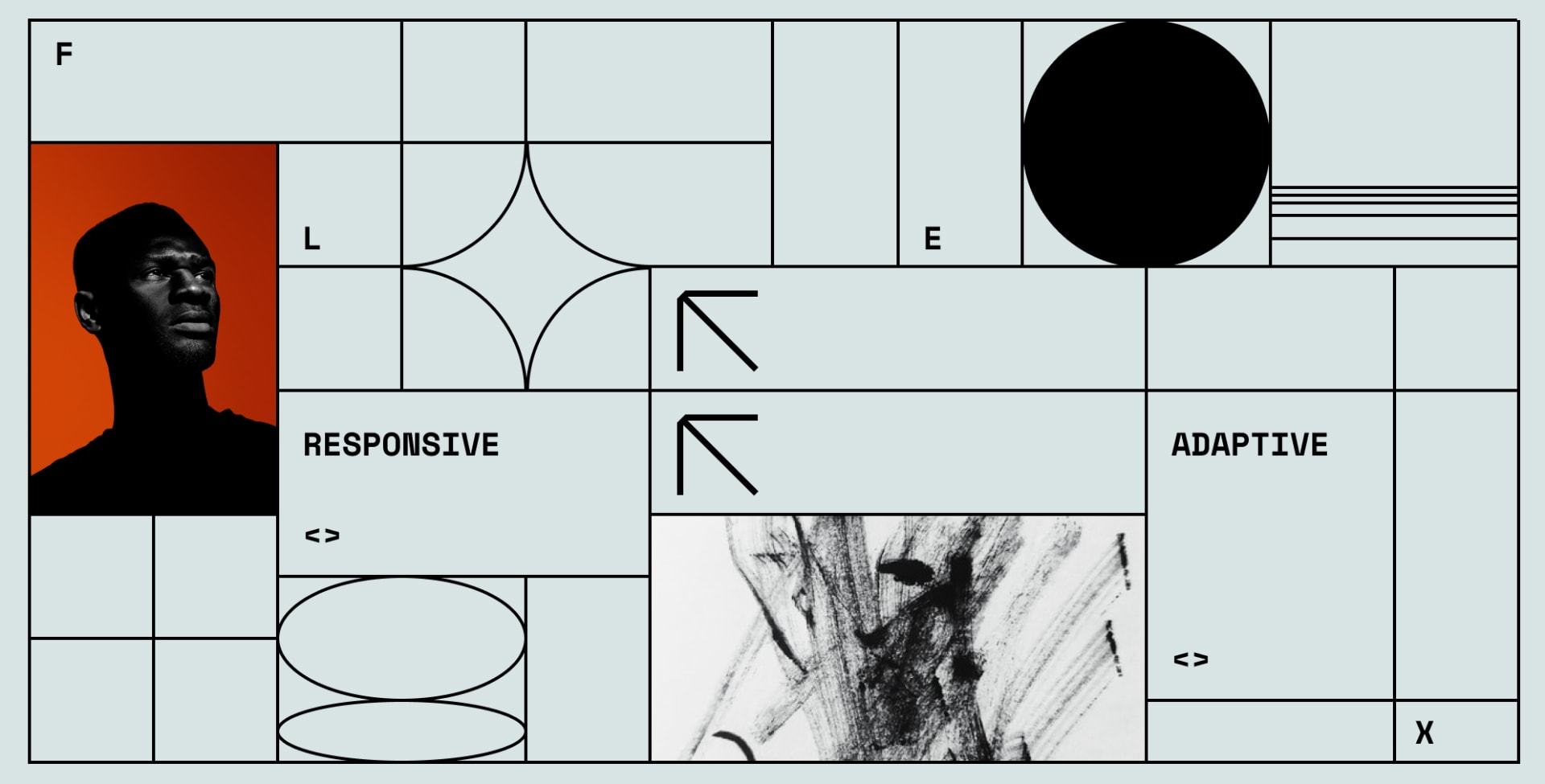
10 Stunning Examples of Responsive and Adaptive Web Design
The theory sounds good as always, but what about practice? To get a better understanding of what we’ve been talking about before, we’ve gathered a few examples of the websites with both adaptive and responsive designs for you.
Responsive design websites
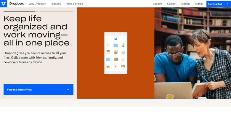
01 Dropbox
Dropbox has an impressive website with flexible visuals and font colors that change to fit the background once users switch from desktop to their devices. To make the layout more intuitive, Dropbox used to add small details to its design, such as a tiny arrow that guides visitors to scroll down when they’re using non-touchscreen devices.
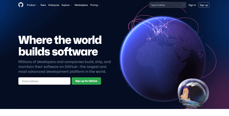
02 GitHub
Next, we have GitHub, which has always provided visitors with the best experience. For instance, they removed the search bar and hidden the menu behind a hamburger button on mobile and other handheld devices. In case you need to shift from the desktop to the mobile version of a website, there will be other changes, like the alteration of a two-column area of a layout into a single-column one.
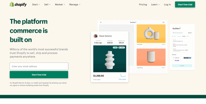
03 Shopify
Shopify is known for providing a consistent user experience. And yes, we’re talking about all types of devices. The only differences that can be found between the desktop and mobile versions of the website are the illustrations and call-to-action buttons; they are placed to the right of the form field on PCs and tablets and beneath it — on mobile devices.
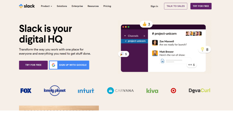
04 Slack
Who doesn’t know Slack? We all appreciate its simple and intuitive design, but you might be amazed at how responsive its website really is. One of the best things there is the flexible grid that can efficiently adjust to viewports of any possible size and shape. So, when some area is displayed in a four-column layout on a PC, for example, it’ll still look like a single-column layout on a mobile phone.
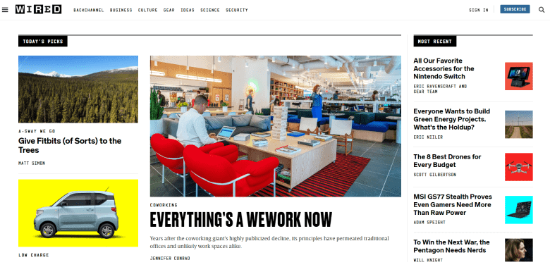
05 WIRED
Finally, we have WIRED and their powerful website with a very dynamic layout. Just like the previous companies, WIRED made it possible to convert their columns into a single one on mobile devices. Their menu also shrinks to keep the page less cluttered. You can find flexible images that are getting cropped on different platforms in order to look clean and nice.
Adaptive websites
01 Food Sense
This website has a classic adaptive layout. Since the company is quite popular, it requires high loading speed of web pages and consistent UX. Due to adaptive templates, mobile users can quickly switch from app view to full-site view when needed. The menu is also hidden for handheld devices, which grants more free space on the page.

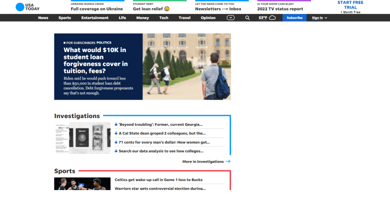
02 USA Today
We all know this magazine and its great number of topics, but why choose adaptive design for their website? Well, it’s all about users. To make their experience amazing, it’s important to provide easy navigation and help them efficiently find what they need. Besides, in case of screen shifting, adaptive design is usually a winner, while the responsive one can make the page look overloaded.
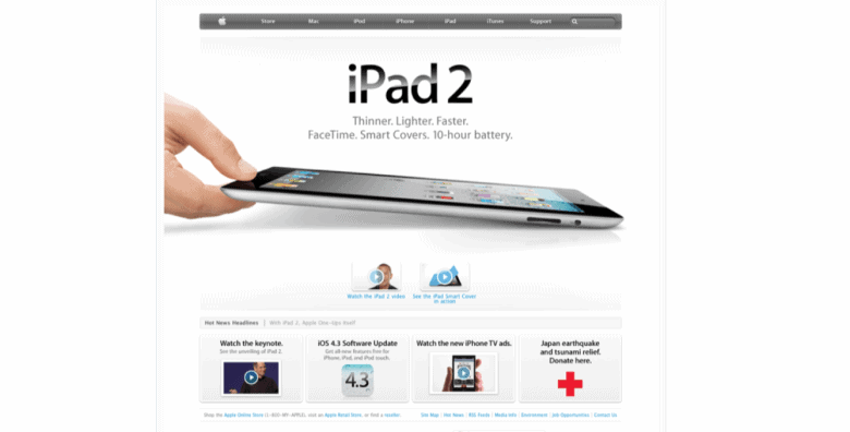
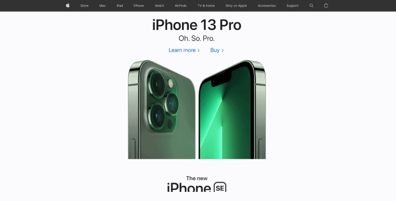
03 Apple
Firstly, Apple chose an adaptive design for their website that could change with the device type and function. Even though this decision had been criticized a lot (mobile phones are literally one of the biggest reasons why responsive design exists), they still stuck to their guns for some time, slowly starting to build and add responsive components years after that. Either way, the website is absolutely magnificent and we’re all here for it!
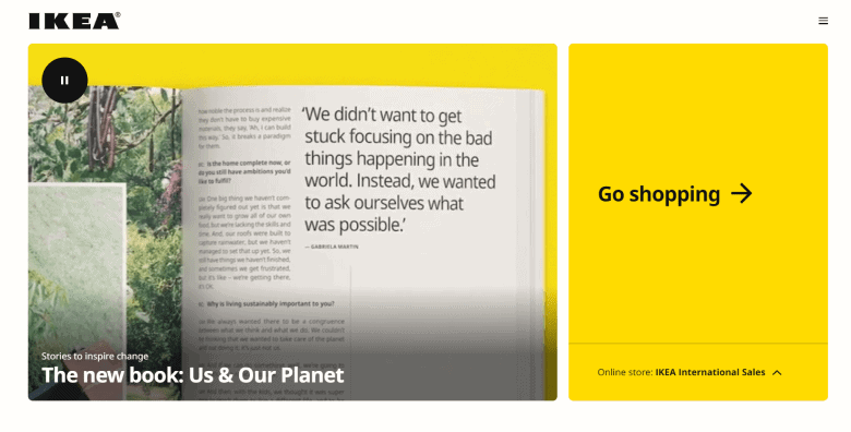
04 IKEA
Ikea is a world-known company, whose website has an adaptive design that perfectly fits any screen and lets customers make purchases on any type of device quickly and easily. It’s also mobile-oriented, which is vital for this kind of business.
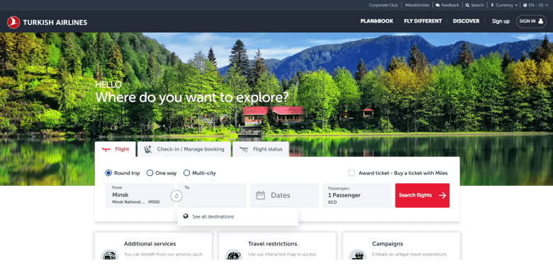
05 Turkish Airlines
Finally, we have Turkish Airlines with a beautiful adaptive website. Such a layout offers a marvelous user experience and shows customers that they’re valued. There is nothing more to say about it — other than all the components of this design are aimed at providing users with everything they need and allowing the page to adjust to any possible screen.
On a Final Note
Both responsive and adaptive design approaches continue to be popular choices among web designers. Each approach has its own unique benefits, making it difficult to choose the right one, especially with the constant introduction of new devices to the market.
While responsive design may appear to be the safer and more convenient option, adaptive websites provide a highly personalized and seamless user experience, often winning the hearts of web designers. Ultimately, the decision comes down to your long-term goals and budget.
If you have any questions or need help deciding between the two approaches, don’t hesitate to contact us. We’ll provide you with a prompt and helpful response.

Copied!


