Outline:
To appreciate typography design, one simply needs to observe their surroundings. It is ubiquitous, from street advertisements and store packaging to the fonts and line spacing of newspapers. Despite its prevalence, people tend to overlook the creativity and diversity of typography.
As a result, it’s not surprising that most web designers consider typography design an essential part of their professional skill set. Selecting the appropriate typeface and integrating it into a website’s layout and color scheme is crucial to avoid undermining their hard work. In this article, our UI/UX design agency will provide all the necessary terms and tips to create exceptional typography designs. Let’s start with the basics and explore the roots of typography.
A Brief History of Typography in Web Design
Essentially, typography design involves using text to convey a message through the skillful arrangement of letters and words in a visually appealing and readable manner. While web designers don’t typically create their own letterforms, they must still choose from a variety of typefaces and point sizes to effectively communicate their message.
The evolution of digital technology has made the process of typography design faster and more accessible. However, the rules of typography continue to change, presenting new challenges for designers.
Looking back before the digital era, movable type was invented by Johannes Gutenberg in the 15th century, although people had been striving to produce books for centuries before that. Back then, everything was done by hand, even when paper and writing tools were scarce. People used other means to transmit written messages, such as carving symbols into wood.
Today, both hand and digital methods are employed in typography design. The combination of these approaches can produce unexpected and intriguing results in typography design. This history of typography reminds us of the evolution of design and how technological advancements have made it possible to create visually compelling typography designs in the digital age.
The Influence of Typography on Messaging
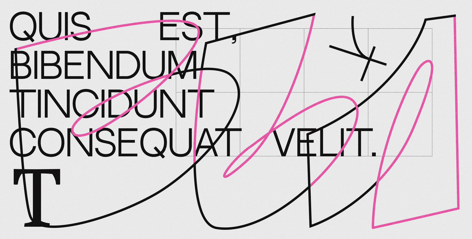
It’s no secret that typography can impact people’s emotions. In the hands of a skilled designer, typography can add personality to printed text, making it more visually appealing and easier to comprehend. Typography is a form of body language that creates a first impression and shapes how a message is perceived. The choice of typeface, font size, and line spacing are among the most significant factors in typography design.
A study has shown that larger font sizes can provoke stronger emotional connections, while smaller font sizes can make texts harder to read. Moreover, the font style itself can play a significant role in shaping how the text makes a person feel. Fonts can be dull and plain, edgy and aggressive, or elegant and appealing, making it possible to find the perfect font for conveying any message.
To understand the impact of typography on messaging, it’s vital to know web typography terminology. Before delving into tips for typography design, take a closer look at the list of terminology below to gain a better understanding of the factors that influence readers’ perceptions.

Understanding Web Typography Terminology
Typography is a crucial element in web design that can influence the messaging and evoke emotional responses from readers. To understand typography, it’s important to be familiar with the following web typography terms:
Typefaces and Fonts: What’s the Difference
Typeface refers to a set of alphabetic and numeric characters that share a common design, while fonts are specific styles within a typeface that vary in weight and size. Typefaces are often referred to as font families.
Enhancing Readability with Kerning and Tracking
Kerning refers to the spacing between individual characters and is used to enhance readability and eliminate unnecessary gaps. It can also impact aesthetics and communication through typography.
Tracking defines the overall spacing between characters of an entire line or piece of text, while kerning focuses on the spacing between two distinct characters.
Leading: The Vertical Spacing Solution
Leading refers to the vertical spacing between multiple lines of text, measured from baseline to baseline. Proper leading is critical for making text look visually appealing and easy to read.
Establishing Hierarchy in Typography Design
Hierarchy is the division of website content into different sections and groups. Typography hierarchy involves selecting the appropriate font sizes, weights, and styles to ensure readability and facilitate navigation for website visitors. It typically starts with a headline (H1) followed by section headings (H2, H3), and then the main text body in a smaller font.
By realizing these web typography terms, designers can make informed decisions that effectively communicate their message while enhancing the overall visual appeal of their website.
Tips for Choosing the Best Typography for Your Website
When it comes to designing a website, typography is a critical element that can make or break the user experience. From typeface and size to colors and line spacing, every detail matters. However, when everything is done right, readers won’t even notice the typography, and the reading experience will feel natural.
To ensure your website’s typography meets all the necessary criteria, here are some tips to follow:
- Keep it Consistent and Limit Your Typefaces: Using multiple typefaces across your website can lead to inconsistency in your content. It’s best to stick to one or two visually distinctive typefaces for consistency in your design.
- Stick to Standard Fonts for Readability: Using standard fonts ensures readability across different browsers and devices. Additionally, readers are familiar with these fonts and find them easier to read than unique or less common fonts.
- The Power of Sans Serif Fonts: Sans serif fonts are easily readable on digital devices, making them ideal for body text. However, more dramatic fonts can be used for titles, headings, and quotes to add emphasis.
- Emphasizing Text Effectively: Avoid using all-caps to highlight text. Instead, use bold text to arouse readers’ interest and make it easier to read.
- The Importance of Text Size and Line Length: Body text should be at least 16px for readability, and headings should be bigger than the body text to create contrast on the page. Additionally, aim for 40-80 characters per line to keep text legible and visually appealing.
- Avoid Animations and Focus on Whitespace: Text animations can distract readers and reduce readability. Use whitespace to make sure readers can freely read text lines and paragraphs, and keep the standard spacing for body text at 1.5, with a spacing of 2.5 between paragraphs.
Typography in Action: Best Examples in Web Design
Now, when you know the ins and outs of typography in web design, it’s time to explore the best examples. It will help you get inspired and find impressive design ideas to implement in your project.
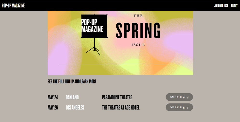
01 Pop-up Magazine
This website doesn’t employ the most generic typography and illustrations. Its headline immediately catches users’ eyes with the larger font size, while the main information below is presented in the same smaller font with enough whitespace between the lines.
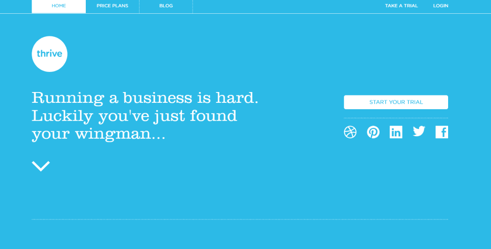
02 Thrivesolo
This website’s headline is a simple font with distinctive letters and a straightforward message, that is perfect for the case. This typeface is used all across the website, providing visitors with the opportunity to scan everything without any difficulties.
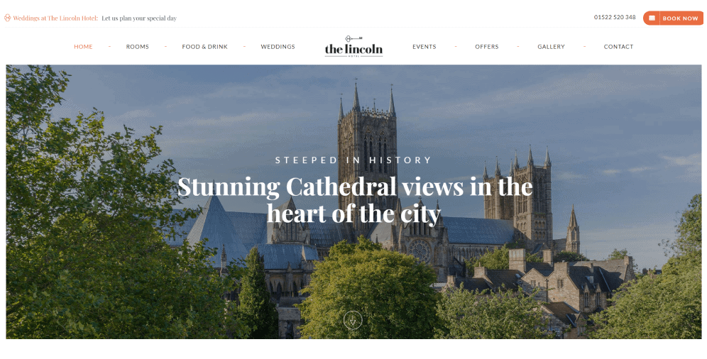
03 The Lincoln Hotel
The Lincoln Hotel has a classy and visually appealing website with the appropriate typography. It’s clean and well distinguishable for people, with an elegant font for the title and a simple yet efficient font for the main body text. When scrolling down, you can notice the phrases with the bold tag that is used for strong emphasis.
04 Luna
Luna’s typography is just on another level. Apart from the variety of font sizes, there is a color game that undoubtedly accentuates the headline. The contrast works out quite nicely while the not-so-regular typeface (Lexend) just adds the whole page some flavor.

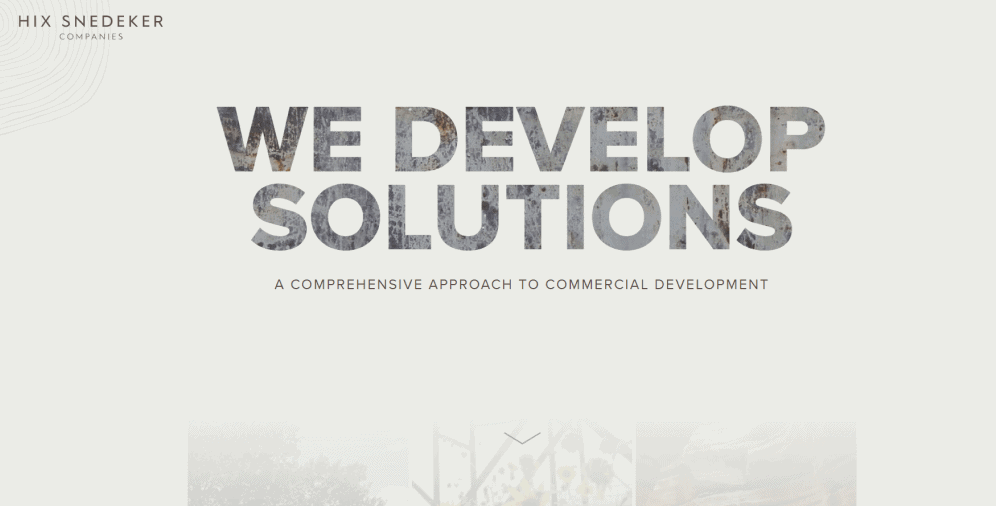
05 Hix Snedeker Companies
This is another example of how great a website can look with the sans serif typeface for the headline and subheading. You can also notice the mixed colors in the headline, which make it even more highlighted.
On a Final Note
In conclusion, typography is an essential element of web design. Properly executed typography enhances readability and makes text understandable, while poor typography can negatively impact users’ experiences and distract them from the content. It’s crucial to remember that the purpose of typography is to honor the content and not overshadow it.
We hope that our tips and explanation of how typography influences text messaging will assist you in achieving your desired results. If you encounter any difficulties, contact our team of professionals who are always here to provide assistance. We are dedicated to helping you create the best possible user experience.

Copied!


