
Outline:
The importance of proper website navigation design cannot be overstated. It can be likened to a map that guides a person to their destination, but in the case of websites, it directs users to the information they need and the actions they want to take through effective site navigation design.
Without a structured navigation system, finding the necessary information can be challenging. Poorly organized websites tend to be unpopular with users, whereas websites with an effective navigation system help them find the answers they seek quickly. Consequently, such websites often enjoy better conversion rates.
In this article, we will explore how to leverage website navigation design to your advantage. We will discuss its best practices, such as placing navigation in easily accessible areas, using descriptive labels, and limiting the number of options. Additionally, we will cover the importance of ensuring website accessibility for users with disabilities, testing website navigation design across multiple devices and browsers, incorporating user feedback and analytics data, and keeping it up-to-date as the website evolves.
The Role of Website Navigation Design in User Experience
Every element that assists users in finding the information they require can be regarded as a website navigation element. Such elements may include a structured menu, links, or buttons that facilitate necessary actions. In total, it comprises a wide range of user interface components that enhance user experience and guide visitors through the platform, regardless of their objectives.
Research has shown that effective website navigation plays a significant role in user engagement and website conversion rates. A study by Forrester Research found that improving website navigation can increase the number of visitors who complete a purchase by up to 200%.
Furthermore, a well-structured menu can help reduce bounce rates and increase the time users spend on a website. According to a survey by the Nielsen Norman Group, users are more likely to leave a website if they cannot find the information they are looking for within 10-20 seconds.
Incorporating a search bar can also improve the user experience and lead to higher conversion rates. Research by Econsultancy found that websites with a search bar have a 50% higher conversion rate than those without one. Additionally, a search bar allows users to find specific content faster, leading to increased engagement and satisfaction.
In conclusion, the importance of proper website navigation cannot be overstated, and the benefits of an intuitive and well-structured menu, combined with a search bar, are backed by research and statistics. These elements can lead to higher conversion rates, reduce bounce rates, and increase user engagement, ultimately improving the overall success of a website.
Understanding Navigation Menus in Website Navigation Design
When designing a navigation menu, it’s important to consider the user’s perspective. The menu should be easy to understand and use, even for first-time visitors. Research shows that users prefer navigation menus that are simple, intuitive, and well-organized. One way to achieve this is by limiting the number of options in the menu and using clear and concise labels for each link.
Another factor to consider when designing a navigation menu is the website’s target audience. For example, if the website is geared towards older adults, the font size and color contrast should be adjusted accordingly to ensure that the menu is easy to read. Studies have shown that users with visual impairments are more likely to leave a website if the font size and color contrast are not user-friendly.
In addition, the placement of the navigation menu can also affect the user experience. Research has shown that users prefer navigation menus to be located in predictable locations, such as the top of the page or on the left side of the page. This allows users to quickly locate the menu and navigate the website with ease.
Finally, it’s important to regularly review and update the navigation menu to ensure that it remains relevant and useful to users. As a website grows and evolves, new pages and sections may be added, which can make the navigation menu more complex. By regularly reviewing and refining the menu, web designers can ensure that it continues to meet the needs of users and contributes to a positive user experience.
In conclusion, the navigation menu is a crucial component of any website. By following best practices in navigation menu design, businesses can ensure that their website is easy to use, accessible, and provides a positive user experience that can lead to increased engagement and conversion rates.

Maximizing User Experience: The Importance of Website Navigation Design
Underestimating the importance of website navigation is a huge mistake. Numerous studies have shown that users are unlikely to spend more than a minute on a website if its navigation is poorly done. For instance, a study conducted by the Nielsen Norman Group found that nearly 80% of website users scan a page instead of reading it word for word. This means that if the navigation is not clear and intuitive, users are likely to miss important information.
If users cannot quickly find the necessary information or links, they will likely leave and not return. In other words, mediocre navigation reduces their time on your website and decreases conversion rates, which is unprofitable for any business. In fact, research has shown that a well-designed navigation system can increase conversion rates by up to 50%. This is because users are more likely to make a purchase or take other desired actions if they can easily find what they are looking for on a website.
It’s crucial to make website navigation user-friendly and intuitive. This means organizing links and information in a clear and logical manner. One effective way to achieve this is by using categories and subcategories to group related content. According to a study by the Baymard Institute, over 75% of users expect to see a navigation menu on the homepage. This highlights the importance of placing the navigation menu in a prominent location where users can easily find it.
Another important aspect of website navigation is the use of descriptive and concise labels for links. This can help users quickly understand what they can expect to find on the linked page. A study by the User Interface Engineering found that 58% of users are likely to leave a website if they can’t find the information they need. This underscores the importance of creating clear and descriptive labels for links to help users find the information they need quickly and easily.
Furthermore, a well-designed navigation system not only helps users find the information they need, but it can also improve the overall user experience of the website. This, in turn, can increase customer satisfaction and loyalty. It’s worth noting that a well-designed navigation system can also contribute to search engine optimization by making it easier for search engine bots to crawl and index the website’s pages.
In conclusion, website navigation is a critical component of any website. It’s not just about providing links to pages, but also about creating a user-friendly and intuitive experience that can improve customer satisfaction and conversion rates. By following best practices in website navigation design, businesses can ensure that their website is easy to use, and provides a positive user experience that can lead to increased sales and revenue.
The Importance of Responsive Website Navigation Design
Websites often contain a vast amount of information, and navigating through it can be a challenging task if the navigation system is not designed correctly. People are accustomed to labels and categories, and they look for them almost everywhere. Just as we search for milk in the dairy section and for “Titanic” in the drama genre, we have certain expectations when we see the “dairy” signboard in a supermarket. The same principle applies to websites.
To help users find what they need quickly, content hierarchy is essential. Research has shown that users prefer navigation menus that are simple and well-organized. By dividing all the content on a website into different categories and subcategories, a page can be correctly organized, and the navigation process can be simplified for users. In fact, studies have found that websites with a clear and intuitive navigation system can improve user engagement by up to 30%.
Effective website navigation is all about creating a user-friendly experience. A study by Forrester Research found that a well-designed user interface can increase website conversion rates by up to 200%. By implementing a logical and intuitive navigation system, businesses can improve the user experience and increase customer engagement. In fact, research shows that a well-designed navigation system can increase conversion rates by up to 50%.
The Power of Organization: How Content Hierarchies and Website Navigation Design Improve User Engagement
It’s no surprise that well-structured content on a website is more likely to be favored by search engines. In addition to helping users navigate a website easily, a proper menu hierarchy can also increase the chances of achieving favorable search results. Search services value website usability and user experience, and will readily recommend websites that meet their standards.
In other words, it’s essential to pay attention to content hierarchy if you want to satisfy both users and search engines. By organizing content into different categories and subcategories and using clear and descriptive labels for links, businesses can ensure that their website is easy to navigate and search engine-friendly.
A well-designed website navigation system not only helps users find what they need quickly, but it can also contribute to search engine optimization by making it easier for search engine bots to crawl and index the website’s pages. According to a study by the Baymard Institute, over 30% of users rely on site search when they can’t find what they’re looking for. This highlights the importance of a clear and intuitive navigation system that makes it easy for users to find the information they need without relying on site search.
A well-structured content hierarchy is essential for any website that aims to provide a positive user experience and achieve favorable search results. By creating a clear and intuitive navigation system that is easy to use and search engine-friendly, businesses can ensure that their website meets the expectations of both users and search engines.
Content Organization and Navigation: Achieving the Perfect Balance in Website Design
Let’s discuss the potential problems that can arise from content hierarchies. Content silos are groups of similar topics in which the content is contained. They typically appear when content is divided into categories and subcategories.
However, some content silos may receive more attention than others, resulting in some pages receiving more traffic than others. This problem is compounded when the content hierarchy cuts off access to the most popular pages. That’s why it’s crucial to remember to implement horizontal linking between pages.
When categorizing content, it’s important to keep a few things in mind. Firstly, the hierarchy system should be connected and understandable for users. This can be achieved by interlinking pages both up and down the hierarchy. This approach can be applied to most links on a website. In other cases, cross-links should be created. Cross-links are useful for pages that belong to different categories but have some similarities.
It’s worth noting that effective navigation design is not just about improving search engine optimization or user experience. It can also have a significant impact on website revenue. A well-designed navigation system can improve engagement and conversion rates, leading to increased sales and revenue.
In conclusion, content hierarchy is an important aspect of website navigation design. By implementing horizontal and cross-linking strategies, businesses can ensure that users can easily find the information they need and that popular pages receive adequate traffic. By following best practices in website navigation design, businesses can also increase engagement and revenue, creating a positive impact on their bottom line.
Types of Website Navigation
There are lots of design patterns when it comes to the navigation system of a website. Knowing your options will help you to create a well-organized and profitable website. Here we have a list of the most popular ones.
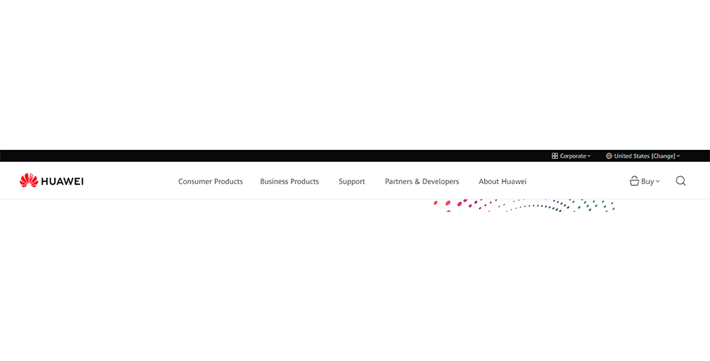
01 Horizontal navigation bar
You are probably already familiar with this one. The horizontal navigation bar is basically the main menu, which contains the major pages.
It is placed on the top of the page and goes as a part of a header. Most websites choose similar sections for their headers, although it may vary. The brand’s logo is usually placed on the left side and directs users to the homepage.
Here you can see the example of Huawei’s website horizontal navigation bar.
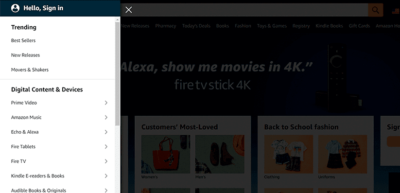
02 Sidebar or vertical navigation
This is also one of the most common types of navigation. It’s often found on the left side of the page, where everything is listed one-by-one on the column. The sidebars are vertical and go ahead of the main content on the page.
Sidebar navigation design is considered to be good at usability. Since most people are used to reading from left to right, they’ll immediately notice it. Also, vertical navigation is able to contain numerous links which can be pretty handy. Just look at Amazon’s sidebar navigation down below.
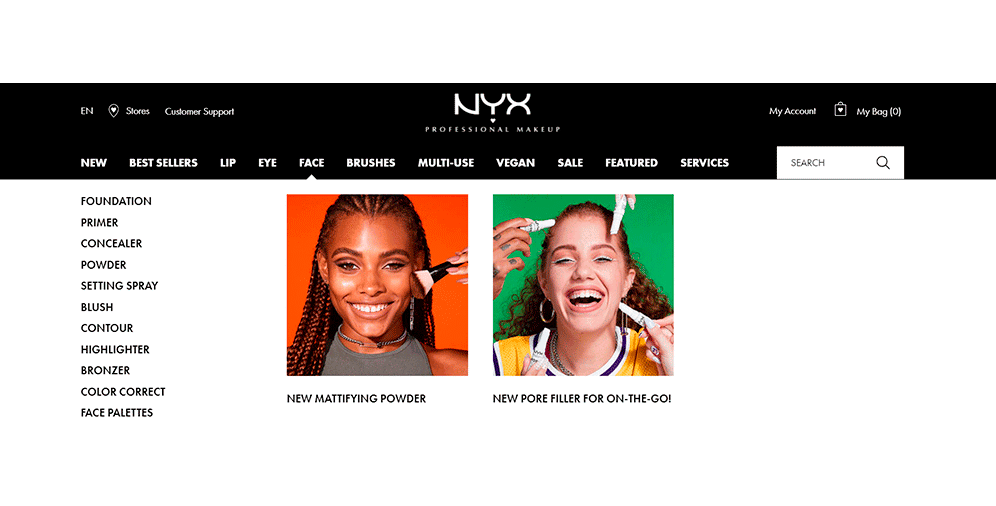
03 Dropdown navigation menu
Websites with big amounts of content require smartly structured navigation most of all. A dropdown navigation menu can be a perfect solution for them.
Putting lots of links in your navigation bar is not always a good idea. If your page is overloaded with content, users might get confused and will promptly leave it. So, instead of trying to put everything in the horizontal bar, you can create some main sections or general items and add the rest in a dropdown menu.
Take a look at the NYX’s dropdown menu and consider it yourself.
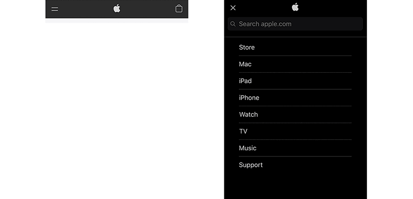
04 Hamburger navigation menu
The hamburger navigation menu is named after the hamburger button, which looks like three parallel horizontal lines.
It’s mostly used in mobile web design and is suitable for small screens. With the hamburger navigation menu, vertical dropdown or horizontal pop-out menus are hidden behind the hamburger button. Once users click on it, the menu appears. You can clearly see it while using Apple’s website on your mobile phone.
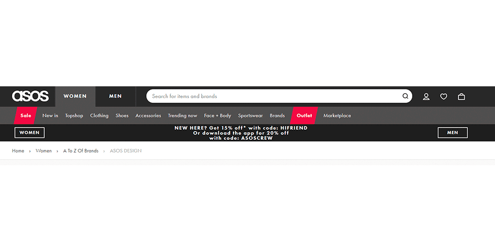
05 Breadcrumb navigation
If you’re familiar with the Hansel and Gretel fairytale, you know where this type of navigation’s name came from.
Breadcrumb navigation isn’t the most common and is used only in addition to the primary navigation system. It works well on websites with numerous hierarchy levels and aims to show users where exactly they stay right now. Breadcrumbs also navigate them through levels and allow visitors to go back when needed.
ASOS is one of the many brands that use breadcrumb navigation on their website.
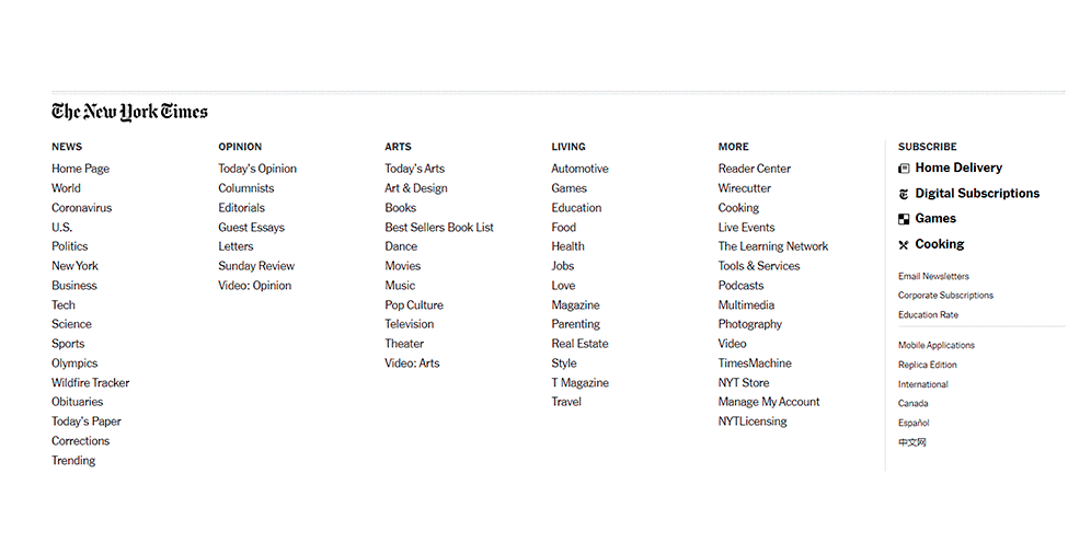
06 Footer navigation menu
This type of navigation is often combined with the horizontal navigation bar. Firstly users look at the top of the page, and when the needed information isn’t there, they scroll down.
The footer navigation menu is set at the bottom of the page and usually suggests a big amount of links. They can also be categorized and put into different sections.
If you want to see a truly amazing footer navigation menu, look here at The New York Times paper’s website.
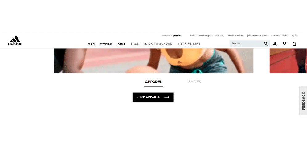
07 Global website navigation
A lot of websites have global website navigation, which means that their menu and links don’t change and stay put on all the pages. No matter what way you’re scrolling – they’re going to “follow” you.
For instance, you can clearly see the header menu on this screenshot of the Adidas website. It’ll stay there even if you scroll down, and will still lead you to the most important pages of the website.
08 Hierarchical website navigation
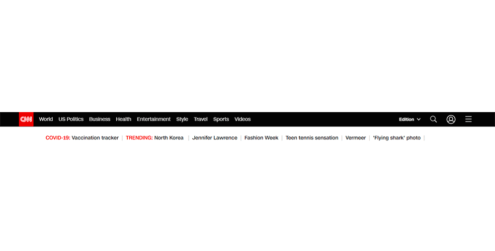
Hierarchical navigation is often used for websites with a lot of content, especially newspapers and news channels. It is known for having a menu that changes and adjusts to the opened page. Take a look at CNN’s website.
Here we have a few top sections in the header but when we choose one, this menu is gone. All we can see now is the subcategories of the section we clicked on.
This is proven to be useful for bigger websites and helps to easily distinguish hierarchical navigation from the global one.
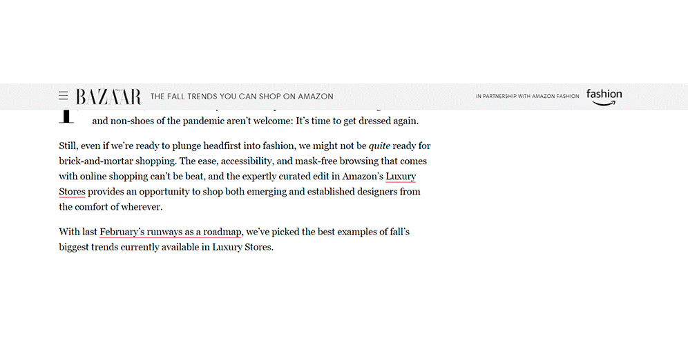
09 Local website navigation
Local website navigation is also clearly recognizable: it has a lot of internal links. Usually, they are included in the content, and with their help users are being directed to the relevant pages.
This type of navigation is great for websites with lots of information and has a good impact on SEO.
Here’s how the internal links look like on the Harper’s Bazaar’s website.
Key Elements of Effective Website Navigation Design
Having established the importance of website navigation, let’s now discuss how to make your website truly usable. Here are some suggestions that you won’t want to miss:
User Satisfaction
Remember who your website is for – your audience. Knowing your audience is crucial, and you should always ensure that your website stays relatable to them to gain their trust and support. Every button, link, or element of the navigation system should be useful to them and enhance their experience. If you’re not sure what your audience needs, don’t hesitate to ask for their opinion. This will help you avoid wasting time and money in vain.
Consistency
Navigating through your site should be simple, and you shouldn’t overcomplicate the navigation elements. While creativity can be a bonus, your main menu should be fixed and in plain sight. Meet user expectations first and add some original content afterward. Consistency is key.
Relevance
Relevance is just as important because it helps to avoid confusion and irritation. When users click on a link, they expect to see relevant and useful information. If the menu has too many links or they lead to unnecessary pages, people will not get a good impression of your website. Make their life easier and stay away from putting irrelevant stuff on your website.
Internal Links
Internal links are beneficial to both users and your business. They help users find the necessary information quickly and easily while also driving more traffic to your website. Search engines love internal links and will appreciate if you incorporate them into your website.
Search Bars
Having an eye-catching search bar on your website is vital. Users should be able to search for whatever they need regardless of your website’s size or content. If they can’t find the information they need and don’t see a search bar, they will probably leave. On the other hand, having a search bar provides them with further assistance and shows that you care.
Get the Order Correct
People remember the first and last item they see in a row. Use this knowledge to plan your navigation structure and put the most important categories in the right place. That’s why most “Contact us” forms are placed at the end of the header.
Be Specific
Avoid user complaints and annoyance by using clear and specific names for your navigation elements. Avoid generic terms like “Resources,” “Process,” “Technology,” and “Tools.” Instead, use more specific terms like “Our Cases” or “Blog,” for example.
Minimize Navigation Links
Less is more when it comes to web design. Users don’t enjoy making numerous choices or being unsure where to click. Make it easier for them by minimizing the links and relish the results.
Recommend Next Steps
Encourage visitors to stay on your website longer by recommending next steps. Suggest similar articles or items, add related links or videos to catch their attention. If they’re interested, they’ll likely click on it and stay a little longer. If it’s their first time on your website, this will help them find what they might like quickly.
Test Your Website Navigation Design on Mobile
Don’t forget about mobile users. Many people use their mobile phones to search the internet, and if your website isn’t optimized for them, you’re in trouble. Navigation should be easy on both desktop and mobile devices, with noticeable buttons and readable fonts.
Analyze How People Use Your Navigation System
Asking people’s opinions about your website is a good start, but it’s not always enough. If you want to ensure you’re doing a good job and improving your website over time, you should analyze how people use your navigation system. Use Google Analytics to analyze user behavior and make changes accordingly. This will undoubtedly benefit you.
Designing a User-Friendly Website Navigation: Best Practices
Proper information architecture (IA) is crucial to designing navigation. Without it, your website’s navigation won’t function as intended. To create clear and familiar navigation for users, there are several tips to follow.
Firstly, make sure not to hide navigation from users. Avoid using the hamburger menu, as users often fail to find it and leave the website. It’s better to make the navigation noticeable and straightforward.
Secondly, place navigation where users expect to find it, such as at the top of the page, footer, or sidebar. This meets user expectations and makes them feel comfortable.
It’s also important to visually separate navigation from content so that users can distinguish it. Use negative space if necessary. Write descriptive labels that inform users what they will find on the page, avoiding generic labels that do not provide useful information.
Incorporating a search bar can simplify web navigation, allowing users to find answers to specific questions. Be cautious with dropdown menus, as users often find them confusing and overwhelming.
Limit the number of top-level options to seven, which is what people’s short-term memory retains, according to George Miller’s psychology paper. Too many categories or elements in your navigation can confuse users and search engines. Ensure that your website is accessible to users with disabilities, incorporating alt tags for images and providing keyboard navigation.
Test your navigation design on multiple devices and browsers to ensure that it is compatible and looks good across different platforms. Remember to keep your navigation up to date as your website and its content evolve. An outdated navigation menu can be frustrating for users and harm your search engine rankings.
Make sure that your navigation is responsive and mobile-friendly, as more and more users are browsing the web on their smartphones and tablets. A clear and intuitive menu hierarchy will help users quickly find the content they’re looking for, and the use of breadcrumbs can provide users with a clear path of where they are within your website’s hierarchy.
Finally, incorporating user feedback and analytics data into your navigation design is essential. User feedback can help identify pain points and areas for improvement, while analytics data can reveal user behavior and navigation patterns. Using this data can lead to a more user-friendly and effective navigation system.
Best Website Navigation Examples
After all the talking there is nothing better than to see some good website navigation designs, so let’s jump right into it.
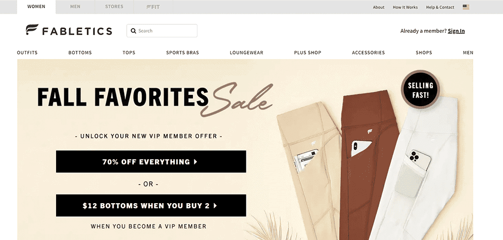
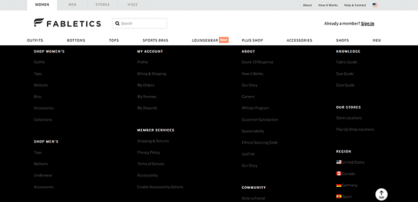
01 Fabletics
Fabletics has a basic horizontal bar menu with the logo on the left. There is also a search bar next to it. At the center is a link to its products page. To the right, there is a link to a member log in, and above it, there are 3 more essential links: “Above,” “How it works,” and “Help & Contact.” At the end of the page, there is a footer with tons of additional information.
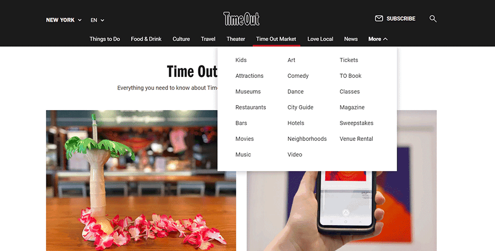
02 TimeOut
TimeOut’s website also has a horizontal bar menu but with a little addition. Apart from the main categories, there is one dropdown section at the end of the header. It doesn’t overwhelm users and allows them to add more links to the menu at the same time. We can also see the search sign and link for subscription at the top right corner.
03 Dollyave
Dollyave is a creative website for creative people. Here you can see an eye-catching sidebar, 4 links to the main pages near the logo, and lots of links to their socials at the top right corner. All in all, it looks very simple and effective.

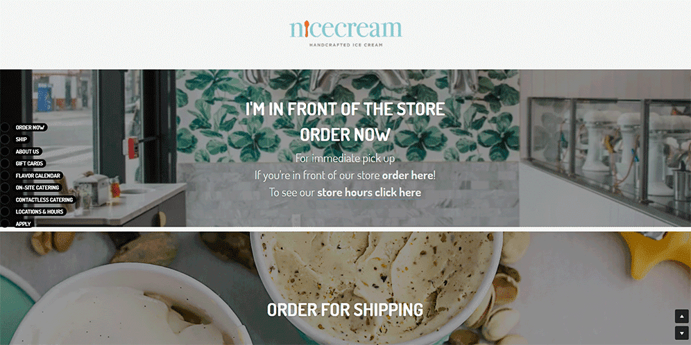
04 Nicecream
Nicecream is another example of a website with a sidebar navigation menu. Apart from it, there are a few links at the center of the page which help visitors to order and see store hours.
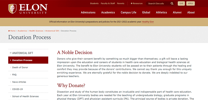
05 Elon University
Elon University’s website shows your whole navigational path, which means it uses breadcrumb navigation. It includes each of your steps, starting with “Home” to make sure you won’t get lost or confused.
It also allows users that didn’t begin on the homepage to easily explore the website and get to the beginning if needed.
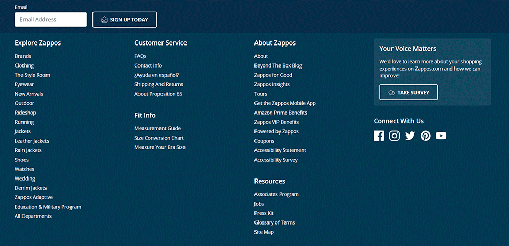
06 Zappos
Here you can see a great example of a solid footer menu. Zappos decided to put lots of links to the site’s main pages at the bottom of their homepage. Plus, they added the links to their socials right next to it.
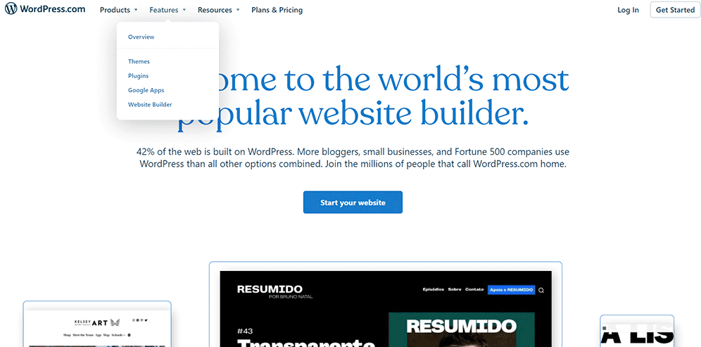
07 WordPress
WordPress has its menu in a header section, and most of its categories have hidden additional subcategories in them. At the center of the homepage, there is also a link urging to take an action. You can also see a “Log in” link at the top right corner.
On a Final Note
Proper website navigation is crucial for leaving a good impression on users, enhancing their experience, and increasing loyalty, conversions, and profit. To achieve great website navigation, you should start by understanding your audience and their behavior patterns, and design solutions that meet their expectations. Choose a navigation type that works best for your website and prioritizes making search engines and users happy.
Take Brokeree or FlowRepublic as examples of successful website navigation designs. They are simple, clear, and precise, without unnecessary steps that can confuse or frustrate users.
If you have any further questions or need help with website navigation solutions, feel free to contact us. We will respond promptly and provide the best advice to improve your website navigation.

Copied!

