Outline:
With new brands emerging every day, customers can be confused by the sheer number of undistinguishable companies that the market is overflooded with. How can companies make themselves known and instantly recognizable? What can serve as a visual statement for their brand values? A logo is an answer.
Imagining a brand without a logo is like imagining a book without a cover – you can still work it out on your own but you’d be left with a feeling as if something wasn’t right, and the experience wasn’t fulfilling and gratifying.
Therefore, if you’re trying to establish your company as a competent and prominent industry player, visual identity services shouldn’t be disregarded. Moreover, logos provide potential customers with information about who you are and what you do, as well as help them to form a first impression of your business.
Logos make you stand out from the crowd, engage your clientele, and create an immediate impression on the users, hence the importance of a properly communicated logo in a harmonious and balanced conversation between you and your customer.
What makes a good logo design? What are the different types of logos? You can learn all about logo design and more in our article.
What is a logo?
We think of logos as this kind of stamp that business owners put on their product packages and main pages of their websites. However, it’s a little bit more than that. Logos serve as your company’s “ID” – it’s a symbol that’s tied to everything you put out onto the market.
Logos bear a lot of marketing responsibility – a good logo may increase your chances of being recognized, whereas poorly designed logos can impede your popularity. They carry your visual character, as well as your values and goals.
There are different types of logos – more on that a bit later – but usually, they include several crucial elements. First of all, it’s some form of typographic element: text, a tagline, or some abbreviation. This element can be created applying any kind of design: from really austere and minimalist to the intricate and complex one.
Another element is imagery and use of color. Logos don’t have to include images, but they can utilize some decorative elements such as lines, shapes, or smaller details. Color can also add to the character of the composition, be it a simple black and white combination, or some fascinating multicolored solution.
Some logos may incorporate a dynamic element, meaning that they change depending on the context. It can be a change of color, an addition of some moving elements, or a slightly altered font.
As we’ve established the logo definition and its basic elements, let’s delve deeper into the types of logos that exist on the market.
Types of logos
With so many different varieties of companies and their logos, it’s hard to pick the one that fits you specifically. In order to get a better idea of how logos work and why they are vital to any business, it’s necessary to distinguish between them. Let’s look closer at 7 main types of logos.
- Lettermarks
Lettermarks or monograms as they are sometimes called, are logos that include letters, usually abbreviations, initialisms, or acronyms of the name of the company. Evidently, this type of logo is usually used by companies with lengthy or ungainly names, such as Home Box Office, better known as HBO, or some fashion brands that need their logos to be clean-cut and sharp, like Gucci or Chanel. This type of logo is perfect if you’re starting out and trying to make yourself known. Just remember that creative and engaging use of fonts is everything in this case.
- Wordmark
Wordmarks, also known as logotypes, exclusively feature the company’s name and rely on typography and fonts to establish their brand identity. Much like lettermarks, font logos offer a creative outlet through the careful selection of a specific font that becomes synonymous with your brand. Consider iconic examples like Coca-Cola or Google; they aren’t overly complex, yet their instant recognizability owes much to their distinctive typefaces.
However, evolving design trends can impact font logos, potentially making certain fonts appear outdated over time, prompting the need for periodic updates. That’s where a font logo maker becomes a practical choice. With a Font Logo Maker, you can access free templates and an easy-to-use interface to design and craft a customized logo in just a few minutes. This ensures that your logo not only stays fresh and relevant but is also a hassle-free process.
- Pictorial
An icon- or graphics-based logo is called pictorial (sometimes referred to as brand mark). This type of logo is usually extremely simplified and contains only an easily reproduced and instantly recognizable image, which makes it easy to use in various outlets, for example, think of a Twitter or Apple logo. At the same time, it might be a challenging option for new companies not yet established on the market, or if the nature of their company’s work can’t be interpreted literally. Picking an image that will be forever associated with your company might be tough too so using this type requires a lot of planning and preparation.
- Abstract
An abstract logo can be regarded as a subtype of a pictorial logo. However, unlike a brand mark, it usually involves using a peculiarly shaped symbol that is tailor-made for you and has no additional associations with any other real-life object, like Pepsi or Nike. This type of logo is one of the most challenging yet artistic ways to establish your brand, as it becomes a fully-fledged aspect of your identity. With that being said, such creative freedom might be suffocating – it’s very easy and dangerous to get lost in the bottomless well trying to put a complex concept into a distinct symbol.
- Mascot
These logos feature an image of a “spokesperson” of your brand, whether it’s a real-life person or a character that serves as your visual representative. Cherished by children, this logo instantly builds a connection with the customers, which means that it can be used mainly for businesses with a very vast target audience, usually in the food industry (for example, KFC or Pillsbury). Such a logo wouldn’t be an appropriate choice if you need to get off serious energy – mascots only work if you’re trying to be fun and engaging.
- Emblem
Emblems are the logos that have fonts placed inside an image or a symbol. Think about old times when powerful clans used to have their own coats of arms and their family names written in some undecipherable font that no one remembers how to read precisely? That’s what we’re aiming for here. Emblem logos, such as Starbucks or Stella Artois, have this antique aura around them as if they’ve been around forever, and that means that they’re really, really good. Of course, these logos are not as flexible and versatile as other logos on this list, but they don’t have to be – they’re too highborn to be adaptable. Also, getting off their high horse is not a quick thing to do.
- Combination
With all that being said, you don’t have to choose between having only a text or only a symbol in your logo – using both is possible. That’s what the combination logo is for. It can include a mascot and a brand mark, a wordmark, and an emblem, the choice is yours. The trick here is to not get overdramatic and eccentric – building a brand with a creative mess of a logo is not ideal. Choose your combination elements wisely. Think of Dove or TransNordic – their unostentatious, yet versatile and powerful logos are recognizable and not excessive, that’s the right path to take.
Why is the logo important?
If you’re still hesitant about the role of logos in your brand journey, we’re going to be rather blunt in our rhetoric and say it: logos are irreplaceable, indispensable, and extremely critical to your success. It is the first thing that your customer interacts with when getting in contact with your product. If they don’t find your logo to be engaging and fascinating, they move on and never come back.
The most obvious reason that points at the importance of logos is that it makes you establish yourself as a business individual. You make yourself stand out from other companies since your logo is unique to you. This reason only should make business owners reevaluate the importance of creating logos, especially if they’re involved in a business industry with a high level of competition.
Another reason why logos are vital is that they express the essential information about you and your brand: its overall energy, level of creativity, the nature of the business or industry. It doesn’t mean that you have to put a cow face on your dairy products (although, some companies do that), but think about what you would like to see first if you were unfamiliar with your business.
On top of that, logos support your overall brand recognition. How else can you make a mark on the market if you don’t have a well-established set of brand attributes? Logos serve as a foundation for your visual brand and can even dictate how other brand elements are developed. Due to their flexibility, they can be used everywhere – from a webpage to the presentation materials and packaging items. This ensures that your brand elements are spread across your digital and physical presence, making you noticeable.
Now, let’s move on to the more practical questions: how to design your own logo? What is a good logo design? What does a logo design process entail?
How to design a logo?
At first sight, logo design may seem like a lot of responsibility: you create something that is going to appear on every branding item you generate, something that’s going to be constantly associated with you and your company. We promise it’s not that scary. We made a list of steps that you should follow if you want to design an effective and powerful logo that reflects your business goals and brand values.
Step #1 Do your research
Before you embark on your logo design journey, you should remember one thing: a logo is not just an image or an illustration that you make with no idea behind it. It is your visual identification, something that must echo your brand message and make an indelible first impression.
You can’t do that if you’re unsure about your foundational principles and if you can’t turn your base notes into something digestible. Take some time beforehand and ask yourself: what is my company doing? Who are my ideal customers, and what are they looking for? Who are my competitors, and how they define their brands? What type of logo am I adhering to, and how can it reflect my company’s character?
After that, you can pick the words, phrases, or even images that can be associated with whatever you define as your foundation. Sketch those ideas out, if you need to, explore the market to get logo ideas, and get inspired by all kinds of companies, not only their logos but their entire visual hierarchy – you never know what is going to catch your eye.
Step #2 Explore the possibilities
Even if you don’t plan to work on the logo yourself or engage your own in-house design team, it’s important to work on the visual personality of your company. A third party may successfully translate your brand goals into a logo but it’s better if you’re participating in the process since the logo is a cornerstone of your entire company image.
Discover what kind of colors evoke the emotions you would like your customers to have when they interact with your product. Explore the endless varieties of fonts and typographic details that can reflect your business attitude and character. Identify shapes, forms, lines, and graphic design elements that you would like your logo to include. Don’t panic – take each component individually and then mix them together to see how they work together. It’s easier to do if you already have your brand style established, but if not, working on a logo is a perfect opportunity to start the ball rolling.
Step #3 Just do it
Once your main design goals are finalized and applying all research you have accumulated during previous stages, it is time to build your logo. You have several options:
- design your logo from scratch – with the help of your own design team, third party, or even yourself;
- acquire a logo design template and bring your take on it;
- use logo design tools or software.
The choice depends on your financial resources and time management issues. If you’re pressed for time or not very tech-savvy, put your trust in professionals, making sure you work with them closely to ensure brand consistency. If you’re only starting out and feel very enthusiastic about logo design, go for it – just try not to go insane while you’re at it.
Regardless of the option you have chosen, the deliverable is clear: at the end of the design process, you should have at least several options to select from. Of course, some pick their logos completely intuitively which is fine, but make sure that the “finalists” are unique, distinctive, and make you seem professional and skillful while fitting in your overall brand image.
Step #4 Refine and test it
With a few options in your arsenal, you have to pick one. We know, how are you supposed to do that, they’re all recognizable, and simple, and evocative, but take a few things into consideration: how are you going to use the logo and where? Which one of the selected options fits into those functions? Which one of them can successfully face the alterations of brand style that you might go through? How seamlessly each variant can be incorporated into your visual architecture?
When you’re finally done with choosing and crying over three practically identical options, it’s time to test the logo you picked. Is it scalable? Can it be used in various outlets and sizes? How well does it look on the platforms you’re going to use primarily? Are you going to have different variations of your logo for different contexts? When all those questions are properly answered, you’re going to be left with a final logo design, the one and only, that can be put into action immediately.
Step #5 Integrate, implement, incorporate
You must be feeling euphoric that you’re finally looking at your own logo, but don’t forget – a logo doesn’t exist outside of your brand identity, it’s the face of it, so it should be blended well with the other stylistic elements that your company possesses. It is usually done in a form of style or brand guidelines that dictate all your steps in terms of the visual arrangement of the content you put out. The guidelines help to set your business tone that you will have to follow on every design step you might want to take in the future.
As a logo design company, Ester Digital can guide you through this painful process and present you with a logo you kept dreaming about but could never visualize it. Contact us, and we’ll be happy to do all the heavy lifting for you.
Top 5 best logos
If you’re still in the dark about logos or if you need some reference points, examples of successful companies and their logos that have stood the test of time, look no further. We present our list of the best logo designs that we think are in the league of their own.
- McDonald’s Predictable choice, yet any list with the best logo design will be incomplete without the McDonald’s logo. A great example of a lettermark logo, this symbol is instantly recognizable for a person of any age, social group, or food habits. Eye-grabbing bright yellow color became McDonald’s main feature. The curve of the letter “M” adds to the uniqueness of the image, making it very classical, yet easily reproducible.
- Apple Another big-time player that has been around for ages, remaining as relevant and as popular as ever, with a huge portion of that success being attributed to its memorable brand identity symbols. Everyone knows the Apple logo – a simple apple with a bite taken out of it. It can be interpreted in many ways, but mostly its popularity is due to it being one of the most creative and innovative logos of all time.
- Google A heavy-weight logo that remained hardly changed since its creation in 1998 till 2015, when the company added a vibrant set of colors and modernized the font slightly, making it more up-to-date and fun. Again, another simple yet effective logo with an artistic approach to the use of colors, their combination, negative space, and letter spacing. We can almost see designers high-fiving each other when they decided to rebel against the system and use two colors – red and blue – two times while leaving yellow and green out in the cold.
- Nike The Nike logo is so cool that it has its own name – the Swoosh. This logo has gone through a lot of changes starting from the orange color to the text underneath the swoosh symbol. Now it’s renowned for its utter simplicity and an unparalleled level of contextuality. Is it a symbol of speed? Power? Is it just saying “you’re going to be okay” when you’re about to die after six jogging laps? No one knows. And you don’t have to because the logo is what it needs to be – captivating and evocative.

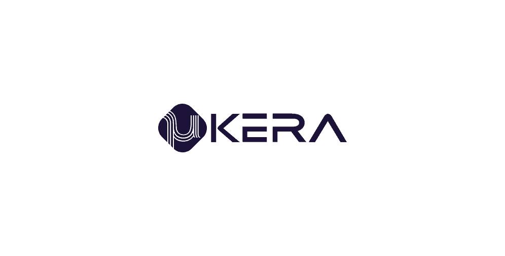
- μKERA
We’re obviously self-promoting ourselves here, but we’re so fond of this logo for μKERA that we worked on that we couldn’t help putting it on this list. μKERA is a hi-tech vaping technology provider. We wanted to reflect its innovative approaches in a logo mimicking the aceramic texture that they use in their products and creatively reinterpreting the letter “µ” that acts as one of the main brand attributes and a typographic stamp for the company.
On a final note
As you can see, logo design is not very easy, yet completely fascinating and captivating. Since it is a pillar of each company’s successful business journey, one has to be careful when embarking on a long and arduous “designing a logo” crusade. It’s a big step forward and a huge responsibility, something that needs to be taken seriously.
A powerful logo may be the ruling factor for a lot of customers to pay attention to your product, just as a weak logo may be a total dealbreaker for others. First impressions matter, and there’s no better first impression than a logo that clearly defines your brand values, business attitude, and general character of your company.
Designing logos is not a walk in the park, so it’s better to work with professionals if you want a long-lasting result. If you still have any questions about logos, feel free to contact us, and we will ensure that your business flourishes and grows with each new day.

