Outline:
Dark UI design has become increasingly popular among web and mobile users, offering a unique visual appeal and improved readability in low-light conditions. But how can web designers reach the grand charm of a dark UI without compromising functionality and user experience?
In this article, we will delve into the benefits and potential drawbacks of dark mode UI design, compare it to its light UI counterpart, and explore the factors that should be considered when choosing between the two. Whether you are a seasoned designer or just starting, this article will provide you with essential insights into creating stunning and user-friendly dark UI designs.
Seeing the Light or Going Dark: How to Choose the right UI for Your Website or App
Did you know that the first computers in the world used a dark mode user interface? Back then, it was a mere necessity since there were no technologies able to efficiently illuminate the screens. Today, things have drastically changed. Dark mode UI is now simply a preference that’s popular among many web and mobile users. And that’s not really a big surprise — dark theme design has its own perks. In this article, we’ll discuss which interfaces are suitable for dark mode and take a closer look at its benefits and pitfalls.
To choose the correct user interface mode, web designers need to acknowledge a few things. The choice of the color schemes is a key factor to a website or web app’s success: to get the needed engagement, you must provide users with clear and well-organized UI elements that are easily accessible and recognized.
Although there is no perfect solution for any kind of website or web app, it’s important to consider the main pros and cons of both light and dark UI and decide what fits best. Let’s explore what makes light UI a great choice:
- It’s ideal for daytime or natural light viewing;
- It goes great with simple web designs;
- It makes the text more clear and visible, which is beneficial for heavy-content websites;
- It’s familiar to users and makes them feel at ease;
- It fits the websites or web apps with a lot of visual components.
Now, let’s learn more about dark UI:
- It looks alluring and unordinary;
- It increases readability in low-light conditions;
- It’s great for web products with little text content;
- It’s also great for web products with a lot of visual elements;
- It fits best intuitive interfaces with fewer buttons and an easy navigation system;
- It’s perfect for landing pages that are focused on one main element or content piece.
Overall, light UI is usually a safer option for simple websites with a lot of content (both text and visual) used mostly in daytime, while dark UI is a more creative and appealing at first glance option used when there is little content, fewer design elements, or a single core component that needs to stand out. However, it’s important to remember that the effectiveness of a UI design ultimately depends on the specific context and user needs.
It’s worth noting that surveys and studies have shown that many people use dark mode on their digital devices. For example, a 2020 survey by Vox Media found that 78% of respondents used dark mode at least some of the time. In addition, a 2019 study by DisplayMate Technologies found that dark mode could extend battery life by up to 60% on OLED displays. If you’re designing for dark mode, it’s important to keep these factors in mind.
Choosing the Right UI: How to Decide Between Light and Dark Themes
Since the increased popularity of dark UI, more and more websites and web apps have started providing users with the possibility of applying a darker theme. The biggest software development companies try out dark layouts, which often brings spectacular results to their business. However, it’s important to remember your web product’s specifics before making a choice. Not every interface is suitable for a darker theme, and web designers should always take under advisement the emotional influence of it as well. Here are a few factors you need to consider when picking a dark UI:
Target audience: Do you know your audience well? What are they looking for on your website or web app? Do they need a simple and highly intuitive interface, or do they care about trends and style? Knowing the answer to these questions can immensely help you at the beginning of designing the perfect interface for your visitors.
Purpose of the interface: As the statistics claim, only 10% of users prefer a light UI when it comes to blogs and news portals. So, if you want to engage your visitors through texts and videos, a light UI might be a better option. At the same time, if the purpose of your interface is to focus users’ attention on a single piece of an element or intrigue them, dark UI is definitely the winner.
Content: As you already know, light UI is more popular with heavy-content websites and web apps. However, it’s worth mentioning that dark UI with light text can impressively improve readability when we’re dealing with long hours of looking at the screen. For instance, reading a book or working on a new programming code can be much easier for the eyes when using dark UI.
The impact you want to produce: Another thing to consider is the emotional impact you want to produce on users. It’s well-known that companies are usually trying to evoke positive emotions in their web product’s visitors by using certain color schemes and visuals. Even though the dark mode per se is unlikely to negatively affect your users, its poor execution can make them feel unwelcome.
Branding: Last but not least, it’s crucial to check if your brand’s style fits dark UIs. You can use a color generator to find the right color palette for your business and make sure it creates appropriate associations for users in conjunction with the dark user interface.
In summary, the choice between a light and dark UI should be informed by various factors such as the target audience, purpose of the interface, content, desired emotional impact, and branding. By considering these factors, you can make an informed decision about which UI is the best fit for your website or web app.

The Dos and Don’ts of Creating Stunning Dark UIs
To become a pro at designing dark UIs, it’s important to gasp its basic rules. Here’s what we consider critical to know in order to achive truly magnificent results:
Сontrast: True black (#000000) is often used for various UI elements, but employing it for surface/background colors is not the best idea. The explanation is quite simple: true black doesn’t provide web designers with the ability to use a broad range of colors. So, using dark gray as a dark theme might be a smarter option in order to create color depth and a more pleasing contrast.
Color: One of the biggest mistakes in dark UI design is the use of saturated colors. Since they visually vibrate against a dark background, it’s better to choose the lighter ones. According to Google, a smart move is to use split complementary colors’ help and turn to a limited number of color accents. Another great tool for choosing the right color combinations for your dark UI is Colorable: it will help you work on the level of accessibility to improve readability and create good contrast simultaneously.
Negative space: Negative space is a crucial component of any dark UI — it helps avoid the heaviness of digital products. By using it skillfully, web designers can make dark UI more lightweight and, hence, readable. The right amount of negative space makes UI elements distinctive and leads users’ attention to the most important pieces of content. When there is not enough negative space, people are more likely to leave your website or web app without properly scanning it first. Therefore, taking into account the negative space peculiarities will not only improve user experience but also significantly help with the creation of a high-quality design.
Typography: Finally, it’s time to address the importance of text, which also requires close examination during dark UI designing. First of all, you need to ensure that your text size is appropriate for your digital product. It shouldn’t be too small since the dark UI makes it harder to read smaller texts, and it should always be easily readable. Secondly, it’s also worth checking the contrast between your text and your background, so they won’t merge. You can choose among a huge variety of digital fonts to emphasize the headers of your texts too. Furthermore, there are lots of typefaces sources that are perfect for dark UI nowadays. For example, you can turn to Google Fonts or Adobe Typekit.
By paying attention to these basic rules of contrast, color, negative space, and typography, web designers can create truly magnificent dark UIs that are both visually appealing and highly functional.
Enhancing User Experience with Dark UI: Tips and Tricks for Web Designers
Once you made up your mind and ultimately decided to use dark UI for your website or web app, it’s important to follow these practices and tips:
Stick to minimal color schemes: To make your dark design look rich and clean at the same time, you need to limit the number of colors you’re going to use. A lot of web designers prefer to choose two or three colors and stick to them to avoid making your product too heavy.
Use neutral colors: Transparent and neutral colors can easily work in your favor if you’ll continuously use them from the beginning of the design process. Find a set of fitting base colors and use them to transform your designs to dark UI in the best possible way.
Choose sans-serif fonts over serif: Since your choice of fonts can either improve or worsen the readability of your product’s text, you should double-check whether they’re good for a dark background. If you’re a fan of the serif fonts, make no mistake: this type of font isn’t the best for dark UI. Instead, you can choose sans-serif fonts, which will look clear and more distinctive.
Add enough whitespaces: Dark backgrounds tend to absorb some of the light from other UI elements, and that’s why it’s critical to use the appropriate amount of white space not to make your interface look overloaded. Another perk of using enough whitespace is its capability to make your texts more readable with the help of increased line spacing.
Decrease color saturation: Employing fully saturated colors will do you no good while designing your dark UI. High saturation comes with a “shaking visual effect,” which makes your digital product look less clear. Therefore, it’s smarter to reduce color saturation for darker surfaces.
Check the contrast: Your contrast design should meet all the WCAG standards. To make sure your texts are legible, you can use one of the most popular tools: Contrast (Figma plugin) or Stark (Sketch, Figma, and XD plugin).
Provide users with a style switcher: Since a lot of people prefer dark UI during the nighttime, it’s wise to give them an option. Add a style switcher to your product and allow users to choose what they need. Some well-known apps (like Google Maps) can even switch the theme automatically based on the daytime, and we can’t help but admire such a handy solution.
Keep on testing: Even though these tips might help you create a base for your dark UI, there is no better way to improve the result than test, test, and test again. Try different color schemes and see how they affect your product’s usability and appeal. Pick different fonts, change the contrast, find out your strong and weak sides, and test everything again on various types of screens and in distinct resolutions. Practice makes it perfect, so don’t ever give up.
By following these practices and tips, web designers can create highly functional and visually appealing dark UIs that improve user experience and engagement.
Dark UI Inspiration
If you’re ready to test your knowledge and try out some new practices, we’re all here for it. However, nothing is better for boosting creativity than checking out a few spectacular examples you might like.
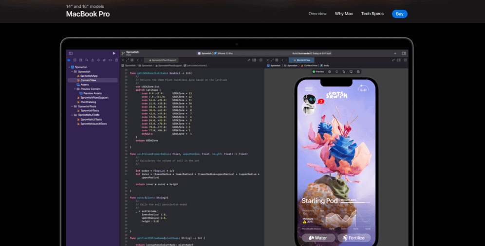
01 Apple
Apple is one of the world’s biggest companies that absolutely loves dark UI. It makes their website look unique and extremely stylish, effortlessly channeling the feeling of power and grace to users.
02 Netflix
Everyone knows Netflix, but have you paid attention to their beautiful dark UI before? Their website design is a perfect demonstration of an endless potential of a skillfully mixed dark background with a lit-up screen. It completely fits the brand’s style and provides visitors with a great experience.

03 Tom Ford
Here’s another well-known company that prefers dark UI for their website. Tom Ford is a luxury fashion house with a broad range of products. By using dark UI, they make an emphasis on the brand’s elegance, trendiness, and magnificence.

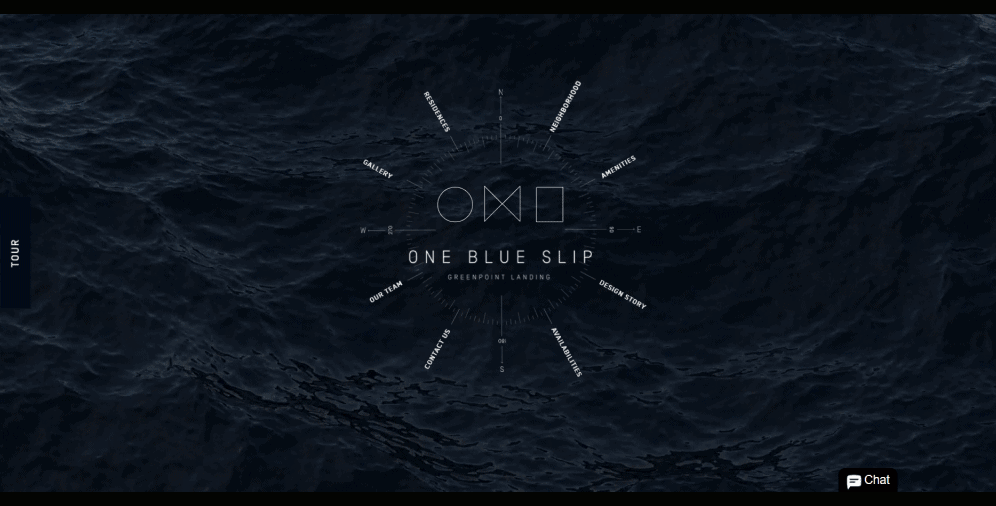
04 One Blue Slip
One Blue Slip is a great example of a minimalistic dark UI website with an authentic design. The dark background leads users’ focus to the central UI element and creates the atmosphere of mystery and opulence.
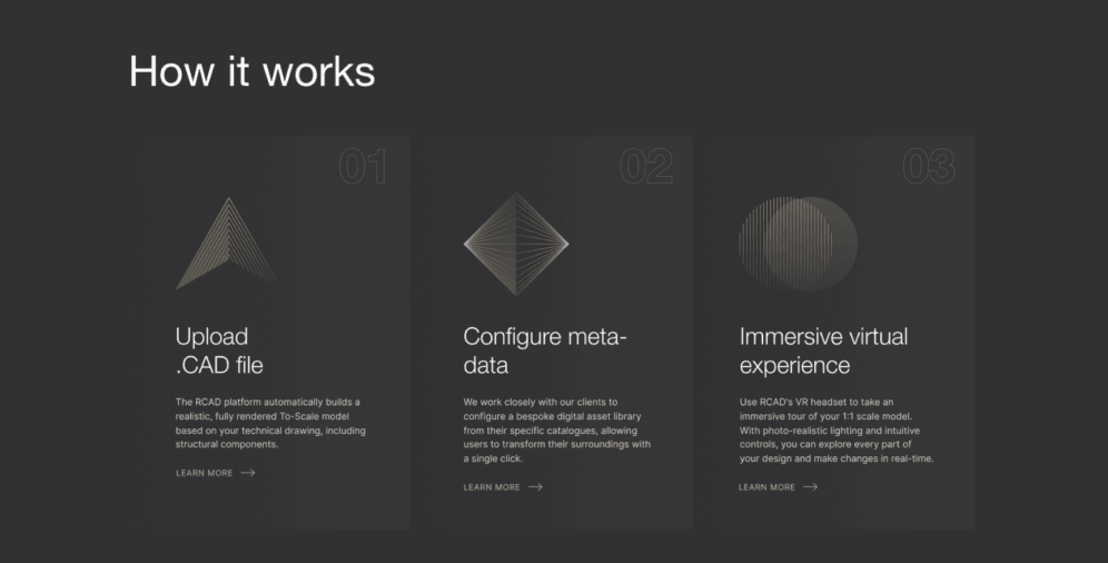
05 RCAD
RCAD is a newly-launched company that is also not averse to using dark UI. We love the color scheme here that helps to create an exceptional, stylish look of the web page.
06 Zepp
Zepp’s web application uses a dark UI as well as their website, and we’re not surprised by it — just look at this striking look that literally screams about the exquisiteness and prestige.

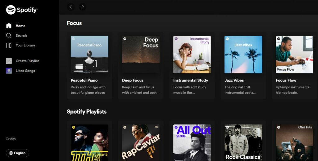
07 Spotify
Spotify’s web app also provides users with the possibility to use a dark theme. In their case, it helps to highlight the photographs of artists, the cover art, and navigation buttons. Moreover, dark UI adds some simplicity, which is also appreciated by users.
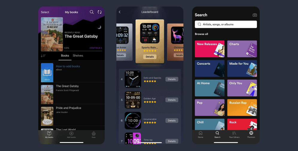
08 eBoox
eBoox is an amazing web app for all the book lovers. It enables users to switch the style and choose a dark UI to improve readability and reduce stress in the eyes while reading at nighttime.
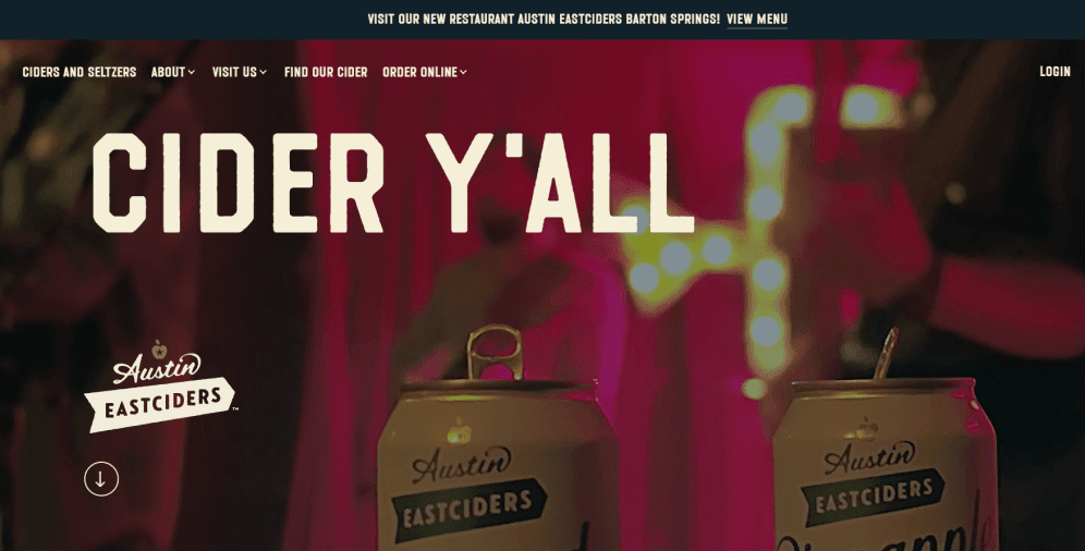
09 Austin Eastciders
Here you can see a beautiful dark UI website for all cider lovers. Their color scheme is truly astonishing and creates an atmosphere of serenity and satisfaction. Even though it’s a dark theme, there is nothing gloomy about this website — thanks to the color choice, visitors feel more than welcome on this web page.
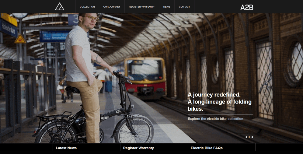
10 A2B
A2B is a company that’s selling electric bikes. The choice of dark UI in their case is frankly perfect: it leads users’ attention right to the visual piece of content that shows their product and highlights the menu.
On a Final Note
When it comes to choosing the right user interface for your website or web app, it’s crucial to keep your target audience in mind. With the increasing popularity of dark UI, more and more businesses are adopting this trend to create visually stunning and highly functional digital products. But to stand out in a crowded market, it’s important to ensure that your dark UI design meets all the necessary criteria for success.
That’s where our team comes in. We have a wealth of experience in designing stunning and effective dark UIs that drive user engagement and deliver results. With our expert guidance, you can create a visually stunning and highly functional dark theme that reflects your brand and resonates with your target audience.
Our article provides you with useful tips and practices, along with examples of dark UI designs, to help you create a truly astonishing user interface. We understand that designing a dark UI can be challenging, but with our support and guidance, you can create a digital product that stands out from the competition.
If you’re looking to create a dark UI for your website or web app, our team is here to help. Contact us today, and let us help you create a dark UI that meets all your business needs and drives results.

Copied!


