Outline:
With new design innovations and UI/UX design services emerging all the time, it’s hard to keep up with the pace and be aware of the current digital design trends. Is it really necessary to follow them or is it just a fashionable thing to do? Everybody decides for themselves, but in a world where creative trends are changing so fast, users are changing too – becoming more well-versed in terms of design and what they would like to see and use.
Obviously, if you have a specific idea for your digital product that might not fit with the most innovative web design trends – go for it, but if you want to be on top of your game, try out some of these and see what works for you!
Parallax Animation and Other Scroll Effects
Websites and digital design, in general, don’t have to be static anymore – there is a plethora of animation software tools and dynamic design approaches that can liven up the product. One way to achieve this is by employing touch-action scrolling.
The idea behind touch-action scrolling is that when users scroll, the page starts to “move”, changing the layout or incorporating new elements that interact with each other. This effect adds depth to the page by moving design elements at a different speed.
A great example of incorporating parallax scrolling, which creates a sense of depth through several backgrounds merging into each other, is the website for the game Firewatch. The site doesn’t rely on super complex scroll effects and doesn’t change the site’s functionality or impede the work of the entire layout.
Parallax is not the only trendy scrolling effect. There are plenty of ways to freshen up a website, such as adding videos as a background, incorporating a change of colors when scrolling, or including complex layout transitions.
Minimalist or Maximalist Extremes
Minimalism is one of the most sought-after trends of the past few years, and it’s having another moment in 2021. This year its “less is more” approach is bordering on “let’s pick a background color and a font and pray it works”. Having minimalistic or monochrome elements is also still in vogue.
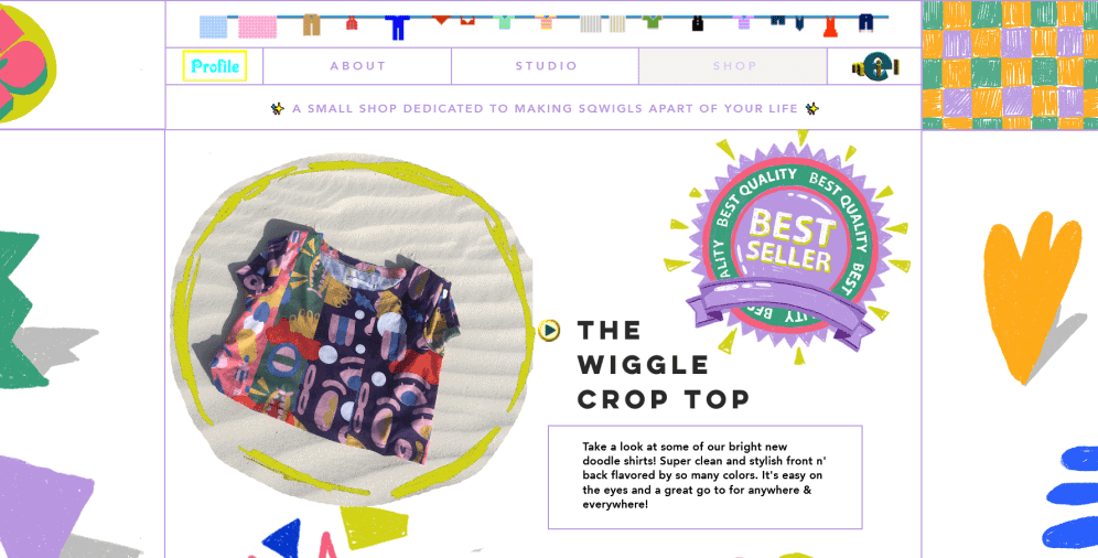
Together with minimalism, the maximalist design is a prominent web design trend. Maximalism in 2021 is almost aggressive – there are not many rules as to how to tame it, so just go for it. Any kind of order is out of the question – you can combine and mix together different types, font sizes, static and dynamic elements, colors, and overlapping structures.
While minimalism and maximalism may be popular trends in 2021, they may not be the best fit for every website or brand. It’s important to consider the target audience, brand identity, and website goals when selecting a design approach.
Animations
Another long-standing favorite, animations are still going strong in 2021. Anything from scroll animations to complex full-on web cartoons is very much in the game. The newest trends include such techniques as adding a texture to the animation, including sound effects, playing around with shapes and details – basically everything that adds to the interactivity and versatility.
Animations are still widely used in web design, ranging from subtle micro-animations to more complex full-on web cartoons. The trend is to add texture, sound effects, and shapes to animations to increase interactivity and versatility. Static imagery is becoming less popular, and micro-animations are gaining momentum. They offer visitors subtle and engaging hints that enhance the user experience.
Gigantic Titles
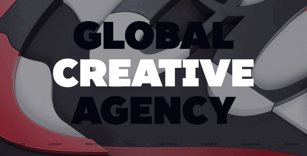
Striking and attention-grabbing fonts and titles are very much in fashion still. Look at Dragon Rouge, for example, – its homepage features a lot of humongous titles, headings, and descriptions. At times, it seems completely over the top, but this chunky, excessive, and almost fleshy feel is what is going to be very prominent text-wise in 2021.
It can be employed anywhere: from a brand name, or a hero shot to the whole typography, like in the Dragon Rouge case. The rules are not too strict – you don’t have to be 100% consistent. The key here is to mix fonts in a way that would echo your brand’s message and evoke strong feelings in your audience.
Also, go for something that’s readable and rather simple since the size of the font is already an image of its own, and an elaborate and convoluted type will overburden the whole composition.
It is generally true that bold and attention-grabbing fonts are popular in modern design, and it is important to choose a font that matches the brand message and is easily readable for the audience.
VR/AR
Websites with virtual or augmented reality elements are going to become even more popular in 2021 than they were in 2020: as users crave more detailed information about the products and services they would like to engage with, web and digital experiences are going to get increasingly more immersive.
Websites with VR/AR may not be 100% fit for any kind of business, but they can be a solid tool for a platform that needs to showcase the properties of a product or a service or see how the company works in detail. Take Dell Technologies, for example. It gives a chance for users to envision the intrinsics of the work with a combination of 360-degree video and web AR technology.
Data Visualization
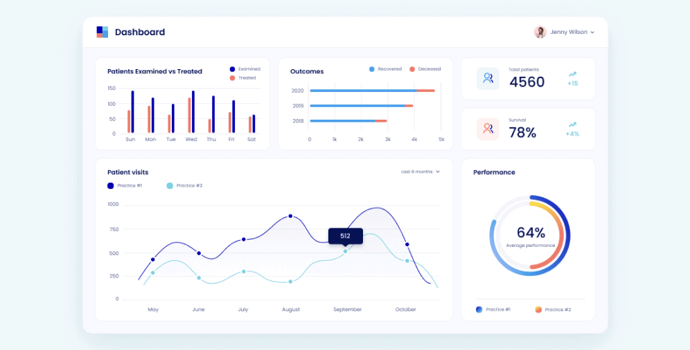
We’re living in the most information-saturated environment than we ever did before. Evidently, it can be utterly overwhelming to go through an avalanche of statistics and numbers without any structure. In 2021, the data visualization approach will be immensely popular in digital design.
Ester Digital has been employing data visualization techniques extensively in the past: for example, we worked on several healthcare platforms that manage to turn rather dull and cumbersome data into an enjoyable visual experience.
Statistics show that such visuals as various graphics, pie charts, and diagrams increase readership by 80%. With so much information being spread worldwide, this number is only going to grow.
Custom Illustrations
Just as data visualization, custom illustrations is a classic digital design technique that’s going to remain widespread in 2021. One of the main advantages of custom illustrations is their flexibility and uniqueness.
Custom illustrations can showcase your brand in the best light, highlighting the specific nature of your company, which is becoming vital in 2021. With so many businesses and websites around, being distinct and original is a must if you want to overcome the competition.
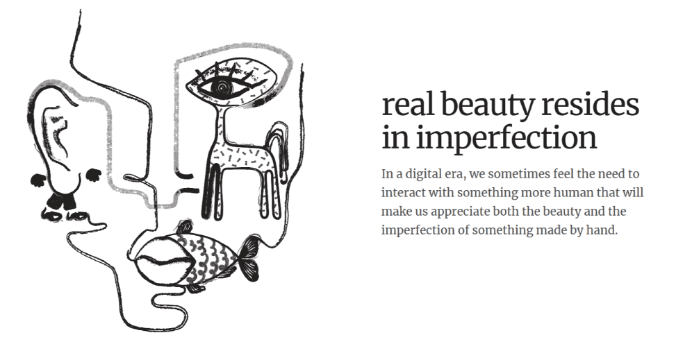
Which custom illustrations are going to be the most popular in 2021? There is a strong demand for abstractions, print formats, and over stylization. For example, check out how Absurd Design manages to incorporate creative visuals in a simple layout, making the result extremely powerful and artistic.
There is a growing demand for more artistic and stylized illustrations in web design, as seen in the example provided.
Just as data visualization and custom illustrations, AI-generated graphics are also becoming increasingly popular in digital design in 2021. One of the main advantages of AI-generated graphics is that they can be quickly and easily customized, making them an efficient and cost-effective way to create unique visuals for a brand. AI-generated graphics can also provide a modern and futuristic feel to a website, which can be appealing to tech-savvy audiences. However, it’s important to keep in mind that these graphics may lack the warmth and authenticity of hand-drawn illustrations, so it’s essential to find a balance between the two. As technology continues to advance, we can expect to see more creative uses of AI-generated graphics in the world of digital design.
Frosted Glass Effect
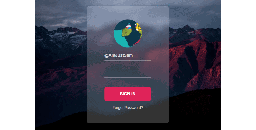
There is evidence to support that the frosted glass effect has been a popular trend in digital design since the release of macOS Big Sur in 2020. However, its level of popularity may vary depending on different design contexts and preferences. After launching macOS Ventura, glass effect is no longer considered as a trend.
3D Illustrations
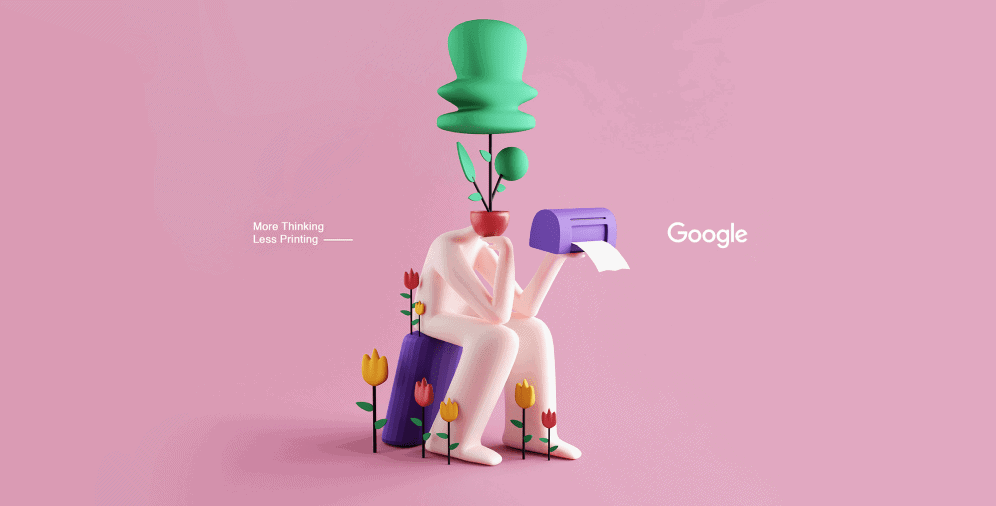
Since the digital design comes up with more and more interactive elements, it’s clear that together with custom illustrations, 3D illustrations are also leading the charge. 3D illustrations echo the overall current design craving for texture, dimensions, and curves that is going to be permeating every creative realm in 2021.
The main advantage of 3D illustrations is their brand storytelling capabilities: by nature of having volume, they resemble cartoon characters that are about to unfold their stories and enthrall you.
Creating 3D visuals is as easy as ever due to the growing number of design tools. You should bear in mind that unlike custom illustrations, 3D illustrations are not something that can be an additional element that gets put on the background – they’re the centerpieces of any page or product they are on.
Accessibility
You can say that accessibility can’t really be a trend because it seems like a necessity rather than a whim. However, you would be surprised at how many designers disregard this rule when working on websites or digital products.
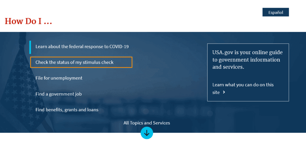
Accessibility and inclusivity increase conversions, attract visitors from different backgrounds and user experience levels, gives an opportunity to expand your audience to the fullest. Having texts of readable fonts and color schemes, employing focus indicators, implementing alt text and captions – all these will not only be beneficial in terms of accessibility, but also for the general user experience which is at the top of priorities for 2021.
The best examples of fully accessible websites are usually government platforms – such as U.S. Government’s official website. It’s fully manageable via keyboard, employs a perfect color coordination scheme, and has a Spanish version.
Dark Design Mode
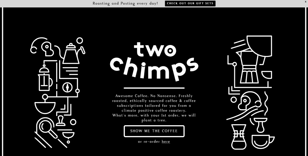
While most websites seem to operate on the lighter side (no pun intended), it’s becoming increasingly trendy to adhere to darker designs. This may seem like an extension of the black and white trend that’s been widespread previously, but the trick here is not to focus on the colors, but rather the light – it’s more like a night shift mode, not as strict with being monochrome as the black and white arrangement.
Take a look at Two Chimps Coffee – while the main color scheme consists of black and white, the layout is actually gray, and the whole composition looks like a cinema show, not a black and white photography.
Design for Different Causes
Not all trends are only concerned with visuals and the outward look of the website – some are conceptual. The 2020 year was incredibly challenging for a number of reasons, so it’s only natural that it determined the design trends for 2021.
With social distancing and lockdowns, 2020 urged us all to find shelter on the internet. Various initiatives, virtual conferences, and entertainment projects are becoming the new normal and moving to the web, and they’ll continue to do the same in 2021.
At Ester Digital, we are more than glad to help the cause and spread awareness about different challenges and social issues. We helped Thespie to work on the All I Want For Christmas Is Theatre project that aims to stream theater performances people are not able to attend on Christmas Eve together bringing awareness to how the 2020 challenges changed our traditions and how we are not going to accept that (is it dramatic enough?).
On a Final Note
It’s up to you whether to follow the new website trends or not, but you can’t deny that the overall shift in the design world – adhering to simpler and dimensional forms and moving away from flat and intricate elements. However, unless you’re operating in a niche or traditional sphere where keeping up with the fashion is not obligatory and sometimes even destructive, being up-to-the-minute seems like a reasonable business strategy.
Of course, it doesn’t mean that you need to completely transform your brand presence and change the way you’re marketed, but adding subtle trendy pieces is a nice way of saying to your customers: we value you that much that we’re constantly on the lookout to make the experience more fun and interesting for you. There is no way they won’t appreciate the effort.
If you’re feeling dizzy after reading about all those trends or feeling like you’ll never be able to implement them into your brand – contact us, and we will provide you with much-needed comfort and insights on how to do it in the most efficient and low-effort way.
