Outline:
In today’s digital age, the success of a website lies in its ability to keep visitors engaged and interested. There are several elements that contribute to this, such as the website’s overall appearance, content quality, and functionality. A well-designed website with the perfect color scheme and typography can make a significant impact on a user’s perception, while visuals with a touch of drama can evoke an emotional response.
While all these components are essential, it is easy to overlook a crucial factor that can make or break a website’s success: the homepage. Even if your platform is packed with excellent features and details, it can be challenging to encourage visitors to explore and engage with it. This is where the power of an impressive homepage design comes into play.
To help businesses master this theme, our UI UX company has compiled a comprehensive guide on how to design a homepage. This guide covers everything from the basic principles of design to advanced techniques for creating a visually stunning and engaging homepage. But first, let’s start with the basics.
A Homepage: The Window to Your Brand’s Online Presence
The homepage is the first thing visitors see when they enter a website. It serves as the gateway to the website’s other sections and is the starting point for further exploration. To make it easy for visitors to navigate the website, the homepage design should include links to all sections.
In addition to its navigational role, the homepage also serves as an introduction to the business or company. It should provide a brief description of the products or services offered, and some websites opt for an impressive statement to capture visitors’ attention.
What is more, visitors expect to find contact information on the homepage, such as a phone number or email address. This enables them to easily get in touch with the business.
However, there is one more vital factor to consider when designing a homepage: its intangible components. Just like meeting someone in person, visitors to a website expect to feel a connection and emotional resonance with the business. A homepage should warmly welcome visitors, convey the brand’s values and personality, and set the tone for the overall interaction. It should create a foundation for communication and entice visitors to explore further.
Overall, a homepage is the visual storefront of a business’s website, and its design can significantly impact visitors’ first impression of the brand. A well-designed homepage that is visually appealing, easy to navigate, and emotionally engaging can make visitors want to stay and explore more.
How a Compelling Homepage Design Can Benefit Your Website
A homepage design plays a crucial role in a website’s success. It’s the first point of contact for visitors and can influence their perception of the brand. Here are three ways a well-designed homepage can benefit your website:
#Provides a Consistent User Experience
Visitors come to your website with a purpose, and an effective homepage helps them find what they want quickly and easily. It provides clear navigation and directs visitors to the relevant sections of the platform. This creates a seamless experience for visitors and shows that you value their time.
#Boosts Conversions
A cluttered and poorly designed homepage can lead to high bounce rates, resulting in lost conversions. A well-designed homepage can guide visitors towards conversion points and encourage them to take action. It creates a positive first impression and communicates the brand’s value, making visitors more likely to trust and convert.
#Improves Brand Awareness
A homepage serves as a brand’s digital storefront and can be a powerful tool for increasing brand recognition. An excellent homepage incorporates branding elements such as logos, color schemes, and messaging that tie visitors’ perception of the brand to the website. The more visitors interact with these elements, the stronger the brand awareness becomes, making them more likely to recognize the brand in other environments.
In summary, a compelling homepage design can enhance the user experience, boost conversions, and improve brand awareness. A well-designed homepage not only directs visitors to relevant content but also sets the tone for the entire website. It creates a positive first impression and helps visitors engage with the brand, increasing the chances of conversion and brand recognition.
Homepage Design Essentials: Key Elements to Include
Creating a homepage that successfully communicates a business’s core values and offerings to users can be a challenging task. As the face and mouthpiece of a website, the homepage needs to be designed with care to ensure an enjoyable and engaging interaction for visitors. Let’s explore together, with our responsive web design development company, what to include on a homepage to make it effective and captivating.
- Headline: A concise yet informative headline should provide visitors with a clear idea of who you are and what you offer.
- Sub-headline: A powerful and descriptive sub-headline should develop the idea introduced in the headline, providing a more precise insight into your business’s message, mission, or purpose.
- Call to action: Multiple calls-to-action should be prominently displayed on the homepage to encourage visitors to dig deeper into the content.
- Visual: Incorporating relevant and emotionally driven images or videos can create a powerful impact and engage visitors.
- Navigation bar: A clear and descriptive navigation bar is vital to help visitors find the necessary information without wasting time searching through multiple pages.
- Logo: Including the business’s logo on the homepage helps present a consistent and holistic user experience and can serve as a link to the homepage.
- Feature list: A concise feature list that describes the core characteristics of the product or service can provide visitors with valuable information.
- Benefit list: Listing the benefits of employing those features can give visitors a compelling reason to rely on and engage with the business.
- Social proof: Customer reviews and testimonials can cultivate credibility and trust among potential clients.
- Success indicators: Displaying the business’s best accomplishments, such as media quotes, customer success stories, or successful partnerships, can positively associate the business with external parties and demonstrate its ability to cater to real people’s needs.
By including these components on a homepage, businesses can create a visually appealing and engaging first impression that encourages visitors to explore further and build relationships with the brand.
Expert Tips for Designing a Homepage That Engages and Convert
The homepage of your website is often the first impression visitors have of your brand. Thus, it’s crucial to design a homepage that captivates and engages them. Here are some essential tips and strategies to consider when crafting an effective homepage design:
#1 Keep it Simple: Ensure a Clutter-free Homepage
We scan rather than read every word on a website, so it’s important to make your homepage clutter-free. Less is more when it comes to homepage design. A cluttered page can be overwhelming and deter visitors from exploring further. Keep it simple, with only the most important information displayed prominently.
#2 Prioritize Important Content: How to Use Visual Hierarchy Effectively
Our eyes naturally notice the most highlighted elements, so it’s vital to prioritize essential content above the fold. Place the most important information above the fold, where it is easily visible without requiring visitors to scroll or click.
#3 Balance Your Design: Spacing Out the Content
Poorly structured homepage design can negatively affect visitors’ experiences. This tip emphasizes the importance of balancing the design of your homepage by leaving some areas blank to achieve a more comprehensive and appealing look.
#4 Keep it Consistent: Use Standard Layouts
When designing a homepage, simplicity is key. Use standard layouts and avoid overwhelming visitors with eccentric layouts and design formats that not everyone will understand.
#5 Avoid Being Too Persuasive: Tips for Using CTAs
While CTAs are essential for converting visitors into customers, overusing them can be counterproductive. Use CTAs sparingly and strategically to avert distracting visitors from the main points of your homepage.
#6 Use Additional Cues: Create a Particular Direction
Directional cues such as arrows or images of a person looking or pointing in a particular direction can help drive visitors’ attention to the most important parts of your homepage. However, avoid packing your page with excessive cues; there are a lot of evident paths users can take easily by themselves.
#7 Harness the Power of Color: Complementing Brand Identity
Colors have emotional connotations, and you can make them work to your advantage. Use colors that complement your brand identity, and employ contrasting ones for CTAs to drive attention to the core elements of your homepage.
#8 Consider Typography: Tips for Choosing the Right Font
Typography has an emotional connotation, just like colors and visuals. Thus, it can have a significant impact on the emotional resonance of your homepage. Choose fonts that complement your brand identity and use sharp fonts for headings or subheadings that need to be loud and strong.
#9 Use Simple Language: Improve the Readability
Readability is vital to the success of your homepage. Use clear, understandable language that avoids jargon or fancy phrases, unless your target audience is familiar with them.
#10 Optimize for Multiple Devices: Responsive Homepage Design
Visitors use various devices to access websites, so it’s important to ensure your homepage looks great on all devices, especially mobile phones. Furthermore, responsive homepage design can greatly influence your SEO positions.
#11 Don’t Keep Visitors Waiting: Load Time Optimization
Visitors do not like waiting for pages to load. Ensure that your homepage loads quickly to avoid visitors abandoning your website before giving it a chance.
By implementing these tips and strategies, you can design a visually appealing, user-friendly, and successful homepage that will captivate visitors and encourage them to engage with your brand.
10 Inspiring Homepage Designs for Your Next Website Project
The best way to create an excellent homepage is to search for inspiration and look around for homepage design best practices. Brilliant homepage designs will encourage your creativity, helping you to build the desired image. Here are the top 10 best homepage designs:
Netflix
The Netflix homepage is the perfect example of a consistent design. Its bright, red-colored CTAs catch the eyes right away. It’s clear what the company wants you to accomplish when you arrive. The red on the buttons coincides with the red logo, creating a balanced and joyful, holistic picture. This homepage employs a background image featuring a large spectrum of films and series posters. The visual is vivid and colorful, yet it’s easy to consume because the black theme calms down the bright contrast.

Airbnb
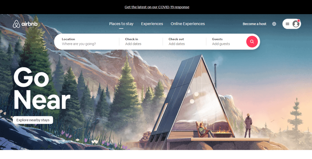
In just one phrase, Airbnb draws visitors and gets them involved. The headline contrasts with the background, making it easy to grasp. So do the CTA and navigation bar. An impressive visual inspires and evokes a spirit of a journey the visitors would definitely want to take. That is what the Airbnb brand is all about, and its homepage is a real brand representative number one.
Tour Partner Group
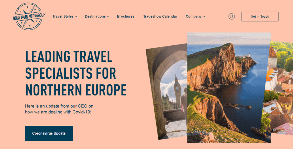
Tour Partner Group homepage gives off an easy-going vibe, and it’s critical for a business that takes a travel niche. The page is complemented with a bright color palette and high-quality, fantastic images. Visitors can scroll through the pictures, which makes the homepage design engaging and interactive.
TED
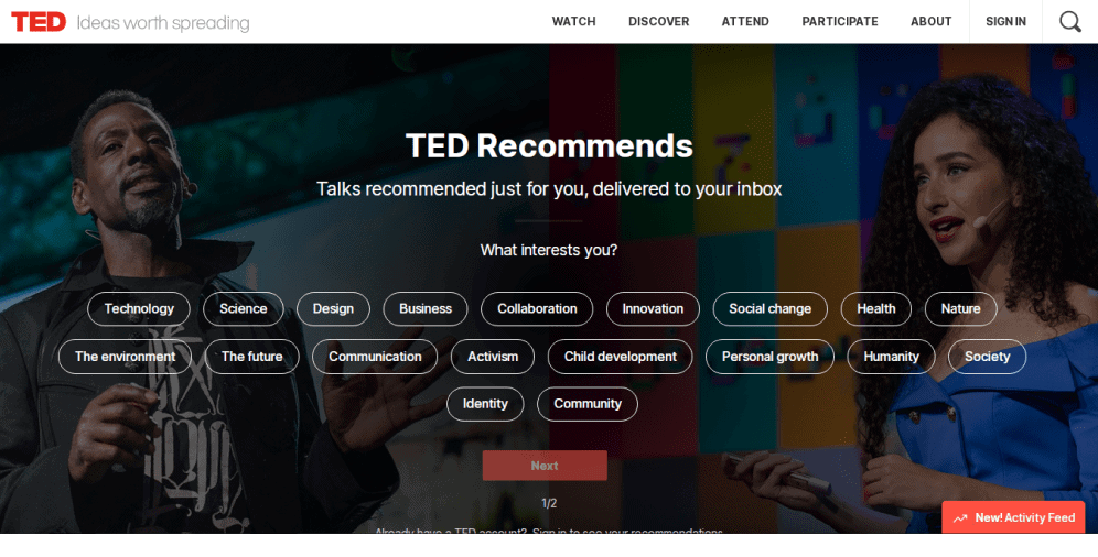
TED homepage opens with a wide choice of possible subjects the website encompasses. That allows visitors to perform multiple clicks instead of endless scrolling, seeking the right themes. It is an excellent example of a user-friendly approach. The page has a clean design with a fascinating visual behind it. The image captures two people speaking, bringing the mission of the TED brand to the forefront.
Evernote
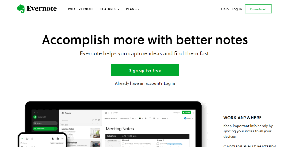
Right from its homepage, Evernote tells its target customers it will help them to capture their ideas. It solves the customers’ problems, and that is the best way to appeal. The use of white space helps to reach balance and highlight main issues – a headline, sub-headline, and a green-colored CTA. When you scroll down, you can see success indicators and social proof that arouse trust and prove the brand is worth working with.
The Brigade
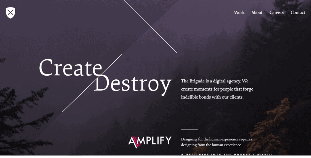
When you arrive at a Brigade homepage, you’re impressed by two things – the dark, quite a mystical image, and the contradictory headline. This combination captivates from a first glance and evokes an incentive to plunge into details, revealing the secrets. The typography stylization is perfect. The font color is contrasted to the background, which makes the text readable and comprehensive.
Skype
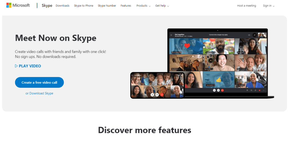
Skype homepage is an example of a simple yet appealing design. The homepage features a clear headline and an informative, short sub-headline. Along with the text, there are visuals portraying real people communicating with each other. That gives a sense of credibility and evokes emotions. Besides, the images show that the platform operates well both on a desktop and mobile.
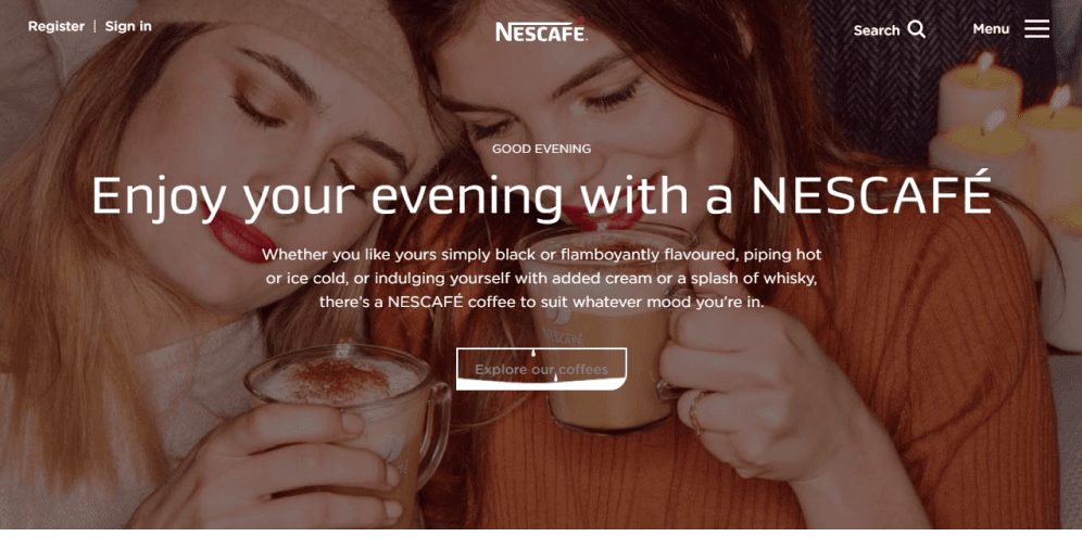
Nescafé
When you arrive at a Nescafé homepage, you experience a sense of joy and comfort. It employs an emotion-driven visual background that will probably make you smile. Another excellent feature is an interactive CTA. It produces an effect of pouring a coffee when you point at it.
Magic Leap
When you launch the Magic Leap website, you plunge straight into a world of the future. The background video tells everything about the brand, so you don’t have to extract details but watch and grasp. Along with the powerful visual, there is a strong headline with a prominent CTA under it.

Woven Magazine
Woven Magazine homepage is elegant. The image portraying two young women laughing fascinates, evoking positive emotions. The navigation bar is polished and straightforward. This homepage proves once again that simplicity is the key.

On a Final Note
The homepage is the entry point into your business and acts as a customer generation machine that must be built impeccably. A well-designed homepage can make a good first impression and draw more visitors to your website, making them more likely to convert into customers. From a powerful headline to a success indicators list, all details matter when designing a homepage.
To ensure that your homepage is designed well and appeals to the public, it is essential to consider critical points such as the visual hierarchy, typography, and color schemes. Additionally, creating a simple and clutter-free design, prioritizing important content, and optimizing load time are crucial for enhancing your website’s performance.
If you are still uncertain about how to design a homepage that attracts customers, don’t hesitate to contact our UI/UX company. We can assist you in achieving fantastic results by providing more insights into the subject and helping you design a visually appealing, user-friendly, and successful homepage. Ultimately, investing in a well-designed homepage can make a significant impact on your business’s prosperity, making it an essential component of your digital strategy.


