Outline:
The fierce competition on the internet has driven modern websites from various fields and of different purposes to seek ways to stand out and be unique. Achieving this requires thoroughly studying every detail of the platform, making it so enticing that visitors will want to return. Here, enticing and effective footer design can help.
Also, some companies mistakenly believe that the users will not venture to the bottom of the page. Contrary to this notion, if visitors cannot find the desired information in the header (as it is impossible to place everything there), they will scroll down the page to locate it in the footer of the website.
In this article, our UI agency will delv into the essence of footer element, share secrets of creating a stylish and multifunctional one, and provide inspirational examples of its design.
What Is a Website Footer
The footer is a visual element located at the bottom of the webpage. Typically, only one footer is created for all pages of the website, containing general information about the company, its products, and services. In addition, it may feature links to various resources, social media icons, a subscription form, and other crucial information.
Similar to its opposite element, the header, it helps link pages, enhancing user engagement and website conversions. It should not be overlooked by users, as a well-designed footer can increase sales. When visitors reach it, they have the opportunity to access the order page, contact a manager, find directions to the office, and much more.
Why Footer Design Matters
Although, the website footer receives less attention than the header, it still plays a vital role in user experience. According to a study by Nielsen Norman Group, visitors are more likely to scroll down to the bottom of the page than they are to click through to a second page. Visitors may use it for two main reasons: they couldn’t locate the desired information in the header or they intentionally scroll down to explore the content in the footer. If you’re not convinced, consider these additional points that highlight its importance.
Firstly, footers improve navigation. According to research by Baymard Institute, site footers with clear links to important pages can increase platform usability and user satisfaction by up to 27%. Users who have scrolled down may have difficulty locating information. Placing links to the main sections of the website in the footer makes it easier for visitors to find what they need and extends their time spent on the site.
Secondly, they communicate relevant information. A footer can contain any information that would interest a visitor, from general information about the company and its products to contact information and links to social media networks. The primary goal is to catch their attention and convey the company’s key message.
Thirdly, footers provide a final call to action and help in winning leads. Reminding visitors that the website’s content is not limited to the current page can prompt them to take further action, such as filling out a contact form, subscribing to a service, or signing up. These actions can have a positive impact on site conversion rates, and a well-designed one can turn platform visitors into customers. In fact, a study by HubSpot found that placing calls-to-action in the footer can increase website conversion rates by up to 23%.
Fourthly, they can boost search engine optimization. Placing keywords and links with promoted page requests in the footer can improve the website’s search engine relevance. However, overusing keywords should be avoided to ensure content harmony and effectiveness.
Additionally, footers keep users engaged till the end and offer a convenient location for useful information that may not fit into the menu. Companies can use them to provide legal information to users, list sponsors and partners, and other helpful data.
It’s crucial to give the footer the same amount of attention as any other element, as neglecting it may lead to negative consequences. For instance, some users may expect to find contact information in the footer, and not having it can cause confusion and frustration.
In conclusion, a well-designed footer can make a vital difference in user experience and website conversions. Therefore, it’s important to explore different ways to make the footer design attractive, convenient, and informative.

Best Practices for Website Footer Design
When designing a website, it’s significant to give proper attention to the footer section, as it can greatly impact user experience and engagement. Companies should start by studying their target audience’s characteristics of information perception, such as eye patterns when reading, to determine where to place the most important information in the footer.
An effective footer should include an impeccable navigation system that can help users who have lost their way on the website. It should also highlight the business personality and brand using photos, videos, and short texts to make the platform more reliable and memorable. Social media icons should be placed in the footer to prevent users from leaving the site and to gain more followers and potential customers.
Clear and catchy call-to-actions, along with a contact form, should also be included in the footer to increase website conversion rates. Besides, companies can use it for SEO purposes by adding relevant keywords or key phrases.
The footer should also include essential elements like copyright, company contacts, and privacy policy. A sitemap can help users find what they are looking for more quickly and also help search engines better understand the website’s structure and content. Including the company’s address and a link to the map can improve user experience and boost trust and loyalty.
Other elements that can be added to the footer include email sign-ups, login options, images and mini-galleries, the company mission and values, awards and certifications, association memberships, testimonials, latest articles, and upcoming events.
However, it’s important to avoid overloading it with unnecessary or unstructured information. Companies should choose the most suitable tools and things according to their needs and goals to create a successful and impactful footer that can stand out from the rest and attract more visitors to their website.
More Footer Design Ideas
Minimalist approach
One of the main trends in modern website design is simplicity and conciseness. It has been long proved that it’s not necessary to fill all the space of the footer since it doesn’t serve as an indicator of its informativeness. Therefore, the footer of most websites today is rather minimalist.
No footer at all
Although the website footer is important and applicable, companies can give up this element in some cases. But it makes sense only when the page is endless, so it literally has no bottom. This is mostly done by companies when they want to show their creativity and non-standard approach to the design.
Sticky footer
This type of website footer will be of help if companies want the most relevant information to be always in front of visitors’ eyes. Another case is when the website has endless pages, but they still have something important to show. Hovever, the best footer to be made sticky should not be too big, as it will take up a significant part of the page.
Unconventional footer shape and size
Just like everything in the design, the shape of the footer doesn’t have any strict rules, and it may be of various shapes and sizes. The only limit is your imagination. If you know how to get rid of a standard rectangular footer of a small size, just do it.
Categorized information
Categorizing the information provided in the website footer can be crucial since it allows users to promptly and easily find the desired information without scanning the entire block. Companies should always remember that everything that may save time is valuable.
Advertised special offers
When the companies have special offers, sales, or discounts then reminding visitors about them in the footer will be worth it since it may encourage customers to stay and make a purchase. This also applicable when it comes to displaying special products or bestsellers. Why not show them? Maybe someone else will also want to buy them.
Simple yet consistent design and style
Companies should remember that the footer is not an external element, and its design should be consistent with the overall style and design of the website. Companies can apply a gradient or reversed color schemes (for example) or just continue with the style utilized on the rest of the pages.
Effective typography
To avoid confusing website visitors with the texts or links provided in the footer, companies should use well-readable fonts and take care of the spacing so that the information blocks don’t merge. It’s also strongly recommended not to use fonts that blend into the background as long as users will simply not be able to see what’s written there.
Easy way to return to the top
For the convenience of users, it’s advisable to add an up arrow to the website footer. With its help, visitors do not have to manually scroll the page up to get to the top. Users expect to see this element on the right or left side of the page.
Fun visuals and animation
Animated elements are always eye-catching. They also add some emotional and positive energy to the footer. What could be better than when the visitors leave the website with a smile on their faces. Furthermore, the chances that they will remember the company for a long time and return soon increase significantly.
Newsletter sign-up
Provide users with an opportunity to subscribe to the company’s newsletter or email list. This will help the company keep in touch with its audience and promote its products and services through email marketing.
Staff profiles
Adding a section that highlights the team behind the company can help create a more personal connection with users. By showcasing the people behind the brand, visitors may feel more inclined to trust the company and its products or services.
Frequently Asked Questions (FAQ)
Including an FAQ section in the footer can save visitors time and effort, as they may be able to find answers to their questions without having to navigate to another page. This can also reduce the number of customer support inquiries.
Awards and recognition
Similar to including association memberships, showcasing any awards, certifications, or recognition the company has received will establish credibility and build trust with users.
Customer testimonials
Along with providing feedback on the company’s products or services, customer testimonials can also serve as social proof and encourage other visitors to make a purchase or take action.
Certifications and accreditations
In addition to showcasing the company’s achievements, adding a section for certifications and accreditations can also be important for companies that need to comply with specific industry regulations.
Upcoming events and webinars
By promoting upcoming events and webinars in the footer, companies can encourage visitors to participate and learn more about the company’s offerings. This can also help establish the business as a thought leader in its industry.
Related content
Similar to displaying the company’s latest articles, adding a section for related content will keep visitors engaged and encourage them to explore more of the website’s offerings. This can also be an effective way to promote related products or services.
The elements provided may also be applied to the website footer. However, it’s impractical to place all of them, as this will overload it. Therefore, companies should choose only the ones that will be useful specifically for their platform.
We are convinced that you have many ideas on how to make an amazing website footer. Nevertheless, let us help you a little bit. Right now we want to look through the steps of creating a truly efficient footer so that you’ll be able to check whether there’s anything you’ve missed out on.
Steps to Create a Good Footer
Decide on the Basics
When it comes to designing the website footer, companies should start by determining its location and size, whether it will be sticky or standard, and take into account the adaptability for mobile devices, as the majority of site visits come from them. According to a report by Statista, mobile devices accounted for 56.91% of site traffic worldwide in the third quarter of 2021. Thus, it’s crucial to ensure the website footer is mobile-friendly to provide a better user experience.
Design the Footer Layout
Once the location and size of the footer are determined, it’s time to think about how to present the information. To make it easier for users to find what they’re looking for, categorization and hierarchy of data are necessary. Research shows that a well-structured footer can improve site usability and conversion rates. In fact, according to a case study by ConversionXL, a website that implemented a well-organized footer increased its conversion rate by 14.79%.
Enhance It With Custom Elements
To make the website footer more engaging, custom elements such as social media icons, maps, and CTA buttons can be added. Also, it’s crucial to ensure that everything remains organized, convenient, and compatible with the site ecosystem. A study by HubSpot found that a well-designed CTA in the footer can increase conversion rates by up to 90%. Moreover, according to a report by Adobe, platforms with social media icons in the footer have a 27% higher click-through rate than those without them.
The process described above will ensure that the footer is created in a way that corresponds to the needs of the company and will help it become prosperous. Each element is of importance, and incorporating them in the footer can have an essential impact on website performance. As long as the theoretical part may be considered clear, we would like to show you bright website footer examples that diverse companies apply to their platforms. Furthermore, we decided to make it in the form of some kind of design comparison between huge brands and their competitors. Maybe you’ll find something that suits you (who knows, right?).
20 Best Website Footer Design Examples
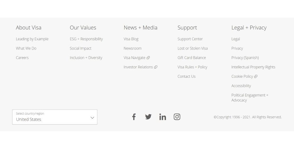
01 Visa
The website footer of Visa seems to be well-structured as long as every piece of information is placed in a certain category that is given a relevant name. This allows users to easily navigate through the website according to their needs and goals. The drop-and-down menu enables visitors to choose their country (consequently, the language) which is also pretty useful. Furthermore, the footer design is fully consistent with the website in general.
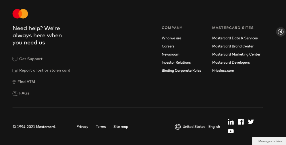
02 Mastercard
In comparison with the previous example, the footer here is somehow divided into two parts. The left part of the footer of the Mastercard website contains a warm phrase offering help with the following links to various useful sections. Among other things, on the right side, users can see the sound icon after clicking on which the audio file turns on and we can hear a pleasant melody that makes customers feel relaxed. This function is not obligatory and can be disabled at any moment.
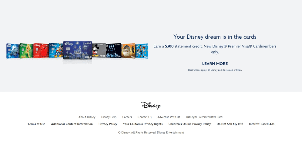
03 Disney
The information in the footer of Disney is presented in the form of lines and, as we can observe, they are distinguished by fonts (the second line that contains legal data is written in a bold one). Moreover, the footer here is used as a place for advertising and demonstrating their new product (credit cards) which is a good marketing move. The copyright symbol lacks any dates, however, they specify that everything produced by this company is under protection.
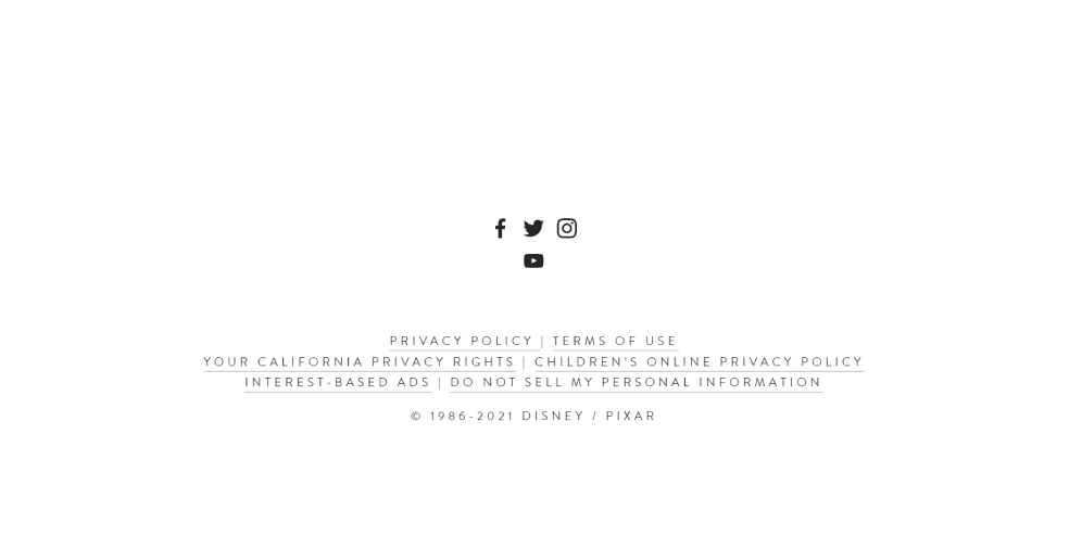
04 Pixar
In comparison with its cartoon counterpart, the footer of the Pixar website is made in a pretty minimalist way. Here at the top of the footer, users can find the icons of social media networks where they are presented and links to some legal information. Moreover, in the copyright section, they indicated two dates: the year of founding the company and a current one, which means that all the products made within this period are protected.
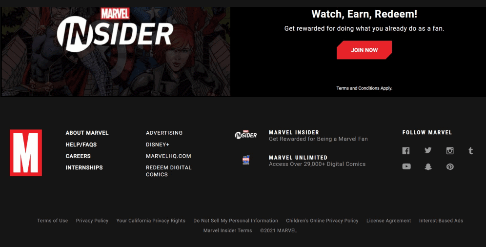
05 Marvel
The design of the Marvel footer is fully consistent with the overall website. On the left, there are links to the information about the company and other important sections. On the right, we can find the icons of their social networks. And just between these two blocks, there is the advertisement of their special offers accompanied by the CTA button which is a bit above.
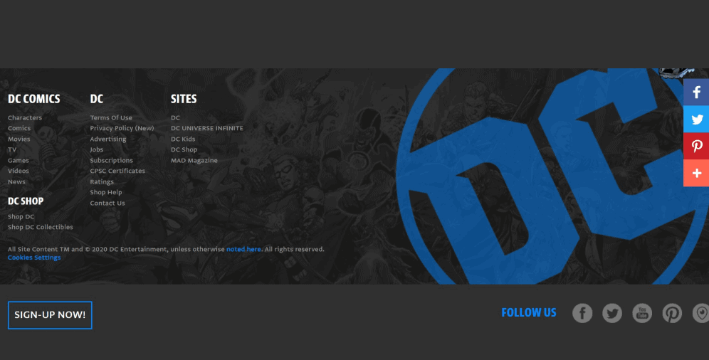
06 DC
The information provided in the footer of DC is displayed in the form of columns which makes the process of finding the information of one’s interest fast and simple. The CTA button of signing up can’t be disregarded since it’s really big and prominent. The same goes for the social media section as long as it’s highlighted by the application of bright blue color.
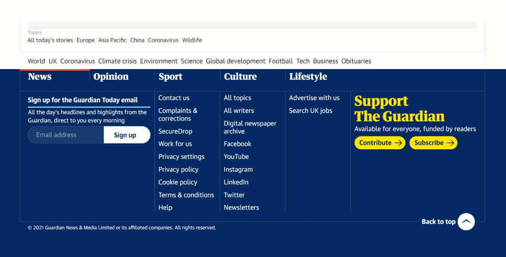
07 The Guardian
The footer of the Guardian is made in the form of a table. At the top of the footer, visitors can see the section with topics among which they can easily pick one and go to the page with relevant articles. If we look to the right, we can see an up arrow that allows readers to quickly go back to the top of the page. The left part, in its turn, offers readers an opportunity to sign up by entering the e-mail. Moreover, the right part has a CTA for supporting this British newspaper.
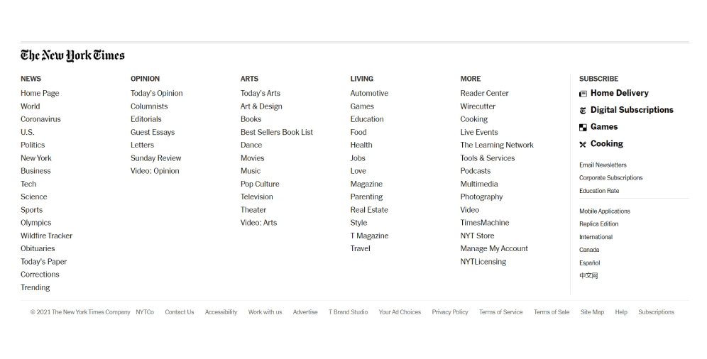
08 The New York Times
Just like its British counterpart, the New York Times offers its readers the section with topics, however, the lists provided here also have subsections. It may be perceived either as an information overload or as a provision of more convenient navigation across the material. The left part is primarily devoted to the subscription options, while the rest of the information can be found at the very bottom of the footer.
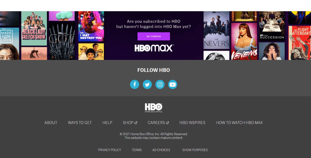
09 HBO
Just like its header, the HBO footer is pretty minimalist, and the first thing that we see is the prominent blue icons that invite users to follow them on social networks. The information is represented hierarchically: the first line is focused on the company itself, the third line is more about legal issues. The second line deserves to be analyzed separately since, besides the copyright information, there’s the notification of adult content. And that is a great thing to be mentioned.
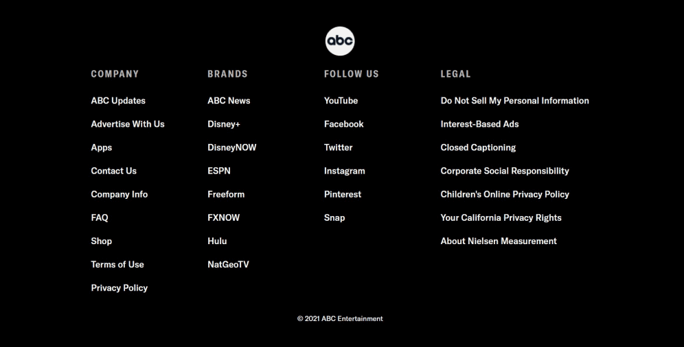
10 ABC
The approach of ABC to the footer design is rather different. The information here is divided into columns and categories and the section with media networks is represented in the form of their names (not icons). The right column that denotes legal data contains rather specific types of information that should be read and accepted by the website visitors. And this shows their serious attitude towards the content and the things they do in general.
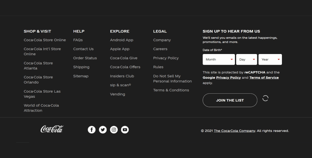
11 Coca-Cola
For better user convenience, the information on the Coca-Cola website footer is presented in the form of sections. Here we can find not only contact and legal information but also their special offers along with links to their mobile application. The right part contains a minimalist form of signing up and the statement about the website protection which convinces visitors of the safety of the personal data provided by them.
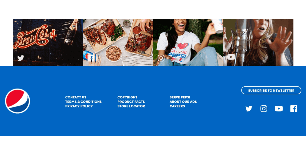
12 Pepsi
Compared to its red-and-white competitor, the footer of Pepsi seems to be pretty laconic and brief with no subsections or big lists of links. The footer design here is made according to the overall website (application of blue and white brand colors) including the company logo. The CTA of the subscription is accompanied by the social media icons and images that are right above the footer itself.
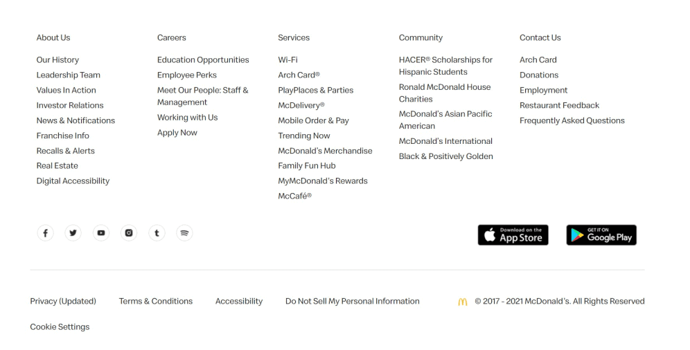
13 McDonald’s
The information in the footer of McDonald’s is presented in a super detailed way. Here each link is placed in the corresponding column which makes the navigation process extremely easy and convenient. In the middle of the footer, users can observe icons of social networks and buttons for downloading their mobile application. When it comes to legal information, then the copyright and privacy policy (with the mark “updated”) along with other aspects, such as cookie settings, for example, can be found at the bottom of the footer.
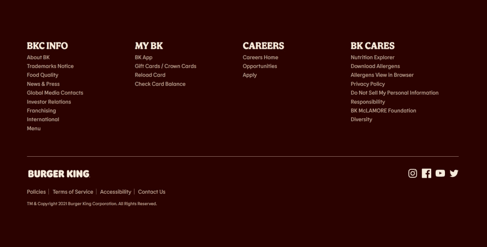
14 Burger King
The footer of Burger King, another fast-food representative, is made following the overall design and it also provides rather exhaustive (however, not that detailed) information that may be of interest to the visitors. The section with the social media icons and probably the most popular aspects is separated from the rest of the footer. Moreover, the copyright specifies the current date which also shows that the company cares about the protection of its rights.
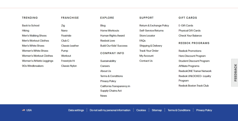
15 Reebok
Besides the standard elements, the website footer of Reebok contains many other sections such as those in which they display their bestsellers, products of their franchisees, discount programs, and others. The lowest part of the footer is devoted to the most popular aspects that are frequently looked for by the customers. In addition, on the right part, there’s the CTA button after clicking on which the visitors are asked to give their fair feedback, which indicates that the company is interested in its further growth and development.
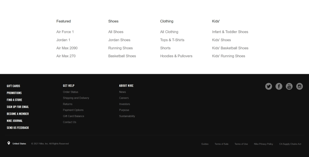
16 Nike
The website footer of Nike (is it bold of us to place it right after Reebok?) is presented in two parts on white and black backgrounds. First of all, we should mention that these colors are their brand ones (as well as logo) and that makes the footer an amazing reflection of it. The white part contains the links to their most popular products, while the black one is devoted to the provision of helpful information along with the icons of social networks. At the bottom of the page, users can also choose their location (as well as a language).
17 Dunkin’ Donuts
The website footer of Dunkin’ Donuts is presented in the form of levels. The first level contains a map with the help of which users can easily find the nearest cafe of this brand. The second one offers links to different fields of interest: from press to sitemap along with the social media icons. The next level is devoted to showing their business partners, while the last one provides users with some information concerning the privacy policy of the company and the copyright.
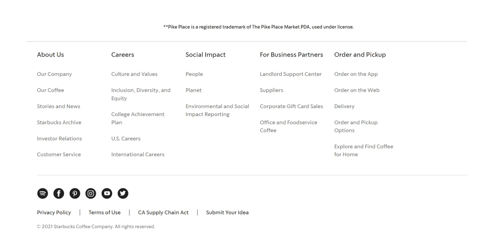
18 Starbucks
Compared to its above-mentioned counterpart, Starbucks has a pretty big scope of information provided in the footer. Most of the space is given to the links connected to the company and its work: from career opportunities and data related to the partnership to sections about their social impact and terms of delivery. Right below the icons of social networks, visitors can find a point that denotes submitting new ideas from the side of the customers that immediately evokes the feeling of involvement and importance.
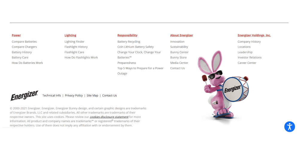
19 Energizer
The footer of Energizer looks like a natural continuation of the website within its design. This is evidenced not only by the application of its brand colors but also by utilizing the image of the logo along with the symbol of the company – the pink bunny. Basic information is presented in columns and the most frequent queries are listed below. At the very bottom of the page, users can familiarize themselves with the copyright and the usage of cookies by the website.
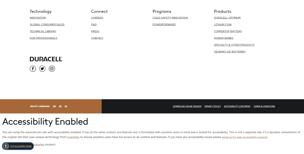
20 Duracell
Just like its energetic buddy, Duracell made the footer of its website quite informative and helpful. However, here users can also find the links to social networks to which the company invites its customers to follow them. The data is categorized in order to provide greater comfort for users. Moreover, in the lowest part of the footer, which by the way is designed in the form of company-branded batteries, customers can discover the language selection function.
As you can see, there isn’t just one strict template of an effective footer design. That’s why it’s mostly about the level of creativity the company is capable of. These brands are united by one more point, which is the fact that they use the space allocated for the footer quite wisely, not striving to fill it all. Anyway, the biggest task for any footer is to make it useful as well as convenient to the customers.
On a Final Note
Are you looking to take your platform to the next level? Don’t overlook the prominence of the website footer! A well-designed footer can help you achieve your business goals by improving user experience, increasing engagement, and driving conversions.
At our company, we understand the process of creating and designing a compelling website footer requires a deep understanding of your target audience and business objectives. That’s why we offer expert guidance to help you create a footer that works for your unique needs.
In this article, we’ve shared valuable insights into the importance of the website footer, along with inspiring examples of effective footers from top brands. But if you’re still feeling unsure about how to get started, we’re here to help! Contact us today to learn more about how we can take your website to the next level.

Copied!


