Outline:
One of the initial elements that users and customers see when they land on a website is the “header.” A header is the topmost section of a website that typically contains the website’s name, logo, and primary navigation menu. It is essentially the first impression of website header design that a user gets of the website and serves as a guide to help them navigate through the site.
In addition to its navigational function, website header design can also add to the website’s overall aesthetic and enhance the user experience. For instance, incorporating eye-catching visuals or animations can make the header more memorable and increase the chances of users staying on the site.
Moreover, headers can also be used to convey important information, such as upcoming promotions, events, or new product releases. This can help website owners keep their customers engaged and informed.
Header Design 101: How to Make Your Website Stand Out
The header is the top section of a website page that contains essential elements, such as logos, links to important categories, sections, search bars, and contact information, that facilitate convenient navigation. In other words, the header is a critical tool for improving user experience and boosting website conversions.
The primary objective of the header is to provide visitors with vital information about the company, including its name, brand, and product offerings through the website menu. This enables users to quickly comprehend the website’s purpose and navigate to their desired section with ease.
When it comes to website header design, there is ample room for creative solutions. Headers can be made in various ways to align with the website’s brand identity, but they should always be catchy, concise, and useful. An effective header should be visually appealing, grab the user’s attention, and be easy to navigate and comprehend.
In addition to its navigational and informational functions, the header can also be used to enhance website visibility and search engine optimization (SEO). Incorporating relevant keywords in the header can help search engines better understand the website’s content, leading to higher rankings in search results.
Why a Well-Designed Header is Crucial for Your Website’s Success
The primary goal of any company is to attract the attention of potential customers. This is where the header comes into play. As the first thing that users see when they land on a website, the header plays a crucial role in improving the interaction between the company and the visitor. It serves as a greeting that forms the first impression and sets the tone for the rest of the website. Additionally, the header has a significant impact on SEO, as it houses essential links and elements.
Moreover, the header offers visitors an opportunity to learn about the brand as they enter the website, discovering what the company does and what goods or services it provides. Consequently, a pleasant and trustworthy impression from the header can significantly increase the chances of attracting more customers.
It is important to note that some people without a technical background may confuse the terms “head” and “header” as synonyms. To avoid potential misunderstandings, let’s clarify their meanings.
Header vs. Head: Understanding the Difference
To clarify, the header refers to the block of information at the top of a website that represents the company’s brand and features. It serves as a visual design element that facilitates interaction between the visitor and the website.
On the other hand, the term “head” refers to the information that is invisible to visitors and located in the HTML page code. It contains important document elements such as technical data elements (links, styles, scripts, etc.) and meta tags – HTML tags used to store information crucial to browsers and search engines (used to retrieve information on the website, keywords, etc.). Essentially, the head contains computer-readable information about the website or page.
Having established the definitions and importance of the header and head, it’s time to delve deeper into the header. Let’s begin with the principles of header design.

Beyond Aesthetics: Leveraging Your Website Header to Convey Information and Drive Sales
As we previously established, the website header is a crucial element for catching the attention of visitors and customers. Let’s examine how new users perceive a website.
Multiple studies have revealed three patterns for content perception on a page:
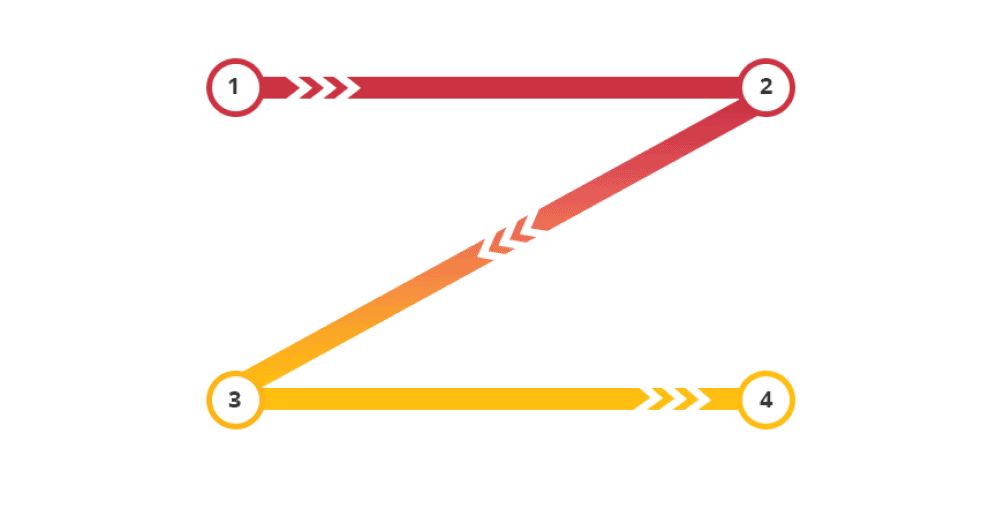
The Z-shaped pattern, where the user sequentially looks through the page according to the points shown, from one to four. The first three points receive the most attention, while the fourth is often overlooked. This pattern works well for minimalist designs with only a few key elements, such as a logo and CTA.
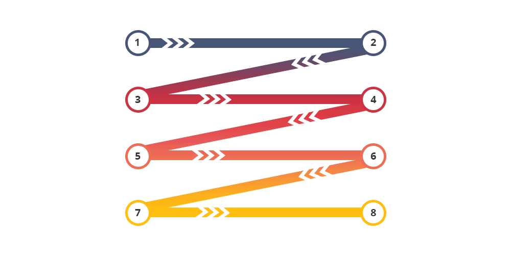
The Gutenberg pattern, which is similar to the Z-shaped pattern, but with a higher number of zigzags. This pattern is common in resources with a block structure of content.
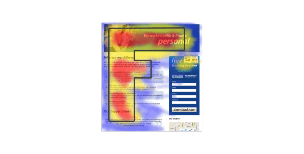
The F-shaped pattern, where the most interesting zones make the shape of the letter F in red, denoting the highest level of focus. Yellow represents a medium level, and blue indicates the lowest. This pattern is suitable for websites with a lot of content, such as a news feed.
Regardless of the pattern, users always start their journey on a website with the header. Therefore, a page that fails to catch the user’s eye within a few seconds risks losing them as potential customers. Given the intense competition, you may not have a second chance to make a good impression.
To improve the user’s perception of the header, it should include essential elements such as the company’s logo, a clear and concise navigation menu, and a prominent call-to-action button. The header’s design should align with the website’s brand identity, be visually appealing, and easy to read.
Additionally, the header can be used to convey vital information such as upcoming sales, promotions, or new product releases. This can help website owners keep their customers engaged and informed.
In conclusion, the website header is a critical component of website design and user experience. A well-designed and optimized header can significantly enhance website usability, increase conversions, and improve overall online presence. By understanding the different patterns of content perception and incorporating essential elements, website owners can create a header that captures the user’s attention and leads to a positive user experience.
Why Including Contact Information in Your Website Header is Crucial for Trust and Local SEO
The header must deliver key information to visitors, assist with website navigation, and make a delightful impression within a few seconds. Research indicates that users spend less than 15 seconds deciding whether to stay on a website or leave. Therefore, the header plays a significant role in capturing users’ attention and improving their experience on the website.
Studies have shown that an optimized header can lead to a significant increase in conversions. For example, a study by HubSpot found that changing the header of a landing page led to a 28% increase in conversions. Furthermore, research has shown that users spend more time on websites with clear navigation, and an optimized header can help achieve this.
Brand symbols, such as the name, logo, motto, and corporate colors, are crucial for representing the company’s personality and helping users identify the website. A study by the Nielsen Norman Group found that users are more likely to remember a website if it has a distinctive and memorable logo.
Including contact information in the header is essential for both users and search engines. Research has shown that displaying contact information on a website can increase user trust, as it indicates that the website is legitimate and trustworthy. Additionally, including contact information in the header can improve local SEO by making it easier for search engines to locate the business’s physical location.
The navigation menu is the header’s primary functionality, enabling users to find everything they need on the website. Research has shown that users spend more time on websites with clear navigation, and an optimized header can help achieve this.
For online stores, a shopping cart element in the header can make the purchasing process smooth and convenient for customers, leading to higher conversion rates. A study by Baymard Institute found that including a shopping cart icon in the header can improve the overall user experience and increase sales.
Emphasizing Key Elements: The Importance of Company Logo and Clear Call-to-Action in the Header
To create an attractive and functional header, website owners should follow certain practices. Firstly, it is important to use clear and readable fonts that reflect the company’s identity and uniqueness, while also being easily readable. Secondly, the header design should be consistent with the rest of the website, and include a clear call-to-action button to increase visitor engagement. Thirdly, adding illustrations or animations can bring aesthetic pleasure and strengthen the company’s identity, while also making the user experience more memorable. Fourthly, concise and informative text should be used, with warm colors that grab the user’s attention. Fifthly, the most significant elements should be emphasized, such as the company logo and important actions for users. Sixthly, the design elements should express the company’s personality and mood.
There are different types of headers that website owners can use to improve their website. The best header type depends on the website’s specific goals, design, and content. Some header types include a full-width header, a sticky header, a transparent header, a centered header, and a left-aligned header. By considering these header types and choosing the most suitable one for their website, owners can create a header that best reflects their brand identity and enhances the user experience.
How to Create an Attractive and Functional Header for Your Website
To create an attractive and functional header, there are several practices that one should follow. These practices include using clear, readable fonts that are consistent with the brand’s identity, including a clear call to action, adding illustrations or animations, being concise and forward-looking, using warm colors, emphasizing significant elements, choosing a layout that showcases the logo, and using design elements that express the company’s personality.
There are different types of headers that can be used to improve website functionality and user experience. These include fixed headers, hidden navigation (hamburger menu), mobile headers, shrinking headers, headers with a message, CTA-focused headers, content-focused headers, video background-focused headers, and headers focused on personal branding.
Fixed header
This type of header is commonly used on websites with long pages. It increases the convenience of users while visiting the website since the navigation doesn’t disappear while scrolling pages. Fixed headers remain in the foreground and allow users to access important information and links at any time.
Hidden navigation (hamburger menu)
The hamburger menu is represented by three horizontal lines that hide the menu. This design approach creates a minimalistic and stylish version of the header while saving space on the page. Hamburger menus are commonly used on mobile devices and smaller screens.
Mobile header
Having an adapted mobile version of a website is critical in today’s digital age. The mobile header design should be adjusted to smaller screen sizes, allowing users to navigate and access important information quickly and easily.
Shrinking header
A shrinking header is characterized by the feature that when the user scrolls down, the header along with its content shrinks. It creates more space on the screen for the remaining content to be displayed.
Headers with a message
Headers with a message serve multiple purposes. They make the website unique and engaging by displaying motivational quotes, welcoming messages, and other creative content. They can also convey the company’s personality and brand identity.
CTA-focused header
A CTA-focused header is an effective way to guide user actions and direct them to important information. By placing CTA buttons like “Buy now,” “Try for free,” or “Subscribe,” users are more likely to take the desired action.
Content-focused header
Content-focused headers are more suitable for websites that primarily provide information, such as blogs, newspapers, and magazines. These headers offer users the opportunity to go to the information block they are interested in and easily navigate the site’s content.
Video background-focused header
Using videos in headers is becoming increasingly popular as it can create a dynamic and engaging experience for visitors. Videos can convey the main concept of the company, its goals, and values, and can be more impactful than traditional text or images.
Header focused on personal branding
Personal branding headers are mainly used in personal blogs or websites of celebrities. They often feature a minimalist design and an image of the person on the main page. The header may contain sections like “Photos,” “Videos,” and “Biography,” which users will find interesting.
Once you have decided on the type of header to use, it’s essential to look at practical examples to get a better understanding of how headers work in real life. By doing this, you can get ideas for your website header and ensure that it meets your expectations and fulfills its purpose effectively.
Expressing Your Brand Personality through Website Header Design: Tips and Examples
Here are our top 10 picks for your website header ideas. Enjoy!
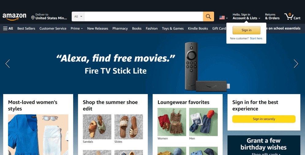
01 Amazon
The header of Amazon provides both existing and potential customers with everything they need. Among the useful features, you can find the company’s logo, the opportunity to change languages, a search bar where the products of interest may be found, the Cart icon, and so on. The pop-up CTA button “Sign in” immediately catches the attention and encourages visitors to take this action. Moreover, this header has an easy-readable font, and it’s fully consistent with the overall design.
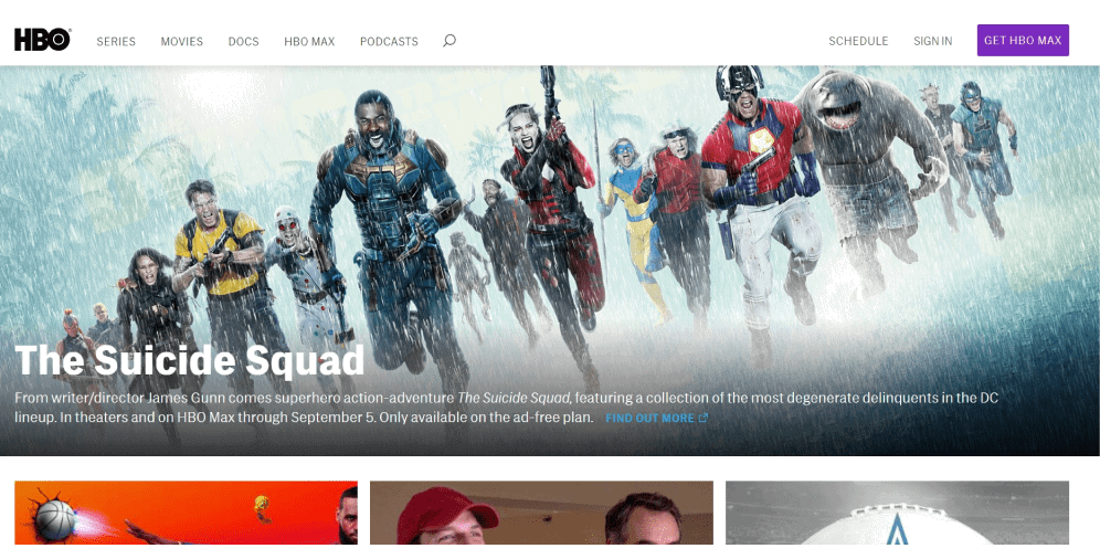
02 HBO
The HBO header is made in a minimalistic way and is focused on the content provided. It’s somehow divided into two parts. In the left part, you can see the logo with the names of the sections (genres) which makes the process of navigation quite easy and convenient. In the right part, users are provided with the buttons calling to sign in or to purchase an extended version. By the way, the CTA button “Get HBO Max” differs from the rest by the color, making it prominent and noticeable.
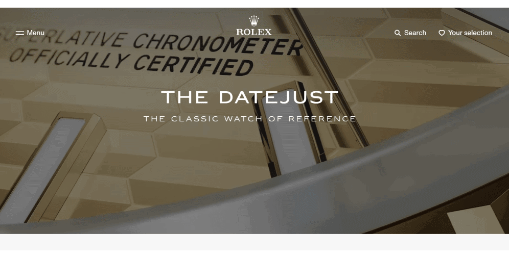
03 Rolex
The website design concept of the Rolex is an amazing brand reflection since nothing extra can be found here. The header of this website doesn’t differ from the main page at all and does it so naturally and thus discreetly. Even if there are still people who have never heard of this brand (which is unlikely), the video provided there immediately tells the website’s purpose and concept. To save space for the product displaying, the hamburger menu applied is probably the best solution here.
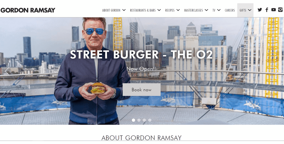
04 Gordon Ramsay
When entering the Gordon Ramsay website, everyone understands its purpose right away. In the header with hidden navigation, you can find various categories about this famous chef (depending on the information visitors are interested in), from his biography and a block of restaurants of his own (after clicking on which you immediately appear on the page where you can book the table) to links to various social networks. Also, the banner with the news about opening the new place accompanied by the CTA button “Book now”, is a great marketing tool.
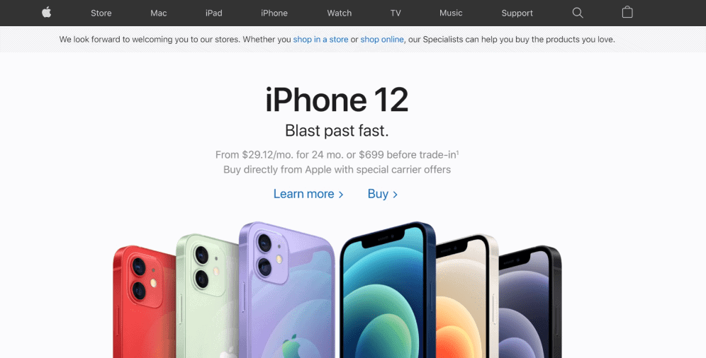
05 Apple
When users first come to the Apple website, they instantly see the latest product image with its slogan “Blast past fast” and brief terms of purchasing it. Furthermore, users are offered two CTAs – to learn more about the item or to buy it (perhaps, because after getting more information no one can resist purchasing). The fixed header is made in a consistent minimalistic manner. It provides customers with the names of the product categories, thus simplifying the searching process and navigation.
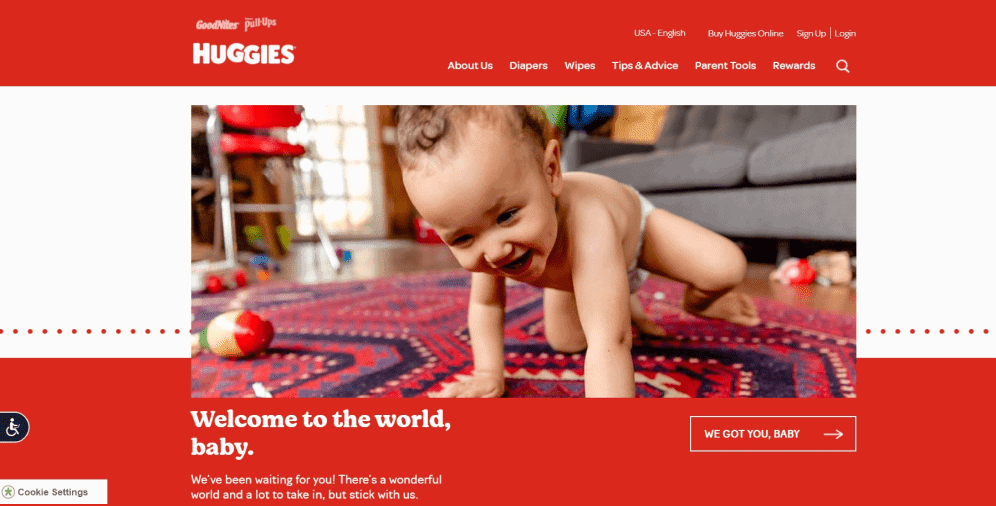
06 Huggies
The website of Huggies is made in the most adorable way possible. It welcomes both new parents and babies born, and in its fixed header, the website offers various blocks that may be of help (not only the store of diapers, what an amazing surprise!). And that makes customers feel that the company really cares and wants to help. After pressing the CTA button “We got you, baby”, users appear on the page with just amazing videos that both entertain and cause an extremely warm feeling. They definitely know how to steal hearts.
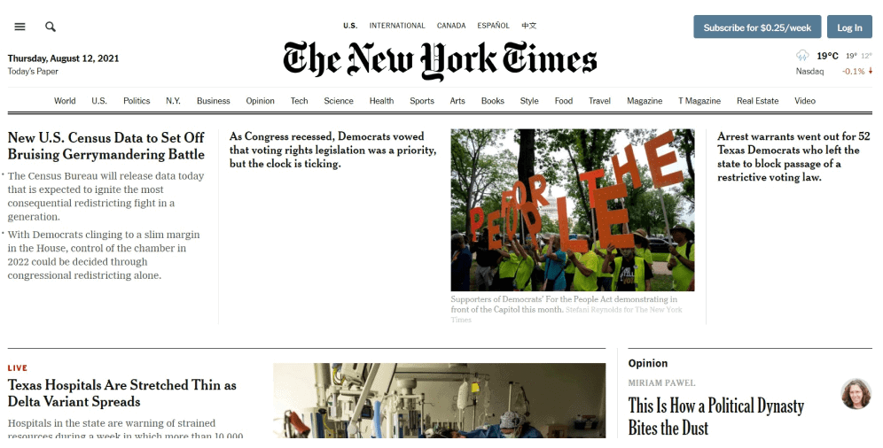
07 The New York Times
One of the brightest examples of the content-focused header can be observed on the New York Times website. In the middle of the header, there’s the newspaper’s name represented in its unique manner. The shrinking header provides readers with the topics of news through which they may easily navigate. The CTAs for subscribing and logging in are also placed here and are set up in another color to make them noticeable.
08 Netflix
A huge header applied in the Netflix website plays several roles at one time. An image displays the main purpose of the website. A concise text in advantage answers main questions that the visitor may have: What does the website provide? – Unlimited movies, TV shows, and more. Where can I watch them? – Anywhere. When can I cancel the subscription? – Anytime. The only thing that is left – to enter the email address and press the “Get Started” button.

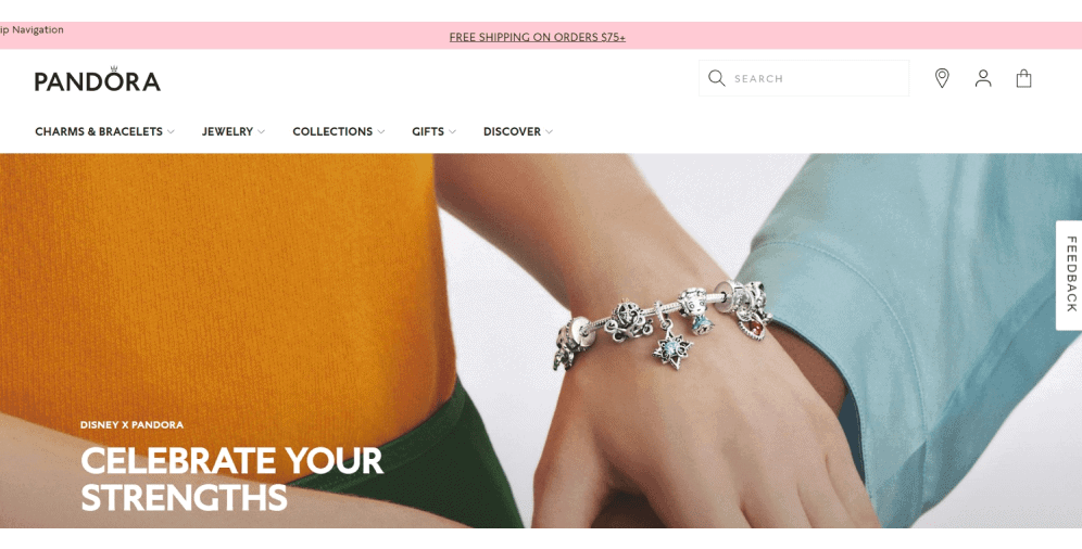
09 Pandora
The design of the world-known brand Pandora supports its main concept of elegance and simplicity. A fixed header with hidden navigation includes product categories that, in their turn, are divided into subcategories, which is pretty useful when customers know precisely what they are looking for. Moreover, at the top of the header, some crucial information (about shipping, returns, etc.) can be found.
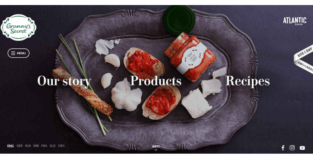
10 Granny’s Secret
An outstandingly designed website, Granny’s Secret, provides users with an interactive header where they can choose where to go next – to the block of the information with their history, their store, or the section with secret recipes.
The header also offers a hamburger menu where users can find contact information, languages, links to social networks, and so on.
As you can see, every company is unique as well as its website. The website design should reflect your brand’s identity along with its goals and concepts. Therefore, it’s up to you to decide which type of header (its style and size) is the best one for you.
On a Final Note
Creating a website can be a challenging and crucial task, especially when it comes to website design. At every step of this journey, you may face difficulties, but we’re here to offer various tips and solutions to help you overcome them.
In this article, we’ve explained the importance of the header and provided tips on how to create an effective one. We’ve also showcased some of the best website header examples to inspire you to improve your own header design.
We hope the information provided was helpful. If you have any questions or need further assistance, our team of professionals is always available to help. Simply contact us for support.

Copied!


