Outline:
In the real estate industry, where visual appeal plays a crucial role, a well-designed website can create a positive impact and establish trust with potential customers. As a result, it can significantly boost your business. However, what sets real estate website design apart from other designs? What message should it convey, and what factors do viewers take into consideration when they visit a real estate website? Additionally, how can you create a design that enhances user engagement?
Apart from including numerous images and comprehensive listing details, a successful real estate website should also project expertise, sophistication, and competence. Clients have a significant investment at stake and therefore need assurance that they can rely on your services. To achieve this level of trust, it’s crucial to ensure that your website radiates professionalism.
To learn how to build a real estate website that will help you grow your digital presence and establish your business, read this article. It will provide valuable insights on how to create an effective design that will maximize user engagement and ultimately increase your business’s profitability.
Types of Real Estate Websites: A Guide to Designing the Right Platform for You
When it comes to designing a real estate website, it’s important to consider the type of work you do and how it should be reflected in your platform. Different types of websites require specific design and UI/UX approaches and tools, making it crucial to decide on the nature of the website before starting the design process.
Below are four common types of real estate websites to help you determine which one is best for your business.
01 Real Estate Directory Website
A real estate directory website is a classic platform that lists various properties available for sale, rent, or purchase. The website allows users to upload their property offerings under different categories and filters, making it easier for potential buyers to navigate through various options. Zillow and Realtor.com are examples of directory websites. The distinguishing feature of a directory website is its navigation and filtering system that allows users to browse through a vast array of options.
02 Single Property Website
A single property website, as the name implies, features only one property offering. This type of website is relatively simple and quick to make because it doesn’t require as much content and complex tools or continuous high-level maintenance.
03 Realtor Website
Unlike a real estate directory, a realtor’s website provides detailed information about the provider of services. It focuses on developing a more personal and trusting relationship with clients and may not necessarily feature listings or any kind of offerings. Various design elements are utilized to create a positive image of the realtor, making it easier for potential clients to connect with them.
04 Rental Property Website
A rental property website is similar to a real estate directory, but only features listings for rental houses or apartments. Some real estate websites may have both property and rental listings, while others work exclusively with the latter. Rentals.com, Avail, and Zumper are examples of rental property websites.
Take a closer look at your real estate activities and determine the type of website that best suits your needs. This approach will help avoid unnecessary clutter and enable you to focus on the specific requirements of your business. Once you’ve determined the type of website you want, you can start the design process with a clear understanding of the platform’s features and functionality.
Designing an Effective Real Estate Website: A Comprehensive Guide
Creating a website that meets the demands of the real estate industry requires attention to detail, creativity, and a deep understanding of what clients need. We’ll provide a few tips and tricks to help you design a top-performing real estate website that attracts and retains clients.
#Acquiring a Domain Name
One of the first steps towards creating a website is getting a domain name. A domain name is your website’s address that distinguishes you from billions of other platforms and becomes the primary branding element of your business. To get a domain name, you should access a domain registrar, such as Hostinger or GoDaddy, and check if the desired domain name is available. If so, you can sign up for registration and pick the option with the price that suits you.
Choosing a catchy and snappy website name is crucial for increasing your recognizability. Here are a few tips on how to choose a domain name:
- Make it easy to remember and reproduce
- Reflect the type and details of your business
- Use a .com in your domain
#Including Testimonials and Biographies
When people turn to real estate agents or companies, they expect the highest level of commitment, assurance, and responsibility. Adding testimonials and short biographies of the agents and staff members can provide potential clients with guarantee and support. Testimonials from previous clients give social proof of your competence and expertise, while staff biographies persuade viewers that your professionals know what they’re doing and can fulfill their dreams. Also, it personalizes the experience and establishes trust.
#Presenting Certifications and Credentials
Displaying any type of certifications and credentials can also be useful for convincing potential clients that you’re a trustworthy professional. Much like testimonials and biographies, it ensures people that they can engage with you and not worry about the result, as your professionalism is unquestionable. Don’t be shy and display everything that you’ve achieved so far – be it a certain designation or course completion (for the staff members), or even a simple mention of memberships in any realtors associations. We advise transforming it into visuals – icons, buttons, or clickable illustrations.
#Integrating MLS and IDX
If you plan to put up listings on your real estate website, MLS and IDX integration is a huge benefit. MLS – multiple listing service – is a database with listings that can be integrated via Internet Data Exchange (IDX). Real estate agents gain membership at MLS and are registered to use it for their website to facilitate the process of buying or selling the property for their users. MLSs can be integrated via custom coding or through IDX. IDX displays the listings from MLS on the website and helps both agents and users work more efficiently.
#Adding Content to Your Website
While real estate website design usually doesn’t include a lot of text content, publishing new and SEO-optimized content in a blog or through regular updates can bring new visitors to your website and increase your lead conversion rate. Regular posting of content or properly structured and detailed service pages establish you as a professional and someone who can help potential customers.
A popular method of adding content is through a storytelling technique. By using the website to reinforce the objectives and goals you’ve set out when starting the business, you can develop a more personal and friendly relationship with potential clients.
#Working on a User Experience Strategy
A captivating UI/UX design that’s attentive to the audience’s needs stimulates lead flow. An appealing website design with a properly designed user interface and masterfully crafted user experience makes users’ time on the platform enjoyable and productive.
One touchstone in this matter is a navigation system. Place the pages on the navigation menu in the order of importance and make it easily seen by locating it in a familiar place. Keep it simple, add only the most crucial buttons and be economical with the text. Always put the visitors and their comfort first.
#Web Design Stage
Real estate web design needs sleek and authoritative visuals that can indicate your professionalism and dedication. Creative real estate website design inspires users to explore and custom design helps catch the user’s eye. Create a user-friendly design system that urges users to make intuitive decisions and flow through the website. A dynamic user flow provides users with transparency and makes you seem like someone who doesn’t try to throw the dust into their eyes.
#Including High-Quality Imagery
High-quality images are crucial for a real estate website. Colorful and professionally made photos grab the attention of the users and provide them with a fuller and more real-life experience than a basic text description. It gives a signal to the viewers that you’ve taken your time and resources to invest in photos and videos, learned about the property through and through, and now can give sound advice. Don’t forget to optimize your images – otherwise, the website’s loading speed will be compromised.
#Using Heatmaps
Heatmaps are an analyzing tool that determines which areas of a website get more user attention than others. It accumulates the data relating to user behavior and helps figure out how they use and interact with certain page elements and blocks. Based on that data, you can make informed and conscious design and UX decisions and introduce updates and improvements in a more perceptive and sensible way.
#Coding
Once you’ve created the mockups and outlined the key concepts, it’s time to turn them into code. This stage can take longer if you need to develop custom features. It’s important to discuss the scope of work with your web development team beforehand to ensure that the functions you want are implemented efficiently and effectively.
A standard real estate website usually includes:
- Listings – the backbone of any real estate website. Property listings and databases need to be integrated via IDX/MLS and be efficient and highly functional.
- Visualization tools – from classic photos to heat maps and VR/AR for a more immersive experience.
- Navigation and filtering system – allows users to go through the offerings, breaking them down into categories.
- Valuation tools – AI-based valuation software helps users to calculate how much they’re going to pay based on certain factors.
At this phase, the most critical aspects to consider are security and functionality, as any gaps that allow data leaks or performance issues can lead to significant changes in the project scope.
#Choosing a Content Management System
After deciding on the features and tools you’d like to integrate, it’s essential to choose the right Content Management System that meets your needs. Based on our experience, developing custom websites with WordPress is the best option for several reasons.
Firstly, WordPress offers an all-encompassing and inclusive experience that’s highly flexible and easy to use. Secondly, it provides a broad range of plugins and themes to choose from, based on your budget and technical requirements. Finally, this CMS allows you to create mobile-friendly and mobile-first websites, which is crucial as more than four billion people use their mobile devices daily.
#Improving SEO Optimization
Even if you’ve worked hard on the previous stages, your website won’t attract a lot of visitors if it’s not high on search engine rankings. To achieve this, there are several things you need to do:
- Look for patterns in your content and UX design and apply UX audits to fix any issues.
- Compile a list of relevant keywords for your real estate website.
- Conduct both on-page and off-page SEO optimization, including optimization of headings, titles, meta descriptions, URLs, internal linking, guest posting, social media pages, and backlinking.
- Improve page speed by compressing files and images and avoiding features that might impede the website’s performance.
#Ensuring Mobile-Friendliness
Mobile-friendliness is a must-have for any website in 2023, and real estate websites are no exception. It’s not just about having a responsive design that retains its functional properties across different devices. It involves an entire redesign of the layout to fit the mobile screen and accommodate the content to the peculiarities of mobile usage.
To be mobile-friendly, consider the following recommendations:
- Easy Navigation: Use large buttons and CTAs with high visibility for easy navigation.
- Simplified Scrolling: Opt for a scrolling feature instead of page-turning and tab-opening for simplified scrolling.
- Content Accessibility: Leave only the essential content and break it down into blocks for easy readability.
- Speed Optimization: Make sure your website’s speed is in check to avoid losing potential leads.
#Testing
After completing your website, it’s crucial to test it thoroughly to ensure that everything works fine and that your conversion rate can grow. A/B testing or split testing is a classic approach that allows you to compare two versions of the same design option to determine which is more likely to work for the users and bring you more leads.
There are different tools and software programs that can conduct the A/B testing and count the difference in conversions, providing you with the best option. You can also run one version of the page or an element for the users, estimate the conversion rate, then do the same with the second version and record the difference.
#Employing Live Chat Bots
In 2023, phone calls can be time-consuming and stressful, which is why live chat bots are becoming increasingly popular. People can type in their questions in real-time and get a detailed response while they go on with their lives.
When choosing a live chat option, consider your technical requirements and possibilities, integration with social media accounts or other communication channels, and budget. Many live chat options offer a free trial period so you can test if it’s worth the cost.
To set up a live chat on your website, there are many software services and tools available, such as Zendesk, CSML.dev, or Microsoft Bot Framework. Some services offer specific real estate live chat options, such as BotPenguin.
If professional real estate website design still seems daunting, consider looking at some of the best real estate website design examples to get inspired.
The Ultimate List of the Top 10 Real Estate Websites You Need to Know
Here are the top 10 real estate websites that offer an exceptional user experience and valuable resources for real estate professionals and consumers:
1. Joyce Rey
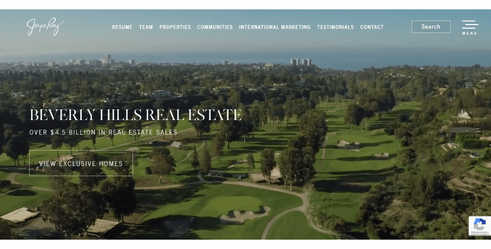
A classic example of real estate agent website design, Joyce Rey’s platform incorporates every little detail we’ve mentioned: from a separate testimonials page to the usage of VR technology. The website is rich in beautiful imagery – right from the start, you’re delving deep into the world of LA’s luxurious real estate properties, getting acquainted with the team, reading the news blog, and going through the listings.
The website is fully functional in the mobile version as well, easy to navigate and it even has an international marketing page, expanding its business reach outside of the US.
2. Dolly Lenz
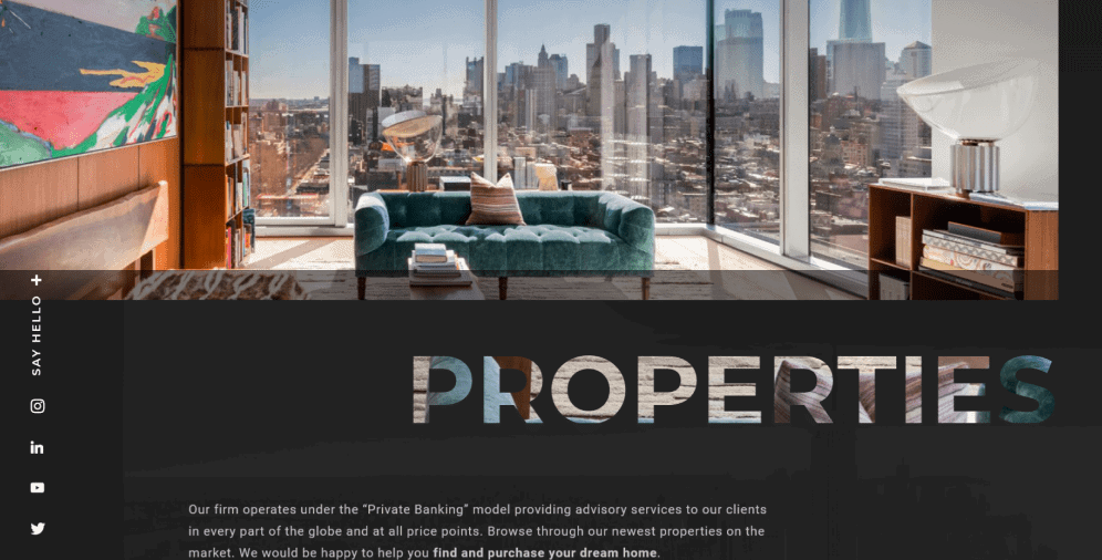
Dolly Lenz’s website is an NYC-based real estate company that sells luxurious properties in the New York City area. Much like Joyce Rey’s website, this one also has lots of videos, room tours, high-quality photos, and extensive info about the company and its founder.
The overall design is very sleek and professional – there’s nothing that seems out of place or inappropriate. The website features numerous resources of Dolly Lenz sharing her expertise on the real estate industry in the “Speaking” section which solidifies her experience and magnitude in the business world.
3. Zillow
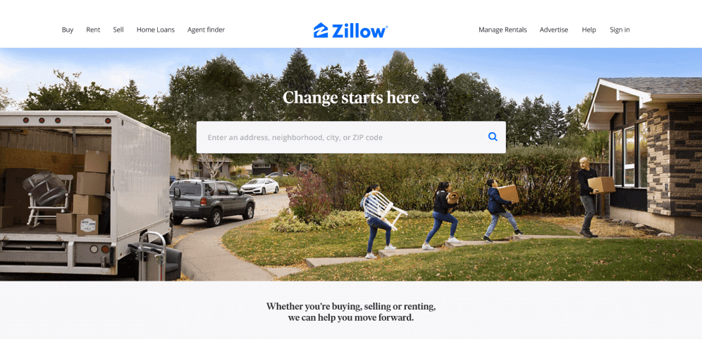
Real estate agent websites aren’t the only type of website present on the market. Real estate directories that post listings are also quite widely used. One of the most well-known examples is Zillow.
It is an online real estate marketplace company that allows users to buy, sell, or rent a property. Its design is transparent and minimalist but its main advantage is its huge number of listings and a strict filter system. You never get lost on the website, can always find what you’re looking for, and estimate the price of the housing via a calculating system called “Zestimate.”
4. Trulia
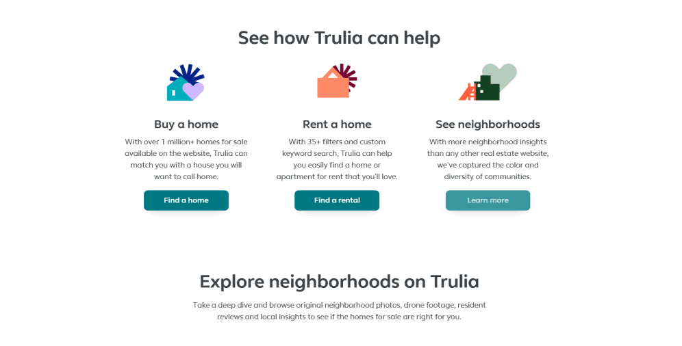
Trulia is another real estate directory that resembles Zillow but applies a more personalized approach. You can not only schedule a visit or a video chat with the agent or the owner but also get a view of the street via Google Maps or explore the neighborhood map to get a better idea about the place before buying or renting.
Trulia also provides guides – for sellers, renters, and buyers, – where they share the info on how to choose a house, how to communicate with realtors, or where to start if you’re planning to sell a property.
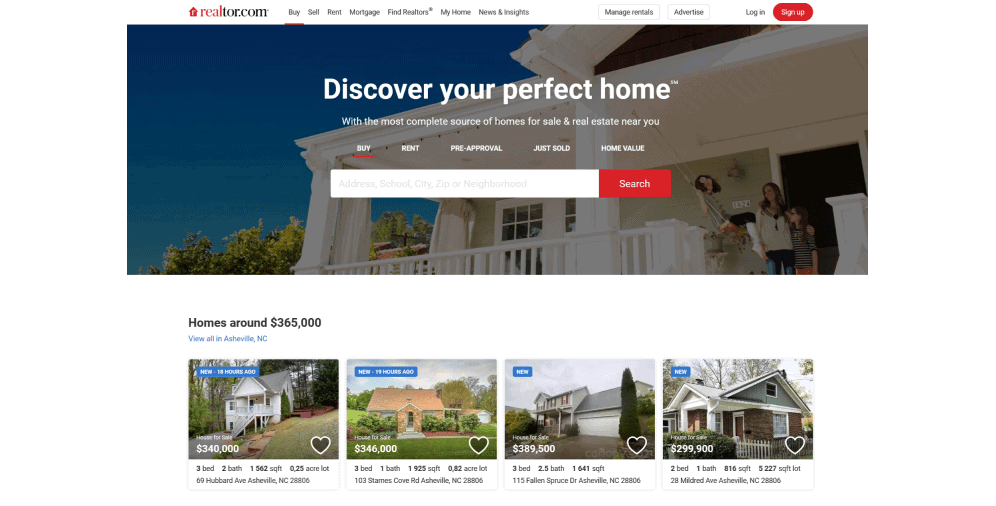
5. Realtor
Another powerhouse of the real estate industry, Realtor has one of the biggest property databases in the business. It is licensed by the National Association of Realtors which cements its flawless reputation among realtors.
Realtor has two mobile apps: one generally resembles the desktop version, and the other is designed specifically for rentals. Another great feature is the calculating system: estimate the mortgage, consider the refinancing options, as well as assess which property you can afford, or even compare whether you should rent or buy a house.
6. HomeLight
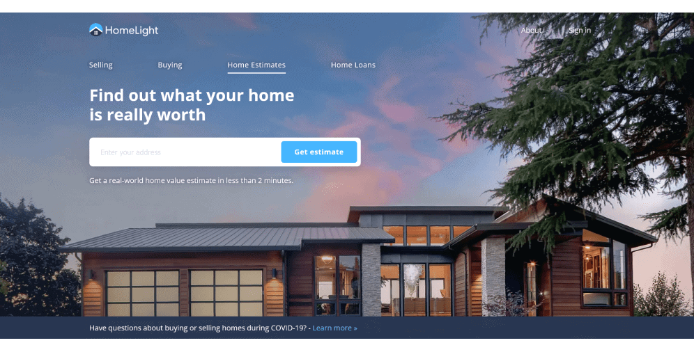
Unlike other websites on the list, HomeLight is first and foremost concerned with finding you an agent who will take care of whatever you’re planning to do with the property based on your answers to a questionnaire. The internal mechanism sets you up with a broker that worked with the property that’s most similar to yours. If you’re buying a property, the website will find an agent who knows the neighborhood you’re considering the best.
Also, like other real estate agent websites, HomeLight estimates your house value to get the most accurate price for your property.
7. Rentberry
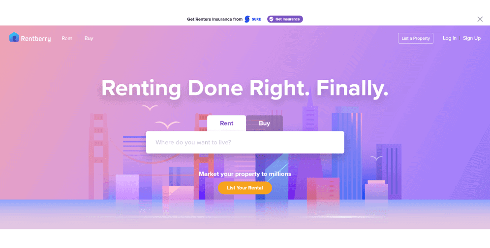
As you might notice by its name, Rentberry is more focused on renting than other websites on the list (including international options). However, it features a wide range of listings based in New York City as well.
Its design is colorful and fun without being forward or bold. Custom illustrations and icons exude more cheerful and laid-back energy which is what people need in their stressful endeavor to find a new house.
A great Rentberry’s feature is a submit mechanism for renting: you put your offer up as a tenant, and the website arranges the best-suited proposal from the owner.
8. Core Real Estate
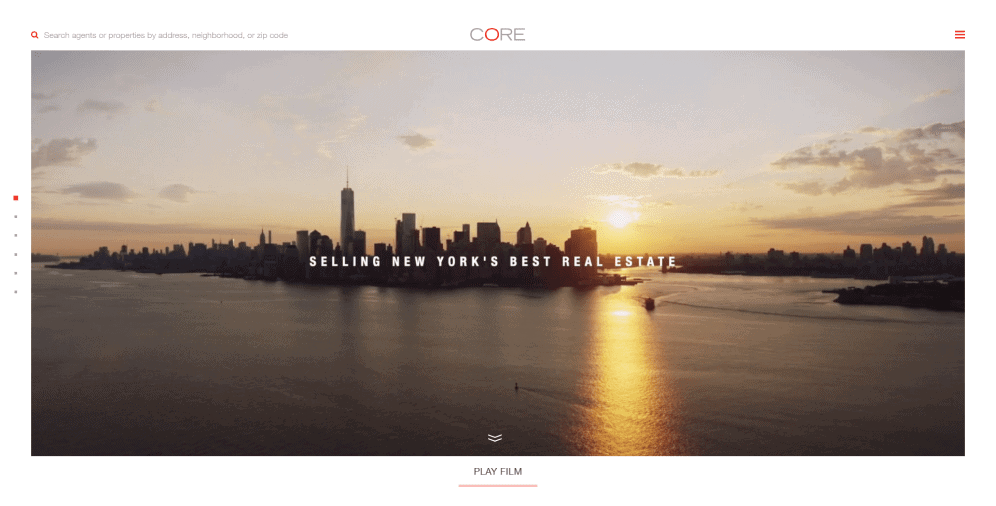
Core Real Estate website design manages to be both inventive and refined: when you enter a website, the first thing that captures your attention is a stunning video showcasing the beauty of New York and its classy and high-class residencies.
Every design element serves specific purposes, and there’s hardly anything except photos, CTAs, and whitespace on the homepage, and this unique approach is truly captivating. You can find all the content and listings when you click on the menu button. There is a page dedicated specifically to the agents, which is great for building a more personal relationship. Also, Core Real Estate provides really detailed and fun descriptions of the NYC neighborhoods.
9. Parkbench
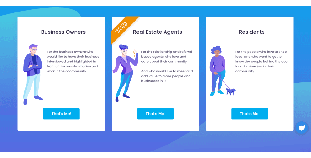
A little more than a regular real estate website, Parkbench is more about deepening the relationships within the communities. The website helps real estate agents, local business owners, and residents to interact with each other and build meaningful connections.
Parkbench website design is super vibrant without going overboard – our designers made sure that the color scheme is reduced to several colors and that there is enough whitespace to balance everything out.
All the CTAs, web forms, and pop-ups on the website are really subtle and coordinated with the overall color design. Parkbench also has a responsive mobile version that relies on scrolling and strictly arranged blocks of content.
10. Landwatch
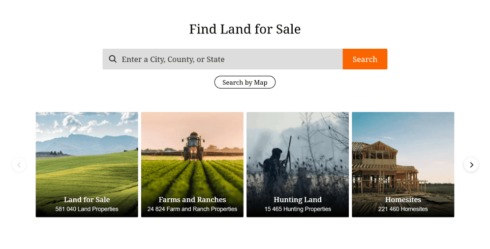
All of the examples listed above deal with houses to buy or rent, but what about real estate websites that help acquire land? Whether you want to buy a piece of land to build the house yourself, develop a farm, a ranch, or hunting sites, or for any other investment purposes, LandWatch is the best website to do that.
Not only does it have a wide range of options to choose from by state, but its filtering system is also impeccable and ensures that everyone can find a piece of land they want. The website design is clean and elegant – there are hardly any pops of bright colors except for CTAs and buttons.
On a Final Note
Real estate web design doesn’t have to follow a set formula. While it’s important to include listings, photos of agents, and functional tools, what really matters is the tone of the website, its ability to engage visitors, and establish trustworthiness. Without these elements, even the most visually stunning website won’t be effective.
As a leading real estate website design company, the Ester Digital team can provide valuable insights and design secrets to create a website that meets your needs and those of your clients. Reach out to us for more information.


