Outline:
Regarding web design, mastering form design is essential for creating an optimal user experience. Web forms have become such a ubiquitous feature of websites that it’s hard to imagine a site without them. From shipping forms to feedback and registration forms, users expect to see their various types and interact with them effortlessly.
Form design is a vital aspect of user interface design services, and it plays a crucial role in helping users achieve their goals, whether it’s signing up for an account or making a purchase. If you want to master form design and create efficient, user-friendly web forms, keep reading this article. We’ll start by defining what form design is and explore some tips and best practices for creating effective web forms.
Creating User-Friendly Forms for Better Conversions
Form design refers to the process of creating a web form, which is an HTML element that collects information from users. The type of data required depends on the website’s specific needs. For instance, online shoppers are often asked to provide their contact information in a form to ensure the successful delivery of their purchases.
Web forms can vary in length and complexity, but their ultimate goal is to obtain the necessary information and enhance the user experience. Some forms are brief and straightforward, while others are more comprehensive and ask many questions. Regardless of their complexity, well-designed forms can greatly improve a user’s interaction with a website.
Form Design that Works: Essential Elements for a High-Performing Web Form
Form design is a crucial aspect of website development that can significantly affect user experience (UX) and conversion rates. Well-designed forms can advance a user’s experience and showcase professionalism, while poorly designed forms can cause frustration and prompt visitors to leave your website. This can have a negative impact on visitors’ engagement.
If you want to ensure your users are satisfied, it’s essential to pay attention to web forms. They should be easily noticeable, reliable, and user-friendly to reach the desired result. In this article, we’ll provide you with a detailed guide on how to create skillfully designed forms that can increase conversions and enhance UX, while also avoiding common design mistakes that can lead to a poor user experience.
Maximizing Form Completion: Tips for a Clear and Concise Design
The effectiveness of a web form is determined by its completion rate, which is why it’s important to keep in mind the form’s complexity. Users tend to avoid forms that appear complex or overwhelming. So, it’s best to keep your form simple and clear, with a minimal number of questions.
In addition, consider the interaction cost, which refers to the effort users must make to complete the form successfully. Forms that require significant effort are often less usable, resulting in lower completion rates. To ensure the effectiveness of your form, it’s crucial to avoid confusing questions or errors that may frustrate users. It should be straightforward and easy to understand. By doing so, you can increase the chances of users completing the form and achieving your desired outcome.
Understanding the Building Blocks of Web Forms
Although the components of web forms may vary slightly, they usually consist of the following parts:
- Input fields: These are fields designed for users to input information, such as text or password fields, checkboxes, and radio buttons.
- Structure: This helps create a logical connection between the fields, determining the order in which they are displayed on the website.
- Field labels: These labels help users understand the purpose of each field.
- Action buttons: They are meant to trigger user actions, such as submitting the form.
- Feedback: The feedback informs visitors about the outcome of their actions, whether positive (e.g., “Payment successfully completed”) or negative (e.g., “Payment failed”).
In some cases, web forms may include additional components, such as assistance in the form of detailed explanations to encourage users to complete the form or validation, an automatic process that verifies the validity of the input data. These can boost the usability and effectiveness of web forms.
Optimizing Your Web Form for Better Conversion Rates
A web form is a manner of dialogue between a website and its users. To ensure its success, you must make the form’s structure elaborate and logical. Here are a few tips to help you create a user-friendly web form:
Get rid of the unnecessary questions: Complex forms decrease conversion rates, so avoid overcomplicating them. Only ask questions that are relevant and necessary, and don’t add extra fields for no reason. Determine the exact information you need from visitors and how you plan to use it in advance.
Take care of logical form order: Imagine yourself in your users’ shoes and ask for information in a logical order. Asking for the user’s city or postcode before their name may cause confusion.
Divide your questions into related groups: This is especially useful for long forms that require lots of data. If you need to know a user’s personal, account, and contact information from the user, it’s smarter to create three separate blocks rather than asking for all the answers together. This can make the form less overwhelming and easier to complete.

Effortless Web Forms: How to Make User Input a Breeze
When designing web forms, reducing user input effort is one of the most critical factors to consider. Here are a few tips to make your users’ experience smoother and more enjoyable:
- Decrease the number of fields: Users appreciate shorter form designs, so minimize the number of fields to only what’s indispensable. If you’re unsure about the necessity of certain fields, consider removing them. Remember, less is often more when it comes to form design.
- Mark additional fields as optional: If you still need to include some optional fields, mark them as such to avoid annoying users. This lets them know the fields are not required, but available if they choose to provide more information.
- Choose field sizes wisely: Select appropriate field sizes to meet users’ expectations. For example, the postcode field should be much shorter than the street address field.
- Use auto-focus: Add automatic focus to help users concentrate on the required fields. Typically, it’s best to engage in the first field to help them start filling out the form quickly. Ensure that the auto-focus feature is clear and noticeable, such as by highlighting the selected field.
- Avoid repeating labels: Making users enter the same information twice, such as email addresses or phone numbers, is not recommended. They may simply copy and paste the information from the first field, resulting in additional fields without benefits. Instead, use form validation to verify the accuracy of the provided information.
How to Place Labels Effectively to Improve Web Form Usability
Using straightforward labels is essential in web form. Users need to understand what information is being requested without needing to think too much, and good labels should enable them to quickly scan the form. To achieve this, stay away from using long words or phrases when labeling your fields. Instead, use concise wording that accurately conveys the information being requested. Place your labels close to the input fields to help users perceive them as a linked group.
One thing to keep in mind is avoiding disappearing placeholder text. While some designers use them instead of labels, they are not the best option. Placeholder text can be bad for usability and is often forgotten by visitors.
It’s also wise not to use capital letters for your labels. All-caps text not only looks like screaming but also makes it harder for users to skim the information. Such text is acceptable for acronyms or logos, but do not use it for your labels unless it’s necessary.
Creating User-Friendly Web Forms with Action-Oriented Language
Actions buttons in web forms are intended to trigger actions, such as submitting information. Here are a few rules to follow when designing effective action buttons:
- Avoid generic instructions: Users always need to know what to expect from the action button, so using generic phrases like “Click here” is inappropriate. Instead, choose something more specific, such as “Send me weekly promo codes” or “Try our FREE program”.
- Use only one action add button: Stick to a single goal and go with one action button not to distract or confuse users.
- Avert reset buttons: They allow visitors to delete the information they’ve entered, which can be frustrating if done accidentally. Users may also decide not to complete the form if they accidentally erase their input.
- Make your action buttons clear and noticeable: Ensure that your buttons stand out and look like buttons, not like another form field or something else. Style them to suit your needs, but users should understand what the button is meant for.
- Use action-oriented language: Action buttons should use language that clearly communicates the action that will be taken when clicked. For example, “Submit” or “Get started” are more action-oriented than “Continue” or “Next.”
- Position buttons strategically: Place action buttons in a prominent location that makes sense for the flow of the form. For example, a “Submit” button should be at the bottom of the form, so users can complete all the necessary fields before submitting.
- Consider using microcopy: Microcopy refers to small, informative text that can be used to provide additional context or instructions. Including microcopy near the action button can help users understand what will happen when they click it.
- Test your buttons: To make sure your action buttons are effective, test them with real users. This can help identify any issues or confusion and provide valuable insights for improving the form design.
Remember, the purpose of action buttons is to encourage users to complete the form, so take care they are coherent and understandable.
Web Form UI
Web form UI (or user interface) is any part of an information device that users interact with. It’s important to continue working on your UI in order to improve the user’s experience of your form. If that’s something you’re interested in, you can begin by focusing on the three vital parts of a form’s UI: structure, layout, and patterns.
01 Structure
To create a great form structure, you need to think of your users first. Decide what exactly can improve their user experience starting from your fields’ order and ending with the way your fields connected.
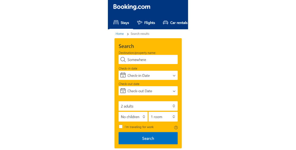
Here’s the example of the Booking’s website form that helps to find a place to stay.
As you can see, this form contains multi-steps. It’s divided into short fields that are clear for any user. People start with filling out where and when they want to stay, and then they are being redirected to the next page with a new form. All the payment information is also grouped together, which makes the whole process much easier and enjoyable for the users.
02 Layout
It’s important to consider the layout of your form’s fields. It can influence user experience as well and should be perceived as logical and natural.
It’s also better to separate different fields to not overwhelm the users. For instance, don’t put account information right next to the payment field to avoid confusion. Users are used to seeing related information together, not the other way around.
03 Patterns
There are numerous UI design patterns that are commonly used by now. We need them to resolve user problems that can happen while filling out the forms. You should use the patterns you find appropriate for your forms, but generally, they are pretty repetitive.
Let’s take reCAPTCHA for example. It’s used to prevent spammers from using OCR software by asking users to check a box before the form’s submission. This UI pattern enhances UX by making sure users are safe from spam attacks and doesn’t require a lot of effort at the same time.
Creating Convenient Mobile Forms: Best Practices and Strategies
Mobile form design is crucial for any website since many users access the internet via mobile devices. In this section, we’ll provide some tips to enhance your mobile form design and improve user experience.
Mobile form design involves creating web forms that are convenient to use on any gadget. The texts and visual content should be clear and fit the screens of mobile phones and tablets. Good mobile form design can significantly affect conversion rates and make your website more convenient for users.
Here are some tips to consider when designing mobile forms:
- Implement a single-column layout: Since mobile device screens are smaller than desktops, numerous columns are usually not the best option. Choose a single-column layout to avoid unreadable information and let users scroll down the page to complete the form field by field.
- Enable autocorrect and autocomplete: These functions can be useful, but they may not work well on small keyboards. Enabling them ensures that user information is accurate and saves time by avoiding retyping.
- Make your form nice looking: Since mobile device screens are not large, your forms should not be overwhelming. Keep the design simple, yet enticing, to show users that you care about their convenience while maintaining a professional appearance.
- Keep it minimalist: Users prefer concise and simple platforms and web forms. Avoid overcomplicating your forms, use unambiguous language, and minimize the number of form fields.
By following these tips, you can design mobile forms that are user-friendly and boost conversion rates.
From Clicks to Conversions: How CTA Design Can Improve Your Web Forms
It’s impossible to imagine a web form without a call-to-action (CTA). There are always phrases like “Download here” or “Learn more” which are catching user attention and making them stay longer on your website. To make sure your CTA will be efficient, you need to work on its design.
Research shows that a well-designed CTA can boost conversion rates by up to 121%. It’s clear that the design of your CTA plays a crucial role in the success of your website. So, what are the major factors you should consider when designing your CTA?
CTA size is an important consideration. According to a study by HubSpot, the ideal CTA button size is between 225 and 325 pixels. This size range ensures that the CTA is easily visible and clickable for users. Besides, larger CTAs have been shown to increase conversions by up to 79%.
The action button is the most important element of your CTA. It should be prominent and transparently visible to users. The language you use on your button also matters. Action-oriented words like “Buy”, “Register”, or “Download” have been shown to enhance click-through rates by up to 45%.
Font is another crucial factor in CTA design. Make sure the font you choose is easy to read and fits well with the rest of your website’s design. According to a study by UsabilityGeek, sans-serif fonts like Arial and Helvetica are easier to read on screens, and bold text can make your CTA stand out even more.
Special effects can also be used to draw attention to your CTA. Adding special effects like gradients or shadows can expand the CTA’s visual appeal and make it more noticeable. In fact, a study by HubSpot found that CTAs with contrasting colors have a conversion rate 75% higher than those without.
Finally, placement is key. You want your CTA to be in a prominent location on the page, but it shouldn’t be obtrusive or get in the way of the user experience. Research has shown that placing CTAs above the fold can raise conversions, but placing them at the end of a form can also be effective since users have already made a commitment to completing the form.
In conclusion, creating an effective CTA is vital for any website looking to increase performance. By considering the factors mentioned above, you can make a CTA that not only looks great but also drives results.
UX-Driven Web Form Design: Ways to Improve Your User Experience
Now, it’s high time to learn the best form design practices. These practices have been proven to help create effective forms for your website and enhance your conversions as well as user experience (UX).
01 Be simple and straightforward
According to a study by the Baymard Institute, web forms with only one column have a 13.5% higher completion rate than multi-column forms. This is because the fewer efforts are demanded from users, the more willing they are to fill out the form.
02 Arrange your form fields from easiest to hardest
Starting with easier fields has been shown to increase the chance that users will fully complete your form. A study by Luke Wroblewski found that by optimizing the order of form fields, completion time was reduced by 15.1%.
03 Align text to the left
Research has shown that people prefer to read text that is left-aligned. This alignment makes it easier for users to read and complete forms quickly.
04 Clearly title your form
A clear form title helps users understand what exactly they should expect. According to a study by Conversion XL, a transparent and descriptive form title can expand engagement rates by up to 49%.
05 Don’t ask for phone numbers
Asking for phone numbers can decrease conversion rates as users may perceive it as an invasion of their privacy. A study by Invesp identified that making the phone number field optional can advance conversion rates by up to 5.9%.
06 Address possible user concerns with summary boxes
Providing summary boxes can help address user concerns about giving certain information. A study by Baymard Institute proved summary boxes can reduce user anxiety and boost completion rates by up to 30%.
07 Design mobile forms differently
Mobile devices have smaller screens, so it’s important to build mobile forms with that in mind. A study by Google detected that mobile-friendly forms can lead to 160% conversion rates rise.
08 Use positive error messages
According to the study by Nielsen Norman Group, positive error messages can intensify user satisfaction and engagement. By giving users specific instructions on how to fix the error, they are more likely to complete the form.
09 Include smart defaults
Smart defaults, such as autofill, can save users time and effort while also ensuring the accuracy of the submitted information. A study by Nielsen Norman Group determined smart defaults can decrease the time users spend filling out forms by up to 25%.
10 Add progress bars for long forms
Progress bars can help users understand how many questions are left and how long the form will take to fill out. According to a study by HubSpot, progress bars can cause 10% pop-up of conversion rates.
11 Name and phone number fields should be one field
A study by UX Movement revealed that combining name and phone number fields into one can increase the completion rate by up to 4.4%. This makes it easier for users to complete the form quickly and efficiently.
12 Make typing easy
Using autofill or predictive text can make typing easier and faster for users. A study by Google found autofill can reduce the time users spend filling out forms by up to 30%.
13 Indicate if each field is required or optional (unless they’re all required)
Clearly indicating which fields are required and which are optional can reduce user distraction and extend completion rates. A study by Baymard Institute exposed that marking fields as optional can increase completion rates by up to 13.8%.
14 Don’t mask passwords on mobile devices
According to a study by Baymard Institute, masking passwords on mobile devices can cut down usability by up to 30%. It’s better to provide an option for users to unmask their password to avoid frustration.
Top 10 Form Design Examples
Knowing the theory of designing great web forms is vital, but seeing such forms with your own eyes can’t harm either. So, here are our top 10 examples of amazing web forms.
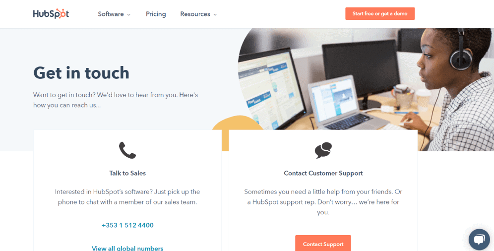
01 Hubspot
Hubspot is a well-known CRM platform that provides marketing, sales, content management, and customer service. Its contact page suggests two options for visitors: they can talk to a member of the sales team on the phone or contact customer support. Their form is simple and clear and gives users an opportunity to choose the option that’s more suitable for them.
02 Beebom
Beebom is a website aimed at helping people to understand and use technology. Their contact form design is very simple and user-friendly. There is an inserted link with their email address, and that’s it.

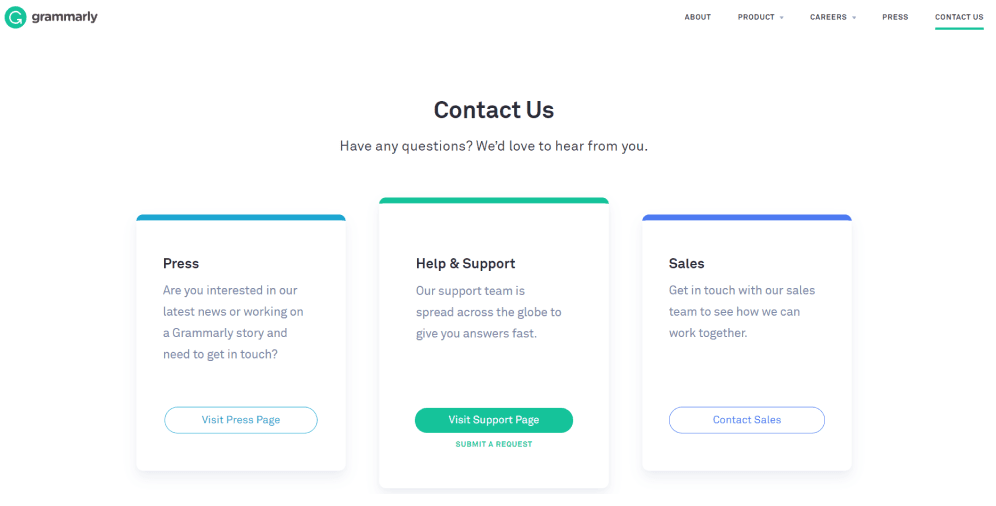
03 Grammarly
Grammarly is a popular online writing assistant that helps people to compose bold and mistake-free writing. Their contact form is more complex and is divided into three sections: press, help & support, and sales.
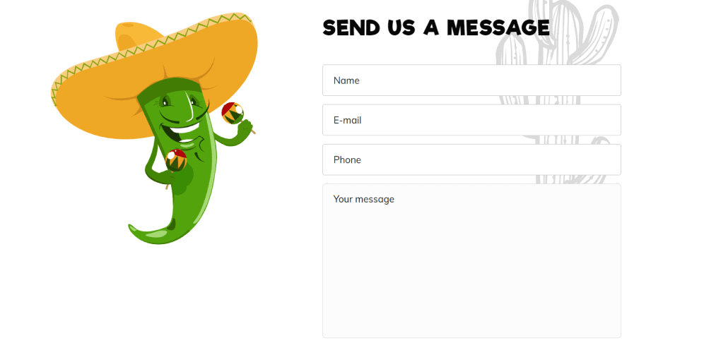
04 Nacho’s
Nacho’s restaurants are known all around the world, and their website also deserves attention. This web form is brief, clear, and eye-catching. You can notice that the action button is brightly colored and easily distinguishable too.
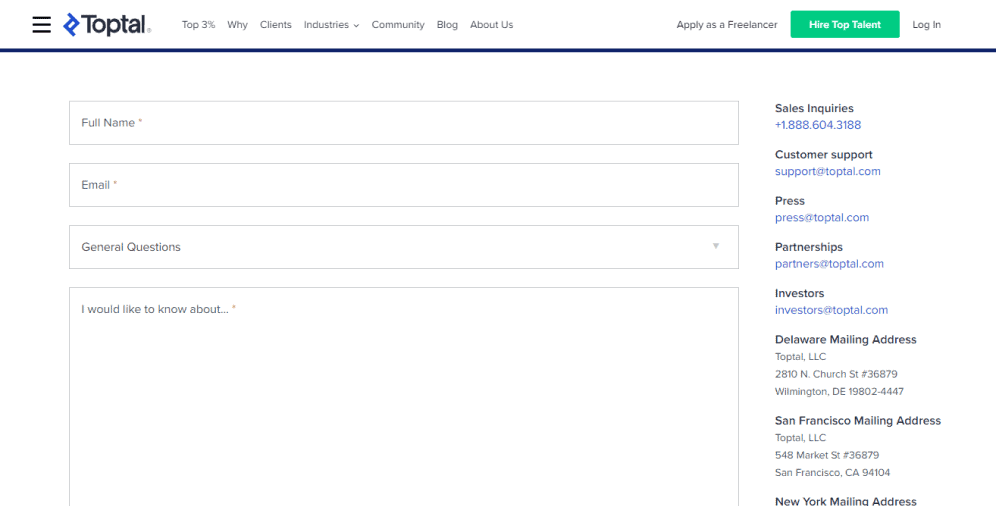
05 Toptal
Toptal is a website that helps the world’s top talent to connect with the world’s top organizations. Down below you can see their web form that is brief and straightforward. The form encourages users to keep going and suggests a phone call after its completion.
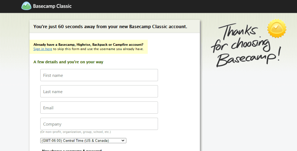
06 Basecamp classic
Basecamp classic greets you with a longer form but points out that you’ll only need around 60 seconds to complete it. The fields are grouped into two sections, and below them, there is the reminder of benefits (free plan with no time limit). It does a great job at encouraging users to fill out and submit the form.
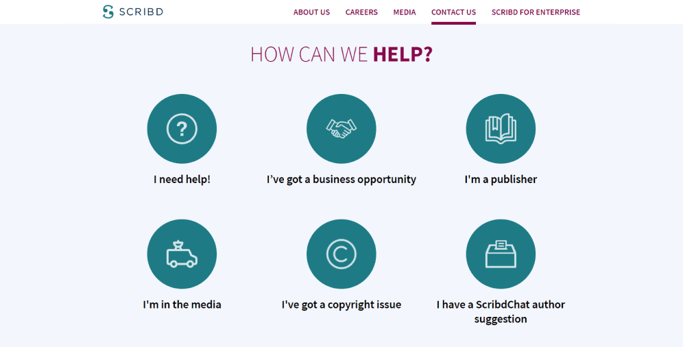
07 Scribd
Scribd is a subscription platform the purpose of which is to share digital publications such as books, documents, and magazines. Its contact form is interesting and eye-catching and suggests users choosing what type of communication they want. Each option then directs them to a certain page and gives further instructions.
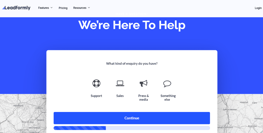
08 Leadformly
Leadformly is a great example of how engaging a web form can be. Here you can also choose what your inquiry is about and see a progress bar below the form. The design is bright and clear, and anyone can easily follow the suggested steps.
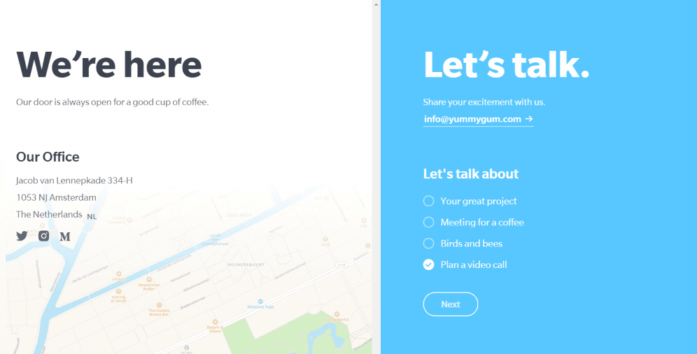
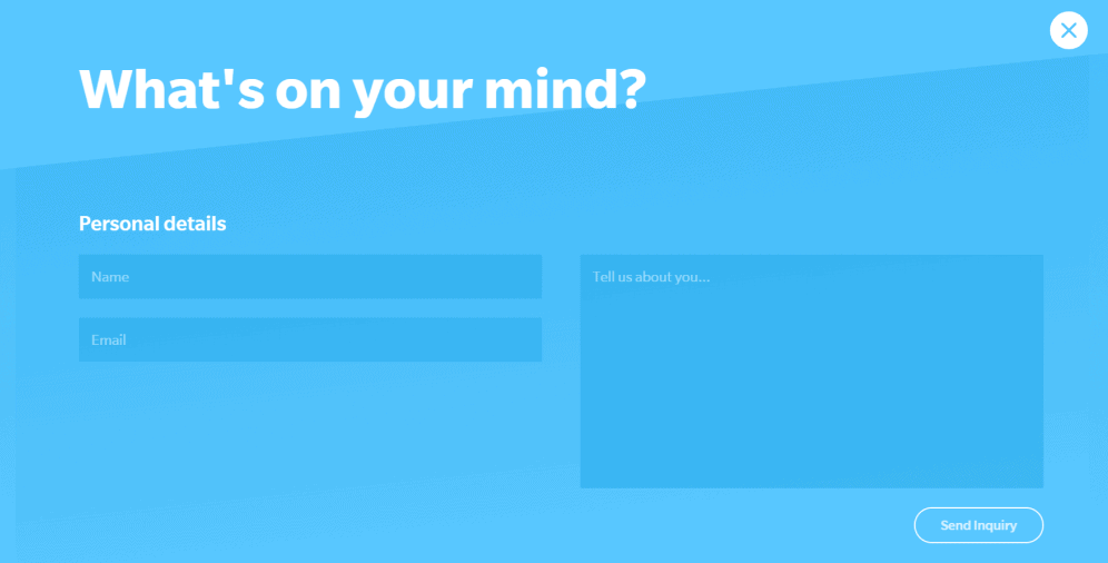
09 Yummygum
Yummygum is a Dutch design studio, and their contact form is worth mentioning. It’s engaging, extremely effective, and offers a good experience to users. It also has only two steps. Just take a look.
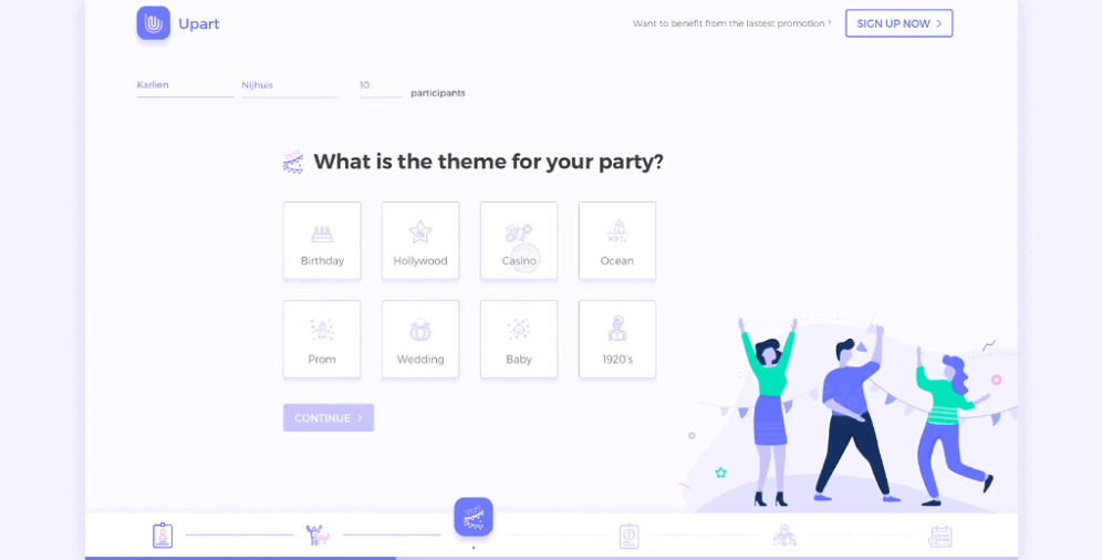
10 Upart
This unique form design belongs to Yifan Ding on Dribble. It’s divided into several animated parts that make the whole process similar to playing games. Users will more likely enjoy completing this form, and the progress bar at the bottom makes it even more fascinating.
On a Final Note
Creating a user-friendly form design is bottom-line for any business, regardless of its type. By prioritizing user experience, you can earn their loyalty and increase your conversions. If you’re not sure where to begin, consider the type of forms you want to use and refer to our tips as needed. If you have any further questions, don’t hesitate to contact us. We’re always here to help.

Copied!

