Outline:
Are you planning to launch a new website or redesign an existing one? Want to make sure that users experience it at its best from the very beginning? The first impression matters a lot, especially in the digital world, where it can significantly impact user retention.
However, the web design process can be time-consuming and challenging, even after launch. But what if you could start building your first impression without having an actual website in place? Fortunately, you can! Building a stunning “under construction” or “coming soon” page is an excellent way to kickstart your online performance and appeal to users before your real website goes live.
At our UI/UX design studio, we’ve got you covered. In this article, we’ll show you how to build a stunning under construction and coming soon page that will make a lasting impression on your users. From choosing the right design to crafting engaging content, we’ll guide you through the process of creating a page that builds anticipation and excitement for your upcoming website launch. So let’s dive in and get started!
Keep Customers Coming Back with Under Construction and Coming Soon Pages
Have you ever wanted to update your e-commerce website with some top-notch items, but worried about losing customers during the redesign process? Closing your website temporarily may drive customers away, while keeping it open during the redesign process could lead to a poor user experience and lower SEO ranking.
That’s where an “under construction” page comes in. This page informs visitors that your website is temporarily unavailable while offering an alternate experience. It doesn’t alienate users but keeps them involved, especially when packed with additional value such as discounts or coupons for those willing to wait. By exhibiting fascinating content and an impressive design, you can intensify engagement and convert visitors into loyal customers.
Similarly, a “coming soon” page is perfect for announcing a new product. It generates leads and builds anticipation for the upcoming launch. Like the “under construction” page, the design and content of the “coming soon” page are crucial to keeping visitors engaged and interested.
In summary, both the “under construction” and “coming soon” pages serve similar purposes of informing visitors that your website is undergoing changes or announcing an upcoming product. However, they have different functions and require unique design and content strategies to keep visitors engaged and loyal. With the right approach, these pages can be powerful tools in building a successful online presence.
Transforming Website Downtime into a Marketing Opportunity: The Benefits of Under Construction Pages
Under construction and coming soon pages can be powerful tools, but it’s essential to use them for the right reasons. Some websites use these pages for no reason, leading to a big gap in the user experience. To avoid this mistake, it’s important to know when to employ an under construction page. Usually, there are three principal reasons for using it:
- Website maintenance: It’s natural for a platform to require regular maintenance, such as a general checkup on the site’s performance or a bug removal. However, maintaining a functioning platform without temporarily closing it can unintentionally expose customers to numerous obstacles and inconsistencies. An under construction page delicately covers the changes in functionality, ensuring that the construction process doesn’t ruin the users’ experience. Moreover, it can be used to inform customers about the duration of the maintenance work and when the platform is expected to be back online, thus reducing customer frustration and enhancing trust.
- Platform redesign: Refreshing your platform is always a good idea to improve user experience and boost conversions. An under construction page acts as a window where visitors can take a glimpse of what you will eventually offer them. It encourages excitement and urges users to keep an eye on the platform until it goes live. Additionally, it’s a chance for you to receive constructive feedback and test your brand’s message before making the final decision. In other words, it gives you an opportunity to carefully think out your future website and implement the best version of it. By adding an email capture form, you can also gather leads and build a pre-launch marketing list.
- New website launch: If you’re launching a completely new website, an under construction page can be a valuable tool for generating buzz and anticipation. It can offer a sneak peek into what the new website will offer, create a sense of exclusivity, and encourage visitors to sign up for updates. Additionally, it can help you test your website’s messaging, design, and functionality before launching it to the public.
In conclusion, using an under construction page is essential for maintaining and improving user experience, redesigning your platform, and launching a new website. Employing it for any other reason may create a gap in user experience and discourage potential customers. By adding relevant information and features, an under construction page can also help you build anticipation, generate leads, and test your website’s messaging and functionality.
7 Goals of an Effective Under Construction Page
To make your under construction page even more effective, it’s important to know its goals. Understanding these goals will provide you with a clear direction and ensure positive outcomes:
- Generate leads: Pre-launch and under construction pages usually include an email subscription form, allowing visitors to receive newsletters with relevant information about the website’s progress and launch date. This helps you collect contact information and establish a solid base for future relationships. In other words, with an effective maintenance page, you can generate leads even without an actual website in place.
- Hide the construction process: A crucial goal of a pre-launch page is aesthetics. Websites under construction can produce numerous functional and design issues that may damage your previous performance. A beautiful construction page hides all the work being done, making communication run smoothly. Ultimately, a legitimate under construction page works better than a “half-cooked” design and suggests a holistic and pleasant experience instead of a fractured one.
- Maintain SEO: Going offline for an extended period of time can impact a website’s SEO, especially for a website that was once online. An optimized under construction page shows search engines that your website is still around and that you want to get indexed. Keywords in your copy allow search engines to crawl your content easily, while optimized images contribute to better speed performance. It’s also crucial to make the page mobile-friendly, as it’s one of the most important ranking factors.
- Uphold reputation: A perfect under construction page assists users when your website is offline, showing your caring attitude towards your audience and making them more loyal to your business. Managing your reputation by creating a perfect under construction page helps you avoid dealing with missing elements and poor service, which can damage your reputation.
- Encourage cross-promotion: Pre-launch pages often incorporate links to various social media accounts, providing an excellent alternative for users when your primary representative is temporarily unavailable. Cross-promotion allows you to expand your influence and obtain additional robust channels of distribution.
- Leverage marketing: A well-designed coming soon page acts as a superb marketing tool, where you can easily present your new product and promote it. For instance, you can suggest customers pre-access to it, which will be an incentive to wait until the product launch, boosting anticipation. If used in conjunction with a proficient marketing campaign, it can significantly leverage your business performance.
- Bridge the gap between the change and the users: When a business grows in complexity, switches over different markets, or needs a complete rebrand, changes should be clear and understandable for the audience. An under construction page helps you reflect these modifications without seeming inconsistent, bridging the gap between change and users.
In conclusion, understanding the goals of an under construction page is crucial for its effectiveness. By generating leads, hiding the construction process, maintaining SEO, upholding reputation, encouraging cross-promotion, leveraging marketing, and bridging the gap between change and users, you can make your under construction page a powerful tool for your business.
Crafting a Powerful Under Construction Page: What to Include
Once you have a clear understanding of the goals of an under construction page, it will be easier to determine a proper design strategy. While there isn’t much space for excessive creativity, it’s better to follow the standards. Each coming soon page should include a text message for the visitors and a powerful visual element. These are compulsory design elements, and without having them in place, your under construction page won’t be as robust and appealing.
The priority of the text message is to communicate that your website is temporarily inactive. It’s crucial to focus on the word “temporarily” because some visitors may assume that the website is closed for good, which may lead to a loss of potential customers. Avoid using cliché phrases like “the website is under construction” and clearly state the reason for closing the platform with an apology and a thank you. This messaging exhibits your professional competence and shows that you value your customers’ involvement.
The message shouldn’t be too long or too short; aim to generate 3-4 sentences with only relevant information. To create an excellent page, let’s consider some examples of coming soon and under construction texts you may use:
- Business Neutral: “We’re working hard to make the website available for you again and looking forward to presenting you with our new products on May 17th. Until then, we will be glad to see you on our Facebook page and will be grateful for sharing the news with others.”
- Cheerful: “Sorry for the dust! Our brand new website is ready to impress you on May 17th. We know it’s hard to sit tight and wait, but we are grateful for your patience. Since we cherish your involvement, we want to offer a bonus for the first 20 visitors to contact us! Subscribe and get a free coupon for our new collection.”
- Teaser: “We have some exciting news for you, but shhh, don’t tell anyone! Our new album will be available on May 17th, the same date our new website goes live! Check out a sample of our new track on Spotify via the link above. Stay tuned not to miss another surprise we’ve prepared for you!”
- Informative: “It’s almost here! We’ve been working hard to announce that from May 17th, you will be able to get an improved version of our app! Now it allows online payments so that you can get access to superior functions, including a vast gallery of original effects! Another beneficial feature is an offline mode that allows you to use the app at any time and place! Do you have more suggestions? Contact us on LinkedIn.”
- Personal: “Hello, I’m Sally! I’ve mastered the degree of interpreting fiction this year, which has given me the opportunity to assist young writers, and I can’t wait to get started! I open my online creative writing course on May 17th. It will include three parts where you will have an opportunity to get valuable insights into the writing principles and techniques and test your creative muscle in practice. I will support you with daily feedback and promise to do my best to get your talents out of the shelf! If you’re still unsure, you can follow the link below and view my works. Do you have more questions? Contact me at email@example.com, and I’ll get back to you as soon as I have officially started.”
The choice of style heavily depends on the essence of your business and the level of relationships you’re having with your customers. For instance, if you have a personal blog, first-person narration is the best option to produce a direct appeal. On the contrary, that style won’t fit a corporate website under construction page that has a more business-like essence.
Designing an Under Construction Page: Tips and Tricks
Now that you have a powerful message and brand-related visual in place, you can enhance the user experience by incorporating some other significant points, such as:
Provide a subscription form: Since the primary goal of an under construction page is to generate leads, you need a subscription form. Allowing visitors to subscribe to the newsletters to notify them about the launch can be a perfect way to promote the website. Without notification, users may forget about it and skip the idea of returning to you. There is no strict rule on the regularity of notifications. Some prefer sending one notice on the launch date – some employ daily mail distribution. One thing should be said – you need to be compelling but not overwhelm the users with tons of emails.
Add contact details: Always provide your customers with several channels of communication despite your website. Place your number and tell your email address. Having these points helps to keep in touch with the customers when temporarily being offline.
Display a countdown timer: If you know the exact launch date, why not announce it to your loyal customers? Add a timer to your coming soon page. It makes the whole process transparent and increases anticipation with each hour down. You can do this by setting a countdown clock or choose from thousands of elegant modern timer templates available on the web.
Formulate a benefit-driven headline: A powerful headline might help you catch the user’s attention. You need the headline to be short yet informative to provide only essential information. The key to keeping users involved is to formulate a benefit-driven headline, highlighting the strong sides of a future website. It boosts interests and urges users to save the link to come back and see the announced top-notch feature with their own eyes.
Show progress: Including a progress bar is a good idea, as users would like to see progress, eliminating many questions about the state of a website. It determines the completeness of a website in percentage, incentivizing users to check back regularly. However, if you plan a considerable construction process that might take months, there is no sense in it. Imagine users will be seeing from 0% til only a 10% progress bar for several days, so they would probably forget about you. This function is applicable in case you’re hours or days away from making your website public, so it can dynamically depict the change.
Offer eye-catching imagery: An under-construction page should be aesthetically pleasing to be memorable. Nowadays, all modern browsers support 3D and animated backgrounds. These effects make your page more lively so that it will definitely grab the users’ attention. You may also consider adding the floating image or auto-changing background. It creates movement that captivates and contributes to the interactive and fun experience to have on your maintenance page.
Give extra incentives: Don’t expect visitors to know what to do when they arrive at your under construction page. Direct them with prominent CTAs. Besides the traditional subscription button, you may add links to your social media, offering extra experiences and making your page more versatile. You can significantly increase the number of social shares on your coming soon page by creating a giveaway. By sharing your page on Facebook, retweeting it on Twitter, or posting about it on Instagram, the news about a new website will come across all key platforms, leveraging the awareness. However, don’t overact and be moderate when calling for action – being too persuasive might cost you a considerable number of customers.
Avoid These Mistakes When Crafting Your Under Construction Page
To craft a successful under construction page, you need to consider not only the main components but also the potential traps to avoid. Here are some things to keep in mind:
- Overpromising can lead to disappointment and mistrust from your audience. Be honest and transparent about what you can deliver.
- Vague content can confuse and alienate users. Clearly communicate what your website will be about and its purpose.
- Launching on time is crucial for establishing reliability and trust with your audience. Stick to the countdown timer and launch date you’ve announced.
- Promotion on social media and collecting emails are essential for building relationships and keeping your audience engaged. Update regularly to avoid falling behind competitors.
- A short-lived under construction page doesn’t give you enough time to build anticipation or generate leads. Take advantage of countdown timers and subscription forms for maximum impact.
- Inconsistency in design and messaging can turn off visitors. Use templates with pre-built structured design components for consistency and cleanliness.
Additionally, it’s important to keep in mind the user experience when designing your under construction page. Make sure the page is mobile-friendly, as more than half of all web traffic comes from mobile devices. It’s also crucial to have a clear and concise message that communicates the temporary nature of the page and apologizes for any inconvenience caused.
Furthermore, it’s recommended to avoid using cliché phrases, such as “under construction” and “coming soon,” and instead use a creative and unique message that reflects your brand and engages users. Finally, make sure to test the functionality of all design elements, such as subscription forms and countdown timers, to ensure they work properly and don’t create any frustration for users.
Top 10 Great Examples of Coming Soon and Under Construction Templates
If you want to build a nice under construction and coming soon page, it’s useful to look for inspiration. That will provide you with a clear vision and a model to build upon. Here, we’ve gathered the top 10 best templates we recommend:
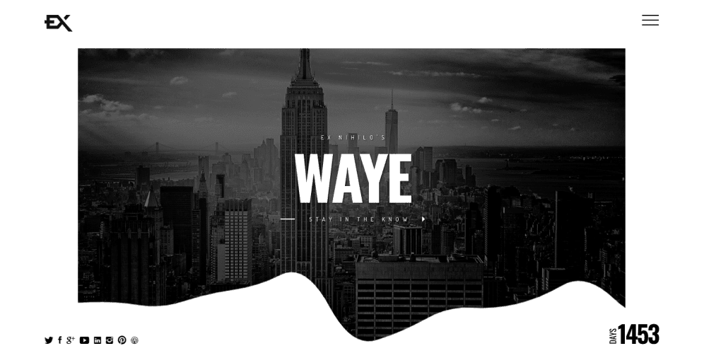
01 Waye
As chic as it comes, the Waye template grabs the visitors’ attention immediately. The animated frame around auto-changing background images creates a memorable experience that turns into a reason to return to the website later. Its stylish and clean design looks dynamic and lively. Also, it allows for downloading your logo at the right corner at the top, which will make your brand even more distinguishable and recognizable.
Besides a nice visual, the Waye template has perfect functionality. It shows the days until the launch, boosting anticipation. The page employs a bright red-colored sidebar menu which makes the page highly navigational.
02 Enva
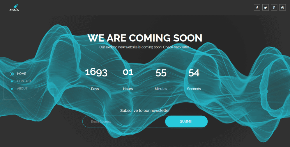
Another example of an excellent coming soon page is Enva. The template encompasses all the essential features, delicately placing them in a sidebar menu. It includes a contact form and an About page that discloses the business essence. Such a structure helps you to avoid any clutter and makes the page look clean and professional.
It has a highly responsive design and hence functions well on any device. Enva template also features a prominent subscription form, which makes it easier to connect with the audience. Although employing a minimalist color palette, the page looks engaging and elegant. And soft bright typography only adds to its delicate look.
03 Saphir
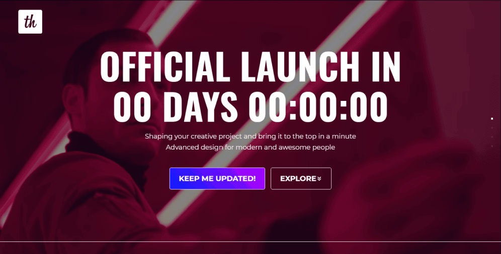
Saphir has everything you may need when putting your website under construction and even more. It’s a clean, modern, and light web page with a fantastic visual. It features a captivating video urging visitors to glue to their screens, watching how the story unfolds. It’s a great decision as it provides the users with an exceptional and enjoyable experience. Although it employs only high-quality video and images, the page loads fast on any device because it is fully optimized.
The bright headline and vivid subscription form will make your page successful at generating customers. Along with that, there is a convenient sidebar menu which makes the page easy to navigate. All in all, its advanced functionality will help you to create an excellent under construction page, and you will definitely like how Saphir maintains your customers when you’re offline.
04 Blex
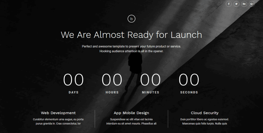
The Blex creative template’s modern and fresh look appeals from the first seconds. Even if you don’t like background images, you can easily alter them. This template allows full customization, including typography and its color. You don’t need any special coding knowledge to accomplish that. It means that you can effortlessly land it according to your needs and enjoy your well-structured and clean under construction page. The page has a comprehensive contact form, ensuring that every visitor can get in touch with you. However, no one would subscribe to a website that loads slow. Fortunately, developers had that in mind when creating Blex. It is fully responsive and optimized so that multiple interactive and animated design elements won’t impede your performance.

05 Coming2live
One look at the stylish Coming2live template will let visitors know that great things are coming. The background image is simple yet impressive, which makes the page look clean. Perfectly fitting a black color palette, contrasting white typography contributes to high readability.
The page features all the necessary elements, including contact details, a headline, a countdown timer, short information about the business below, and prominent social media icons. The template is highly responsive so that it won’t lose its elegant look when on mobile.
06 Everest
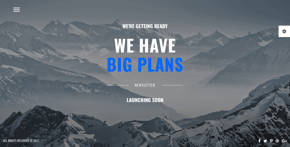
Being an ultra-responsive coming soon template, Everest has a large variety of useful features. The template has a brilliant appearance and comes with 11 ready-to-use skins to choose from. Its perfectly chosen color palette will give your page a fresh look and easily attract visitors. The template includes an animated sidebar menu that allows users to find what they need quickly and easily.
What we liked the most about this template is that it has a gallery option. Thus, you will be able to share some nice pictures right on your under construction page and impress users with authentic content. If you worry about the functionality, Everest comes with an excellent 24/7 support service so that you won’t lose control over the design process.
07 Stomp
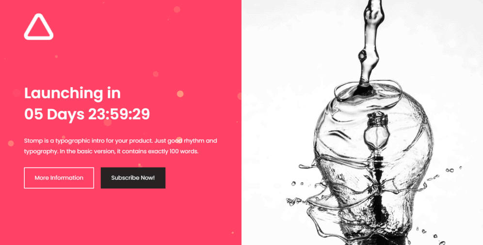
The Stomp template is highly appealing due to its vivid yet uncomplicated color palette. Despite a minimal set of design components, a page looks stunning and engaging. It has two contrastive CTAs that spark interest and urge visitors to linger on the page.
It’s a multi-image template with one side featuring a compelling brand message, while the other consisting of a custom image. The Stomp template is flexible and clean in design and structure, which means you can make various inputs without risking damaging the visual balance.
08 Co.
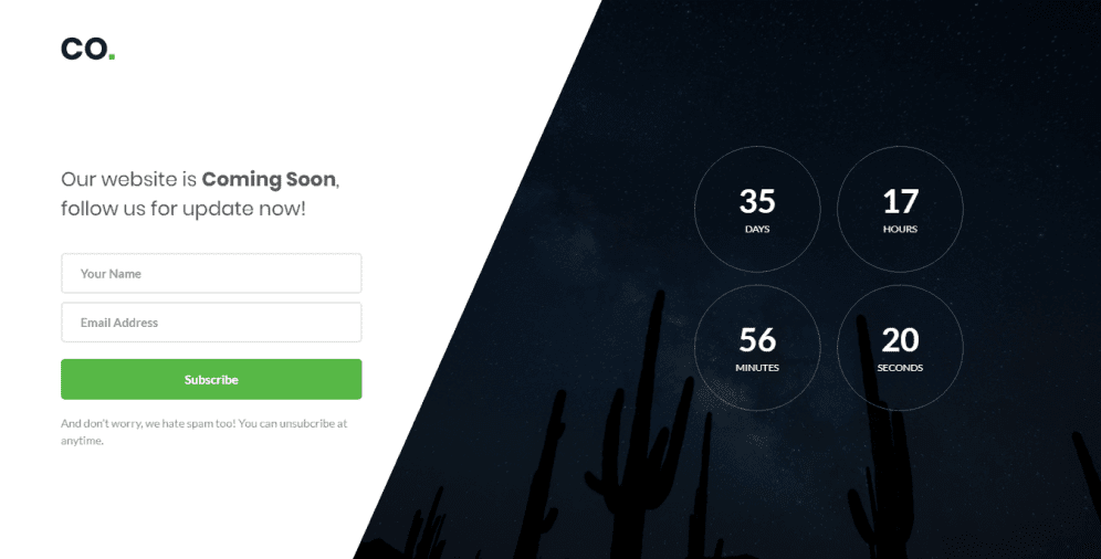
Co. template is extremely simple yet attractive. It has a fancy countdown timer in the form of four circles that will give your potential clients precise information about your website launch. Apart from that, the page has a prominent email subscription form and vivid social media buttons. It allows you to keep in contact with your customers and invite them to receive relevant information. Although being minimalist in terms of design, the template offers all the necessary for building an amazing under construction page.
09 Coming soon 12
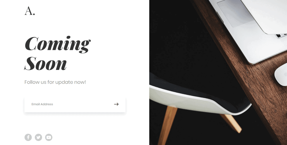
Coming soon 12 is another minimal modern template from Colorlib. It employs a vertical split-screen design that helps you to manage the content of your coming soon page effortlessly. On the left side, you add your brand message and provide social media profile links, and most importantly, place a subscription form. The form is very simple as it requires only an email address, so users don’t have to waste time filling out countless fields.
10 Finely
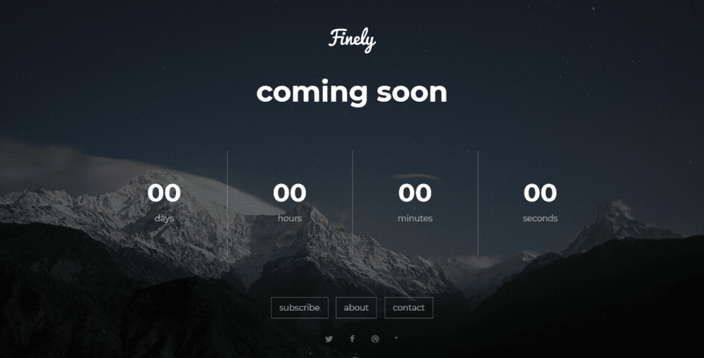
The innovative design of the Finely template will make your coming soon page look trendy and clean. It employs a simple layout, which makes it easy to comprehend. Depending on your preferences, you can use any other image slideshow or even download a youtube video in the background. Being highly customizable, the template includes multiple fonts and styles to choose from.
Maximize Your Online Presence with the Coming Soon and Maintenance Mode Plugin for WordPress
In today’s world, it’s essential to have a professional and polished online presence. An under construction page or maintenance mode page can help you achieve that while working on your website behind the scenes. The coming soon and maintenance mode plugin on WordPress is an excellent tool that makes it easy to create a high-quality under construction page without any coding knowledge.
The plugin is available for free download on WordPress, with additional premium packages available for purchase. The free version features responsive design and various customization options, making it an excellent starting point for those who want to create an under construction page quickly.
To get started, follow these three easy steps:
- Step #1: Install and activate the coming soon page and maintenance mode plugin from your WordPress account under “Plugins”. It is a quick and simple process, requiring only a few clicks to complete.
- Step #2: Configure the plugin by selecting either the coming soon mode or maintenance mode from the “Settings” section of your dashboard. The coming soon mode will hide your site from the public while you continue to work on it, while maintenance mode will create a page for when you need to take your site offline entirely.
- Step #3: Customize your under construction page by uploading a visual, entering a headline, and writing an accompanying message. The plugin provides extensive customization options, allowing you to choose an eye-catching background image, specify the color palette, and adjust the typography size.
The coming soon and maintenance mode plugin also includes several premium payment plans, which offer extra functionalities such as incentive-driven signup forms, progress bars, and social media buttons. The basic plan costs $25 per year and allows for use on only one site, while the Pro plan costs $69 and enables usage on up to three sites. The Agency plan costs $250 and provides access to the plugin on 100 clients’ personal sites at once, along with numerous templates and drag and drop modules.
In conclusion, the coming soon and maintenance mode plugin is an excellent tool for creating a professional and effective under construction page. With its responsive design and vast customization options, you can easily build a page that reflects your brand and provides a seamless user experience. The premium packages offer additional features that can help you drive engagement and conversions, making it a worthwhile investment for anyone who wants to create a high-quality under construction page.
Maximizing Anticipation: The Science Behind Determining the Length of Your Under Construction Page
To determine the optimal time period for your under construction page, you should consider the nature of your business. If your goal is to attract new customers, it’s recommended to announce your website at least a week before launch. This gives you enough time to build anticipation without causing frustration. On the other hand, if you already have an existing customer base, you can extend the time period up to two weeks to communicate with them and answer their questions.
If you’re in a rush to launch, you can consider introducing a minimal version of your website that includes only the most important pages. However, before doing so, it’s crucial to ensure that the pages are fully functional and won’t harm your website’s performance. It’s also essential to stick to the deadline you’ve set on your coming soon page. By keeping your promises, you demonstrate that you’re organized, reliable, and committed to delivering what you’ve promised, which builds trust and credibility with your audience.
Optimizing Your Under Construction Page for SEO Success
When building a website, it’s important to consider its impact on search engine optimization (SEO). A website that is under construction can negatively affect SEO, as search engines may interpret the site as inactive and therefore not send visitors there. However, a well-crafted under construction page can help to minimize these negative effects and sustain your SEO reputation.
According to a study by Backlinko, websites that rank in the top 10 search results have an average content length of at least 2,000 words. This means that incorporating relevant keywords into your under construction page can help search engine crawlers to recognize your website and improve its relevance in search results. In addition, making sure that your page is mobile-friendly and responsive is crucial for SEO, as mobile devices account for over half of all website traffic.
By optimizing your under construction page with relevant keywords and ensuring that it is mobile-friendly, you can maintain your SEO performance while your website is temporarily offline. This can help to ensure that your website is visible to potential customers and continues to rank well in search results, even during periods of maintenance or construction.
On a Final Note
Don’t let your website’s downtime turn potential customers away! With the right under construction page, you can keep them engaged and excited for your site’s launch. Our team at Ester Digital can help you build the perfect under construction or coming soon page that fits your brand and keeps your customers hooked.
Don’t waste valuable time trying to figure out how to design and create an under construction page on your own. Let us do the heavy lifting for you. Our team of experts will work with you to craft a compelling message and design a visually stunning page that captures your customers’ attention.
We know that incentivizing visitors to subscribe is critical, and we’ll help you create an irresistible offer that will keep them eagerly awaiting your website’s launch. We’ll also provide you with the tools you need to keep your customers engaged during your downtime, including valuable content for your social media channels.
At Ester Digital, we understand the importance of maintaining your online presence even when your website is offline. Let us help you build a powerful under construction page that keeps your customers coming back for more. Contact us today to learn more about our services and how we can help you build a successful online presence.

