Outline:
Commerce has been prevalent for centuries. In ancient times, merchants used to travel to and fro to make deals. Fortunately, the digitalization of the financial system has enabled more efficient and quicker methods for conducting trade. Transactions that were previously running primarily locally or across regions transitioned to electronic means. Later, that functionality, enhanced with digital media and robust Internet integrity, brought to the world what we know as e-commerce sites. And now, millions of retailers operate online, allowing consumers to make purchases without even needing to cross a street.
Essentially, e-commerce websites are platforms that sell products and services via the Internet. They function pretty much the same way as conventional shops. The fundamental difference is that e-commerce is more flexible and accessible for both buyers and retailers. As a result, some may think that e-commerce platforms are easier to build and maintain compared to traditional ones. However, there is much to be done behind that fascinating prospect, especially when it comes to designing your e-commerce website.
Therefore, to assist you in this complex task, our corporate website developers have compiled this guideline, in which we hope you’ll get helpful and valuable information.
Unlocking E-Commerce Success: Why Thoughtful Website Design Matters
Website design plays a critical role in the success of e-commerce businesses. A well-designed e-commerce website not only attracts and retains customers but also directly impacts sales, conversions, and overall user experience. The importance of website design in e-commerce can be highlighted through several key aspects:
- First impressions: An appealing and professional website design creates a positive first impression, which is crucial for attracting potential customers. Visitors are more likely to explore and engage with a visually appealing site that reflects the brand’s identity and values.
- Better experience: A well-designed e-commerce website focuses on providing a seamless and intuitive user experience. This includes easy navigation, clear product descriptions, and a straightforward checkout process. A great user experience encourages customers to spend more time on the website, which increases the likelihood of making a purchase.
- Trust and credibility: A professional-looking website design instills trust and credibility in your e-commerce business. Online shoppers need to feel confident about sharing their personal and financial information on your website. A well-designed site with clear policies, contact information, and security measures will help build trust and encourage customers to make a purchase.
- Increased traffic: A well-designed website with relevant content and proper structuring can improve its search engine rankings. Higher search engine visibility leads to increased organic traffic and higher conversion rates, which ultimately results in more sales opportunities for your e-commerce business.
In conclusion, a well-designed e-commerce website is essential for attracting and retaining customers, providing a seamless user experience, and ultimately driving sales and business growth. Investing in a high-quality website design not only enhances your online presence but also contributes to the long-term success of your e-commerce business.
Design Tips for E-commerce Websites
Now, when you know how website design influences your sales, let’s move further and explore some design tips. These points can help businesses optimize their e-commerce websites to enhance user experience, boost engagement, and ultimately drive more closed deals.
- Simple and clear navigation: Ensure that your website has a straightforward and intuitive navigation structure, making it easy for users to find and explore different products, categories, and pages.
- High-quality product images: Use high-resolution images that showcase your products in the best possible light. This will not only improve the overall aesthetics of your website but also help build trust and credibility with potential customers.
- Easy-to-use search functionality: Implement a powerful and user-friendly search function that allows customers to quickly and efficiently find the products they are looking for.
- Clear and concise product descriptions: Provide accurate and detailed product descriptions that effectively communicate the features and benefits of your products, helping customers make informed decisions.
- Streamlined checkout process: Simplify the checkout process by minimizing the number of steps and input fields, providing multiple payment options, and offering guest checkout functionality.
- Prominent call-to-action (CTA) buttons: Make sure your CTA buttons, such as “Add to Cart” and “Checkout,” are visually appealing, prominent, and easy to locate.
- Personalization: Offer personalized product recommendations, content, and offers based on the user’s browsing history, preferences, and previous purchases to enhance customer engagement and increase the likelihood of conversions.
By implementing the design tips mentioned above, businesses can create a user-centric e-commerce website that not only attracts and engages potential customers but also converts them into loyal patrons.
An Ultimate Guide: How to Design an E-Commerce Website for a Profitable Business
To build a strong distributional e-channel, you must either comprehend the web design process yourself, delve into its core principles, and create a detailed business plan, or seek the expertise of online creative services offered by various dedicated agencies. Furthermore, given the numerous aspects involved in web design, it is advisable to break down the process into several phases and steps, ensuring that no critical detail is overlooked. This approach promotes consistency and helps you circumvent any significant setbacks during or after the website launch.
Phase #1: Preliminary Discovery – Setting the Stage for Your E-Commerce Venture
First and foremost, prior to the web design process, it is crucial to examine the context in which you will launch your e-commerce website. During this stage, you must thoroughly investigate the market and pinpoint prevailing industry trends. The insights you uncover will help shape your business idea, ensuring it remains relevant and in sync with the current e-commerce digital landscape.
In addition, you should conduct a competitor analysis to identify key UX features shared by your rivals, as well as common pitfalls to sidestep in your own approach. Use these findings as lessons to learn from, rather than elements to copy — it is vital that your website stands out in order to establish an authentic and unique proposition.
Bear in mind that even if your trade proposition is exceptional, it holds little value for consumers if they have no reason to choose you over competitors. Consequently, it is imperative to research your target customer segments and collect relevant data. Is your website designed to captivate a younger audience with striking creativity and contemporary elements? Or is its primary focus to cater to regular online shoppers with more conventional preferences? In any case, be sure to address the following aspects:
- Analyze the market
- Conduct a competitor analysis
- Evaluate your product’s value proposition
- Define the target audience and its needs
Phase Outcomes:
The preliminary research phase enables you to assess the broader landscape, and based on your findings, you will accomplish:
- A well-defined value proposition that resonates within the digital commerce market
- A comprehensive checklist of fundamental features and design practices to implement
- A thorough evaluation of potential opportunities and risks
- The development of user personas, providing insight into how to effectively engage with them and successfully market your products
Phase #2: Project Discovery – Crafting Your E-Commerce Strategy
Gaining a deep understanding of the idea behind your website is key to a consistent and flawless design process. That’s why it’s essential to set up goals, define the purpose, and establish the mission of your e-commerce platform.
For instance, if you operate as an extensive retail business selling a vast range of conventional goods, you likely need to focus on your product presentation design. Here, exercise caution with excessive design creativity, as it can damage your product pages and overload the platform, causing slower load speeds.
You may also consider including technical requirements. If you want your website design to load well, regardless of the device used, ensure it is responsive and mobile-friendly. In other words, let your goals and purpose guide your design strategy in a way that is reasonable and beneficial for your performance.
In addition, it’s crucial to define your brand style. Faceless e-commerce websites can seem untrustworthy. When shopping online, buyers want to engage with established brands that are reliable and secure. That’s why employing branding is vital. At this point, you need to develop your brand style and document each decision, including typography, color palette, iconography, logo, and layouts. This approach ensures consistency as you progress through the design process. Moreover, by showcasing your brand, you increase your chances of appealing to shoppers, building trust and credibility.
To further enhance the design process’s transparency, you must determine the platform’s scope and decide which pages your website should include. Typically, e-commerce websites start with a landing page, which serves as the initial touchpoint aimed at encouraging consumers to engage and guiding them towards making purchases. It’s also vital to create detailed product pages and ensure a smooth checkout process.
For clarity, compile all this data into a creative brief, which consists of a documented set of features, resources, and objectives, along with timeframes and estimated budget limits. This brief serves as a reliable guide during the workflow, ensuring you stay on the intended path.
Phase outcomes:
Once you’ve established your core goals, it becomes easier to identify ways of achieving them, naturally revealing the following:
- Clear design strategy
- Website’s brand style aligned with your business objectives
- Outlined timeframes and budget
- Set of pages to include
- Documented creative brief
Phase #3: Laying the Groundwork – Establishing an Efficient E-commerce Site Architecture
Once you know what pages to include, you need to establish dependencies between them and design user flows that consumers will experience on your website. Generally, e-commerce website architecture involves three main components: a virtual storefront, a product catalog, and a checkout process. It’s essential to address all of them and ensure users can easily navigate each without any gaps in their interaction with the platform.
Entering a disorganized store, cluttered with unpacked products, is far from an enjoyable experience. It’s clear that straightforward navigation is vital. It helps buyers quickly find what they need without going through countless pages. At this stage, you need to determine the website’s main touchpoints and seamlessly connect them to provide a smooth and friction-free experience for users.
As you develop the sitemap, it’s crucial to outline the content that will appear on each page or page group, and create wireframes to define the content hierarchy. You can group several pages that share the same design layout, such as product pages. This approach will streamline the subsequent design activities and ensure consistency throughout the workflow.
Phase #4: Bringing Your E-commerce Site to Life with Mockup Designs
The next step in your e-commerce web design process is to incorporate visual language into the wireframes. Mockup design provides a rough idea of the final product, allowing you to see a real-life example of your e-commerce website. It is essential to add visuals and UI elements to the established layouts and observe how everything works together.
Consider it akin to a traditional shop window. If it appears clean, elegant, and simply beautiful, it acts as a magnet for buyers. Even if the shop doesn’t offer what they need, it’s difficult to resist the temptation to drop by and explore the interior. Conversely, a dull and bland storefront can deter potential buyers, even if it sells items from their wish lists. This is the power of mockup design. It helps you find the best design solutions that captivate consumers, while avoiding mistakes and minimizing time spent on revisions.
Phase #5: Unleashing Your Brand’s Potential with Exceptional Design
Once you’ve generated the blueprint for the site, you can embark on the actual design journey. It’s crucial to view an e-commerce website as a complex mechanism consisting of several touchpoints. To build a perfect e-commerce store, you need to address each of them with appropriate design decisions. Let’s delve deeper:
#01 The Opening Stage: User Engagement
This is the initial point where users interact with your website. You want to make this experience as smooth as possible to encourage them to explore your offerings further.
- Place CTA buttons: When buyers enter your e-commerce website, they typically land on your homepage. Within the first few seconds, they want to understand who you are, what you offer, and what actions to take on your website. Design a CTA button and place it in a prominent location. Ensure it is visible and clickable, so users can immediately begin their journey.
- Add visuals: Take only high-quality images to showcase your products and captivate viewers’ attention. You can also display pictures of items in use, helping users understand their functionality and see that you sell genuine products worth purchasing.
- Keep to simplicity: Rather than trying to impress buyers with fancy designs, focus on simplicity. Confusing UI/UX design is your worst enemy. Avoid overloading the website design with excessive elements.
#02 Ease of Interaction: Product Discovery
After connecting with users, it’s time to think about further interaction by crafting impeccable product pages and elevating the user experience to a more prolific level.
- Define product categories: Given the numerous items on your platform, a comprehensive product category list is essential. This allows shoppers to locate products and navigate through sections effortlessly. Ensure you include brief descriptions for each category to maintain transparency and prevent confusion. Here, you can incorporate visual cues by using icons for each category segment. Remember to use recognizable symbols to avoid confusing buyers.
- Place a prominent search bar on every page: Nobody enjoys sifting through endless pages to find desired results. A visible search bar enables users to bypass this tedious process.
- Enable filters and various sorting functions: Simplifying customers’ lives when searching for specific items is crucial. The more filters available, the faster and more easily buyers can achieve their goals. Don’t hesitate to offer multiple sorting options, such as color, size, or price range. However, keep in mind that filters should assist, not interfere.
#03 Shopping Time: Product Page Design
Everything is going well so far, as you’ve guided potential customers to a product page. However, many things can go wrong here and ruin the previous success. There is a lot to focus on while designing:
- Utilize grids: When users arrive at the product page, they expect a clean and comprehensive content layout. Provide them with a digestible design by using grids.
- Offer detailed product pages: Ensure consumers can view individual items apart from the overall product selection. This means that each item on the list should include a detailed standalone page that is easy to open or close without losing progress.
#04 The Centerpiece: Adding Purchases to the Cart
The sale is now within reach, but at this stage, many online shoppers face a psychological barrier: buying virtual products is challenging since they can’t see them in person. Fortunately, there are some ingredients for a successful transaction.
- Cart button design: A cart button might seem like the simplest element to design. However, when considering its importance, you’ll understand that it requires many design decisions. First, a cart button is a call to action guiding consumers toward your conversion goal. Place it in an obvious location, such as above the fold and duplicated at the bottom, to be readily available for customers.
Next, apply an appealing visual language to make the button even more prominent. This includes color, typography for the label, and spacing inside it. Ensure its visuals blend well with your primary color scheme while remaining noticeable and outstanding. Typically, a cart button features an icon, such as a basket or shopping cart, as a visual cue for buyers. Some may use text inside the button, and the font you choose plays a significant role in attracting customers’ attention.
Behind the visual, there should be excellent functionality. Clicking the button should allow users to return to the cart, access checkout, or preview the purchase list. For the cart pop-out, there are many options: full page, sliding in from the side, or centered. Choose the option that best fits your overall layout and design. Remember that opening the cart shouldn’t interrupt the shopping experience. Make it smooth and provide an opportunity to return to the previous stage if needed.
Another e-commerce web design pillar is the cart content. Ideally, it should include information about product quantity, options, individual prices, and the total sum. If the cart is empty, invite users to add products with a tempting CTA. Consider including product suggestions or displaying your bestsellers to encourage buyers to engage further.
#05 Closing the Deal: The Checkout
You’re now approaching the conversion you’ve been working towards. The only thing separating customers from a completed order is the checkout process. If it’s cumbersome, you’ll lose potential sales. At this point, it’s crucial to keep your design simple, allowing buyers to quickly enter their billing data and complete their purchase. Here are some tips for streamlining the checkout process:
- Ask for only relevant information and keep it concise
- Be straightforward in your queries so buyers easily understand what to fill in
- Use a single-column design to focus the customer’s attention
- Employ pre-fill and auto-detect functions to save buyers’ time
- Use inline validation and notify customers immediately if there are issues
- Activate the next step button only when all fields are completed
- Display a prominent confirmation message, so users know the transaction is complete
Ultimately, maintain consistency across all web pages by using a single color palette and typography style from your brand style checklist. This ensures balance and keeps your visual design always on point.
Phase #6: Bringing Your E-commerce Vision to Life with Web Development
Once you have all the components of your e-commerce website, it’s time to assemble them into a cohesive, functioning unit. During the web development stage, it’s crucial to select the appropriate framework and adjust the created content accordingly.
To minimize the need for writing code from scratch, consider employing a CMS system. When choosing a content management system, it’s essential to keep the design in context. In other words, select a tool that excels both in terms of functionality and future product customization, thereby reducing the need for manual coding.
Shopify and WooCommerce fully meet these requirements. Both are user-friendly, well-equipped, and highly flexible in terms of design. These tools allow for full customization and offer a vast collection of extensions to support internal store functionality and external marketing integrations.
Another dedicated e-commerce builder is Squarespace. It provides mostly minimalist yet elegant templates suitable for various commerce types. Its award-winning designs will impress you, while the extensive array of useful apps can assist with implementation.
Another crucial aspect is ensuring that the website functions properly, including buttons, filters, shopping carts, and navigation. It is vital to keep the website’s performance in mind; if any feature significantly impacts load speed or usability, it must be modified or removed. Additionally, the platform should be tested page by page on various devices to guarantee its responsiveness and compatibility with different screen resolutions and browsers.
Aside from usability testing, the web development phase also involves security approval. It’s critical to examine the code and eliminate all vulnerable points, ensuring that customers’ personal information remains secure within the website.
Phase #7: Perfecting Your E-commerce Platform with Rigorous Testing and Launch
Now, your e-commerce website has reached the stage of testing and launch. Before your platform goes live, you need to conduct a thorough final check-up, focusing on functionality, security, and performance. This involves addressing potential issues such as broken links, inconsistencies in the sitemap, fractured user experiences, or insecure payment gateways.
Even a minor mistake can have a ripple effect, adversely impacting the overall performance. If you identify any of these issues, promptly address and fix them. Once everything is in place, you can launch your website, integrate your design files into a live server, and install an SSL certificate to ensure secure data transmission.
Phase #8: Safeguarding Your Online Store with Regular Maintenance and Expert Support
Many believe that the web design process should end after launching the platform. However, there is still much work to be done. Now, you need to evaluate the performance and identify pain points your consumers may encounter. This involves assessing not only the visual aspects of the website but also its technical components. Also, regularly conducting security testing is crucial, as vulnerabilities can emerge over time.
Furthermore, it’s essential to closely monitor user experience, gather feedback, and perform audits. This will help you determine which improvements can add value and positively impact your metrics. In the end, there is always room for growth and enhancement.
A Roadmap to a Clear and Effective Web Design Workflow
Undoubtedly, developing an e-commerce website can be painful. Creating one from scratch isn’t a task that can be completed in three days. In fact, it may take you three months to establish a smooth workflow. Nonetheless, there are some effective tips to help you master the process successfully:
#01 Master time management
Allocating proper time and energy to tasks can not only bring consistency into the workflow, but also save your money.
#02 Incorporate visualization
Consider using mood boards or other visualization tools to better understand the ideas and concepts that may be difficult to comprehend.
#03 Implement electronic processes to improve your website performance
Whenever possible, replace human input with automated mechanisms to increase efficiency and enable you to focus on more complex and significant activities. Additionally, consider using a design system that will provide you with reusable and reliable design components.
#04 Monitor each new input and track progress
Make an effort to stay informed about each web design phase, ensuring that you’re aware of every aspect of the process and maintain control over the project.
Inspiring Online Retail: 5 Outstanding E-commerce Website Designs
Are you ready to see how good website design can work for e-commerce? We will showcase 5 best e-commerce website design examples to get you inspired.
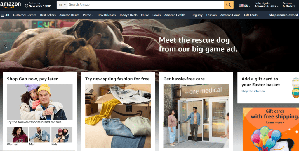
01 Amazon
Amazon’s e-commerce website design focuses on simplicity, user-friendliness, and efficient navigation. With easy-to-use search functionality, personalized recommendations, and a seamless checkout process, Amazon sets the standard for a successful e-commerce experience.
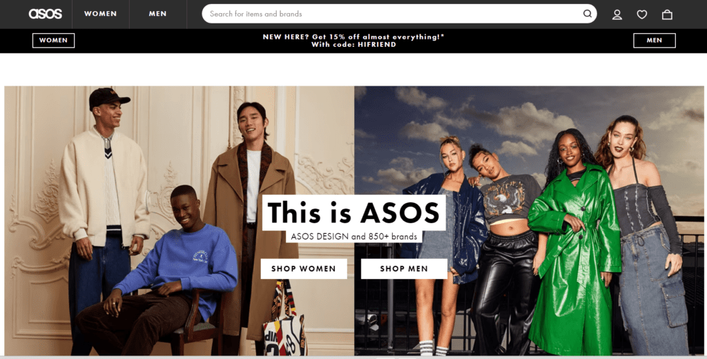
02 ASOS
ASOS is a global fashion retailer with a visually appealing and responsive design. The site utilizes high-quality images, intuitive navigation, and a clean layout that showcases their wide range of products. Their easy-to-use filters and quick-view options create a smooth shopping experience for customers.
03 Warby Parker
Warby Parker’s e-commerce website design is known for its clean, minimalist aesthetic, which highlights their eyewear products. The site offers a virtual try-on feature, user-generated content, and detailed product descriptions, creating an engaging and interactive shopping experience.

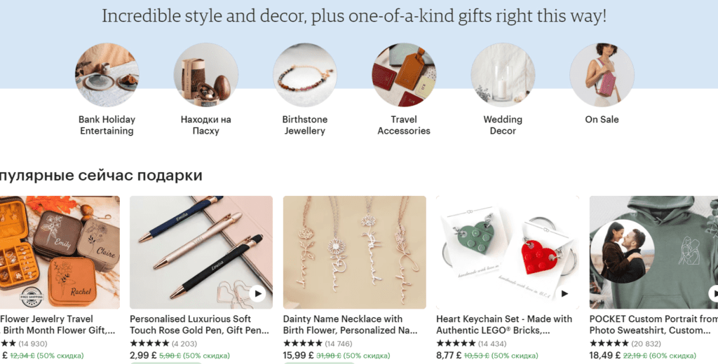
04 Etsy
Etsy’s marketplace for handmade and vintage items showcases a unique and creative e-commerce website design. With its focus on supporting small businesses and artists, the site offers personalized recommendations, detailed product information, and easy-to-use search functionality to help customers find the perfect item.
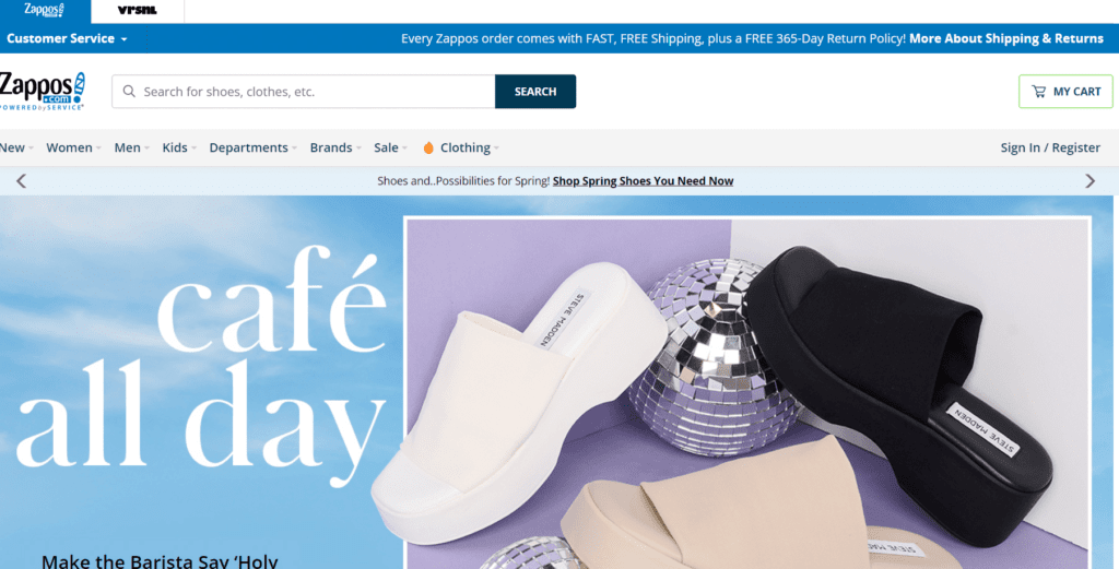
05 Zappos
Zappos, an online retailer specializing in shoes and clothing, has an e-commerce website design that emphasizes user experience. The site features high-quality images, comprehensive filters, and a streamlined checkout process. Zappos is also known for its excellent customer service, which adds to the overall positive shopping experience.
On a Final Note
As you can see, designing an e-commerce website is a complex task. The process involves several customer phases, and each requires specific design decisions. From an eye-catching CTA to a smooth checkout process — all details play a crucial role. It’s essential to monitor these aspects closely and ensure that everything works in unity, delivering holistic and consistent experiences to the buyers. Ultimately, an excellent e-commerce website design serves as a catalyst for your business performance. By investing in a quality design, you can seize the opportunity to create a reliable and robust distribution channel that boosts your sales, enabling you to expand.
If you’re still uncertain about how to design your e-commerce website for optimal performance, feel free to contact us. We will provide you with valuable insights and assist you during the process if needed.


