Outline:
The goal of any website is to provoke the interest of the target audience in the service or product provided. When customers have already made up their mind about making a purchase, or in case of some issues or problems, they may want to address the company. Therefore, to avoid losing them, all companies need to create an efficient “Contact Us” page design.
The “Contact Us” page is often underestimated, and as a result, its content and design may not given due attention. However, this page serves as the direct point of interaction between customers and the company. which makes it crucial. In this article, our UI UX development company would like to study the essence of the “Contact Us” page design and provide some examples of UI\UX design.
Why Your Contact Us Page Matters: Creating a Positive Impression for Potential Customers
As UI/UX designers, we understand the critical role that the “Contact Us” page plays in a user’s journey through a company’s website. It’s often the final touchpoint before a regular visitor transitions to a potential customer, making it a vital opportunity to create a positive impression and build trust.
Its primary purpose is to provide users with a means to communicate with the company and receive information on how to reach them. However, this page also serves as a reflection of the company’s commitment to customer service and support. A well-designed “Contact Us” page can instill confidence in the user, leaving them with a positive perception of the company and increasing the likelihood that they will make a purchase.
It’s essential to recognize that this page is a crucial aspect of a website’s user experience, and its design should not be overlooked. Instead of simply providing users with a phone number and email address, the page should be carefully crafted to ensure that it is functional, easy to use, and aesthetically pleasing. By doing so, companies can create a strong, positive impression and show their commitment to providing a superior customer experience.
Why Your Contact Us Page Matters: Boosting Customer Satisfaction and Sales
As a UI/UX design agency, we understand the importance of a well-designed “Contact Us” page. According to the statistics, 64% of users want to see the contact information of a company, and failing to provide multiple communication channels can create a negative perception of the brand.
While some visitors may choose to use the contact form or send an email after exploring the page, it’s essential to offer multiple communication options. This allows customers to choose the method that best suits their needs and preferences, demonstrating the company’s commitment to providing superior customer service.
At our agency, we believe that a proper “Contact Us” page should incorporate various elements, including clear and concise contact information, a user-friendly interface, and multiple communication options such as phone, email, live chat, or social media. By creating a well-designed one, companies can establish a positive impression with their customers and increase the likelihood of converting visitors into loyal customers.
Six Main Components of a Contact Page
It should incorporate several elements to make communication with the company as smooth and straightforward as possible. These elements include:
- Contact form: For many users, it’s more convenient to contact the company in writing. A well-designed contact form can also offload the flow of emails and calls. It should be short and straightforward, including fields for name, email, phone number, and a statement of the problem.
- Address: The contact page should include the address of the company, especially if it offers products or services that cannot be purchased online. This information is crucial for customers to visit the company office/store.
- Telephone: In some situations, a phone call is the easiest and the fastest way to reach any company. Therefore, the phone number should be prominently displayed to add a feeling of reliability and prove that the company is real.
- Social networks: Including links to the company’s social media networks is advisable, particularly if they are regularly updated with posts, photos, and customer interactions.
- E-mail: Providing an email address is crucial for users who prefer this method of communication or need to attach files or have problems with the contact form.
- Buttons: After filling a contact form, users should have a clear, noticeable button to click to send their message.
By incorporating these elements into the “Contact Us” page, companies can make communication with customers pleasant, simple, and straightforward. The contact form is just one of these essential elements. In the next section, we will explore why it is so crucial.
How to Make Communication with Your Company Simple and Straightforward
A contact form is a vital component of a well-designed “Contact Us” page, offering several benefits for both companies and customers:
- Reduce spam e-mails: With it, customers don’t need to use the company’s email address, reducing the risk of spam emails clogging up the inbox.
- Make yourself reachable: It provides a direct and reliable means for customers to address the company, ensuring that potential customers are not lost or ignored.
- Invite professional opportunities: A well-designed contact form can be a valuable tool for recruiting, business contacts, and increasing sales and service opportunities.
- Build connections with your customers: Direct communication with customers enhances their trust and loyalty to the company while also providing the company with valuable customer insights.
- Capture leads: A simple and user-friendly contact form encourages potential customers to submit inquiries and leads, reducing the likelihood of them wasting time and effort.
- Keep track of inquiries: It allows companies to easily track inquiries and store customer information for later reference.
- Build your e-mail marketing list: The contact form provides valuable customer information, making it easier for companies to send targeted marketing emails.
- Offer support to customers: It offers an easy way for customers to get help with any questions or concerns they may have.
- Delegate tasks to your team: It can be used to assign tasks and send notifications to the relevant team members.
While email and contact forms may seem similar, they have important differences that make the contact form a preferred choice for many users. In the next section, we will explore these differences in more detail.
When to Use Email Instead of a Contact Form
While email and contact forms serve similar functions, they have distinct differences that make contact forms the preferred option for many users.
A contact form provides an easy and fast way for users to communicate with the company regarding various issues without leaving the website. In contrast, emailing requires several more steps to reach the company.
The primary difference between a contact form and email is that sometimes the first is not sufficient for certain customer needs. For example, a customer may need to send an image of a broken product to make a complaint or request a refund, requiring an email attachment.
Once the critical elements are established, it’s essential to consider where the links to the page should be located on the website. In the next section, we will explore the best practices for placement and visibility of the “Contact Us” page.
Creating a Positive User Experience: Best Practices for Designing Your Contact Us Page
According to the usability research, customers will typically search for contact information in either the upper right corner or the bottom of a website page. Therefore, the primary options for placing a link to the “Contact Us” page are in the header or footer of the website. Including contact information in various subsections or other locations is generally considered a mistake.
We recommend placing contact links in both the footer and header of the website to increase the chances that users will quickly and easily find the “Contact Us” page. This will benefit both the company and customers by facilitating communication and resolving issues promptly.
To create an efficient “Contact Us” page design, companies should also consider the following points:
- Clear and concise design: The “Contact Us” page should have a clean and straightforward design that makes it easy for users to understand and use.
- Visibility: The contact information and links to the “Contact Us” page should be prominently displayed on the website to ensure that users can quickly find the information they need.
- Mobile compatibility: With the increasing use of mobile devices for browsing the web, it’s essential to ensure that the “Contact Us” page is mobile-friendly and easy to use on small screens.
- Personalization: The “Contact Us” page should be personalized to the company’s brand and include information that is relevant to the user’s needs.
By considering these factors, companies can create an efficient “Contact Us” page that meets the needs of their customers and enhances the user experience. In the next section, we will explore the best practices for designing a visually appealing “Contact Us” page.
Boost Your Search Ranking and Attract More Customers: Incorporating SEO Strategy on Your Contact Us Page
As a UI/UX design agency, we understand that creating an effective contact us page is crucial for enhancing customer experience and engagement. To achieve this, there are several key factors that should be taken into account:
Firstly, it’s important to limit the number of required fields in your contact form. Customers don’t want to spend a long time filling out forms, so keeping it simple and relevant will increase your chances of getting the information you need.
Secondly, your contact us design should be simple yet consistent with the general website design. It should provide customers with an easy and convenient way to interact with your business, without being overloaded with graphics, animation, or extravagant fonts.
Thirdly, embedding Google Maps is essential for both online and offline businesses, making it easy for customers to find your location and enhancing your credibility.
Accessibility is also a critical consideration for your contact us page. By placing the links in the header and footer of your website, you can make it easily reachable and save customers time and effort.
Convenient information is another vital factor, meaning the information provided should be readable and concise, without misleading customers. Replacing images with brief texts can also help.
Guided user input can be a big help, saving customers time and making information processing more efficient. An adaptive design that works well on mobile devices is also essential, as many customers will access your contact page from their mobile phones.
Enclosing a privacy statement assures customers that their personal information is secure, making them feel more comfortable providing it to you.
Interactive phone numbers and emails can make the process of interaction more handy, requiring only a click to get in touch with your company.
Finally, including well-written text on your page, including a greeting or an explanation of your services, will help customers understand when and why to approach you. Links to a FAQs section can also be helpful in avoiding repetitive queries.
Incorporating an SEO strategy is also critical to boost your search ranking and attract more customers. By adding keywords and ensuring that the page is well-structured, you can help search engines notice your business.
Templates for Contact Form Design That Work
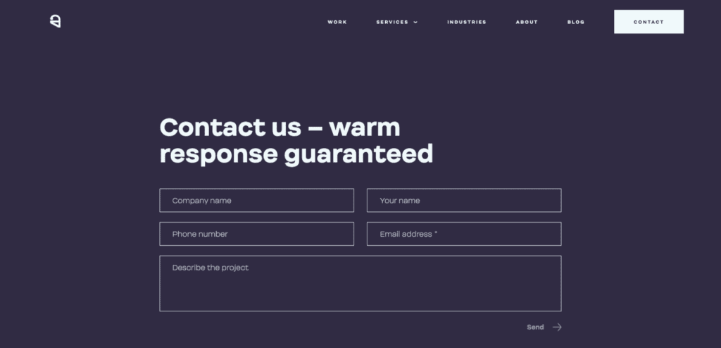
- Standard contact form
The name of this type speaks for itself as long as the users are required to fill in basic fields only: name/company name, contact information, and a message that the user wants to convey to the company. Moreover, such type is suitable for both B2B and B2C businesses.
- Minimalist contact form
This template reflects the easiest way for contacting the company as long as the only fields to be completed are the name and subject. Its small size allows companies to put it on several website pages. However, the only way of contacting might become a problem since it may be not suitable for every user.

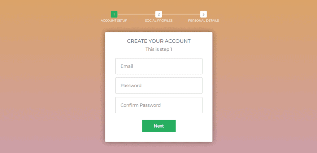
- Multistep contact form
The form represented above is mostly applicable when it comes to registration. In this case, users are provided with a multi-step registration process. It’s highly beneficial and convenient as long as the users are not obliged to fill in a huge questionnaire to sign-up.
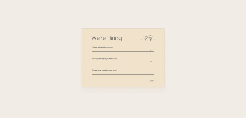
- Job application contact form
From time to time all the companies face the need in hiring new employees. This type of contact form allows the candidates to quickly and easily complete the job application form. It may be created in the form of questions and fields or as it’s shown on the picture (with a drop-down menu).
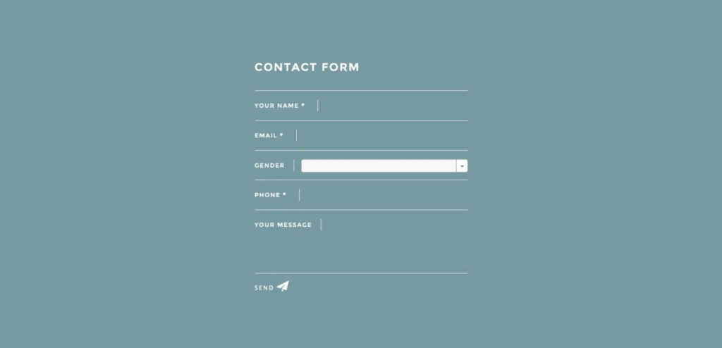
- Sales lead contact form
To better understand the needs of potential customers and to improve the process of generating leads, companies should make such a type of contact form. Here users have to share not only their contact information but also some personal one (about their gender, as it’s shown in the template). Moreover, such forms may contain other questions (about their tastes and interests, for example).
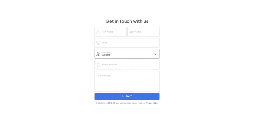
- Support contact form
The provision of users with a support contact form is a great plan so that in case of any issues or questions they’ll have an opportunity to quickly report on them. With the help of a drop-down menu, the process becomes organized since the query will promptly be delivered directly to the corresponding department.
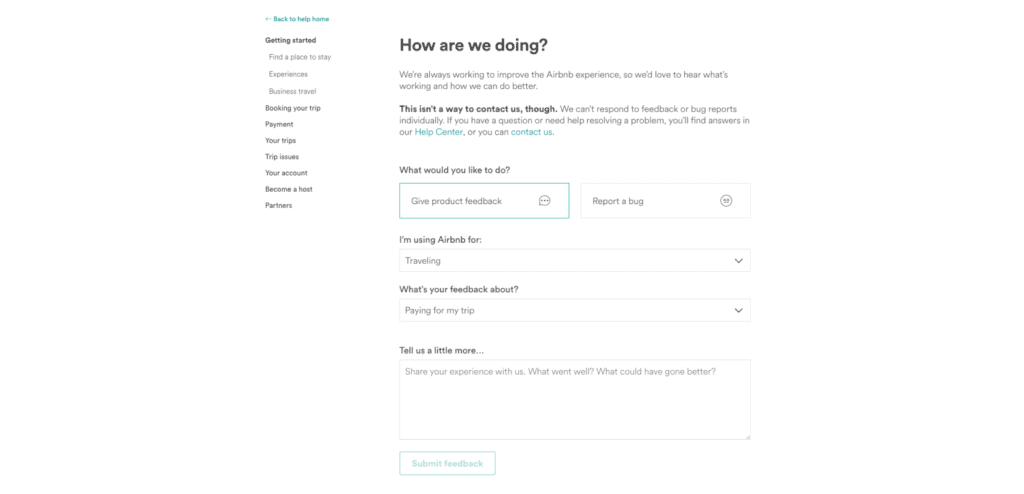
- Feedback contact form
An opportunity to get feedback from the customers is of great importance for any company that wants to grow and develop in terms of providing the best service ever. The field with some ideas for the corrections should not be disregarded as long as sometimes telling about the issue is simply not enough to fix it.
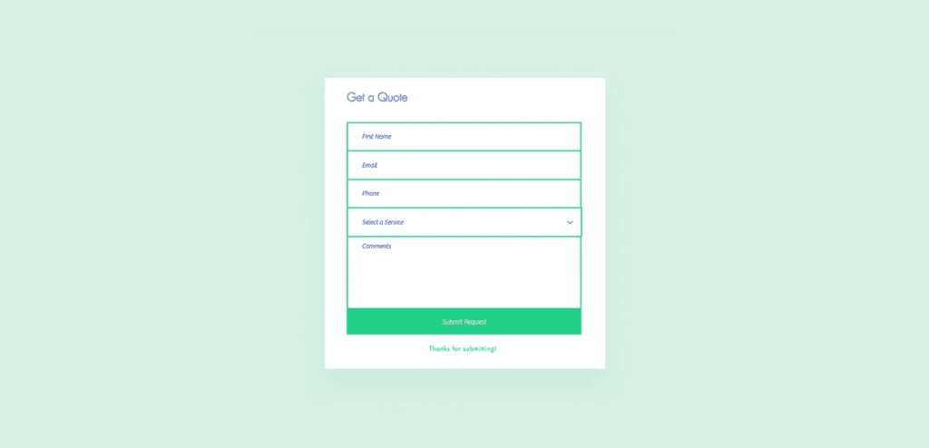
- Price quote contact form
The price for the services that the customers are interested in is one of the most crucial and determining factors in choosing the company. Sometimes there are some nuances in the service desired that the companies should take into account. And these features may influence the total price. That’s why the provision of a price quote contact form is strongly advisable.
Once we are aware of the types of contact forms that the companies may apply in different cases and for various reasons, it’s time to see great examples of contact forms.
Top 10 Contact Form Examples
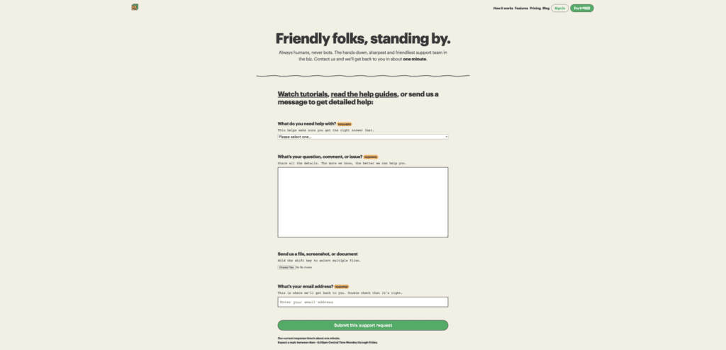
01 Basecamp
Everything here is super friendly. Basecamp provides its users with a contact form that contains rather informal questions with tips and explanations to them so that the users fully understand what they should do and why. They also specify the time of the answer to the query. The links to the tutorials and FAQs section are of much help as well. Moreover, the users have an opportunity to attach files which almost eliminates the need to use e-mail.
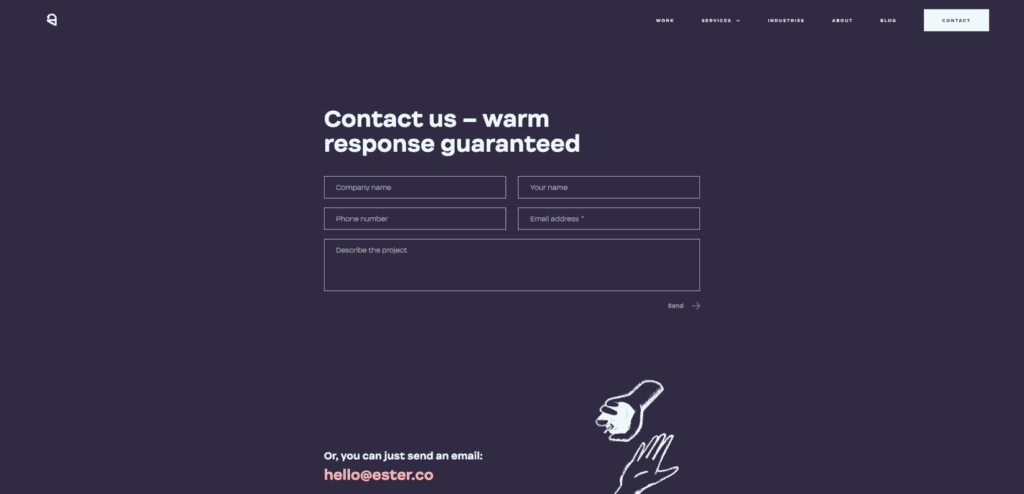
02 Ester Digital
A standard contact form provided by Ester Digital is created corresponding to the whole website design. The users (companies mostly) are provided with several fields to fill in which makes the process of interaction rather fast and simple. They also offer a clickable link to contact them via e-mail along with the physical addresses of their offices. The links to social networks located at the bottom of the page invite customers to follow and become a member of their “world of art”. It’s worth mentioning that the website is perfectly adaptive and lacks no functions while being used via the mobile phone.
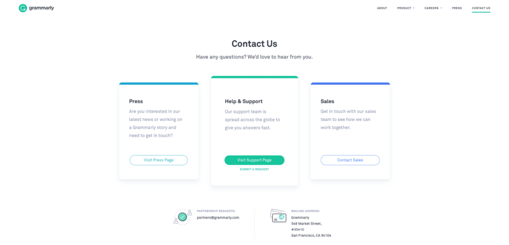
03 Grammarly
The contact page of Grammarly offers its visitors a highly convenient way of interaction. Here, the users may pick the section of their interest according to the department responsible. After clicking on a certain button, the users appear on the page with the search bar (to find the answers there) and various links. The process of contacting is rather automated and makes the matter of contacting urgent only in case when the system itself cannot find the relevant answer or solution.
04 Infinum
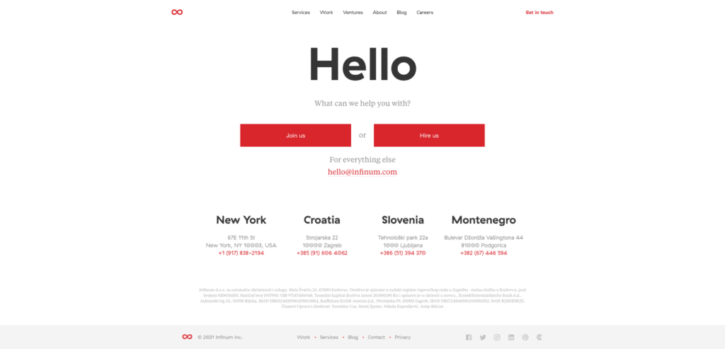
Infinum created a contact page that serves several purposes. Here users can find a job application contact form (CTA Join us), a standard contact us form (CTA Hire us) with an opportunity to attach files, and an e-mail address for all other issues. The users just need to choose the one they are interested in and complete the form desired. They also placed the contact information of all their offices along with the physical addresses.
05 Let’s Travel Somewhere
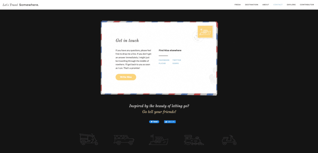
The contact page of Let’s Travel Somewhere is made in the form of a postcard which reflects the main concept of the company (which is traveling, obviously). The page consists of charming and hilarious text with an interactive link (Write Nisa) following which users will see a minimalist contact form where they have to fill three fields only (name, e-mail, and a message). The links to various social networks can also be found here.
06 Rescue Agency
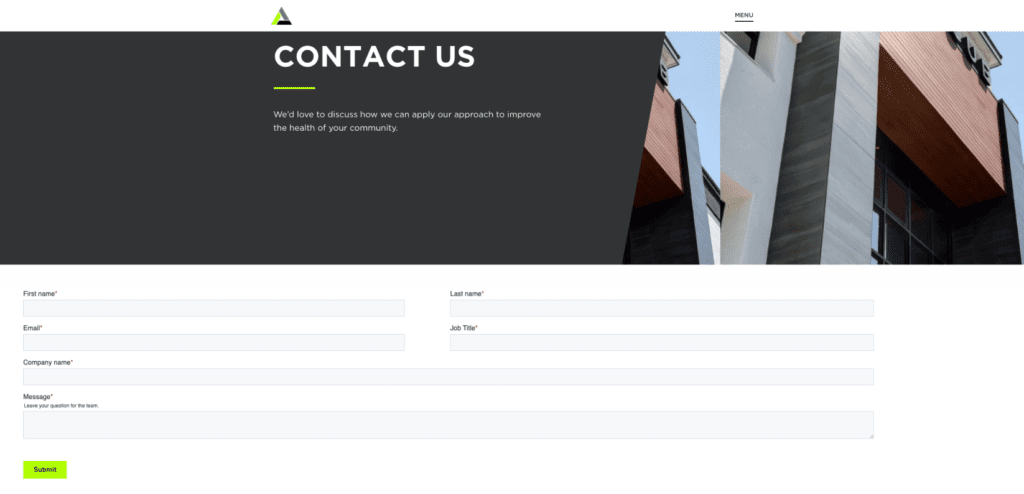
The contacting page of Rescue Agency starts with a welcoming text in which the company explains what they are expecting from users to contact them about. Furthermore, we can see a lead-generating contact form since, among other standard questions, there are also those related to the jobs of users (job title and company name). Below the contact form, you can find the section with the physical addresses of the branch offices accompanied by the map where they are marked.
07 Survicate
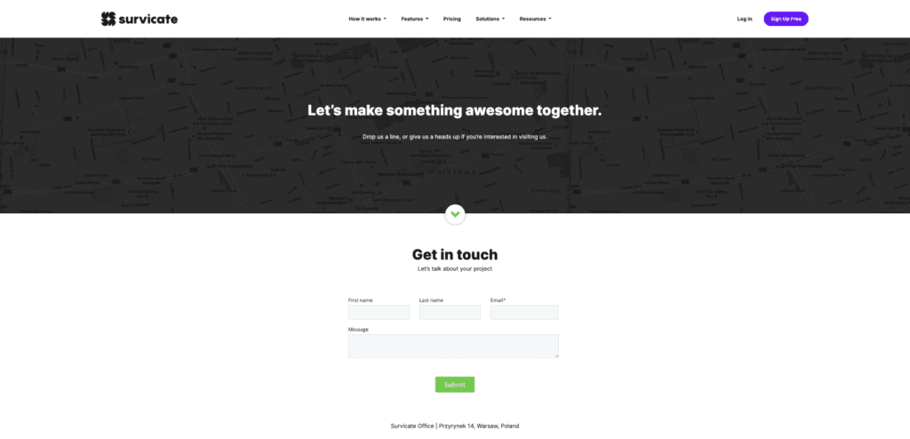
The first phrase that visitors bump into when they open the website of Survicate (“Let’s make something awesome together”) sounds warm and inspiring. Moreover, the informal language applied here makes users feel as if they are heading to contact their best friends. The contact form itself is rather short and simple. They also provide users with the physical address of their office and a bit below we can find links to their social networks.
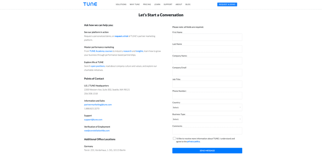
08 Tune
It seems that the contact page of the Tune website has everything that needs to be included in it since the information provided there along with various CTAs, and a clear and understandable contact form can be found here. With the help of diverse links, this contact page serves not only as an interaction point but also as a source of marketing and promotion for their company. Furthermore, the contact information includes all the details required: physical addresses, phone numbers, and e-mails.
09 Yeti
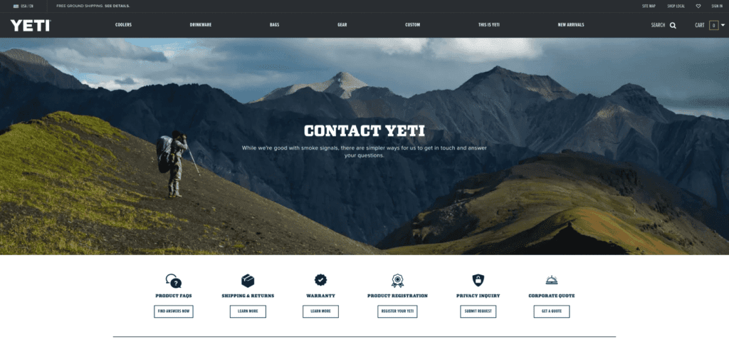
The welcoming amusing phrase of the Yeti website conveys a feeling of comfort and reliability. The contact page is well-structured and organized. Here the users are provided with links to FAQs and other sections with relevant information. However, if the users still fail to find the information of their interest, they can use an e-mail to contact the company. A bit below there is the address of their corporate office along with the links to their departments, the details on their working hours and phone numbers.
10 Yummygum
The contact page of Yummygum provides users with a multistep contact form. Here users can choose the topic of their message and then fill in a pretty standard form. The page itself seems rather friendly and it’s achieved with the help of the “Our door is always open for a good cup of coffee” welcoming phrase and a list of options to contact them. The company also contains information about their location (in the background of the map) and links to their social networks where they are presented.
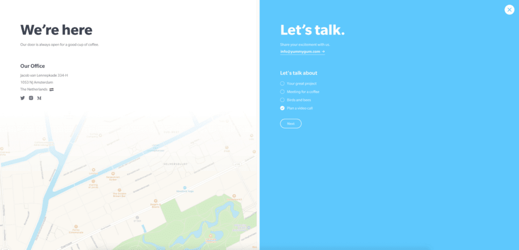
The above-displayed contact page examples show diverse approaches to designing this type of page. They are all unique but the thing that unites them is that they are consistent with the overall website design and that they all have been thoroughly developed. This is what each company should strive for.
On a Final Note
Creating a top-notch contact us page can be a challenging task, but fear not! Our team of UI/UX design experts is here to guide you through the process. By following our recommended guidelines, you can ensure that your page is user-friendly and optimized to meet your business needs.
Remember that customers don’t want to spend hours filling out a contact form, so keep the number of required fields to a minimum. A simple and consistent design with relevant information will help ensure that your customers can quickly and easily find the information they need. In addition, incorporating elements such as Google Maps, interactive phone numbers and emails, and adaptive design can boost both customer convenience and credibility.
To make the most out of your contact page, it’s also important to focus on accessibility and information convenience. Including a well-written text with various calls to action, guided user input, and links to your FAQs section can help your customers find the information they need quickly and easily.
Finally, don’t forget to check everything before launching your website. Proofread your texts and test the technical side to ensure that everything runs smoothly.
We hope this article has provided you with valuable and workable insights that can help take your business to the next level. If you have any questions or need further assistance, don’t hesitate to contact our team of professionals. We’re always here to help you succeed!


